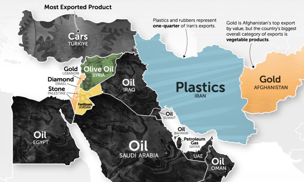
It's more than just oil. This map of Middle East exports shows the top global product of each country by...
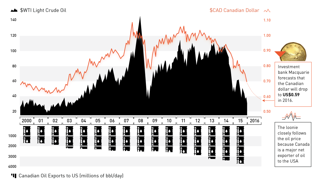
The oil plunge has wreaked havoc on the Canadian dollar. Now at 13-yr lows and expected to go lower, we explain the relationship between oil and...
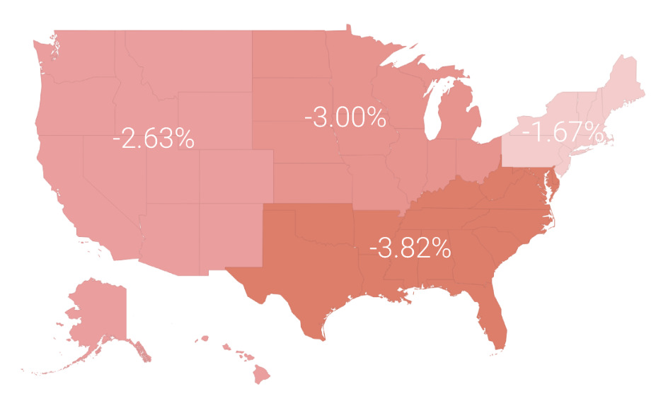
In a volatile market in 2015, the average investor lost 3.1%. In today's post, we break this performance down by region, profession, and age.
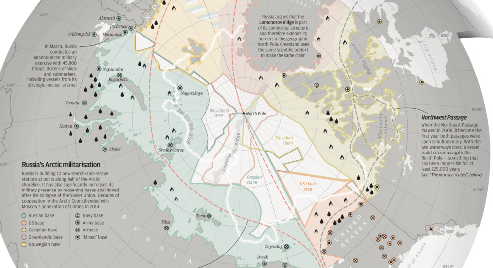
With Arctic ice thawing, the race for natural resources, shipping routes, and other territorial claims is heating up. The race for Arctic Domination is on.
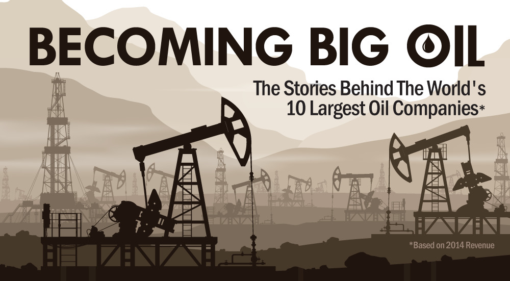
The 10 largest oil companies generated a massive $3.26 trillion in revenue last year. How did Big Oil come to be? This infographic takes a look.
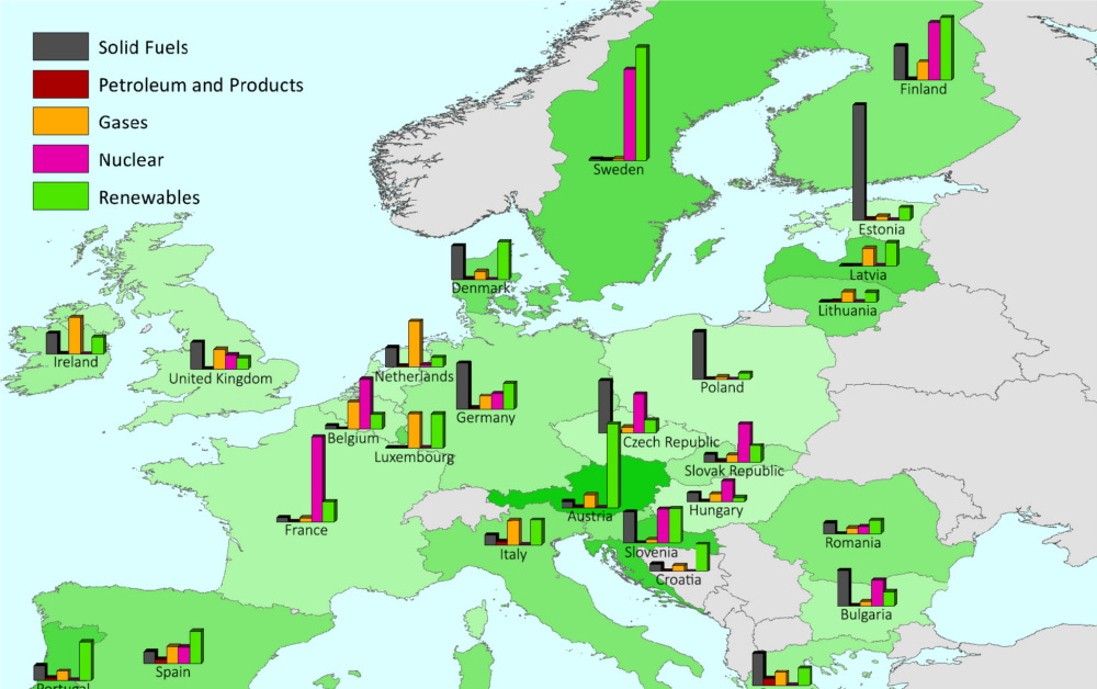
This series of charts and maps show an overview of Europe's energy consumption, as well as consumption (per capita) by country and source.
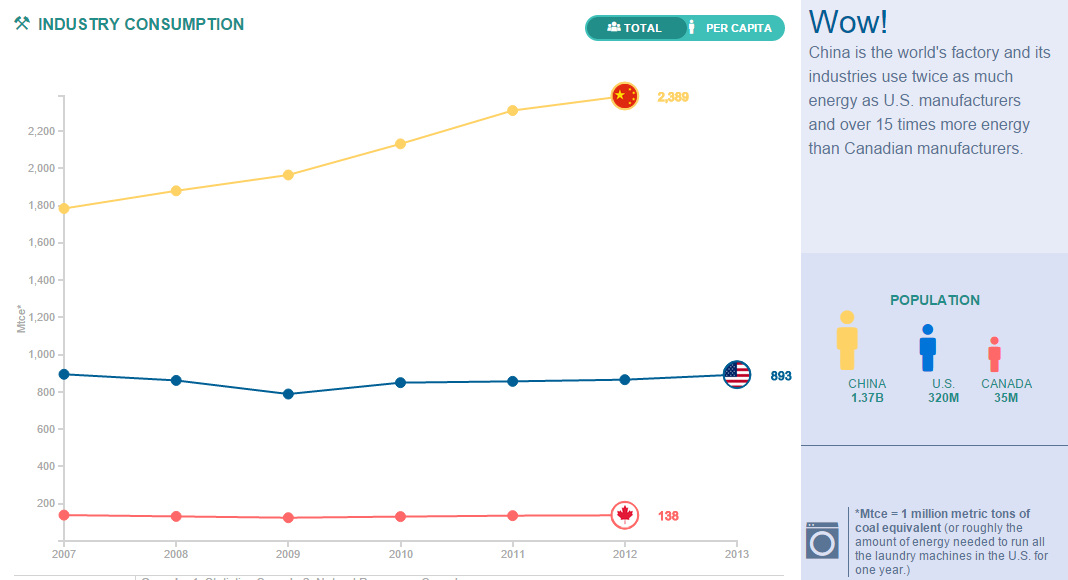
Compare the United States, China, and Canada side-by-side to see the differences in how these energy titans consume, produce, and import/export energy.
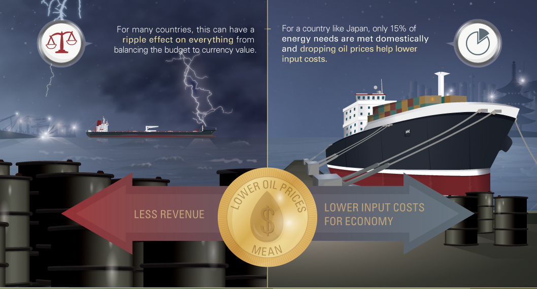
Plunging oil prices have profound effects on major importers and exporters of oil. In this case, we look at how currencies of net exporters are impacted.
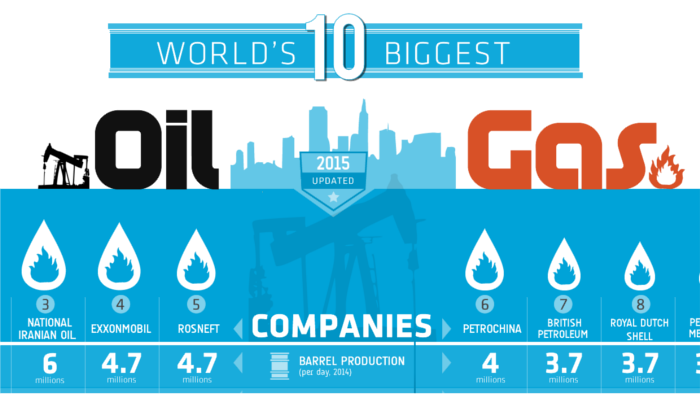
Ranking the world's 10 biggest oil and gas companies by oil production per day, country, and production growth over the last decade.
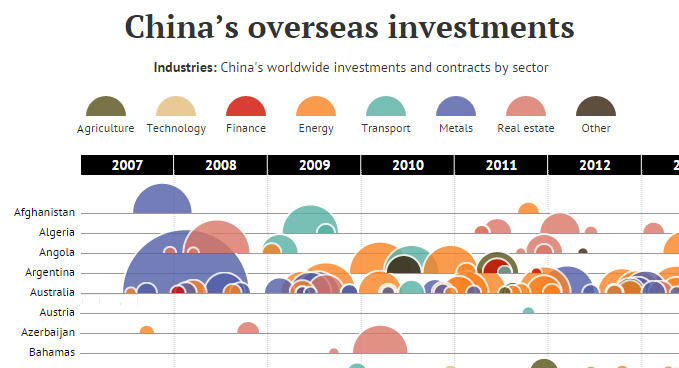
In this data visualization, every attempted Chinese overseas investment over $100 million is organized by country and sector.
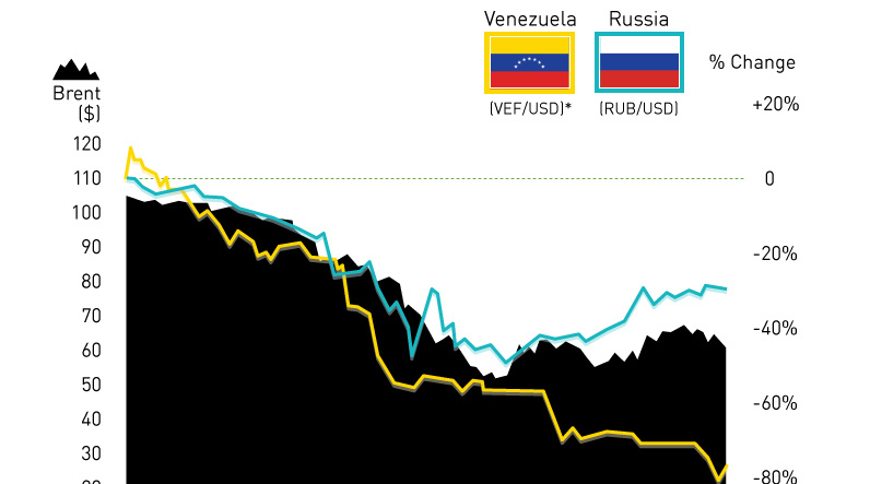
Black market rates for US dollars in Venezuela have jumped over the last two weeks dramatically, as citizens pay up to 400 Venezuelan bolívars for one...


