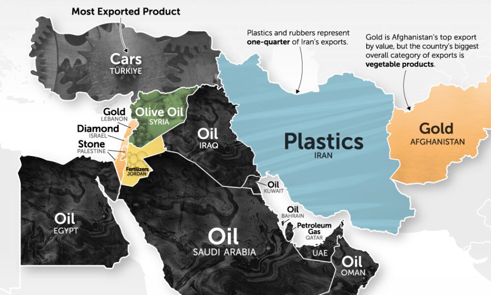
It's more than just oil. This map of Middle East exports shows the top global product of each country by...
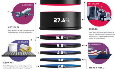

Oil is a building block that makes modern life possible. Here are the proportion of finished products that are created from a barrel of oil.
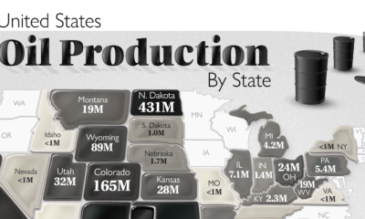

The U.S. is the largest oil producer in the world. Here we map the share of oil production in the country by all 50 states in...
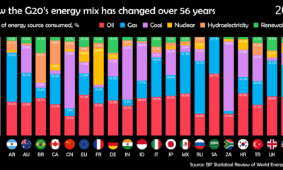

Watch how the energy mix of G20 countries has evolved over the last 50+ years.
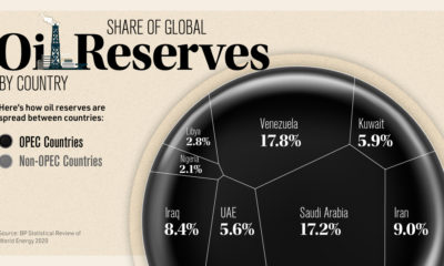

The world holds 1.73 trillion barrels of proven oil reserves. Here we rank the top 14 countries that make up 93.5% of the world.
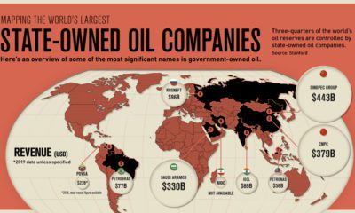

State-owned oil companies control roughly three-quarters of global oil supply. See how these companies compare in this infographic.
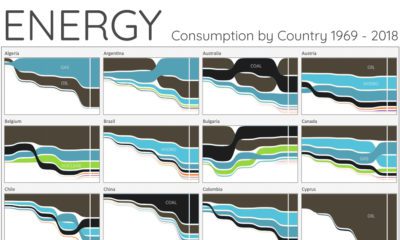

For the last 50 years, fossil fuels have dominated energy consumption. This chart looks at how the energy mix is changing in over 60+ countries.
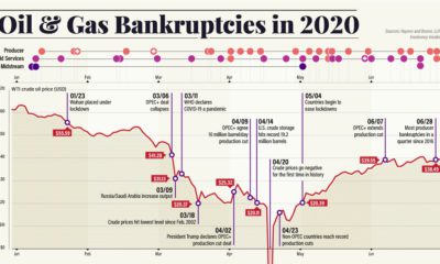

Dropping crude prices and a worsening pandemic have led to a growing wave of energy bankruptcies. Here’s what that fallout looks like.
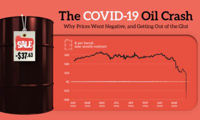

How oil prices went negative: this explainer shows how a collapse in demand, a Saudi-Russia price war, and oversupply led to futures prices going wonky.
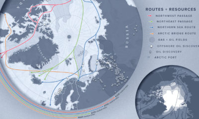

As the Arctic becomes more accessible due to reduced ice cover, countries with polar real estate increasingly viewing the region through an economic lens.
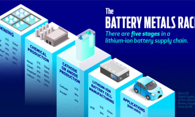

Is the U.S. positioned to win the battery arms race, or will China remain in control of the world's transition to renewable energy?


