

We visualized the top U.S. companies by employees, revealing the massive scale of retailers like Walmart, Target, and Home Depot.

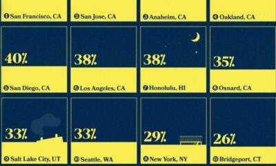
Visualizing the least affordable U.S. cities for renters by the percentage of affordable rentals available on an average salary.


This graphic shows U.S infrastructure grades and highlights the general low grade.
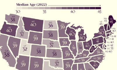

The U.S. might have a median age of 39, but the median age by state ranges from the low 30s to the mid 40s.


To offer perspective on the population of U.S. states, this map compares them to countries that share similar population sizes.
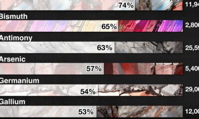

The U.S. Geological Survey estimates that in 2022, China was the world’s leading producer of 30 out of 50 entries on the U.S. critical minerals list.


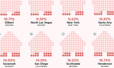
This infographic ranks the 20 most popular neighborhoods in the U.S. for homebuyers based on search interest.
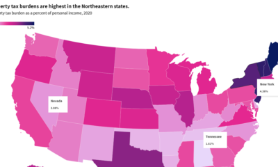

This interactive graphic shows property taxes by state in the U.S. as a percentage of personal income in 2020.
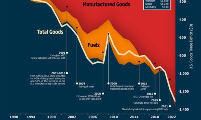

This graphic the U.S. trade deficit growth since 1990, and how manufactured goods and fuels factor in over the last three decades.
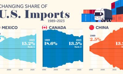

We highlight seven key U.S. trade partners and their changing share in the sources of U.S. imports from 1989–2023.

We highlight the top 15 U.S. metro areas by their percentage of million-dollar homes, from San Francisco to Miami.


 Creator Program