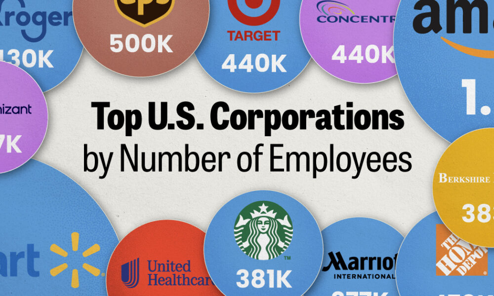
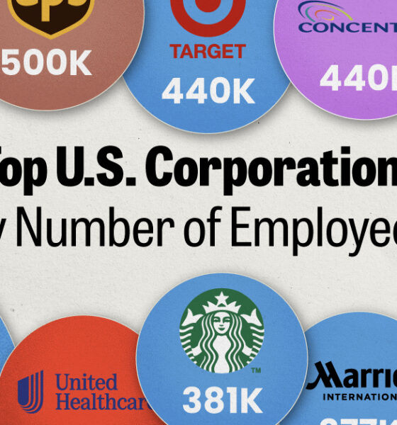
We visualized the top U.S. companies by employees, revealing the massive scale of retailers like Walmart, Target, and Home Depot.
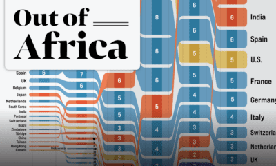

In 2020 the African continent exported nearly $378 billion worth of goods. Here are the top destinations for 25 years of Africa’s exports.
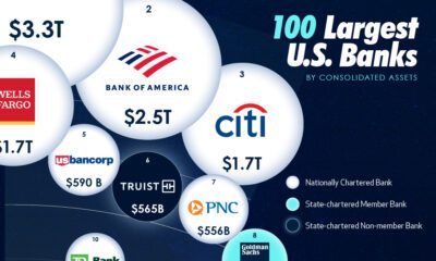

In this visual we showcase the relative size of the 100 largest U.S. banks in terms of consolidated assets.
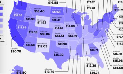

Which states and industries in the U.S. pay a good internship salary? Which pay the worst, or none at all?
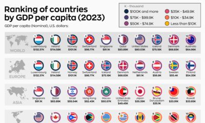

What are the world's top countries by GDP per capita? How do those rankings change when we adjust for purchasing power parity?
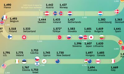

Where do people work the most? Explore our analysis of the average annual working hours across OECD countries.
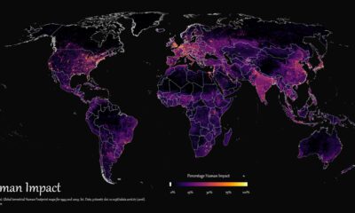

How far has humanity spread, and where haven't we gone? This graphic maps the extent of humanity’s impact on the world from 1993 to 2009.


There's more to consider than the price tag when purchasing a house. This ranking reveals the most affordable U.S. cities for home buyers.
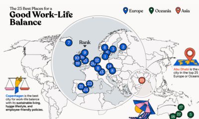

In this infographic, we explore which cities around the world excel in prioritizing work–life balance.
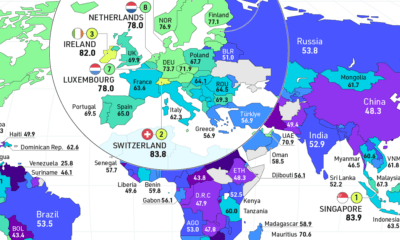

How free are people to control their own labor, property, and finances? This map reveals the state of economic freedom globally.
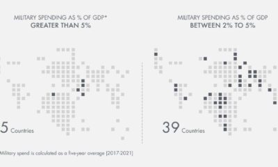

Which countries have the highest military spend relative to their economy? This visual breaks down the amount spent in each country by GDP.


 Creator Program