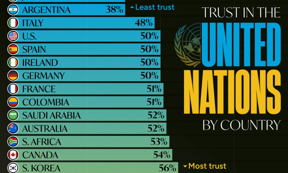
Which countries trust the United Nations to do the right thing the most, and the least?

Today, China dominates the trade market, accounting for almost 15% of all merchandise.
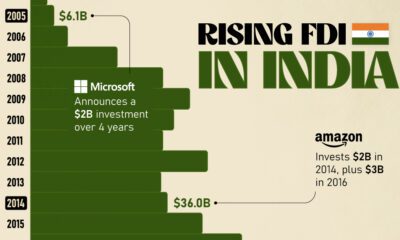

Mirroring the country's rapid economic growth, India's FDI (foreign direct investment) inflows have skyrocketed over the last twenty years.
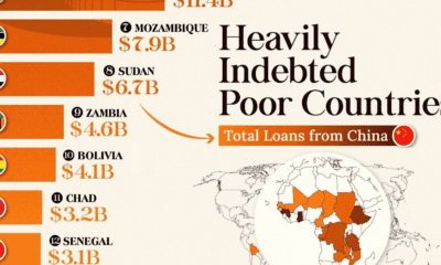

This infographic lists countries in Africa and other developing regions that received billions in loans from China.
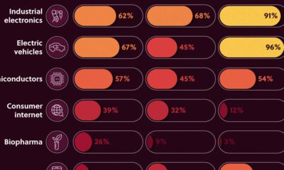

We look at the share of Asian companies in the top 3,000 global firms—measured by market capitalization in 2020—broken down by industry.
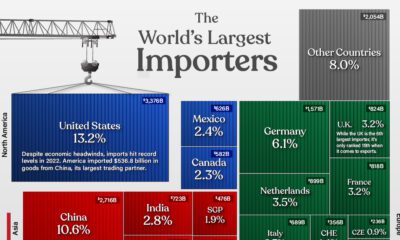

The value of global imports hit $25.6 trillion in 2022. Here are the world's largest import countries, and their share of the global total.
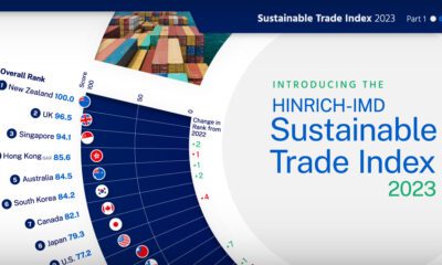

The Sustainable Trade Index 2023 is an annual ranking of the world's most sustainable economies. View this infographic to see the results.
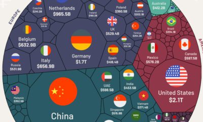

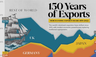
We visualize nearly $25 trillion of global exports by country, showing you the top exporting nations and the data behind it all.
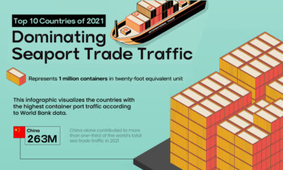

This infographic highlights the countries with the highest container traffic across their ports, thus dominating seaport trade in 2021.
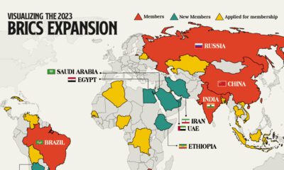

We provide a data-driven overview of how the recent BRICS expansion will grow the group’s influence and reach.


 Creator Program