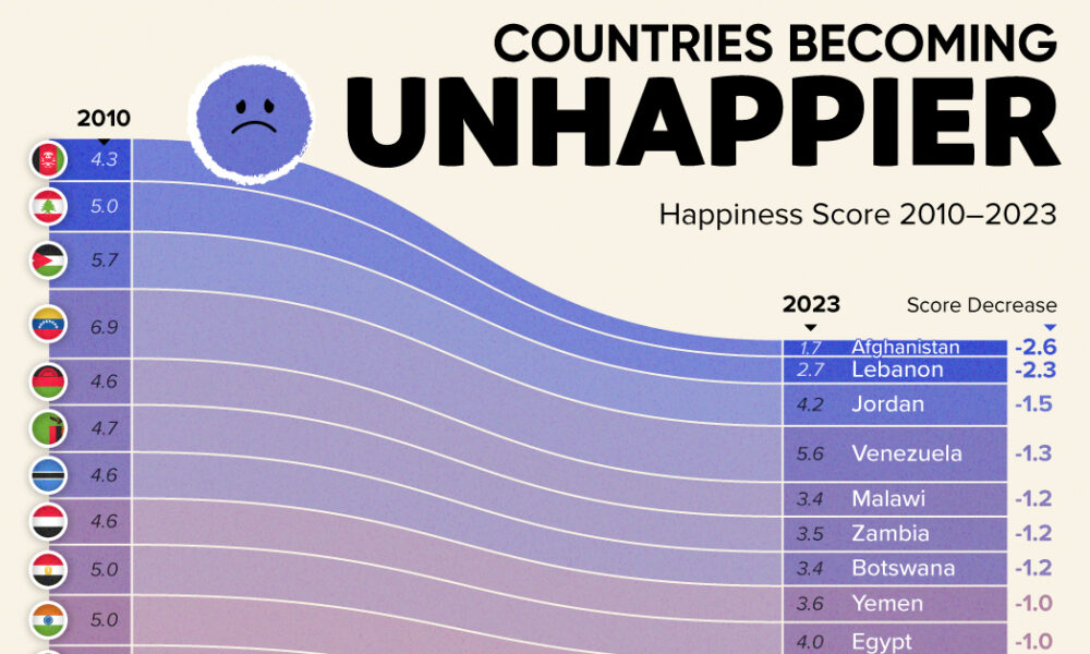
Tracking Gallup survey data for more than a decade reveals some countries are witnessing big happiness declines, reflecting their shifting...

We’ve come a long way since Pangea. This short video examines the area, population, and GDP of our continents as a share of the world's total.
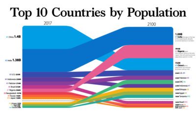

New estimates show that world population may begin shrinking in coming years. We visualize this and how country populations will change by 2100.
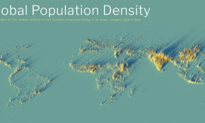

What does population density look like on a global scale? These detailed 3D renders illustrate our biggest urban areas and highlight population trends.
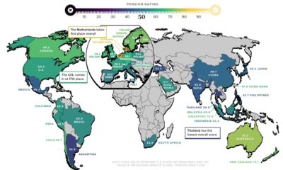

As the global population ages, pension reform is more important than ever. Here’s a breakdown of how key countries rank in terms of pension plans.

This fascinating animated map provides an overview of the top trending Google searches in every state over the last decade.
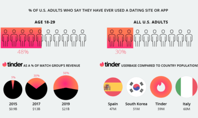

Online dating is a cultural force driven by Millennials and Gen Z. But it's also a phenomenon dominated by just one company—Match Group.
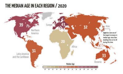

The world’s population is aging, but not at the same rate. This animated map visualizes the changes in median age in every region since 1950.
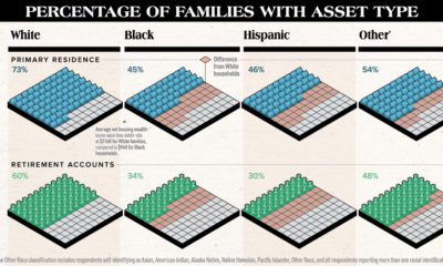

White families are more likely to hold assets of any type compared to other races. This chart highlights the substantial racial wealth gap.
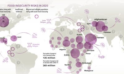

Over 135 million people face acute food insecurity worldwide—but COVID-19 could almost double these numbers. Which regions could be most affected?
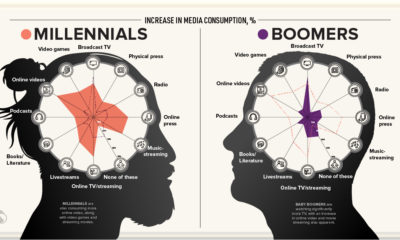

This visualization explores how each generation's media consumption is changing amid the frenzy of pandemic-induced quarantines.


