
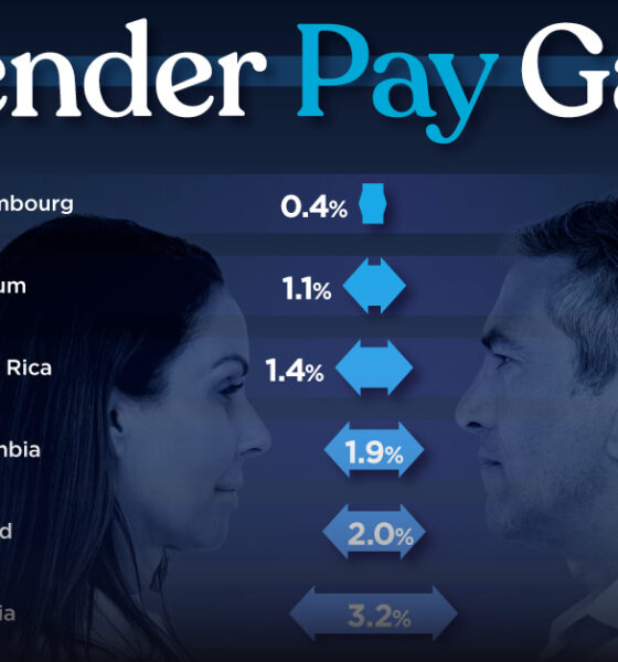
Which OECD countries have the smallest gender wage gaps? We look at the 10 countries with gaps lower than the...


Population density varies across the globe. These maps use geographical circles to show the most densely populated areas on multiple continents.
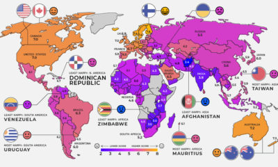

Global happiness levels are determined by several different factors. Here's a look at the happiest and unhappiest countries in every region.


Ukraine has made the headlines due to the ongoing tensions with Russia. In this map infographic, we examine Ukraine from a structural point of view.
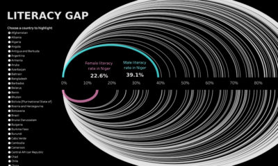

Global literacy rates have increased in the last few decades, but some countries are still lagging behind, especially in Sub-Saharan Africa.
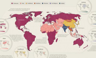

Today, 84% of the world’s population identifies with a religious group. Here we visualize the distribution of the major religions worldwide.


From presidential elections, to cryptocurrencies and billionaires, here are the trending searches in every U.S. state in 2021.
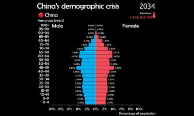

See why China is facing a demographic crisis in this animated chart.


The U.S. is home to a plethora of languages. Here we map the most common language spoken in each state (aside from English and Spanish)
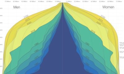

The world is in the midst of a notable demographic transition. Here's how the world population pyramid will change as we close in on the year...
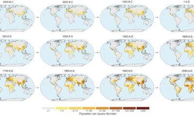

In the next year or so, humanity is expected to pass the 8 billion person milestone. These charts and maps put global population growth into context.