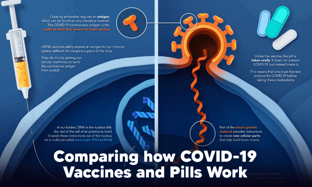
Despite tackling the same disease, vaccines and antiviral pills work differently to combat COVID-19. We visualize how they work in...
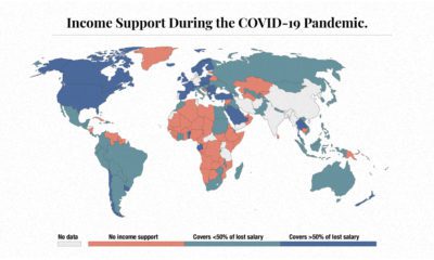

The need for income support during COVID-19 has been vast. This map visualizes different levels of income support around the world.
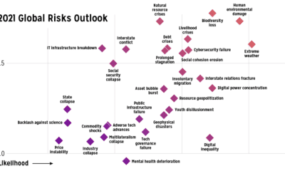

Which risks are top of mind in 2021? We visualize the World Economic Forum's risk assessment for top global risks by impact and livelihood.
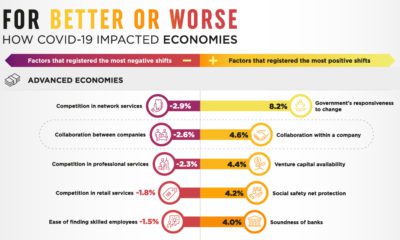

It’s been a rollercoaster year. Here’s a look at the economic impact of COVID-19 worldwide, according to a survey of global business leaders.
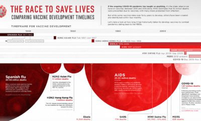

This graphic looks at how long vaccine development has historically taken for pandemics dating back to the 1900s.
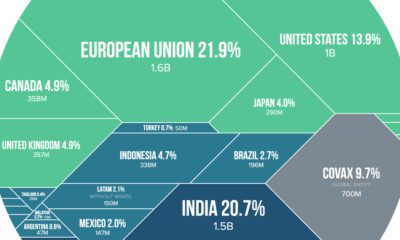

Visualizing the share of COVID-19 vaccines purchased by different countries and the companies that are manufacturing them.
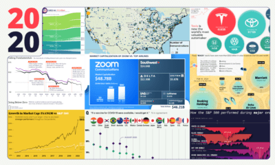

These 20 charts, maps, and visualizations help capture what happened in a tumultuous year around the globe.
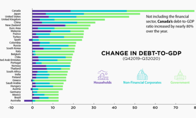

The battle against the COVID-19 pandemic has resulted in heightened debt-to-GDP levels across all sectors and countries.


This graphic compares consumers’ most loved brands before the COVID-19 pandemic to their most loved brands during the pandemic.
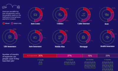

57% of U.S. consumers' incomes have taken a hit during the pandemic. How do such financial anxieties affect the ability to pay bills on time?
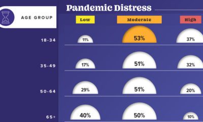

This graphic visualizes the impact of COVID-19 on emotional distress levels by different demographic subgroups such as race, education, or sex.


