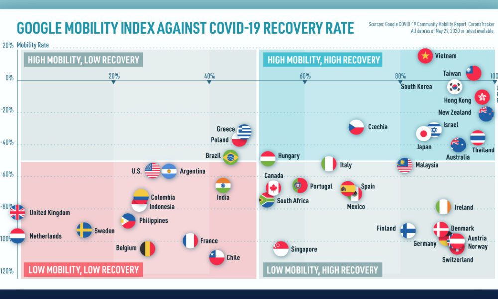
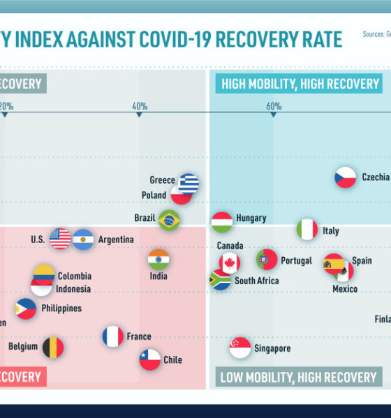
We look at mobility rates as well as COVID-19 recovery rates for 41 economies, to see which countries are reopening...
The rise of ETFs has been meteoric, and passive investing has been huge since the crisis. However, as a whole, passive has barely made a dent...
Family and neighborhoods influence a child's development and opportunities - and as a result, future incomes. See which cities have the biggest impact.
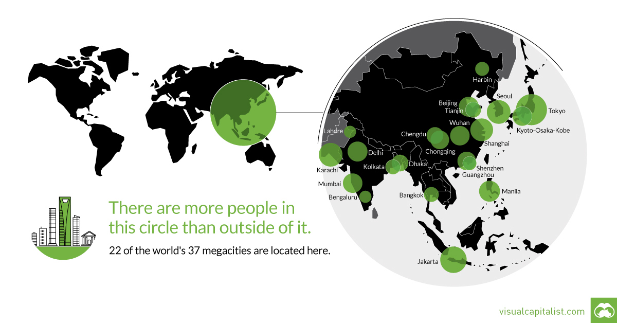
That's right - nearly 4 billion people live inside the circle on this world map, including 22 of the world's 37 megacities.
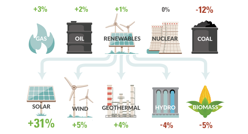
How is U.S. energy consumption shifting? This week's chart looks at the rate of change in the use of different energy sources, including future projections.
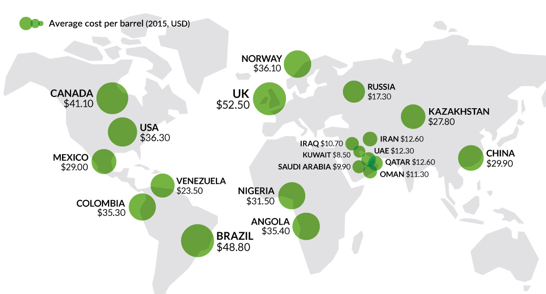
It's been two years since the oil price crash. This chart looks at three sets of oil data, while we check in on the economies most...
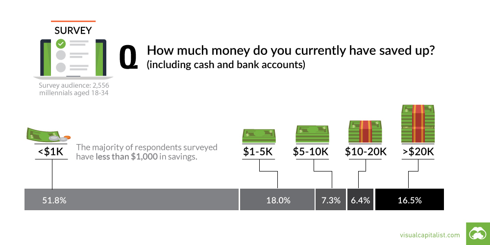
A recent survey shows that most millennials are living paycheck to paycheck. This chart looks at their savings, as well as differences between subgroups.
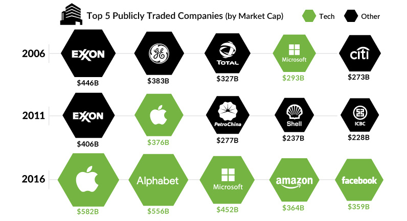
What are the largest companies by market cap, and how have they changed over the years? This chart shows them, while also presenting a broader narrative.
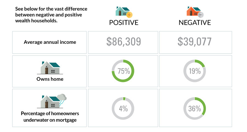
The differences between America's poorest homes - those with negative wealth - and their positive counterparts are stark and numerous.
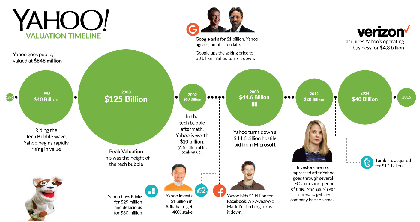
The roller coaster for Yahoo finally ends. This timeline shows where Yahoo execs went wrong during the company's 20 year history.
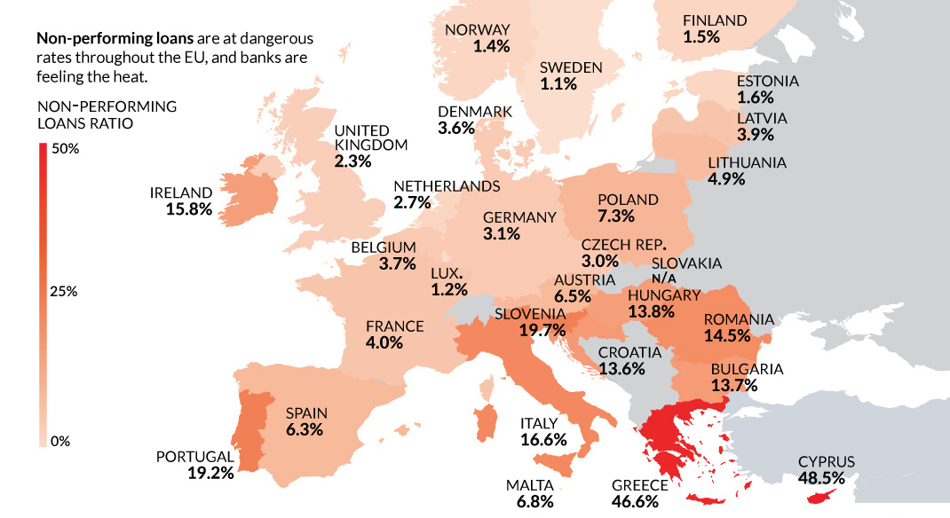
Despite the potential negative economic consequences, there is one reason a Brexit makes sense: non-performing loans and Europe's troubled banking sector.


