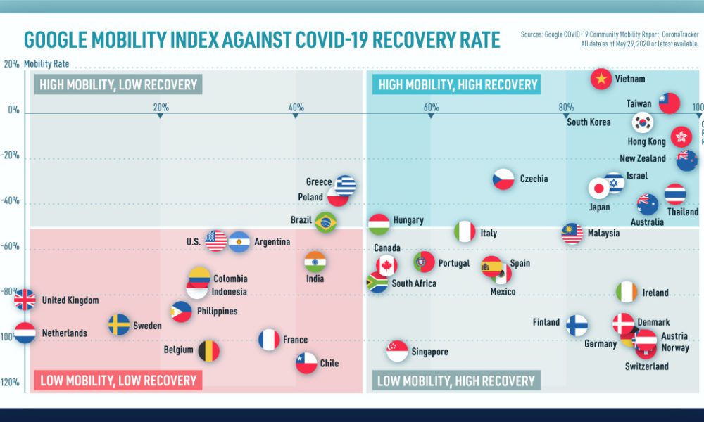
We look at mobility rates as well as COVID-19 recovery rates for 41 economies, to see which countries are reopening...
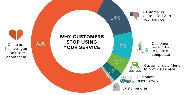
An astonishing two-thirds of your customers leave because they think you don't care about them. Here's how to change that.
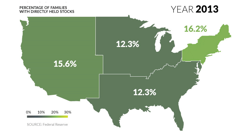
U.S. markets continue to hit all-time highs, but what percentage of population actually benefits? See stock ownership across the U.S. on this animated map.
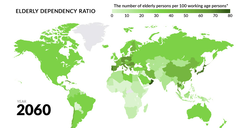
Globally, fertility rates have decreased by about half since 1960. What will happen to the economy when the world's aging population begins to retire?
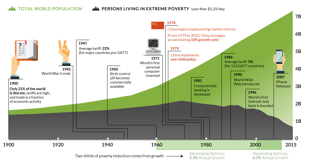
Population is growing, but world poverty isn't. See how the amount of people living in extreme poverty has been cut in half since 1990.
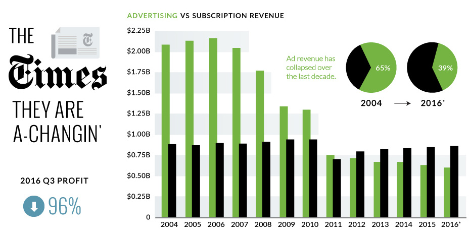
The New York Times just announced a 95.7% decrease in quarterly profits - we look at the numbers and context around the NYT's digital transition.
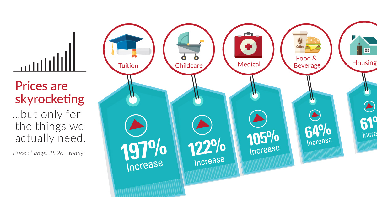
Over the last 20 years, the things that are the most important to us, such as healthcare, education, food, and shelter, have skyrocketing prices.

Can upstart robo-advisors compete against the scale of financial behemoths like Vanguard or Blackrock? See in this week's chart.
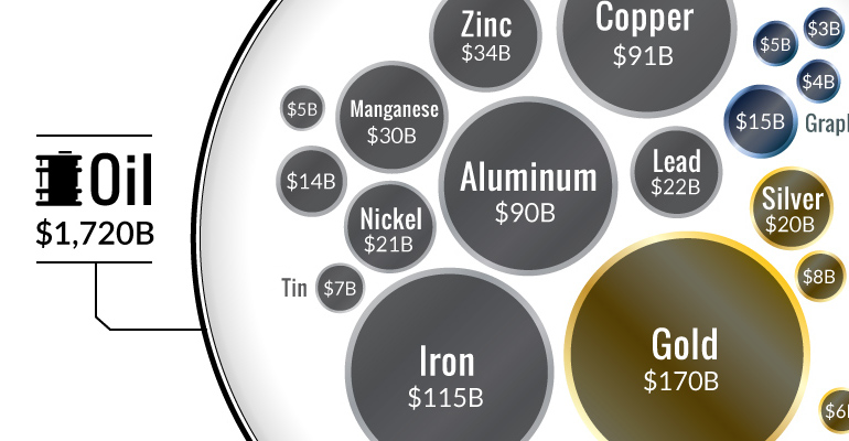
Ever wonder why the oil industry has so much influence? This chart shows that all metal markets combined don't even come close to touching the oil...
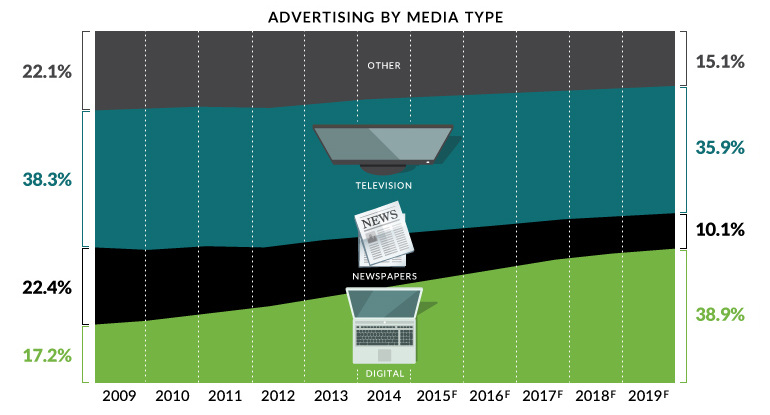
Digital media will be the largest advertising channel globally by 2019 - even bigger than television. This chart covers the death of traditional media.
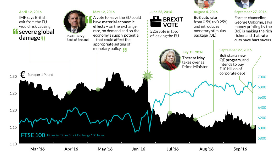
Many experts predicted a Brexit calamity if the UK voted to leave. Were they right? We look at the last three months and the aftermath of...


