Datastream
Why Branch Banking is Dying in America


The Briefing
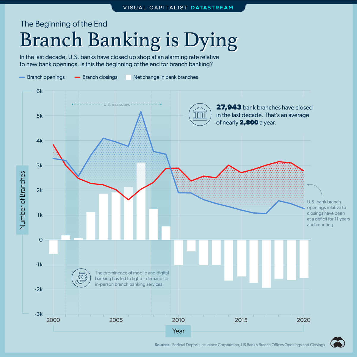
- In the last decade, 27,943 bank branches have closed in the U.S.
- The increasing prominence of mobile and digital banking is leading to lighter demand for in-person banking services
Branch Banking Is Dying
The 2008-09 financial crisis was triggered by reckless banking practices that dominoed into the global economic system.
Though the world has since recovered and moved on from the crash, the banking system that ignited such damage has in some ways never been the same.
Take U.S. branch bank net openings, which is undergoing a notable trend reversal. According to the Federal Deposit Insurance Corporation (FDIC), for 11 years and counting, the number of U.S. bank branch closings has exceeded the number of branch openings.
| Year | Openings | Closings | Net |
|---|---|---|---|
| 2020 | 1,251 | 2,788 | -1,537 |
| 2019 | 1,460 | 3,090 | -1,630 |
| 2018 | 1,563 | 3,134 | -1,571 |
| 2017 | 1,065 | 2,986 | -1,921 |
| 2016 | 1,084 | 2,826 | -1,742 |
| 2015 | 1,209 | 2,689 | -1,480 |
| 2014 | 1,351 | 2,996 | -1,645 |
| 2013 | 1,470 | 2,500 | -1,030 |
| 2012 | 1,623 | 2,570 | -947 |
| 2011 | 1,901 | 2,364 | -463 |
| 2010 | 1,897 | 2,892 | -995 |
| 2009 | 3,457 | 2,877 | +580 |
| 2008 | 3,562 | 2,300 | +1,262 |
| 2007 | 5,168 | 2,024 | +3,144 |
| 2006 | 3,759 | 1,609 | +2,150 |
| 2005 | 3,947 | 2,026 | +1,921 |
| 2004 | 4,095 | 2,217 | +1,878 |
| 2003 | 3,404 | 2,271 | +1,133 |
| 2002 | 2,556 | 2,469 | +87 |
| 2001 | 3,193 | 2,982 | +211 |
| 2000 | 3,274 | 3,826 | -552 |
There are fewer banks in America with every passing year—in 2020 alone, a deficit of 1,537 branches was recorded, almost 2% of the roughly 85,000 branches in the country.
Branching Towards Digital
Unsurprisingly, the fall in branch banking coincides with the adoption of digital activity in the banking space. And this is especially true for younger, tech-savvy generations.
Undoubtedly, convenience is a big factor, as now nearly 50% of traditional branch banking activity can be conducted online. As a result, mobile banking activity occurs most frequently on one’s couch or bed.
The Good Ol’ Days
The decline in the number of branch banks also reflects the overall downturn of the broader banking industry. In that, the industry faces a slew of challenges including:
1. Contracting net interest margins
Net interest margins are the difference between the interest income generated for financial institutions and the amount they pay to lenders.
2. Fintech industry disruption
Fintech is bridging the gap between finance and digitization, sleek modern technologies enable firms to optimize financial services and the customer experience.
3. More stringent reserve ratio regulations
Reserve ratios are a portion of reserves that a financial institution must hold onto rather than invest or lend.
Investors are fleeing to other avenues as is evident in the stock price performance of the big U.S. banks. As a result, underperformance has been a common theme in the last decade.
| Number of U.S. Branches | Stock Price Performance (Jan 2011 - Jan 2021) | Change Relative to S&P 500 | |
|---|---|---|---|
| JPMorgan Chase | 5,016 | 208% | +17% |
| S&P 500 | 191% | ||
| Bank of America | 4,265 | 116% | -75% |
| U.S. Bancorp | 3,067 | 76% | -115% |
| Citigroup | 704 | 25% | -160% |
| Wells Fargo | 5,195 | -2% | -193% |
What Lies Ahead
Yet, despite the progress towards digital banking, the U.S. is still a laggard. For instance, large cohorts of Americans still use cash as a frequent transaction method, while the country’s mobile payment penetration rates are lower than most developed nations.
As a percentage of smartphone users, 29% of Americans have adopted mobile payments. A tepid figure relative to Denmark at 41%, and India at 37%.
America’s fierce economic rival, China, has a whopping 81% of smartphone users that have adopted mobile payments. That’s 801 million people, compared to America’s 69 million. Adjusting for population disparities, China still has 2.7x more mobile payment users.
If the U.S. follows on the path of other more fintech savvy countries, visiting a bank branch and using physical cash may become as increasingly antiquated as writing a check is today.
Where does this data come from?
Source: Federal Deposit Insurance Corporation
Notes: This data was updated last on January 8, 2021


Datastream
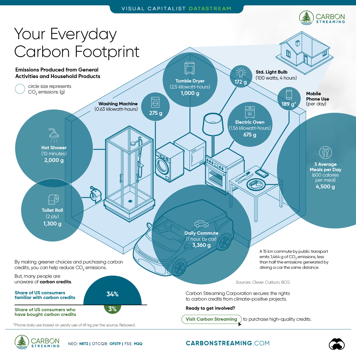
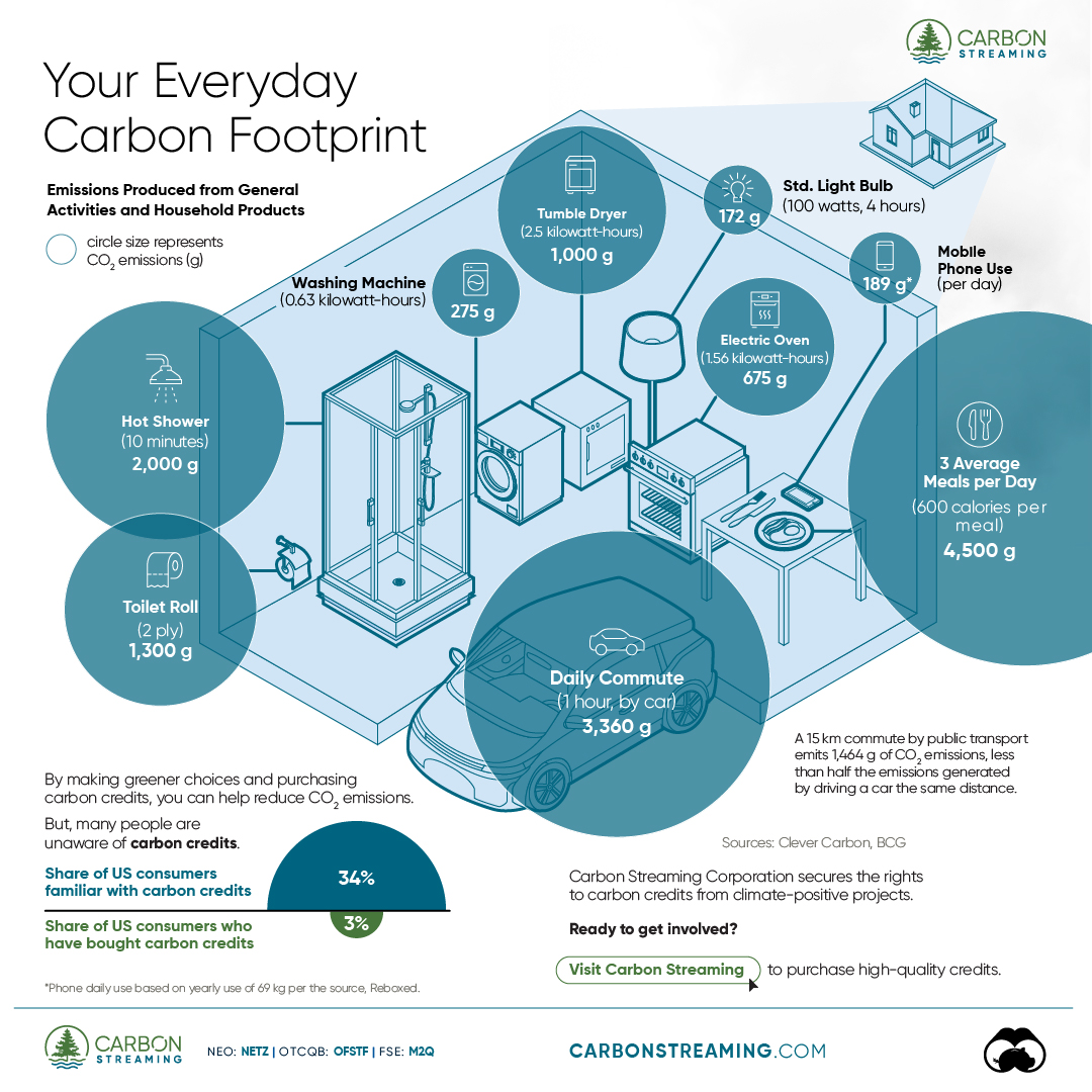
Can You Calculate Your Daily Carbon Footprint?
Discover how the average person’s carbon footprint impacts the environment and learn how carbon credits can offset your carbon footprint.
The Briefing
- A person’s carbon footprint is substantial, with activities such as food consumption creating as much as 4,500 g of CO₂ emissions daily.
- By purchasing carbon credits from Carbon Streaming Corporation, you can offset your own emissions and fund positive climate action.
Your Everyday Carbon Footprint
While many large businesses and countries have committed to net-zero goals, it is essential to acknowledge that your everyday activities also contribute to global emissions.
In this graphic, sponsored by Carbon Streaming Corporation, we will explore how the choices we make and the products we use have a profound impact on our carbon footprint.
Carbon Emissions by Activity
Here are some of the daily activities and products of the average person and their carbon footprint, according to Clever Carbon.
| Household Activities & Products | CO2 Emissions (g) |
|---|---|
| 💡 Standard Light Bulb (100 watts, four hours) | 172 g |
| 📱 Mobile Phone Use (195 minutes per day)* | 189 g |
| 👕 Washing Machine (0.63 kWh) | 275 g |
| 🔥 Electric Oven (1.56 kWh) | 675 g |
| ♨️ Tumble Dryer (2.5 kWh) | 1,000 g |
| 🧻 Toilet Roll (2 ply) | 1,300 g |
| 🚿 Hot Shower (10 mins) | 2,000 g |
| 🚙 Daily Commute (one hour, by car) | 3,360 g |
| 🍽️ Average Daily Food Consumption (three meals of 600 calories) | 4,500 g |
| *Phone use based on yearly use of 69kg per the source, Reboxed | |
Your choice of transportation plays a crucial role in determining your carbon footprint. For instance, a 15 km daily commute to work on public transport generates an average of 1,464 g of CO₂ emissions. Compared to 3,360 g—twice the volume for a journey the same length by car.
By opting for more sustainable modes of transport, such as cycling, walking, or public transportation, you can significantly reduce your carbon footprint.
Addressing Your Carbon Footprint
One way to compensate for your emissions is by purchasing high-quality carbon credits.
Carbon credits are used to help fund projects that avoid, reduce or remove CO₂ emissions. This includes nature-based solutions such as reforestation and improved forest management, or technology-based solutions such as the production of biochar and carbon capture and storage (CCS).
While carbon credits offer a potential solution for individuals to help reduce global emissions, public awareness remains a significant challenge. A BCG-Patch survey revealed that only 34% of U.S. consumers are familiar with carbon credits, and only 3% have purchased them in the past.
About Carbon Streaming
By financing the creation or expansion of carbon projects, Carbon Streaming Corporation secures the rights to future carbon credits generated by these sustainable projects. You can then purchase these carbon credits to help fund climate solutions around the world and compensate for your own emissions.
Ready to get involved?
>> Learn more about purchasing carbon credits at Carbon Streaming

-

 Maps2 weeks ago
Mapped: Average Wages Across Europe
-

 Money1 week ago
Which States Have the Highest Minimum Wage in America?
-

 Real Estate1 week ago
Ranked: The Most Valuable Housing Markets in America
-

 Markets1 week ago
Charted: Big Four Market Share by S&P 500 Audits
-

 AI1 week ago
The Stock Performance of U.S. Chipmakers So Far in 2024
-

 Automotive2 weeks ago
Almost Every EV Stock is Down After Q1 2024
-

 Money2 weeks ago
Where Does One U.S. Tax Dollar Go?
-

 Green2 weeks ago
Ranked: Top Countries by Total Forest Loss Since 2001