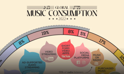

How do people around the world consume their music, and how are these consumption habits changing as technology evolves?
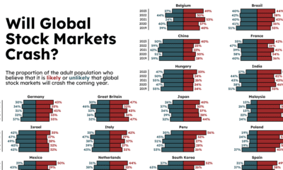

How likely are the stock markets to crash in 2023, according to different countries? And how have those predictions changed over time?
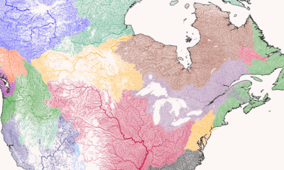

Where does each river start, converge, and end? This series of maps traces river basins in each continent around the world.
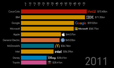

How much money is in a brand? And which brands have risen and fallen? This animation tracks the most valuable brands over 20+ years
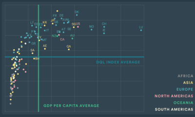

Which countries have the best internet quality, or electronic security? This index breaks down the digital quality of life of countries in 2022.
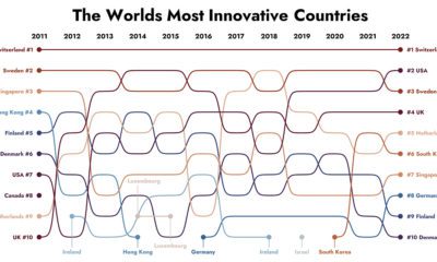

How have the world's most innovative countries changed over time? This graphic tracks the top 10 most innovative countries from 2011-2022.
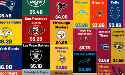

The average NFL team is worth $4.47 billion, more than any other sports team has ever sold for. What are the most valuable NFL teams?
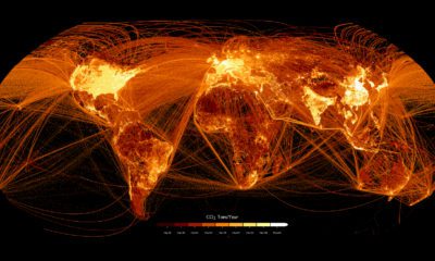

This graphic maps out carbon emissions around the world and where they come from, using data from the European Commission.
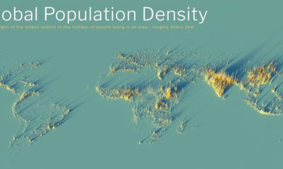

What does population density look like on a global scale? These detailed 3D renders illustrate our biggest urban areas and highlight population trends.
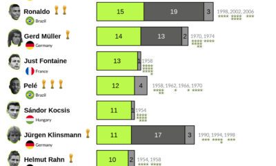

Who are history's top international goal scorers? These graphics highlight the players with the most goals scored in FIFA World Cup history.
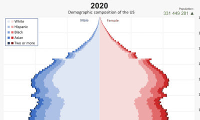

From 1901 to 2020, the U.S. population has changed significantly. This video reveals the change in America's demographics over 100+ years.
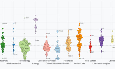

This video highlights S&P 500 performance through Q3. See how sectors and key companies have performed from Jan 1 to Sep 30, 2022.
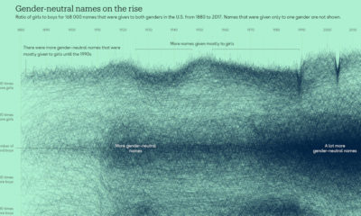

In the last three decades, gender-neutral names have become more common across the U.S., particularly for boys.
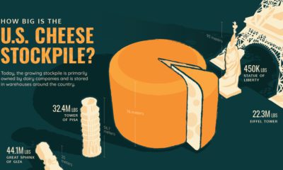

The U.S. has 1.5 billion pounds of cheese in cold storage across the country—around $3.4 billion worth of cheese.
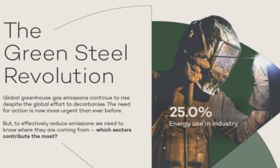

How will high emission industries respond to climate change? We highlight industrial emissions and hydrogen's role in green steel production.
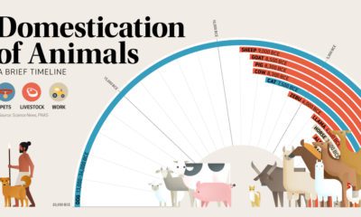

This graphic shows a timeline of when 15 different animals became domesticated, based on archaeological findings.
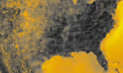

Wind is a great renewable energy source, but the spread of potential power is uneven. This graphic maps the average wind speed of the continental U.S.
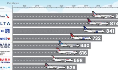

What type of aircraft do the world’s largest airlines use? This infographic breaks down the airline fleets of major carriers
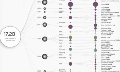

In 2021, more than 5.9 billion user records were stolen. This graphic visualizes the 50 largest data breaches, by entity and sector, since 2004.
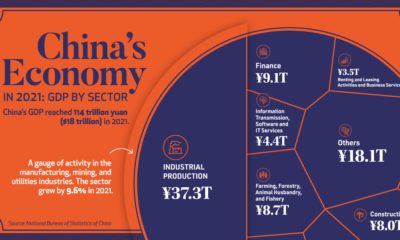

China’s economy reached a GDP of 114 trillion yuan ($18 trillion) in 2021, well above government targets. What sectors drove that growth?
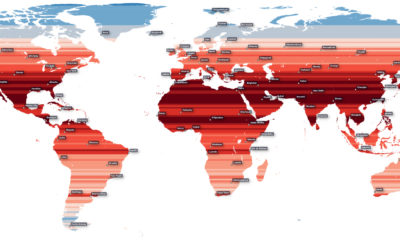

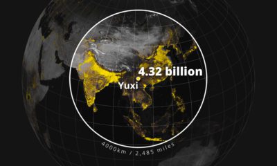
How much of the Earth’s population is located near the equator? This map visualizes the world’s population density by latitude.
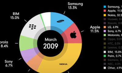

This animation chronicles the evolution of the mobile phone market, showing the rise and fall of various mobile phone manufacturers.
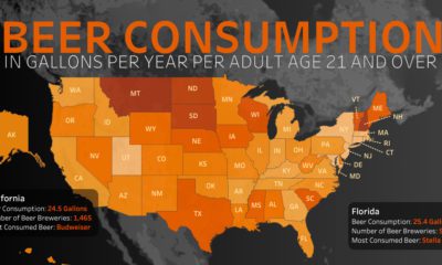

Which U.S. states consume the most beer per capita, and what beers do people prefer?
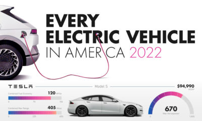

When it comes to purchasing electric cars, Americans have a few to choose from. Here’s a look at every electric vehicle sold in the U.S.
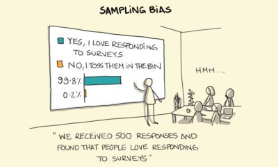

We fall victim to cognitive biases in our daily lives, far more often than we realize.

Population density varies across the globe. These maps use geographical circles to show the most densely populated areas on multiple continents.
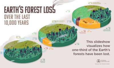

How much has the world’s land use changed over the last 10,000 years, and how have forests been impacted?
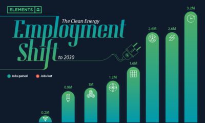

Will the clean energy transition create jobs, or will jobs be lost? Here is projected employment growth in clean energy and related sectors to 2030.
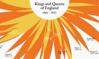

Who sat on the throne and for how long? This visualization highlights the reigns of England’s kings and queens from 1066 to present day.
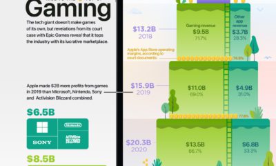

In 2020, Apple generated an estimated $13.5 billion dollars in gaming revenue, despite the fact it doesn't make any games or gaming consoles.
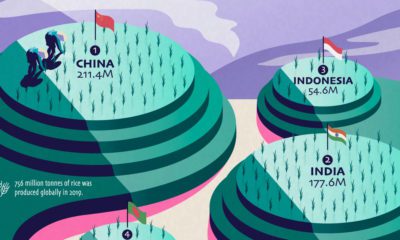

Over half of the world’s population lives on rice as a staple food, but just a few countries dominate global rice production.
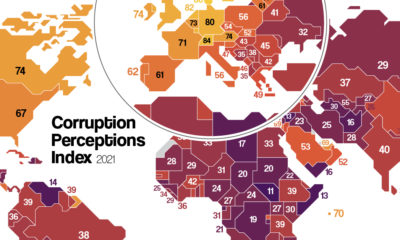

Which countries are the most (and least) corrupt? This map shows corruption around the world, and the movers and shakers over the last decade.
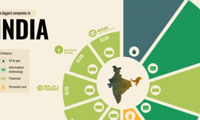

What are the biggest companies in India, one of the largest and most populated countries in the world?
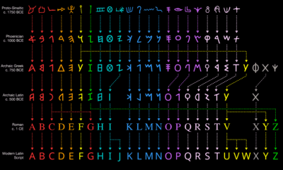

The Greek alphabet is just one part of the modern alphabet’s long evolution.
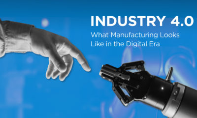

From increased robotization to lights-out manufacturing, this infographic breaks down the Industry 4.0 rollout.
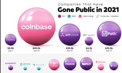

Tracking the companies that have gone public in 2021, their valuation, and how they did it.
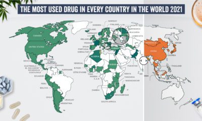

What are the most commonly used illicit drugs around the world?
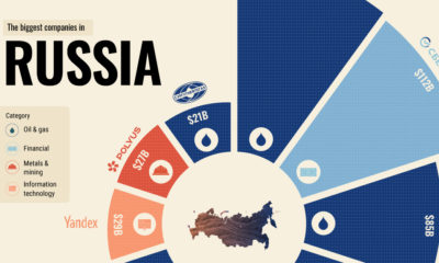

Here are the top 10 biggest companies in Russia, the largest country in the world.
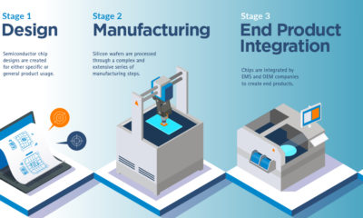

From smartphones to cars and factories, the semiconductor supply chain powers our entire digital economy.
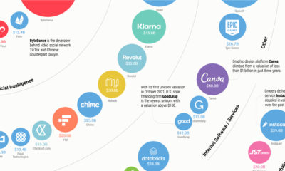

Here are the world’s biggest startups with a valuation above $10 billion.
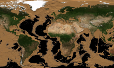

More than two-thirds of Earth’s surface is covered by water and hidden from sight. This animation drains the world’s oceans to reveal the ocean floor.
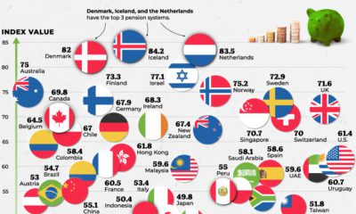

Which countries are best equipped to support their elderly citizens? This graphic compares pension plans around the world.
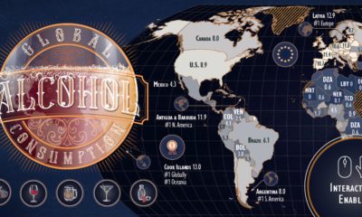

Which countries are the world's biggest alcohol drinkers? This interactive map explores global alcohol consumption per capita.
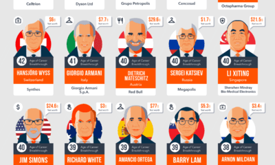

In the business world, not everyone has their career breakthrough early in life. Here are 45 late bloomers that ended up as billionaires.
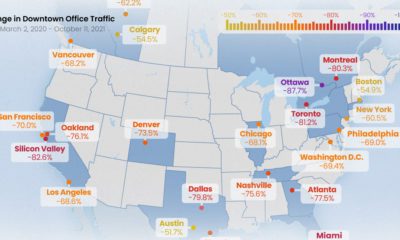

All North American downtowns are facing a sluggish recovery, but some are still seeing more than 80% less foot traffic than pre-pandemic times
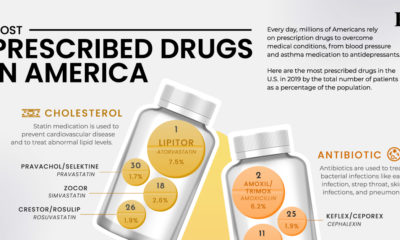

Here are the 30 most prescribed drugs in America, from blood pressure treatments to asthma medication.
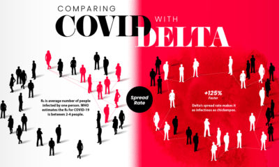

How does the COVID-19 Delta variant compare with the original disease? Here are the key differences according to consolidated studies.
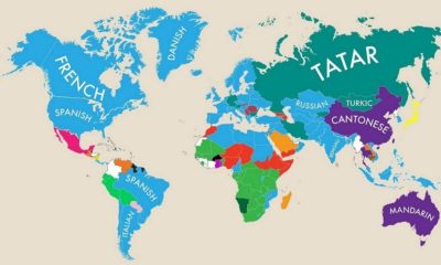

This fascinating map highlights the second most commonly spoken primary language in almost nearly every country.
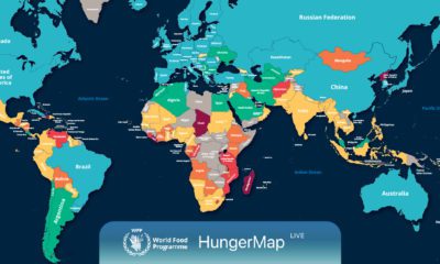

Every day, hunger affects more than 700 million people. This live map from the UN highlights where hunger is hitting hardest around the world.
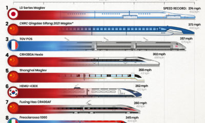

Which country has the fastest trains in the world, and how fast can they go?


 Creator Program