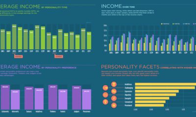

Can your Myers–Briggs personality type impact how much you make? See for yourself with this breakdown of average income for all 16 personality types.
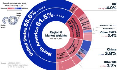

The MSCI ACWI Investable Market Index (IMI) covers 99% of the investable global equity market. Here, we show its region and market breakdown.
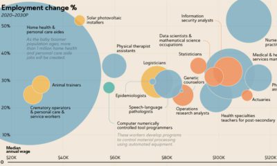

The U.S. Bureau of Labor Statistics predicts an overall job growth rate of 7.7%. Here, we show the fastest growing jobs and how much they pay.
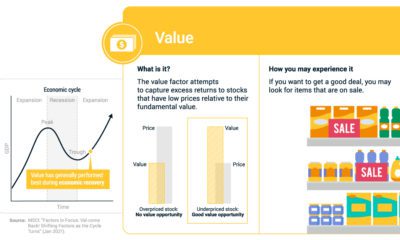

If you've bought an item on sale, you've experienced the value factor. We break down factor investing using real life examples.
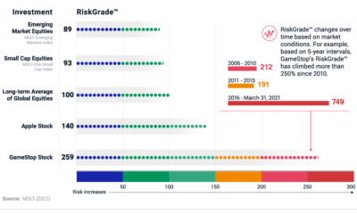

RiskGrade allows for apples-to-apples comparisons of investment risk. For example, GameStop was 2.5 times more risky than global equities.
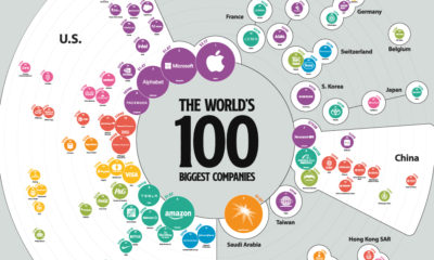

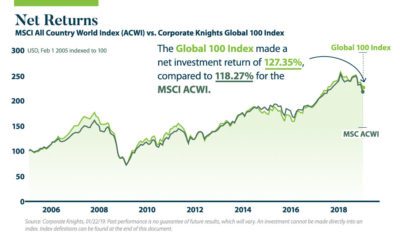
The 100 biggest companies in the world were worth a record-breaking $31.7 trillion as of the end of Q1, up 48% year-over-year.
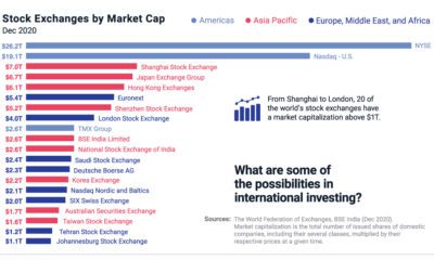

Around the world, 20 stock exchanges have a market cap above $1 trillion. Learn how international equity investing opens new possibilities.

The Bill and Melinda Gates Foundation is funded by a trust that has a portfolio value of over $25 billion. Here's how it invests its assets.
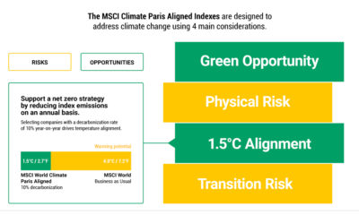

MSCI’s Climate Paris Aligned Indexes are designed to reduce risk exposure and capture green investing opportunities using 4 main objectives.
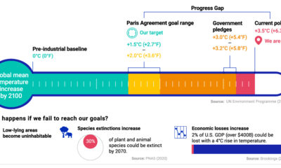

This graphic shows how close we are to achieving the Paris Agreement's climate action plan, and what happens if we fail to reach its goal.
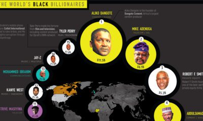

Black billionaires make up fewer than 1% of all billionaires worldwide. Who are they, and how have they built their wealth?


With this map of U.S. presidential voting history by state, discover patterns that have emerged over the last twelve elections.
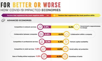

It’s been a rollercoaster year. Here’s a look at the economic impact of COVID-19 worldwide, according to a survey of global business leaders.
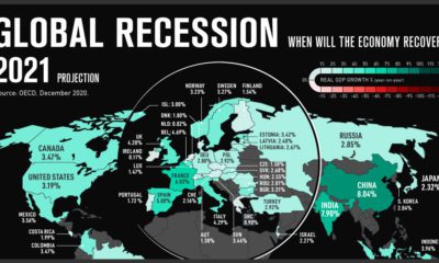

The global recession of 2020 will cause overall GDP to fall by 4.2% this year. Which countries are forecast to recover the fastest?
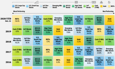

What are the best-performing investments in 2020, and how do previous years compare? This graphic shows historical returns by asset class.
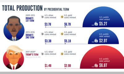

While gold and silver coin production during U.S. presidencies has declined, public debt continues to climb to historically high levels.
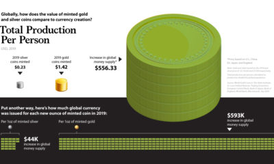

In 2019, the value of global money creation was over 500 times higher than the world's gold and silver coin production combined.
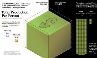

Amid trillions in COVID-19 stimulus, this graphic compares new U.S. dollars printed to U.S. precious metal coin production.
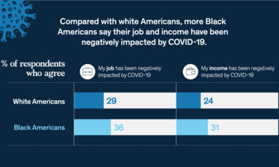

COVID-19 has worsened Black-White financial inequality, with Black Americans more likely to see negative impacts to their job and income.
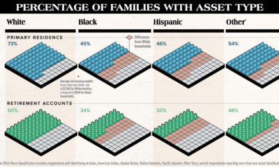

White families are more likely to hold assets of any type compared to other races. This chart highlights the substantial racial wealth gap.
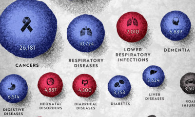

COVID-19 deaths can be hard to interpret without context. This graphic shows how many people die each day globally, by cause.
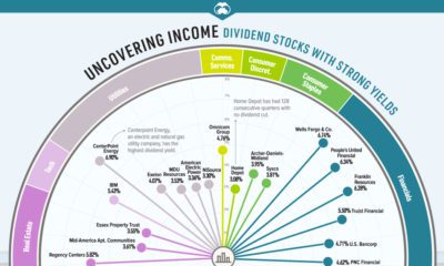

Some companies are cutting or suspending dividends. Which dividend stocks can investors consider for stable distributions and strong yields?
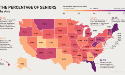

The U.S. senior population is much more vulnerable to COVID-19. Which states and cities have the most people in this at-risk age group?
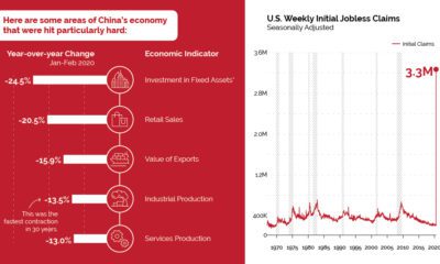

China has seen a severe economic impact from COVID-19, and it may be a preview of what's to come for countries in the early stages of...
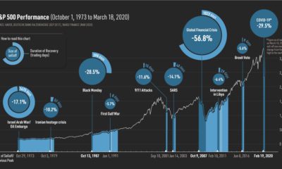

Black swan events like COVID-19 can cause market panics. However, markets have historically recovered—and such drops may offer long-term opportunities.
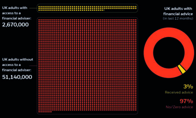

The UK has a financial adviser gap, leaving about 51 million adults without advice. Learn how wealthtech makes investing accessible for everyone.
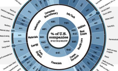

U.S.-based companies have a heavy weighting in global equity markets. In most industries, their market capitalization exceeds 50% of the total.
Intangible assets – such as goodwill and intellectual property – have rapidly risen in importance compared to tangible assets like cash.
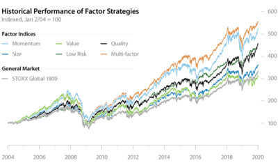

Factor investing has demonstrated its potential to outperform the general market for years. In this infographic, learn how to apply it in your portfolio.
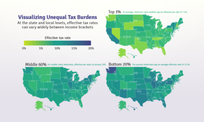

Poor families pay a higher share of their income towards state and local taxes than wealthy families. These maps show the inequitable tax burdens.
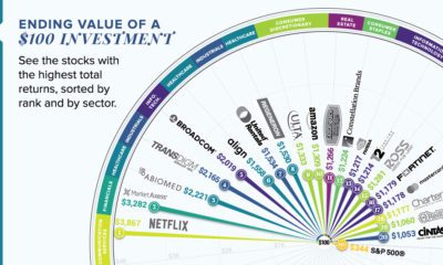

This graphic reveals the best-performing stocks over the last 10 years, and shows how much an initial $100 investment would be worth today.
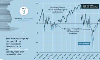

Structured notes provide some downside protection, while allowing investors to participate in market upswings. Learn all about them in this infographic.
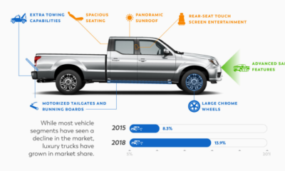

This infographic explores the trends driving the auto industry today, from millennial purchasing habits to luxury trucks.
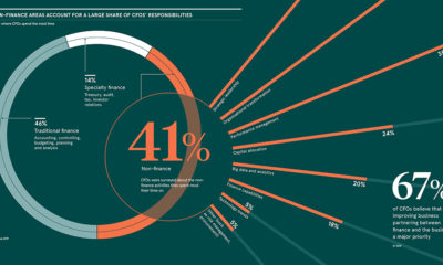

About 41% of CFOs spend the majority of their time on non-finance related activities. This infographic explores the expanding role of the CFO.
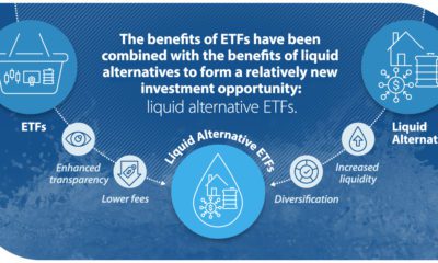

Liquid alternative ETFs are projected to grow nearly 2.5x by the end of 2020—but what are they, and how can investors use them?

Do sustainable strategies underperform conventional ones? This infographic shines a light on the realities of sustainable investing and the ESG framework.
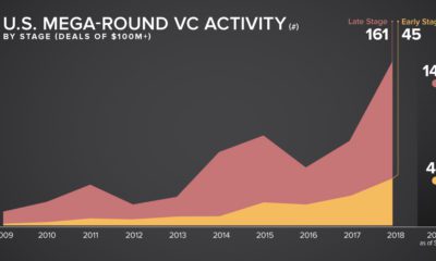

With bigger deals and multi-billion dollar IPOs, venture capital financing is reaching new heights. This infographic explores the latest trends.


From the Erie Canal to the Golden Gate Bridge, U.S. municipal bonds have financed crucial infrastructure. This infographic details their long history.
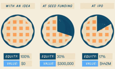

About 1,500 companies are founded daily, but how does the typical startup get financed? This creative graphic uses pie to explain startup funding rounds.
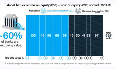

As we enter a late-cycle economy, a staggering 60% of banks are destroying value. Here’s the steps they can take in order to succeed.
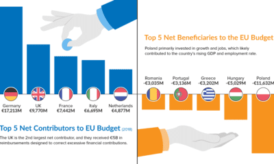

As Brexit looms, the EU budget is under the microscope. Learn which countries contribute the most—and least—to the bottom line in this chart.
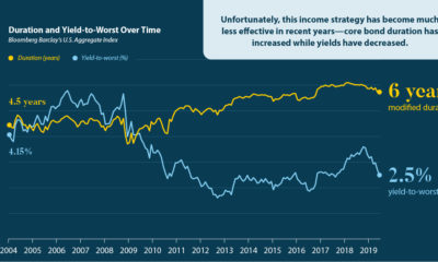

Traditional longer-terms bonds are no longer as effective—so which additional income strategies should investors be considering?

Learn how climate change and resource scarcity are affecting our most basic needs, and how investors can take advantage of this growing megatrend.
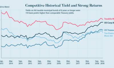

Taxable municipal bonds will help finance the $4 trillion needed for U.S. infrastructure repairs. Here's a case for why they are an interesting investment.
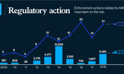

Anti-money laundering cost financial institutions about $25.3B in 2018. How can organizations improve their processes & gain a competitive advantage?
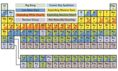

You're likely familiar with the periodic table, but do you know the origin of elements? This graphic shows where our solar system's elements come from.
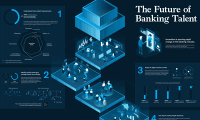

Banking talent is undergoing a fundamental shift. This infographic explores how banks are adapting to rapid automation and digitization in the industry.
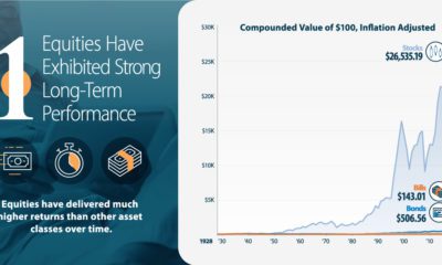

With life expectancies increasing, will you outlive your savings? Learn how allocating more of your portfolio to equities may reduce longevity risk.
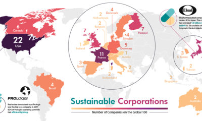

The world's most sustainable corporations have a monumental impact on social and environmental issues. See where they are located in this visualization.
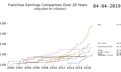

This fascinating animation charts the revenue of some big movie franchises. Watch blockbusters like Marvel shoot up the rankings over time.


