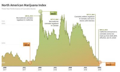

The Dramatic Rise and Fall of Cannabis Company Stocks The unprecedented expansion of cannabis across North America took the investment world by storm, as investors raced...
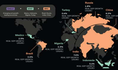

Emerging markets are ascending on the global stage and wielding more economic power—and it's drastically altering the investment landscape.
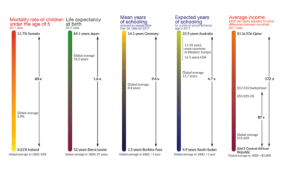

This visualization shows the global inequality gap — a difference in the standards of living around the world, as well as how it's changed over 200...
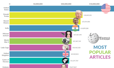

Millions flock to Wikipedia every day to satisfy their curiosity on every imaginable topic. What have been the most popular Wikipedia pages over time?
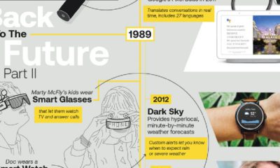

AI is shaping the global economy in unprecedented ways, and transforming life as we know it—but science fiction has predicted this all along.
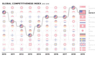

The world's top countries excel in many fields—but there can only be one #1. How have the most competitive economies shifted in the past decade?
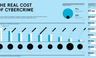

In recent years, cybercrime has become a top concern for organizations around the world. How much do these cyberattacks cost companies annually?
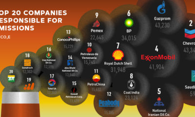

Since 1965, over ⅓ of the world’s cumulative carbon emissions can be traced back to just 20 fossil fuel companies. Who are the biggest contributors?
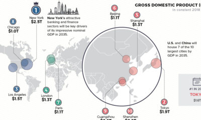

Cities are heavy hitters in the global economy. Where will the top 10 cities be in 2035—based on GDP, population, and annual growth?
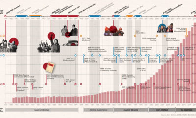

How did China go from agrarian economy to global superpower? This timeline covers the key events and policies that shaped the PRC over its 70-year history.
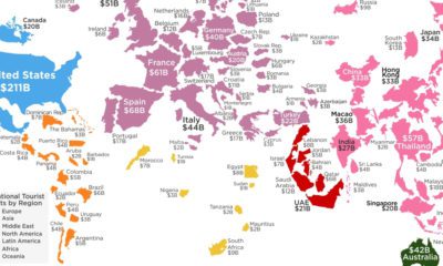

How much do your vacations contribute to your destination of choice? This visualization shows the countries that receive the most tourist spending.
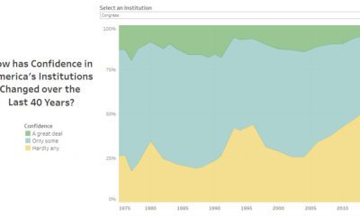

Americans rely on several institutions for their services and safety—but how has their confidence in institutions changed since 1975?
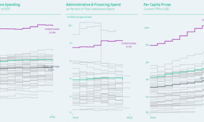

Healthcare spending can be measured as a proportion of GDP, by admin costs, and per capita—and the United States comes in first in every category.
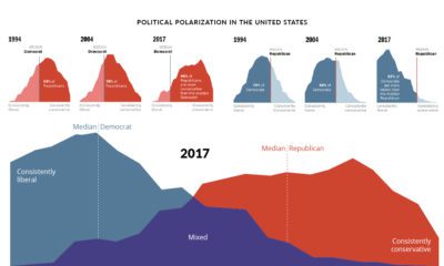

Since 1994, the political divide in the United States has only become more extreme. How have American feelings across major issues evolved over time?
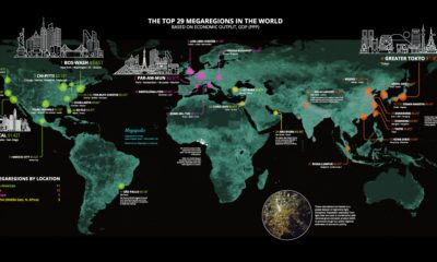

Today’s stunning map ranks the world’s most powerful megaregions — together, they contribute a whopping $28 trillion to the global economy.
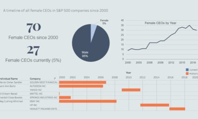

Since the turn of the century, only a meager 5.6% of S&P 500-indexed companies have been led by women. Today's interactive timeline highlights their tenures.
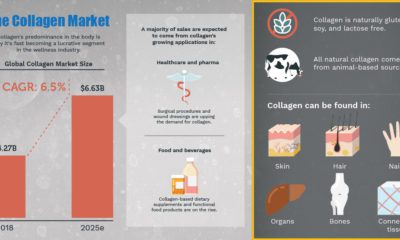

Infographic: Why Collagen Is Vital For the Body For centuries, collagen has been viewed as the “Fountain of Youth”. While its anti-aging claims may be exaggerated,...


Rare diseases affect upwards of 350 million people worldwide. This infographic breaks down their types and prevalence, and estimated related drug sales.
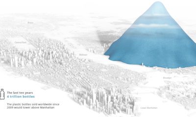

Today's stunning visualization depicts the incredible scale of plastic bottle waste accumulated globally in each hour, day, month, year, and decade.
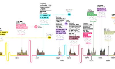

From the pyramids to the Eiffel Tower, our creations have scaled dramatically over the centuries. Which have been the world's tallest structures in history?
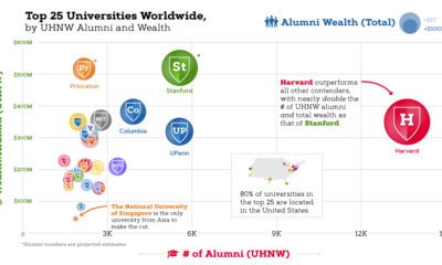

Today's chart ranks the top 25 universities in the world by ultra-high net worth (UHNW) alumni and total wealth. Does your institution make the cut?
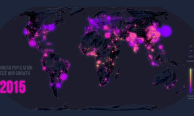

Few global trends have matched the profound impact of urbanization. Today’s map looks back at 70 years of movement in over 1,800 cities.
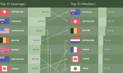

How do the rankings of the world's most affluent countries change when using different metrics to measure wealth per capita?

Global fertility has almost halved in the past century. Which countries are most resilient, and which have experienced the most dramatic changes over time?
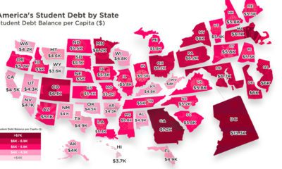

Crippling student debt in the U.S. has reached a record high of $1.5 trillion nationwide. Today’s map breaks down which states bear the highest burden.

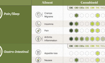
Cannabidiol (CBD) is one of the major compounds in cannabis—and its therapeutic properties and varied applications are driving the $12 billion industry.


This striking map depicts all the stars and celestial bodies that are visible in the night sky, all on one giant backdrop.
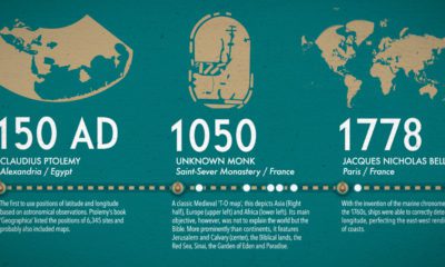

What did ancient maps look like, before we had access to airplanes and satellites? See the evolution of the world map in this nifty infographic.
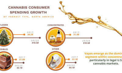

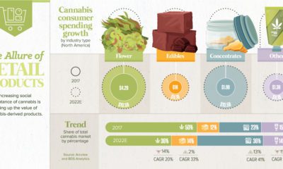
Cannabis consumers could spend up to $10.5B on concentrates by 2022—and they’re increasingly relying on the influence of branding to make their choices.
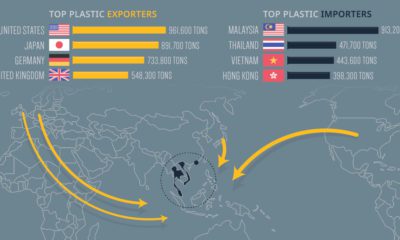

Every year, the United States exports almost one million tons of plastic waste, including 'recycled' materials. Where does all of this waste go?
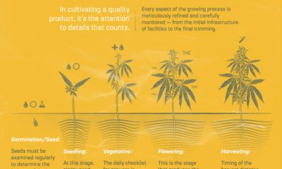

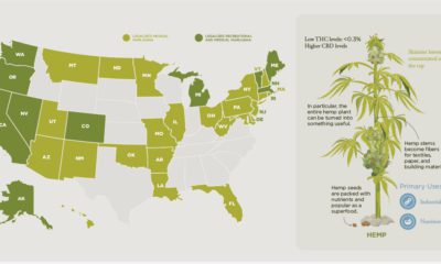
The following content is sponsored by Grown Rogue. Growing cannabis isn’t like growing any other plant in your backyard. It requires a relentless commitment to the...
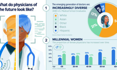

Today’s doctors are increasingly young and diverse, and skilled at using digital tools. How will they disrupt the healthcare landscape in years to come?
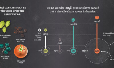

Craft products are taking the retail world by storm. Find out why investors should be paying close attention to craft cannabis and its potential impact.

Just 15 countries are responsible for almost three quarters of the world’s carbon emissions. But what does this look like per capita, and over time?
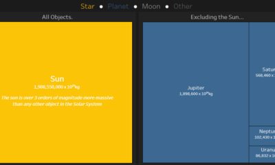

This interactive data visualization illustrates how the different planetary objects in our solar system compare based on their individual masses.

From Colombia to China, explore this map to uncover the diverse histories and cultures represented in the literal translation of each country's name.
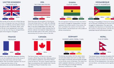

Many world flags are instantly recognizable, but there's more to it than meets the eye. What are the stories behind some of the world's most iconic...

The cannabis industry is evolving fast, and it's being driven by consumer preferences. See the growth of retail cannabis, and the trends shaping the future.
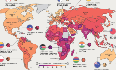

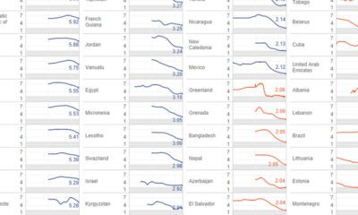
Where are the happiest, least happy, and fastest improving countries worldwide? We've broken down this annual ranking by region to answer that question.

The Rise of Cannabis Treatments for Pets For millennia, people have shared their lives with domestic animals – and pets have since become a fixture in...

From artificial intelligence to the Internet of Things, advances in healthtech are pushing the boundaries of the modern healthcare industry.
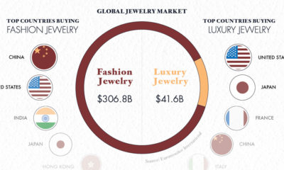

Jewelry has been coveted for centuries by many different cultures. Here's a look at the history of jewelry, and how it's evolved into a $348B industry.

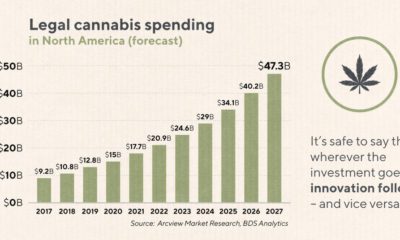
Retail cannabis could flourish into a $47.3 billion industry by 2027. What makes this cannabis segment so enticing for investors and consumers alike?
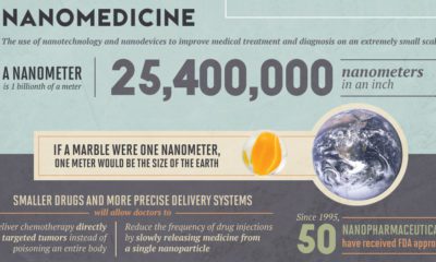

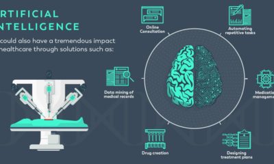
How are emerging technologies like nanomedicine or AI shaping the future of the healthcare industry? See five ways, in this infographic.

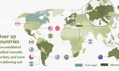
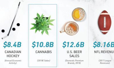
A deep-dive into the science behind the medical cannabis industry can provide some investor insight into what makes it a multi-billion dollar market.

Legal spending in cannabis is set to break the $12B mark in 2019 - and technological innovations could drive the future of cannabis to even greater...
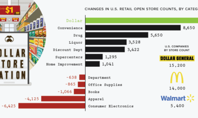

The retail apocalypse has forced the closure of many types of brick-and-mortar stores around the country. Despite this, here's why dollar stores are thriving.
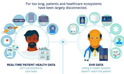

In a chaotic healthcare system, the $23.6 billion electronic health records (EHR) industry offers a route towards streamlined patient-doctor interactions.
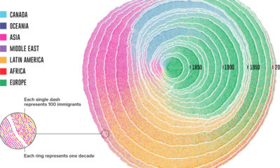

Since 1830, there have been four major waves of U.S. immigration - and this unique video depicts the influx of immigrants as rings in a tree...
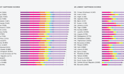

What contributes to happiness? These charts break down global happiness scores - how does your country fare, and how has it changed over ten years?


