Charted: ChatGPT’s Rising Traffic vs. Other Top Websites
AI Week Wrap Report: See All the Visuals in One Place
Visualizing U.S. vs. Chinese AI Model Performance
Visualizing AI vs. Human Performance in Technical Tasks
The Ultimate Visual Breakdown of the AI Index Report 2025 (VC+)
Ranked: Top Performing Equity Markets as of May 2025
Mapped: The World’s Top Financial Centers in 2025
All of the World’s Billion Dollar Companies by Country
Charted: S&P 500 Returns in First 100 Days of Modern Presidents
Ranked: Top 30 Chinese Companies Listed in the U.S.
Exclusive: Visualizing the Shifting Global Financial Landscape (VC+)
Ranked: The 50 Best Places to Work in America
Ranked: World Carbon Emissions by Country
Visualized: Global Military Spending as a Share of GDP in 2024
Breaking Down Trump’s Executive Orders in His First 100 Days
Ranked: The Top Chip Designers by Revenue (2019-2024)
Charted: A Decade of Smartphone Production, by Brand (2015-2024)
Ranked: The Most Popular Web Browsers
These 18 Industries Could Reshape the Global Economy by 2040
Mapped: The World’s Most Expensive Real Estate Markets
Mapped: Average Salary by State in 2025
Ranked: The Largest American University Endowments
Mapped: The Income Needed to Buy a Home in Every U.S. State
Visualized: Post-Pandemic GDP Growth Recovery, by Region
Suicide in America: A Closer Look at the Statistics
Mapped: Life Expectancy by Country in 2025
Mapped: Countries Where People Don’t Exercise Enough
How U.S. Medicare Prices Compare to Other Rich Nations
Charted: How American Life Expectancy Compares to Its Peers
Visualizing China’s Battery Recycling Dominance
Mapped: The Countries Most Dependent on Imported Fossil Fuels
Charted: Battery Capacity by Country (2024-2030)
Charted: How Top Economies Generated Electricity in 2024
How the Largest Importers of Russian Fossil Fuels Have Changed (2022 vs. 2025)
Mapped: The World’s Largest Economies, Including U.S. States
Mapped: The Size of Each Country’s Shadow Economy
Visualized: Population vs. GDP by Global Region
Charted: Where the U.S. Gets Its Rare Earths From
Charted: The End-of-Life Recycling Rates of Select Metals
Mapped: Ukraine’s Mineral Resources
How Rich is Canada in Natural Resources?
Charted: Top Suppliers of Aluminum and Steel to the U.S.
Brands With the Most EV Models in the U.S.
Visualized: Global Carbon Emissions by Sector
Infographic: How Long Does Plastic Take to Decompose?
Harrison Schell is an infographic designer focused on pushing boundaries of what can be done with information design. While he has been known to travel with his work, he currently resides in his hometown of Vancouver, BC.
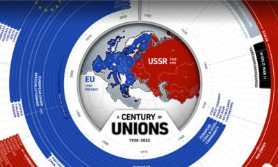
This year marks 100 years since the birth of the Soviet Union. How have countries in and near Europe aligned themselves over the last century?
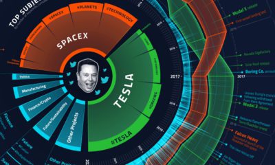
What goes on in the mind of Elon Musk, the world’s richest person? We analyzed over 15,000 of his tweets to find out.
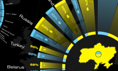
This graphic visualizes Ukraine's top international trading partners and the country's most exported and imported products in 2020.
What's the lowest-carbon way to travel? Here's how much CO2 different types of vehicles emit per passenger-kilometer.
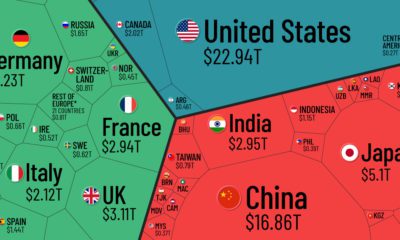
Which countries and regions contribute the most to the world economy? In this infographic, we break down all $94 trillion of global GDP by country.
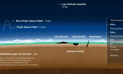
Earth’s atmosphere is thousands of miles long, but only a fraction can sustain life. Here's a look at how small Earth's habitable zone is.
America's major cities are some of the most traffic congested in the world. Click to find out which ones made the top 10.
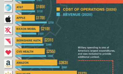
Running a Fortune 500 company is a costly endeavor. In this chart, we compare the operating costs of America's biggest names.
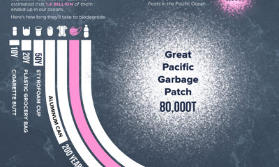
1.6 billion face masks entered our oceans in 2020, representing 5,500 tons of plastic pollution.
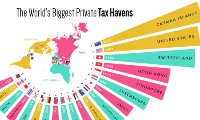
What countries or territories do the ultra-wealthy use as tax havens?
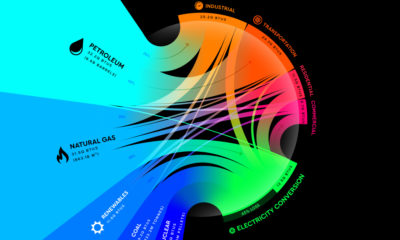
From renewables to fossil fuels, we've visualized the diverse mix of energy sources that powered U.S. energy consumption in 2020.
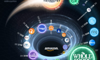
Amazon just announced its plan to acquire MGM Studios—one of the tech giant’s largest acquisitions to date.
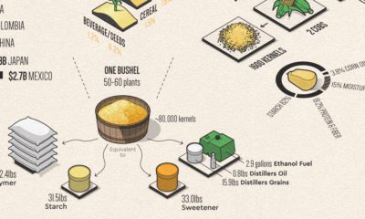
Corn has many uses that make modern life possible. This infographic breaks down U.S. corn usage in 2020.
Lumber prices in the U.S. continue to break records as pressure from both the supply and demand sides of the market collide.
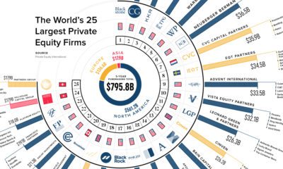
How big is private equity? We show funds raised by the largest 25 private equity firms over the last five years and their notable investments.
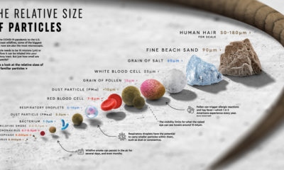
From wildfire smoke molecules to the coronavirus, this graphic compares the relative size of particles that we, for the most part, can't see.
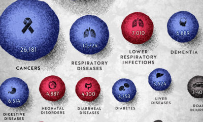
COVID-19 deaths can be hard to interpret without context. This graphic shows how many people die each day globally, by cause.
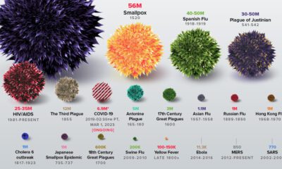
The history of pandemics, from the Antonine Plague to the novel coronavirus (COVID-19) event, ranked by their impact on human life.