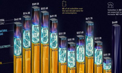

Governments pour nearly $500 billion into fossil fuel subsidies annually. This chart breaks down fossil fuel subsidies between 2010 and 2021.
Nuclear power accounted for 10% of global electricity generated in 2020. Here's a look at the largest nuclear power producers.
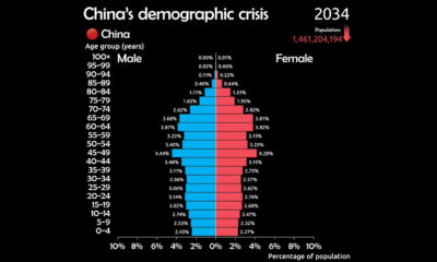

See why China is facing a demographic crisis in this animated chart.
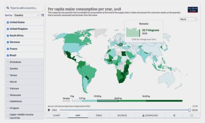

Where does your favorite food come from? Here's an interactive look at global food production.
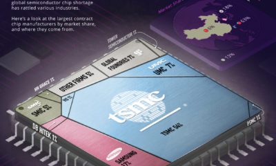

The global semiconductor shortage has affected several industries. Here's a look at the 10 largest semiconductor companies by market share.
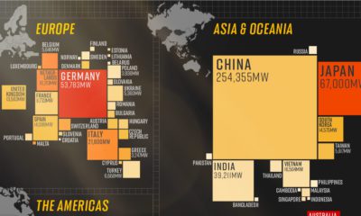

In 2020, solar power saw its largest-ever annual capacity expansion at 127 gigawatts. Here's a snapshot of solar power capacity by country.
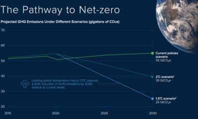

Achieving a net-zero carbon future requires a massive shock in the global emissions trajectory. The Carbon Streaming model is helping achieve this goal with carbon credit...


How much gold is in the world? This infographic visualizes all the gold ever mined and the reserves that remain underground.
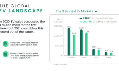

The global electric vehicle market crossed 3 million units in sales for the first time in 2020. Here's a snapshot of the largest EV markets.
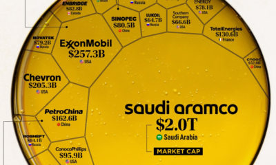

Oil still makes up the largest share of the global energy mix. Here are the largest oil and gas companies by market cap in 2021.
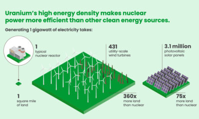

Nuclear power is among the world's cleanest sources of energy, but how did uranium and nuclear power come to be?
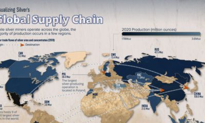

Nearly 50% of global silver production comes from South and Central America. Here's a look at the global silver supply chain.


Space junk and orbital crowding are threatening the future of space activities. Learn more about space sustainability in this infographic.
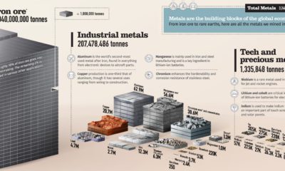

From iron ore to rare earths, over 3 billion tonnes of metals are mined each year. This chart shows them all on a relative scale.


Antimicrobial copper kills over 99.9% of certain bacteria within two hours of exposure. How does copper kill germs?
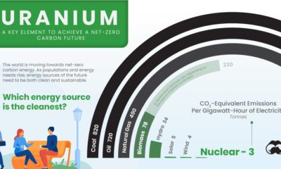

All energy sources have negative impacts, but some are better for the environment than others. Which energy source is the cleanest?
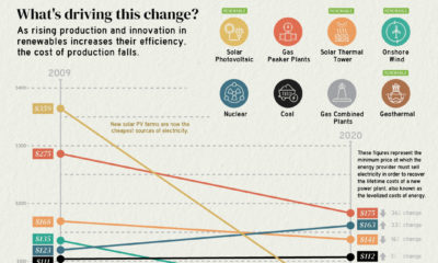

The cost of electricity from solar PV plants has decreased by 90% since 2009, highlighting the rapidly changing economics of electricity production.
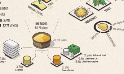

Corn has many uses that make modern life possible. This infographic breaks down U.S. corn usage in 2020.
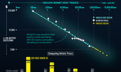

Declining battery costs are making electric vehicle prices more competitve. By 2023, EV prices could be on par with similar gas-powered vehicles.
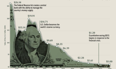

$1 in 1913 had the same purchasing power as $26 in 2020. This chart shows how the purchasing power of the dollar has changed over time.
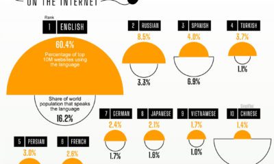

The internet is a truly global phenomenon, but a handful of languages dominate the digital world. Over 60% of the top 10 million webpages feature content...
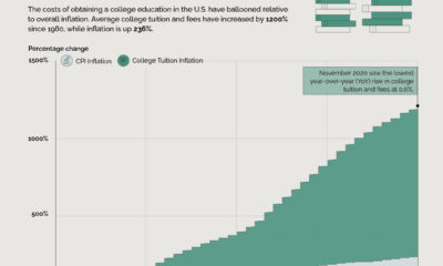

Since 1980, the average cost of college has risen by 1200%. This chart compares the inflation in college tuition with overall inflation.
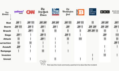

The incident at the U.S. Capitol has received wide news media coverage, but the type of language used to describe it has varied greatly depending on...
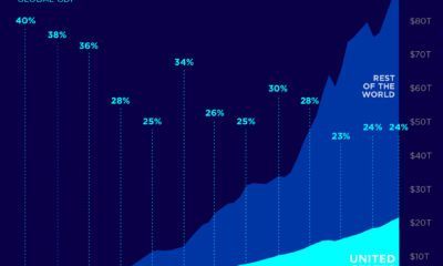

As of 2019, the U.S. made up almost a quarter of the global economy. This chart shows how the U.S. Share of the global GDP has...
Rare earth deposits exist all over the planet, but the majority of the world's rare earth metals are produced and refined in China.
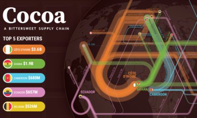

The cocoa supply chain is a bittersweet one. While chocolate is a beloved sweet treat globally, many cocoa farmers are living a bitter reality.
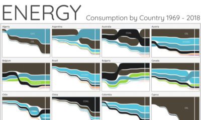

For the last 50 years, fossil fuels have dominated energy consumption. This chart looks at how the energy mix is changing in over 60+ countries.


 Creator Program