Demographics
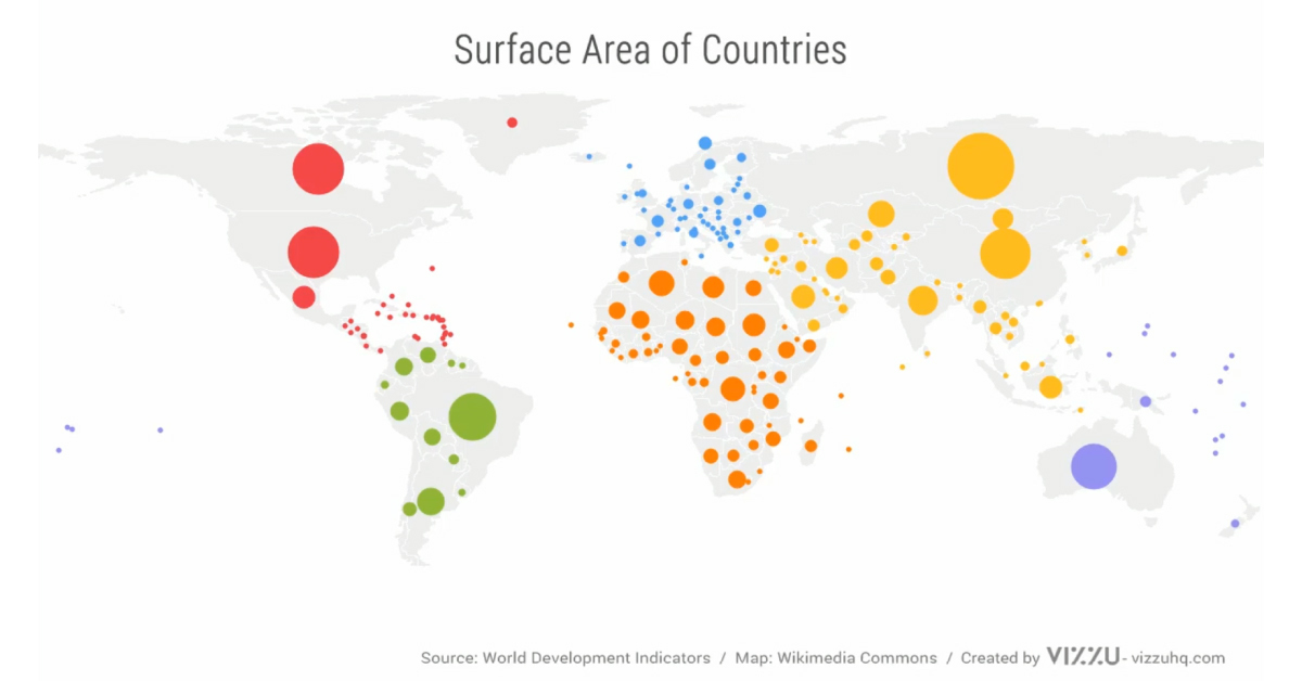
Animated Map: The Comparative Might of Continents
Animated Map: The Comparative Might of Continents
We’ve come quite a long way since the time of Pangea. Today, the world’s continents are home to over 7.8 billion people, and each one is unique in its own way.
This video from the data visualization tool Vizzu compares the surface area, population, and GDP of the continents—all in terms of their contribution to the world’s total. Let’s dive further into the results of each category.
Click through to source to see the country breakdowns. Antarctica has been excluded from these calculations.
Surface Area: Does Size Matter?
When it comes to sheer land mass, Asia emerges on top with over one-third of the global surface area. On that front, it certainly has a little help from the combined forces of Russia and China, even as the former overlaps Eastern Europe as well.
| Rank | Region | Share of Global Surface Area | Largest Country |
|---|---|---|---|
| #1 | Asia | 36.5% | 🇷🇺 Russia |
| #2 | Africa | 22.3% | 🇩🇿 Algeria |
| #3 | North America | 17.1% | 🇨🇦 Canada |
| #4 | South America | 13.2% | 🇧🇷 Brazil |
| #5 | Oceania | 6.4% | 🇦🇺 Australia |
| #6 | Europe | 4.6% | 🇷🇺 Russia |
Africa comes in second, but doesn’t lag behind by much. A stone’s throw from Europe, Algeria is the largest country on the continent—and the 10th largest in the world.
Failing to grasp the true size of Africa is a common mental mistake, as many maps systematically underestimate its scale. The continent could easily fit the entirety of China, India, the U.S., and multiple European countries within its borders.
Population: Packing People Together
Another way to look at things is in terms of the number of inhabitants in each region. Asia is once again on top, with almost two-thirds of the world squeezed onto the continent.
| Rank | Region | Share of Global Population | Most Populous Country |
|---|---|---|---|
| #1 | Asia | 61.8% | 🇨🇳 China |
| #2 | Africa | 16.1% | 🇳🇬 Nigeria |
| #3 | Europe | 8.2% | 🇷🇺 Russia |
| #4 | North America | 7.7% | 🇺🇸 U.S. |
| #5 | South America | 5.6% | 🇧🇷 Brazil |
| #6 | Oceania | 0.5% | 🇦🇺 Australia |
Asia’s lead in population is impressive, but it’s a margin that is unlikely to last forever.
By the year 2100—new estimates show the populations India and China could start to dip. Meanwhile Nigeria, which is already Africa’s most populous country with near 196 million people, could potentially quadruple in numbers in the same time frame.
In this metric, Europe also rises to third place. This is thanks again to the approximately 146 million people within Russia. However, if only the countries located completely within the continent are considered, Germany’s population of nearly 84 million would win out.
GDP: Emerging Wealth Overtakes
Finally, economic output—measured in terms of Gross Domestic Product (GDP)—is the most common way to assess the relative prosperity of countries and continents.
At this, the U.S. dominates with $21.4T according to the World Bank, though it swaps places with China which boasts $23.5T when adjusted for purchasing power parity (PPP).
| Rank | Region | Share of Global GDP | Richest Country (both nominal and PPP) |
|---|---|---|---|
| #1 | Asia | 36.9% | 🇨🇳 China |
| #2 | North America | 28.9% | 🇺🇸 U.S. |
| #3 | Europe | 23.9% | 🇩🇪 Germany |
| #4 | South America | 5.1% | 🇧🇷 Brazil |
| #5 | Africa | 3.1% | 🇳🇬 Nigeria |
| #6 | Oceania | 2.1% | 🇦🇺 Australia |
Source: World Bank for both GDP Nominal and PPP, 2019.
Global wealth share drops sharply between Europe and South America, though it’s worth noting that rising inequality is also hidden under the surface within many high-income regions.
In terms of overall GDP, the Asian continent makes up the lion’s share. Asia is also home to many of the world’s emerging markets—which means there may be an even more pronounced shift of wealth towards the East in coming decades.


Demographics
The Countries That Have Become Sadder Since 2010
Tracking Gallup survey data for more than a decade reveals some countries are witnessing big happiness declines, reflecting their shifting socio-economic conditions.


The Countries That Have Become Sadder Since 2010
This was originally posted on our Voronoi app. Download the app for free on iOS or Android and discover incredible data-driven charts from a variety of trusted sources.
Can happiness be quantified?
Some approaches that try to answer this question make a distinction between two differing components of happiness: a daily experience part, and a more general life evaluation (which includes how people think about their life as a whole).
The World Happiness Report—first launched in 2012—has been making a serious go at quantifying happiness, by examining Gallup poll data that asks respondents in nearly every country to evaluate their life on a 0–10 scale. From this they extrapolate a single “happiness score” out of 10 to compare how happy (or unhappy) countries are.
More than a decade later, the 2024 World Happiness Report continues the mission. Its latest findings also include how some countries have become sadder in the intervening years.
Which Countries Have Become Unhappier Since 2010?
Afghanistan is the unhappiest country in the world right now, and is also 60% unhappier than over a decade ago, indicating how much life has worsened since 2010.
In 2021, the Taliban officially returned to power in Afghanistan, after nearly two decades of American occupation in the country. The Islamic fundamentalist group has made life harder, especially for women, who are restricted from pursuing higher education, travel, and work.
On a broader scale, the Afghan economy has suffered post-Taliban takeover, with various consequent effects: mass unemployment, a drop in income, malnutrition, and a crumbling healthcare system.
| Rank | Country | Happiness Score Loss (2010–24) | 2024 Happiness Score (out of 10) |
|---|---|---|---|
| 1 | 🇦🇫 Afghanistan | -2.6 | 1.7 |
| 2 | 🇱🇧 Lebanon | -2.3 | 2.7 |
| 3 | 🇯🇴 Jordan | -1.5 | 4.2 |
| 4 | 🇻🇪 Venezuela | -1.3 | 5.6 |
| 5 | 🇲🇼 Malawi | -1.2 | 3.4 |
| 6 | 🇿🇲 Zambia | -1.2 | 3.5 |
| 7 | 🇧🇼 Botswana | -1.2 | 3.4 |
| 8 | 🇾🇪 Yemen | -1.0 | 3.6 |
| 9 | 🇪🇬 Egypt | -1.0 | 4.0 |
| 10 | 🇮🇳 India | -0.9 | 4.1 |
| 11 | 🇧🇩 Bangladesh | -0.9 | 3.9 |
| 12 | 🇨🇩 DRC | -0.7 | 3.3 |
| 13 | 🇹🇳 Tunisia | -0.7 | 4.4 |
| 14 | 🇨🇦 Canada | -0.6 | 6.9 |
| 15 | 🇺🇸 U.S. | -0.6 | 6.7 |
| 16 | 🇨🇴 Colombia | -0.5 | 5.7 |
| 17 | 🇵🇦 Panama | -0.5 | 6.4 |
| 18 | 🇵🇰 Pakistan | -0.5 | 4.7 |
| 19 | 🇿🇼 Zimbabwe | -0.5 | 3.3 |
| 20 | 🇮🇪 Ireland | -0.5 | 6.8 |
| N/A | 🌍 World | +0.1 | 5.5 |
Nine countries in total saw their happiness score drop by a full point or more, on the 0–10 scale.
Noticeably, many of them have seen years of social and economic upheaval. Lebanon, for example, has been grappling with decades of corruption, and a severe liquidity crisis since 2019 that has resulted in a banking system collapse, sending poverty levels skyrocketing.
In Jordan, unprecedented population growth—from refugees leaving Iraq and Syria—has aggravated unemployment rates. A somewhat abrupt change in the line of succession has also raised concerns about political stability in the country.

-

 Markets1 week ago
U.S. Debt Interest Payments Reach $1 Trillion
-

 Markets2 weeks ago
Ranked: The Most Valuable Housing Markets in America
-

 Money2 weeks ago
Which States Have the Highest Minimum Wage in America?
-

 AI2 weeks ago
Ranked: Semiconductor Companies by Industry Revenue Share
-

 Markets2 weeks ago
Ranked: The World’s Top Flight Routes, by Revenue
-

 Countries2 weeks ago
Population Projections: The World’s 6 Largest Countries in 2075
-

 Markets2 weeks ago
The Top 10 States by Real GDP Growth in 2023
-

 Money2 weeks ago
The Smallest Gender Wage Gaps in OECD Countries