Markets
Breakdown: How Americans Get Healthcare Coverage
With Obamacare firmly in the crosshairs of Republican lawmakers, the debate around U.S. healthcare is at a fever pitch.
While there is no shortage of opinions on the best route forward, the timeliness of the debate also gives us an interesting chance to dive into some of the numbers around healthcare – namely how people even get coverage in the first place.
How Americans Get Healthcare
The following infographic shows a breakdown of how Americans get healthcare coverage, based on information from Census Bureau’s surveys.
Put together by Axios, it shows the proportion of Americans getting coverage from employers, Medicaid, Medicare, non-group policies, and other public sources. The graphic also includes the 9% of the population that is uninsured, as well.
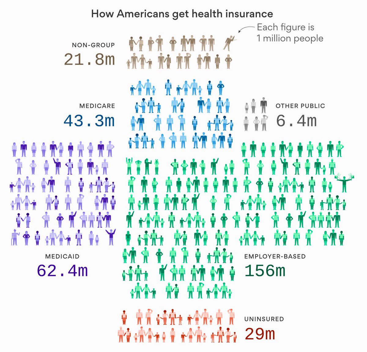
The following definitions for each category above come from the Kaiser Family Foundation, a non-profit that uses the Census Bureau’s data to put together comprehensive estimates on healthcare in the country:
Employer-Based: Includes those covered by employer-sponsored coverage either through their own job or as a dependent in the same household.
Medicaid: Includes those covered by Medicaid, the Children’s Health Insurance Program (CHIP), and those who have both Medicaid and another type of coverage, such as dual eligibles who are also covered by Medicare.
Medicare: Includes those covered by Medicare, Medicare Advantage, and those who have Medicare and another type of non-Medicaid coverage where Medicare is the primary payer. Excludes those with Medicare Part A coverage only and those covered by Medicare and Medicaid (dual eligibles).
Other Public: Includes those covered under the military or Veterans Administration.
Non-Group: Includes individuals and families that purchased or are covered as a dependent by non-group insurance.
Uninsured: Includes those without health insurance and those who have coverage under the Indian Health Service only.
Healthcare Mix by State
Here’s another look at how Americans get healthcare coverage on a state-by-state basis.
This time the graphic comes from Overflow Data and it simply shows the percent of buyers in each state that receive health coverage from public sources:
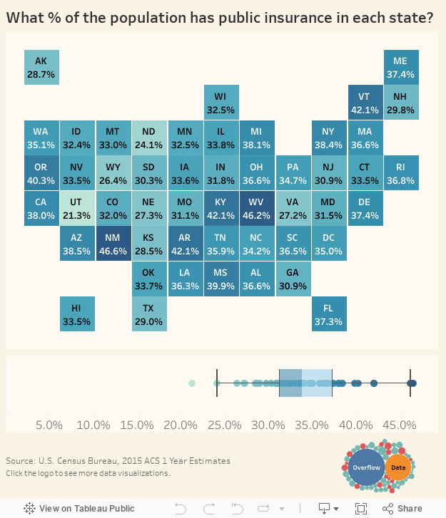
Oddly, the state that gets the highest proportion of public health coverage (New Mexico, 46.6%) is kitty-corner to the state with the lowest proportion of public health coverage (Utah, 21.3%).
Why the Debate is Paramount
If you ask some people what is going on with U.S. healthcare, they will tell you that things are going “sideways” – that costs are going up, but care is not improving anywhere near the same pace.
Here’s a graphic we published last year from Max Roser that puts this sentiment in perspective:
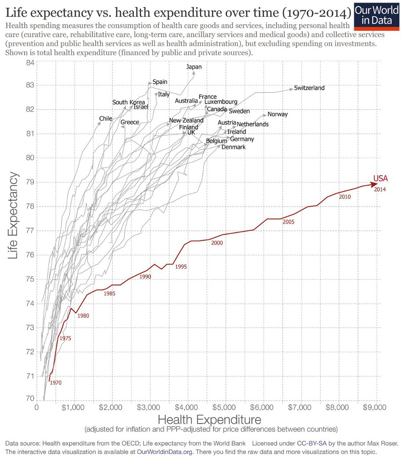
It’s fair to say that care has been going sideways in the U.S. for some time, and the stakes couldn’t be higher.
So, what needs to be done to fix the problem?


Economy
Economic Growth Forecasts for G7 and BRICS Countries in 2024
The IMF has released its economic growth forecasts for 2024. How do the G7 and BRICS countries compare?
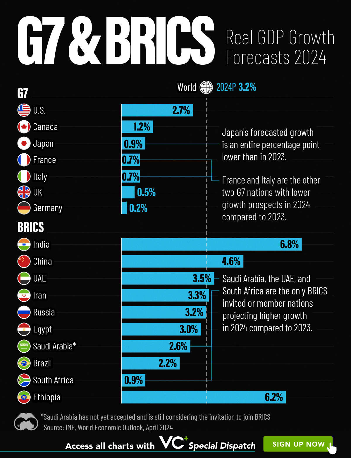
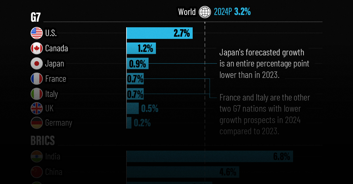
G7 & BRICS Real GDP Growth Forecasts for 2024
The International Monetary Fund’s (IMF) has released its real gross domestic product (GDP) growth forecasts for 2024, and while global growth is projected to stay steady at 3.2%, various major nations are seeing declining forecasts.
This chart visualizes the 2024 real GDP growth forecasts using data from the IMF’s 2024 World Economic Outlook for G7 and BRICS member nations along with Saudi Arabia, which is still considering an invitation to join the bloc.
Get the Key Insights of the IMF’s World Economic Outlook
Want a visual breakdown of the insights from the IMF’s 2024 World Economic Outlook report?
This visual is part of a special dispatch of the key takeaways exclusively for VC+ members.
Get the full dispatch of charts by signing up to VC+.
Mixed Economic Growth Prospects for Major Nations in 2024
Economic growth projections by the IMF for major nations are mixed, with the majority of G7 and BRICS countries forecasted to have slower growth in 2024 compared to 2023.
Only three BRICS-invited or member countries, Saudi Arabia, the UAE, and South Africa, have higher projected real GDP growth rates in 2024 than last year.
| Group | Country | Real GDP Growth (2023) | Real GDP Growth (2024P) |
|---|---|---|---|
| G7 | 🇺🇸 U.S. | 2.5% | 2.7% |
| G7 | 🇨🇦 Canada | 1.1% | 1.2% |
| G7 | 🇯🇵 Japan | 1.9% | 0.9% |
| G7 | 🇫🇷 France | 0.9% | 0.7% |
| G7 | 🇮🇹 Italy | 0.9% | 0.7% |
| G7 | 🇬🇧 UK | 0.1% | 0.5% |
| G7 | 🇩🇪 Germany | -0.3% | 0.2% |
| BRICS | 🇮🇳 India | 7.8% | 6.8% |
| BRICS | 🇨🇳 China | 5.2% | 4.6% |
| BRICS | 🇦🇪 UAE | 3.4% | 3.5% |
| BRICS | 🇮🇷 Iran | 4.7% | 3.3% |
| BRICS | 🇷🇺 Russia | 3.6% | 3.2% |
| BRICS | 🇪🇬 Egypt | 3.8% | 3.0% |
| BRICS-invited | 🇸🇦 Saudi Arabia | -0.8% | 2.6% |
| BRICS | 🇧🇷 Brazil | 2.9% | 2.2% |
| BRICS | 🇿🇦 South Africa | 0.6% | 0.9% |
| BRICS | 🇪🇹 Ethiopia | 7.2% | 6.2% |
| 🌍 World | 3.2% | 3.2% |
China and India are forecasted to maintain relatively high growth rates in 2024 at 4.6% and 6.8% respectively, but compared to the previous year, China is growing 0.6 percentage points slower while India is an entire percentage point slower.
On the other hand, four G7 nations are set to grow faster than last year, which includes Germany making its comeback from its negative real GDP growth of -0.3% in 2023.
Faster Growth for BRICS than G7 Nations
Despite mostly lower growth forecasts in 2024 compared to 2023, BRICS nations still have a significantly higher average growth forecast at 3.6% compared to the G7 average of 1%.
While the G7 countries’ combined GDP is around $15 trillion greater than the BRICS nations, with continued higher growth rates and the potential to add more members, BRICS looks likely to overtake the G7 in economic size within two decades.
BRICS Expansion Stutters Before October 2024 Summit
BRICS’ recent expansion has stuttered slightly, as Argentina’s newly-elected president Javier Milei declined its invitation and Saudi Arabia clarified that the country is still considering its invitation and has not joined BRICS yet.
Even with these initial growing pains, South Africa’s Foreign Minister Naledi Pandor told reporters in February that 34 different countries have submitted applications to join the growing BRICS bloc.
Any changes to the group are likely to be announced leading up to or at the 2024 BRICS summit which takes place October 22-24 in Kazan, Russia.
Get the Full Analysis of the IMF’s Outlook on VC+
This visual is part of an exclusive special dispatch for VC+ members which breaks down the key takeaways from the IMF’s 2024 World Economic Outlook.
For the full set of charts and analysis, sign up for VC+.

-

 Markets1 week ago
U.S. Debt Interest Payments Reach $1 Trillion
-

 Markets2 weeks ago
Ranked: The Most Valuable Housing Markets in America
-

 Money2 weeks ago
Which States Have the Highest Minimum Wage in America?
-

 AI2 weeks ago
Ranked: Semiconductor Companies by Industry Revenue Share
-

 Markets2 weeks ago
Ranked: The World’s Top Flight Routes, by Revenue
-

 Demographics2 weeks ago
Population Projections: The World’s 6 Largest Countries in 2075
-

 Markets2 weeks ago
The Top 10 States by Real GDP Growth in 2023
-

 Money2 weeks ago
The Smallest Gender Wage Gaps in OECD Countries