population
Visualizing the American Workforce as 100 People
Click to view this graphic in a higher-resolution.


Visualizing the American Workforce as 100 People
In 2022, the U.S. population stood at 333 million. Of that, roughly 60% were employed in various jobs, positions, and sectors in the U.S. economy.
But where did all these people work? What jobs did they do and what positions did they hold? Where do most Americans do their nine-to-five?
Using data from the National Occupational Employment and Wage Estimates (2022) put out by the U.S. Bureau of Labor Statistics (BLS), we reimagine the employed American workforce as only 100 people, to find out answers.
Interestingly, the data contains a mix of information demarcations. Some are job-specific (type of work), some are based on position (like Management), and some are broken down by industry (Transport and Health).
The Most Common Jobs In the U.S.
By far, most of the American workforce (13 out of 100) are employed in Office & Administrative work. This includes a mind-boggling variety of jobs: receptionists, payroll clerks, secretaries, proof-readers, administrative assistants, and customer service representatives to name a few.
Notably, any sort of management role is absent from this, as well as any other job categories, since the BLS categorizes managers in their own class.
The industry which employs the second largest group of people is Health, accounting for 11 people from the 100. This category is a combination of two sectors listed in the original dataset (healthcare practitioners and healthcare support) and covers the entire industry: from physicians, surgeons, veterinarians, nurses, and therapists to technicians, assistants, orderlies, and home and personal care aides.
Here’s a quick look at all the major sectors most of America’s workforce actually works in.
| Rank | Jobs | People | Examples |
|---|---|---|---|
| 1. | Office & Admin | 13 | Receptionists, Clerks, Customer service, Secretaries. |
| 2. | Health | 11 | Doctors, Nurses, Paramedics, Vets, Orderlies, Personal care aides. |
| 3. | Transport | 9 | Warehouse workers, Packagers, Pilots, Ambulance, Bus, Truck, Taxi drivers, Ship captains. |
| 4. | Sales | 9 | Sales representatives, Counter clerks. |
| 5. | Food | 8 | Food preparers & servers, Bartenders, Dishwashers, Hosts. |
| 6. | Management | 6 | Legislators, Chief executives, Directors, General & Operations managers. |
| 7. | Business & Finance | 6 | Accountants, Auditors, Financial analysts, Logisticians. |
| 8. | Manufacturing | 6 | Factory workers, Gas fitters, Machine operators, Cobblers, Tailors, Barbers. |
| 9. | Education | 6 | Teachers (all fields, all levels). |
| 10. | Construction & Extraction | 4 | Stone / brick / block / cement masons. Construction laborers. Roofers, Plumbers, Electricians, Mining workers. |
| 11. | Mechanics & Installation | 4 | Auto mechanic, Farm equipment mechanic, Home appliance mechanic, Locksmiths. |
| 12. | Data & Tech | 3 | Information analyst, Database architect, Software & Web developers, Data scientists, Mathematicians, Computer support. |
| 13. | Custodial | 3 | Cleaning, Groundskeeping, Landscaping, Housekeeping. |
| 14. | Protection | 2 | Cops, Firefighters, Security guards, Lifeguards, Correctional officers. |
| 15. | Hospitality | 2 | Animal trainers / caretakers. Ushers / attendants. Makeup artists. Concierge. Exercise trainers. |
| 16. | Architecture & Engineering | 2 | All engineers and architects (excluding the information industry). |
| 17. | Community & Social Service | 2 | Social workers, Therapists (counsellors) & Religious work. |
| 18. | Arts, Media, & Sport | 1 | Fine artists, Designers, Actors, Athletes, Journalists, Writers, Authors, Musicians. |
| 19. | Science | 1 | All scientists (not engineers). |
| 20. | Legal | 1 | Lawyers, Judges, Paralegals, Mediators. |
| 21. | Farming, Fishing, & Forestry | 1 | Farmers, logging workers. |
| Total | 100 |
The third most common job is actually a tie between Transport—cargo moving workers, pilots, truck drivers—and Sales—retail and industry sales agents, counter clerks—with both sectors employing nine of the 100 people. In the Sales category, two of the nine people are cashiers.
Ranked fifth is Food, with eight people, ranging from private chefs to serving staff at fast food restaurants.
Another six all belong in some kind of Management role (across industry, and including legislators) with two of those six being “top level executives” like a CEO, a general manager, a mayor, or university president. Management shares its spot with Business & Finance, Manufacturing, and Education, all at six each.
The following jobs or industries also employ the same number of people:
- Construction & Extraction along with Mechanics & Installation, at four each.
- Data & Tech, with Custodial jobs, with three each.
- Protection, Hospitality, Architecture & Engineering, and Social work, all at two each.
- Artists & Athletes, Scientists, Legal, and Farming, Fishing & Forestry are all one each.
Quirks of the Job Data
From the numbers, some fascinating nuances of the American workforce are revealed. For example, there are more cashiers (2) in the economy than artists, writers, designers & athletes (1). There are the same number of customer service representatives as the entire Scientific and Legal fields put together (2).
But perhaps the most interesting quirk comes from how few people are employed in the Farming, Fishing & Forestry industry, a critical primary sector. In raw data, the BLS estimates only slightly more than 450,000 farm, fish & forestry workers.
Importantly, it’s worth noting the BLS only collects data from “nonfarm” establishments, explaining the low estimate for their category, which is almost one-sixth of what the USDA estimates. Please see the data note at the end of this article for a full explanation.
Which Jobs Have the Highest Wages in the U.S.?
Meanwhile, the top 20 highest paid jobs (by annual average wages) all belong to doctors (usually specialists or surgeons), with two exceptions: CEOs and athletes.
The lowest-paid jobs are a mix of entertainers, and service and retail staff.
As a broader category, however, Management makes the most money, followed by Legal and then Tech. Workers in Food, Health Support, and Custodial jobs have the lowest wages.
| Rank | Jobs | Annual Average Wages |
|---|---|---|
| 1. | Management | $131,200 |
| 2. | Legal | $124,540 |
| 3. | Data & Tech | $108,130 |
| 4. | Health (Practitioners) | $96,770 |
| 5. | Architecture & Engineering | $94,670 |
| 6. | Business & Finance | $86,080 |
| 7. | Scientists | $83,640 |
| 8. | Arts, Media, Sports | $76,500 |
| 9. | Education | $63,240 |
| 10. | Construction & Extraction | $58,400 |
| 11. | Community & Social Service | $55,760 |
| 12. | Mechanics & Installation | $55,680 |
| 13. | Protection | $54,010 |
| 14. | Sales | $50,370 |
| 15. | Office & Admin | $45,550 |
| 16. | Manufacturing | $45,370 |
| 17. | Transport | $43,930 |
| 18. | Farming, Fishing, & Forestry | $37,870 |
| 20. | Hospitality | $36,210 |
| 19. | Custodial | $35,900 |
| 21. | Health (Support) | $35,560 |
| 22. | Food | $32,130 |
Analyzing the data throws up a few correlations between number of employees and wages. The top three sectors with the most jobs (Admin, Transport, and Sales) are in the bottom 10 categories when it comes to pay.
On the other hand, three sectors in the bottom 10 of employment numbers, (Data & Tech, Architecture & Engineering, and Legal) are in the top five highest paid sectors.
The Health sector sees a big divide in pay between practitioners (doctors, nurses, therapists) ranked 5th and support staff (assistants, aides, & orderlies), ranked 21st, or second-to-last.
How is the American Workforce Changing?
Over the last five years, the American workforce has not stayed static. Of the listed 22 groups, 13 saw growth in employment numbers, nine saw a decrease, and one stayed flat since 2018.
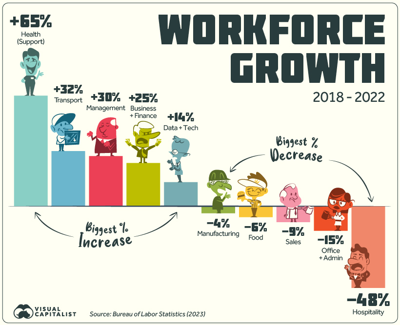
The top gainer by far is Health Support (medical assistants, care aides, orderlies, etc.) which grew by 65%. Looking at the timeline of growth does not paint a steady picture: employment jumped between 2018 and 2019, briefly fell in 2020, and has since risen again in 2021-2022.
Another top gainer is Transport, rising from the 4th to 3rd biggest employer, beating out Sales in 2022. Business & Finance and Management have also seen steady increases since 2018.
On the other hand Hospitality saw a staggering 48% drop in numbers, not all together surprising given the impact of the COVID-19 pandemic as well as the rise of tech companies like Airbnb.
Meanwhile, Office & Admin work saw a 15% loss in employees, even though this category is still the biggest employer in the country by a significant margin. Although jobs in this group saw steady declines from 2018-2021, it registered a slight uptick in workers between 2021 and 2022.
Here’s a full list of top-level sectors and how they changed.
| Jobs | 2018 | 2022 | % Change (2018-2022) |
|---|---|---|---|
| Health Support | 4,117,450 | 6,792,310 | +65% |
| Transport | 10,244,260 | 13,560,460 | +32% |
| Management | 7,616,650 | 9,860,740 | +29% |
| Business & Finance | 7,721,300 | 9,677,720 | +25% |
| Data & Tech | 4,384,300 | 5,003,910 | +14% |
| Sciences | 1,171,910 | 1,314,360 | +12% |
| Legal | 1,127,900 | 1,216,600 | +7% |
| Community & Social Service | 2,171,820 | 2,313,620 | +7% |
| Arts, Media, & Sports | 1,951,170 | 2,063,380 | +6% |
| Health Practioners | 8,646,730 | 9,043,070 | +5% |
| Mechanics and Installataion | 5,628,880 | 5,823,400 | +3% |
| Construction & Extraction | 5,962,640 | 6,075,520 | +2% |
| Protection | 3,437,410 | 3,437,610 | 0% |
| Custodial | 4,421,980 | 4,316,350 | -2% |
| Architecture & Engineering | 2,556,220 | 2,481,170 | -3% |
| Education | 8,779,780 | 8,496,780 | -3% |
| Farming, Fishing, & Forestry | 480,130 | 461,750 | -4% |
| Manufacturing | 9,115,530 | 8,738,980 | -4% |
| Food | 13,374,620 | 12,514,620 | -6% |
| Sales and Related | 14,542,290 | 13,183,250 | -9% |
| Office & Admin | 21,828,990 | 18,674,770 | -15% |
| Hospitality | 5,451,330 | 2,835,650 | -48% |
Looking ahead, questions about the future of the American workforce loom large, especially in the wake of the AI revolution that has swept imaginations, and quite possibly, soon the economy. People who hold administrative jobs—the largest category—are most vulnerable since many office tasks can be automated with increasingly sophisticated AI tools.
Will AI be as dominating a factor as the Industrial Revolution on the global economy? Will it cause as big a shift as the offshoring of manufacturing from the U.S.?
Or will AI blend seamlessly into the current make-up of the American workforce, merely enhancing productivity and profit?
Source: U.S. Bureau of Labor Statistics (BLS).
Data note 1: Categories from the original data were modified slightly for better readability. Some have been renamed all together. They are:
- Production, listed as Manufacturing.
- Installation, maintenance and repair, listed as Mechanics & Installation.
- Computer and mathematical operations, listed as Data & tech.
- Building and groundskeeping, listed as Custodial.
- Personal care and service, listed as Hospitality.
- Life, physical, social science, listed as Science.
Data note #2: OES data is a combination of surveys conducted by the BLS and estimates are produced for over 800 jobs in the country. The survey collects occupational employment and wage data from establishments in nonfarm industries only and doesn’t survey the following: Crop production, Animal production, Timber tract operations, Forest nurseries & gathering of forest products, Fishing, hunting, and trapping, Forestry support activities, and Private households.
The survey also does not cover the self-employed, owners and partners in unincorporated firms, household workers, or unpaid family workers.
Data note #3: On the calculating end, due to rounding of each category and the 100 workers total, some categories can have slightly more or less workers, depending on the method use. In 2022, both Management and Business & Finance employment can be rounded up to 7 workers each. On the other hand, Farm, Fishing and Forestry can be rounded down to 0. Our rounding was done to provide as wide a scope of the economy as possible, while also maintaining accuracy.
Finally, percentage change in employment per sector was not adjusted for general population or employment growth from 2018 to 2022.


population
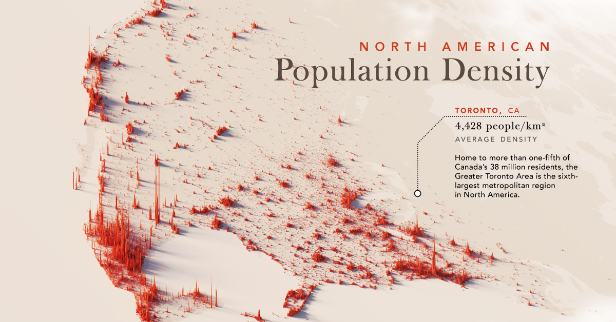
Mapped: North America Population Patterns by Density
Nearly half a billion people live on the third-largest continent. We take a closer look in this population map of North America.
Mapped: North America Population Patterns by Density
This was originally posted on our Voronoi app. Download the app for free on iOS or Android and discover incredible data-driven charts from a variety of trusted sources.
From the icy expanses of the Arctic to the warm Caribbean sea, the North American continent covers nearly 25 million square kilometers, or about 15% of the Earth’s land area. Populating this vast region are nearly half a billion people, spread out from coast to valley, along the edges of arid scrublands and rainforests.
We visualize a map of North America population patterns, including Central America and the Caribbean, with spikes illustrating densely populated areas.
Data for this map is sourced from Statistics Canada, the World Bank, and WorldPop—a research group based out of the University of Southampton that tracks population growth and movement across the globe.
Ranked: Countries and Territories by Population Density
Deep in the Atlantic, seen as a small dot near Haiti on the map, the island state of Bermuda is the most densely populated jurisdiction on the continent. Measuring just 53 km² in area, and home to 65,000 people, results in an average population density of 1,266 people per km².
Also in the Caribbean, Barbados ranks second with an average population density 642 people/km², followed by Aruba, ranked third-highest at 550 people/km².
| Rank | Country/Territory | Average Population Density (per km²) | Area (km²) |
|---|---|---|---|
| 1 | 🇧🇲 Bermuda | 1,226 | 53 |
| 2 | 🇧🇧 Barbados | 642 | 439 |
| 3 | 🇦🇼 Aruba | 550 | 193 |
| 4 | 🇭🇹 Haiti | 423 | 27,750 |
| 5 | 🇵🇷 Puerto Rico | 360 | 8,897 |
| 6 | 🇲🇶 Martinique | 325 | 1,130 |
| 7 | 🇸🇻 El Salvador | 303 | 21,040 |
| 8 | 🇱🇨 Saint Lucia | 292 | 617 |
| 9 | 🇻🇮 Virgin Islands | 285 | 346 |
| 10 | 🇻🇨 Saint Vincent & the Grenadines | 267 | 389 |
| 11 | 🇯🇲 Jamaica | 257 | 10,992 |
| 12 | 🇬🇵 Guadeloupe | 252 | 1,628 |
| 13 | 🇩🇴 Dominican Republic | 234 | 48,442 |
| 14 | 🇧🇶 Netherlands Antilles | 229 | 800 |
| 15 | 🇹🇹 Trinidad & Tobago | 212 | 5,128 |
| 16 | 🇦🇬 Antigua & Barbuda | 214 | 440 |
| 17 | 🇻🇬 British Virgin Islands | 206 | 153 |
| 18 | 🇰🇳 Saint Kitts & Nevis | 176 | 269 |
| 19 | 🇦🇮 Anguilla | 175 | 91 |
| 20 | 🇰🇾 Cayman Islands | 168 | 264 |
| 21 | 🇬🇹 Guatemala | 165 | 108,889 |
| 22 | 🇨🇷 Costa Rica | 101 | 51,100 |
| 23 | 🇨🇺 Cuba | 102 | 109,884 |
| 24 | 🇭🇳 Honduras | 94 | 112,492 |
| 25 | 🇩🇲 Dominica | 91 | 750 |
| 26 | 🇲🇸 Montserrat | 91 | 103 |
| 27 | 🇹🇨 Turks & Caicos Islands | 75 | 616 |
| 28 | 🇲🇽 Mexico | 65 | 1,972,550 |
| 29 | 🇵🇦 Panama | 60 | 74,177 |
| 30 | 🇳🇮 Nicaragua | 54 | 130,370 |
| 31 | 🇺🇸 U.S. | 35 | 9,834,000 |
| 32 | 🇧🇸 The Bahamas | 29 | 13,880 |
| 33 | 🇵🇲 Saint-Pierre & Miquelon | 24 | 242 |
| 34 | 🇧🇿 Belize | 17 | 22,966 |
| 35 | 🇨🇦 Canada | 4 | 9,984,670 |
| 36 | 🇬🇱 Greenland | 0 | 2,166,086 |
| 37 | 🇺🇸 Navassa Island | 0 | 5 |
Naturally the largest countries on the continent—Canada, the U.S., and Mexico—have some of the lowest average population densities compared to other nations in the region.
However, thanks to their size, their overall population distribution is more apparent on a map of this scale. In Canada, the Greater Toronto Area is home to one-fifth the country’s entire population. In stark contrast, the rest of the country seems almost empty—averaging just 4 people/km².
Major U.S. cities—New York, Chicago, and San Francisco—also stand out, though the more regular dispersion of Americans, particularly in the Northeast, South, and Midwest can also be seen.
Interestingly, Monterrey in Mexico jumps out on the map; the city is built at the foot of Cerro de la Silla, and several districts are densely populated as a result.
Ranked: Continents by Population Density
How does North America compare to the other continents by population density?
Unsurprisingly, thanks to its large land area, as well as comparatively smaller population, North America is one of the least densely populated continents in the world, beaten only by Oceania, which averages 5 people/km², and Antarctica.
| Rank | Continent | Average Population Density (per/km²) |
|---|---|---|
| 1 | Asia | 149 |
| 2 | Africa | 49 |
| 3 | Europe | 32 |
| 4 | South America | 25 |
| 5 | North America | 25 |
| 6 | Oceania | 5 |
| 7 | Antarctica | 0 |
Source: World Population Review.
In comparison, Asia, while being the largest continent, is also home to 60% of the global population, and averages 149 people/km².

-

 Maps2 weeks ago
Mapped: Average Wages Across Europe
-

 Money1 week ago
Which States Have the Highest Minimum Wage in America?
-

 Real Estate1 week ago
Ranked: The Most Valuable Housing Markets in America
-

 Markets1 week ago
Charted: Big Four Market Share by S&P 500 Audits
-

 AI1 week ago
The Stock Performance of U.S. Chipmakers So Far in 2024
-

 Automotive2 weeks ago
Almost Every EV Stock is Down After Q1 2024
-

 Money2 weeks ago
Where Does One U.S. Tax Dollar Go?
-

 Green2 weeks ago
Ranked: Top Countries by Total Forest Loss Since 2001