Money
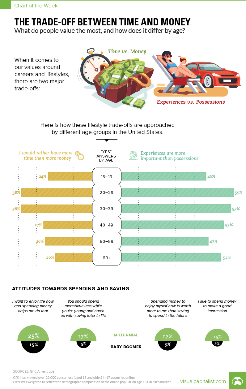
How Different Age Groups View the Trade-Off Between Time and Money
The Trade-Off Between Time and Money
The Chart of the Week is a weekly Visual Capitalist feature on Fridays.
Every individual person has their own unique set of values when it comes to how they approach their lifestyle and career.
Generally speaking, however, most people have a viewpoint on the inherent trade-off between time and money, as well as whether these precious resources should be used to seek out experiences or buy possessions.
Today’s chart uses data from a global survey of 22,000 internet users in 17 different countries by GfK Global, which gave people the option to choose whether they valued:
- Time vs. Money
- Experiences vs. Possessions
We’ll first look at the U.S. data with a focus on generational differences, and then we’ll present the international data on how this trade-off between time and money manifests itself between countries.
Generational Differences
Judging by age alone, one might guess that younger generations would prefer to “take the money and run”. After all, millennials are often stereotyped as a cash-strapped generation.
Interestingly, this doesn’t seem to be the case at all, at least according to U.S. data:
| Age Group | Time > Money (% agree) | Experiences > Possessions (% agree) |
|---|---|---|
| 15-19 years | 24% | 46% |
| 20-29 years | 38% | 59% |
| 30-39 years | 38% | 57% |
| 40-49 years | 27% | 53% |
| 50-59 years | 26% | 47% |
| 60+ years | 20% | 52% |
When it comes to time and money, 38% of both the 20-29 year and 30-39 year ranges prefer to choose time over money. This is a significantly higher portion than those of other age groups. Surprisingly, only 20% of people in the 60+ group clearly had a preference for time over money.
As for experiences and possessions, it was a similar case, with the 20-29 year and 30-39 year groups having the highest preference for experiences. This is not surprising, and it’s a widely known millennial attribute to seek powerful experiences like travel, music festivals, sports, and live events over buying new material possessions such as furniture or a new car.
International Differences
How do people from different countries approach the same survey questions?
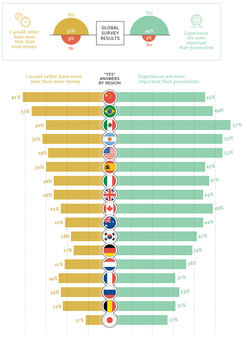
The international chart reveals some interesting differences about the perceived value of time and money.
One very stark one lies between two Asian nations in close proximity. Folks surveyed from China had the highest preference for time over money (41% agreeing), while across the East China Sea, in Japan, the results show the lowest preference for time over money (11% agreeing).
Another interesting cultural difference: countries in Latin America tend to see experiences as far more important than the rest of the globe. Mexico (57%), Argentina (53%), and Brazil (49%) all were well above the global average of 44% for choosing experiences over possessions.


Money
How Debt-to-GDP Ratios Have Changed Since 2000
See how much the debt-to-GDP ratios of advanced economies have grown (or shrank) since the year 2000.


How Debt-to-GDP Ratios Have Changed Since 2000
This was originally posted on our Voronoi app. Download the app for free on Apple or Android and discover incredible data-driven charts from a variety of trusted sources.
Government debt levels have grown in most parts of the world since the 2008 financial crisis, and even more so after the COVID-19 pandemic.
To gain perspective on this long-term trend, we’ve visualized the debt-to-GDP ratios of advanced economies, as of 2000 and 2024 (estimated). All figures were sourced from the IMF’s World Economic Outlook.
Data and Highlights
The data we used to create this graphic is listed in the table below. “Government gross debt” consists of all liabilities that require payment(s) of interest and/or principal in the future.
| Country | 2000 (%) | 2024 (%) | Change (pp) |
|---|---|---|---|
| 🇯🇵 Japan | 135.6 | 251.9 | +116.3 |
| 🇸🇬 Singapore | 82.3 | 168.3 | +86.0 |
| 🇺🇸 United States | 55.6 | 126.9 | +71.3 |
| 🇬🇧 United Kingdom | 36.6 | 105.9 | +69.3 |
| 🇬🇷 Greece | 104.9 | 160.2 | +55.3 |
| 🇫🇷 France | 58.9 | 110.5 | +51.6 |
| 🇵🇹 Portugal | 54.2 | 104.0 | +49.8 |
| 🇪🇸 Spain | 57.8 | 104.7 | +46.9 |
| 🇸🇮 Slovenia | 25.9 | 66.5 | +40.6 |
| 🇫🇮 Finland | 42.4 | 76.5 | +34.1 |
| 🇭🇷 Croatia | 35.4 | 61.8 | +26.4 |
| 🇨🇦 Canada | 80.4 | 103.3 | +22.9 |
| 🇨🇾 Cyprus | 56.0 | 70.9 | +14.9 |
| 🇦🇹 Austria | 65.7 | 74.0 | +8.3 |
| 🇸🇰 Slovak Republic | 50.5 | 56.5 | +6.0 |
| 🇩🇪 Germany | 59.3 | 64.0 | +4.7 |
| 🇧🇪 Belgium | 109.6 | 106.8 | -2.8 |
| 🇮🇱 Israel | 77.4 | 56.8 | -20.6 |
| 🇮🇸 Iceland | 75.8 | 54.6 | -21.2 |
The debt-to-GDP ratio indicates how much a country owes compared to the size of its economy, reflecting its ability to manage and repay debts. Percentage point (pp) changes shown above indicate the increase or decrease of these ratios.
Countries with the Biggest Increases
Japan (+116 pp), Singapore (+86 pp), and the U.S. (+71 pp) have grown their debt as a percentage of GDP the most since the year 2000.
All three of these countries have stable, well-developed economies, so it’s unlikely that any of them will default on their growing debts. With that said, higher government debt leads to increased interest payments, which in turn can diminish available funds for future government budgets.
This is a rising issue in the U.S., where annual interest payments on the national debt have surpassed $1 trillion for the first time ever.
Only 3 Countries Saw Declines
Among this list of advanced economies, Belgium (-2.8 pp), Iceland (-21.2 pp), and Israel (-20.6 pp) were the only countries that decreased their debt-to-GDP ratio since the year 2000.
According to Fitch Ratings, Iceland’s debt ratio has decreased due to strong GDP growth and the use of its cash deposits to pay down upcoming maturities.
See More Debt Graphics from Visual Capitalist
Curious to see which countries have the most government debt in dollars? Check out this graphic that breaks down $97 trillion in debt as of 2023.

-

 Maps1 week ago
The Largest Earthquakes in the New York Area (1970-2024)
-

 Money2 weeks ago
Where Does One U.S. Tax Dollar Go?
-

 Automotive2 weeks ago
Almost Every EV Stock is Down After Q1 2024
-

 AI2 weeks ago
The Stock Performance of U.S. Chipmakers So Far in 2024
-

 Markets2 weeks ago
Charted: Big Four Market Share by S&P 500 Audits
-

 Real Estate2 weeks ago
Ranked: The Most Valuable Housing Markets in America
-

 Money2 weeks ago
Which States Have the Highest Minimum Wage in America?
-

 AI2 weeks ago
Ranked: Semiconductor Companies by Industry Revenue Share