Misc
A Visual Guide to Human Emotion
A Visual Guide to Human Emotion
Despite vast differences in culture around the world, humanity’s DNA is 99.9% similar.
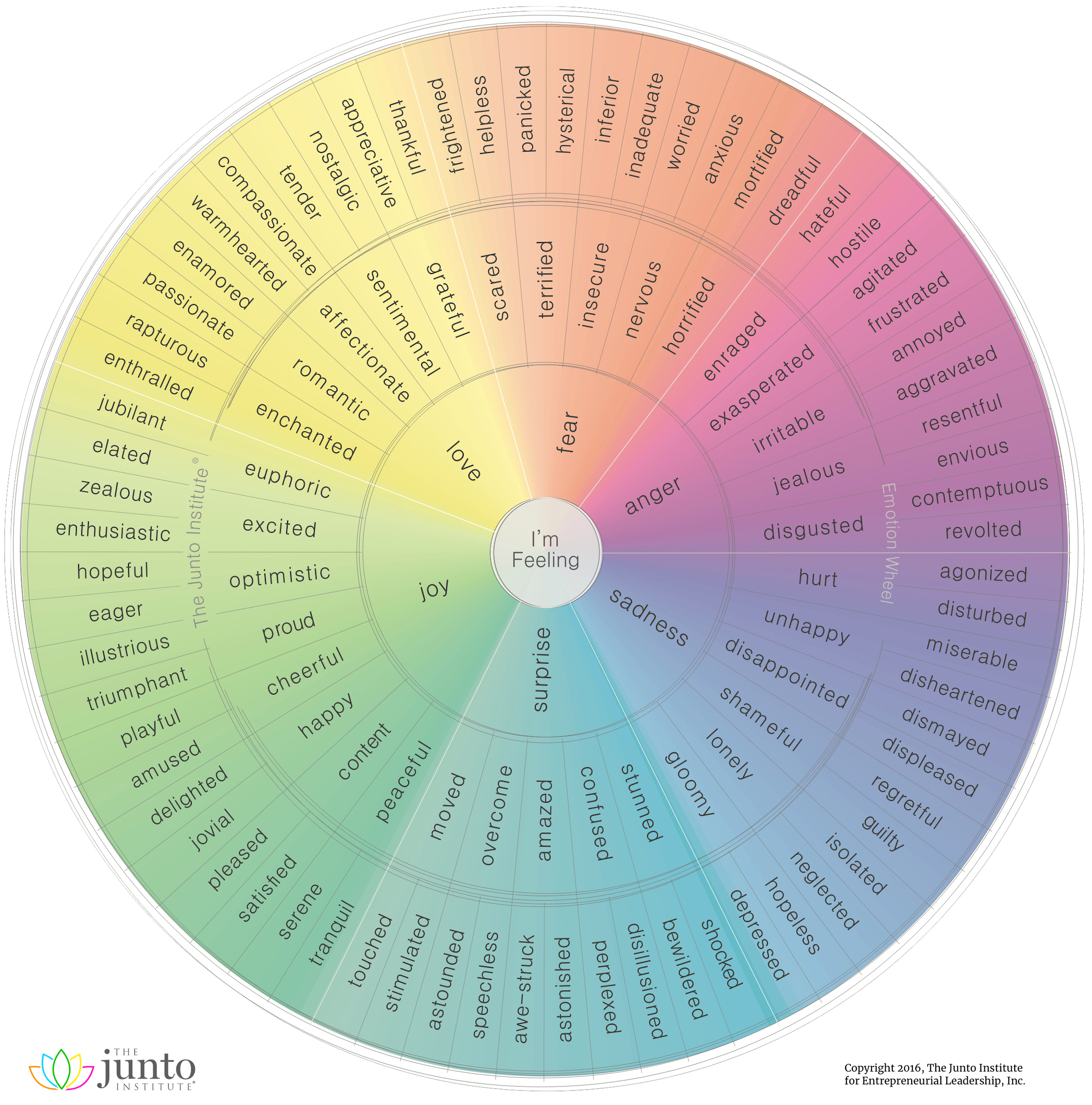
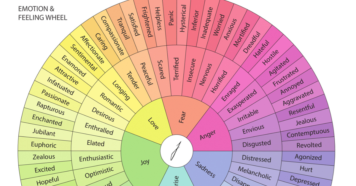
There are few attributes more central and universal to the human experience than our emotions. Of course, the broad spectrum of emotions we’re capable of experiencing can be difficult to articulate. That’s where this brilliant visualization by the Junto Institute comes in.
This circular visualization is the latest in an ongoing attempt to neatly categorize the full range of emotions in a logical way.
A Taxonomy of Human Emotion
Our understanding has come a long way since William James proposed four basic emotions – fear, grief, love, and rage—though these core emotions still form much of the foundation for current frameworks.
The wheel visualization above identifies six root emotions:
- Fear
- Anger
- Sadness
- Surprise
- Joy
- Love
From these six emotions, more nuanced descriptions emerge, such as jealousy as a subset of anger, and awe-struck as a subset of surprise. In total, there are 102 second- and third-order emotions listed on this emotion wheel.
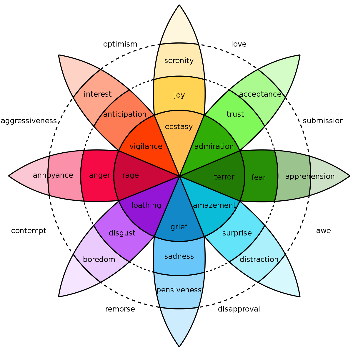
Reinventing the Feeling Wheel
The concept of mapping the range of human emotions on a wheel picked up traction in the 1980s, and has evolved ever since.
One of these original concepts was developed by American psychologist Robert Plutchik, who mapped eight primary emotions—anger, fear, sadness, disgust, surprise, anticipation, trust, and joy. These “high survival value” emotions were believed to be the most useful in keeping our ancient ancestors alive.
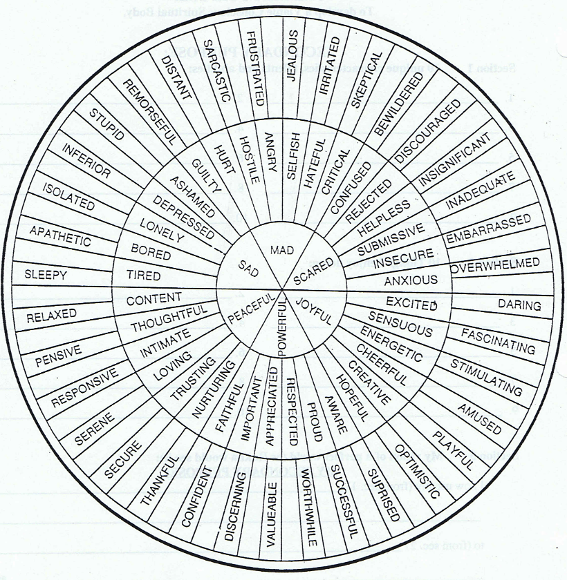
Another seminal graphic concept was developed by author Dr. Gloria Willcox. This version of the emotions wheel has spawned dozens of similar designs, as people continue to try to improve on the concept.
Further Exploration
The more we research human emotion, the more nuanced our understanding becomes in terms of how we react to the world around us.
Researchers at UC Berkeley used 2,185 short video clips to elicit emotions from study participants. Study participants rated the videos using 27 dimensions of self-reported emotional experience, and the results were mapped in an incredible interactive visualization. It is interesting to note that some video clips garnered a wide array of responses, while other clips elicit a near unanimous emotional response.
Here are some example videos and the distribution of responses:
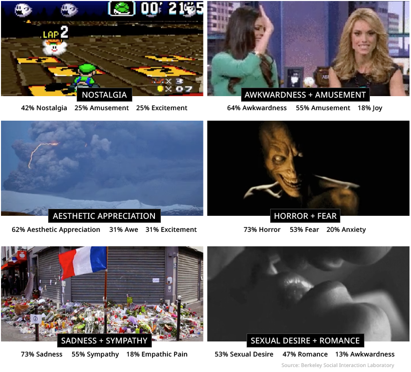
The data visualization clusters these types of videos together, giving us a unique perspective on how people respond to certain types of stimuli.
Much like emotion itself, our desire to understand and classify the world around us is powerful and uniquely human.
VC+
VC+: Get Our Key Takeaways From the IMF’s World Economic Outlook
A sneak preview of the exclusive VC+ Special Dispatch—your shortcut to understanding IMF’s World Economic Outlook report.

Have you read IMF’s latest World Economic Outlook yet? At a daunting 202 pages, we don’t blame you if it’s still on your to-do list.
But don’t worry, you don’t need to read the whole April release, because we’ve already done the hard work for you.
To save you time and effort, the Visual Capitalist team has compiled a visual analysis of everything you need to know from the report—and our upcoming VC+ Special Dispatch will be available exclusively to VC+ members on Thursday, April 25th.
If you’re not already subscribed to VC+, make sure you sign up now to receive the full analysis of the IMF report, and more (we release similar deep dives every week).
For now, here’s what VC+ members can expect to receive.
Your Shortcut to Understanding IMF’s World Economic Outlook
With long and short-term growth prospects declining for many countries around the world, this Special Dispatch offers a visual analysis of the key figures and takeaways from the IMF’s report including:
- The global decline in economic growth forecasts
- Real GDP growth and inflation forecasts for major nations in 2024
- When interest rate cuts will happen and interest rate forecasts
- How debt-to-GDP ratios have changed since 2000
- And much more!

Get the Full Breakdown in the Next VC+ Special Dispatch
VC+ members will receive the full Special Dispatch on Thursday, April 25th.
Make sure you join VC+ now to receive exclusive charts and the full analysis of key takeaways from IMF’s World Economic Outlook.
Don’t miss out. Become a VC+ member today.
What You Get When You Become a VC+ Member
VC+ is Visual Capitalist’s premium subscription. As a member, you’ll get the following:
- Special Dispatches: Deep dive visual briefings on crucial reports and global trends
- Markets This Month: A snappy summary of the state of the markets and what to look out for
- The Trendline: Weekly curation of the best visualizations from across the globe
- Global Forecast Series: Our flagship annual report that covers everything you need to know related to the economy, markets, geopolitics, and the latest tech trends
- VC+ Archive: Hundreds of previously released VC+ briefings and reports that you’ve been missing out on, all in one dedicated hub
You can get all of the above, and more, by joining VC+ today.

-

 Travel1 week ago
Airline Incidents: How Do Boeing and Airbus Compare?
-

 Markets2 weeks ago
Visualizing America’s Shortage of Affordable Homes
-

 Green2 weeks ago
Ranked: Top Countries by Total Forest Loss Since 2001
-

 Money2 weeks ago
Where Does One U.S. Tax Dollar Go?
-

 Misc2 weeks ago
Almost Every EV Stock is Down After Q1 2024
-

 AI2 weeks ago
The Stock Performance of U.S. Chipmakers So Far in 2024
-

 Markets2 weeks ago
Charted: Big Four Market Share by S&P 500 Audits
-

 Real Estate2 weeks ago
Ranked: The Most Valuable Housing Markets in America