U.S. Debt Interest Payments Reach $1 Trillion
Ranked: The Largest U.S. Corporations by Number of Employees
The Top 10 States by Real GDP Growth in 2023
Ranked: The World’s Top Flight Routes, by Revenue
Ranked: The Most Valuable Housing Markets in America
Ranked: Semiconductor Companies by Industry Revenue Share
The Stock Performance of U.S. Chipmakers So Far in 2024
Ranked: The Most Popular Smartphone Brands in the U.S.
Visualizing Nvidia’s Revenue, by Product Line (2019-2024)
Visualizing Internet Usage by Global Region
How Debt-to-GDP Ratios Have Changed Since 2000
The Smallest Gender Wage Gaps in OECD Countries
Which States Have the Highest Minimum Wage in America?
Where Does One U.S. Tax Dollar Go?
Visualizing the Growth of $100, by Asset Class (1970-2023)
The Cost of an EpiPen in Major Markets
Charted: Global Tobacco Use by Country and Sex
Visualized: What Lives in Your Gut Microbiome?
Charted: Average Years Left to Live by Age
Charted: The Average Cost of Insulin By Country
The World’s Biggest Nuclear Energy Producers
The World’s Biggest Oil Producers in 2023
How Much Does the U.S. Depend on Russian Uranium?
Charted: Global Uranium Reserves, by Country
Visualizing the Rise of the U.S. as Top Crude Oil Producer
The Largest Earthquakes in the New York Area (1970-2024)
Mapped: Average Wages Across Europe
Mapped: Asia’s Population Patterns by Density
A Map of Global Happiness By Country in 2024
Mapped: Population Growth by Region (1900-2050F)
Gold vs. S&P 500: Which Has Grown More Over Five Years?
Charted: The Value Gap Between the Gold Price and Gold Miners
The Periodic Table of Commodity Returns (2014-2023)
China Dominates the Supply of U.S. Critical Minerals List
Ranking the Top 15 Countries by Carbon Tax Revenue
Ranked: The Countries With the Most Air Pollution in 2023
Top Countries By Forest Growth Since 2001
Ranked: Top Countries by Total Forest Loss Since 2001
The World’s Top Cocoa Producing Countries
...pp -06 pp 🇲🇾 Malaysia +07 pp -09 pp 🇲🇽 Mexico +20 pp -21 pp 🇳🇱 Netherlands +03 pp -09 pp 🇵🇪 Peru +30 pp -23...
...93 Seychelles NA NA NA 2.20 2.29 94 Venezuela, RB 6.36 4.69 3.45 2.63 2.23 95 Peru 6.94 5.71 3.91 2.69 2.22 96 Indonesia 5.55 5.04...
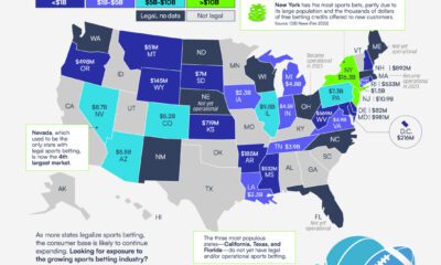
...and other factors. In this graphic from Roundhill Investments, we show a breakdown of legal sports betting by state. A State View of Legal Sports Betting...
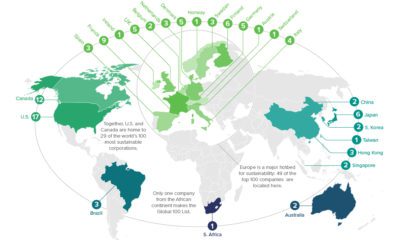
...Osram Licht AG Electrical Equipment and Power Systems 🇩🇪 Germany #13 Storebrand ASA Insurance 🇳🇴 Norway #14 Umicore SA Primary Metals Products 🇧🇪 Belgium #17 Iberdrola...
...seven different sports make, and where they get their money from. Sports1 month ago The World’s Most Valuable Sports Teams in 2024 The most valuable sports...
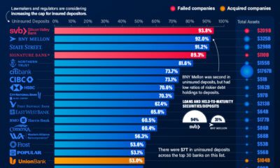
...NA 52.2 $90 19 JPMorgan Chase Bank NA 52 $3,202 20 U.S. Bank NA 51.4 $585 21 Synovus Bank 50.7 $60 22 Bank of the West**...
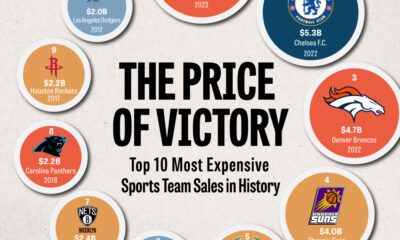
...Sports Team Sale Prices So High? Sports teams haven’t always collected such sky-high prices like the Washington Commanders sale. In fact, sports teams used to be...
...(+116 pp), Singapore (+86 pp), and the U.S. (+71 pp) have grown their debt as a percentage of GDP the most since the year 2000. All...
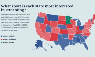
...graphic from ExpressVPN provides an overview of sports streaming interest in America by using Google Trends data to examine the most searched-for sports. Sports Streaming Search...
...most since 2000 are China (+7.7 pp), Mexico (+3.2 pp), and South Korea (+2.5 pp). There are clear drivers behind each of these growth stories. For...


 Creator Program