Markets
Visualizing the 700-Year Fall of Interest Rates
Visualizing the 700-Year Decline of Interest Rates
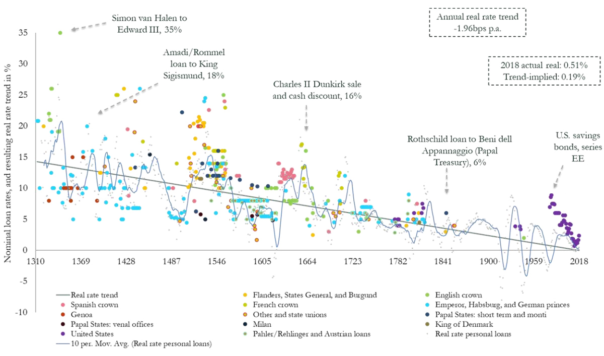
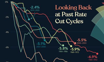
How far can interest rates fall?
Currently, many sovereign rates sit in negative territory, and there is an unprecedented $10 trillion in negative-yielding debt. This new interest rate climate has many observers wondering where the bottom truly lies.
Today’s graphic from Paul Schmelzing, visiting scholar at the Bank of England (BOE), shows how global real interest rates have experienced an average annual decline of -0.0196% (-1.96 basis points) throughout the past eight centuries.
The Evidence on Falling Rates
Collecting data from across 78% of total advanced economy GDP over the time frame, Schmelzing shows that real rates* have witnessed a negative historical slope spanning back to the 1300s.
Displayed across the graph is a series of personal nominal loans made to sovereign establishments, along with their nominal loan rates. Some from the 14th century, for example, had nominal rates of 35%. By contrast, key nominal loan rates had fallen to 6% by the mid 1800s.
Centennial Averages of Real Long-Term “Safe-Asset”† Rates From 1311-2018
| % | 1300s | 1400s | 1500s | 1600s | 1700s | 1800s | 1900s | 2000s |
|---|---|---|---|---|---|---|---|---|
| Nominal rate | 7.3 | 11.2 | 7.8 | 5.4 | 4.1 | 3.5 | 5.0 | 3.5 |
| Inflation | 2.2 | 2.1 | 1.7 | 0.8 | 0.6 | 0.0 | 3.1 | 2.2 |
| Real rate | 5.1 | 9.1 | 6.1 | 4.6 | 3.5 | 3.4 | 2.0 | 1.3 |
*Real rates take inflation into account, and are calculated as follows: nominal rate – inflation = real rate.
†Safe assets are issued from global financial powers
Starting in 1311, data from the report shows how average real rates moved from 5.1% in the 1300s down to an average of 2% in the 1900s.
The average real rate between 2000-2018 stands at 1.3%.
Current Theories
Why have interest rates been trending downward for so long?
Here are the three prevailing theories as to why they’re dropping:
1. Productivity Growth
Since 1970, productivity growth has slowed. A nation’s productive capacity is determined by a number of factors, including labor force participation and economic output.
If total economic output shrinks, real rates will decline too, theory suggests. Lower productivity growth leads to lower wage growth expectations.
In addition, lower productivity growth means less business investment, therefore a lower demand for capital. This in turn causes the lower interest rates.
2. Demographics
Demographics impact interest rates on a number of levels. The aging population—paired with declining fertility levels—result in higher savings rates, longer life expectancies, and lower labor force participation rates.
In the U.S., baby boomers are retiring at a pace of 10,000 people per day, and other advanced economies are also seeing comparable growth in retirees. Theory suggests that this creates downward pressure on real interest rates, as the number of people in the workforce declines.
3. Economic Growth
Dampened economic growth can also have a negative impact on future earnings, pushing down the real interest rate in the process. Since 1961, GDP growth among OECD countries has dropped from 4.3% to 3% in 2018.
Larry Summers referred to this sloping trend since the 1970s as “secular stagnation” during an International Monetary Fund conference in 2013.
Secular stagnation occurs when the economy is faced with persistently lagging economic health. One possible way to address a declining interest rate conundrum, Summers has suggested, is through expansionary government spending.
Bond Yields Declining
According to the report, another trend has coincided with falling interest rates: declining bond yields.
Since the 1300s, global nominal bonds yields have dropped from over 14% to around 2%.
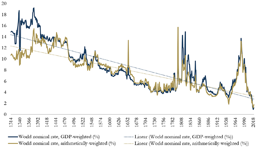
The graph illustrates how real interest rates and bond yields appear to slope across a similar trend line. While it may seem remarkable that interest rates keep falling, this phenomenon shows that a broader trend may be occurring—across centuries, asset classes, and fiscal regimes.
In fact, the historical record would imply that we will see ever new record lows in real rates in future business cycles in the 2020s/30s
-Paul Schmelzing
Although this may be fortunate for debt-seekers, it can create challenges for fixed income investors—who may seek alternatives strategies with higher yield potential instead.


Markets
U.S. Debt Interest Payments Reach $1 Trillion
U.S. debt interest payments have surged past the $1 trillion dollar mark, amid high interest rates and an ever-expanding debt burden.


U.S. Debt Interest Payments Reach $1 Trillion
This was originally posted on our Voronoi app. Download the app for free on iOS or Android and discover incredible data-driven charts from a variety of trusted sources.
The cost of paying for America’s national debt crossed the $1 trillion dollar mark in 2023, driven by high interest rates and a record $34 trillion mountain of debt.
Over the last decade, U.S. debt interest payments have more than doubled amid vast government spending during the pandemic crisis. As debt payments continue to soar, the Congressional Budget Office (CBO) reported that debt servicing costs surpassed defense spending for the first time ever this year.
This graphic shows the sharp rise in U.S. debt payments, based on data from the Federal Reserve.
A $1 Trillion Interest Bill, and Growing
Below, we show how U.S. debt interest payments have risen at a faster pace than at another time in modern history:
| Date | Interest Payments | U.S. National Debt |
|---|---|---|
| 2023 | $1.0T | $34.0T |
| 2022 | $830B | $31.4T |
| 2021 | $612B | $29.6T |
| 2020 | $518B | $27.7T |
| 2019 | $564B | $23.2T |
| 2018 | $571B | $22.0T |
| 2017 | $493B | $20.5T |
| 2016 | $460B | $20.0T |
| 2015 | $435B | $18.9T |
| 2014 | $442B | $18.1T |
| 2013 | $425B | $17.2T |
| 2012 | $417B | $16.4T |
| 2011 | $433B | $15.2T |
| 2010 | $400B | $14.0T |
| 2009 | $354B | $12.3T |
| 2008 | $380B | $10.7T |
| 2007 | $414B | $9.2T |
| 2006 | $387B | $8.7T |
| 2005 | $355B | $8.2T |
| 2004 | $318B | $7.6T |
| 2003 | $294B | $7.0T |
| 2002 | $298B | $6.4T |
| 2001 | $318B | $5.9T |
| 2000 | $353B | $5.7T |
| 1999 | $353B | $5.8T |
| 1998 | $360B | $5.6T |
| 1997 | $368B | $5.5T |
| 1996 | $362B | $5.3T |
| 1995 | $357B | $5.0T |
| 1994 | $334B | $4.8T |
| 1993 | $311B | $4.5T |
| 1992 | $306B | $4.2T |
| 1991 | $308B | $3.8T |
| 1990 | $298B | $3.4T |
| 1989 | $275B | $3.0T |
| 1988 | $254B | $2.7T |
| 1987 | $240B | $2.4T |
| 1986 | $225B | $2.2T |
| 1985 | $219B | $1.9T |
| 1984 | $205B | $1.7T |
| 1983 | $176B | $1.4T |
| 1982 | $157B | $1.2T |
| 1981 | $142B | $1.0T |
| 1980 | $113B | $930.2B |
| 1979 | $96B | $845.1B |
| 1978 | $84B | $789.2B |
| 1977 | $69B | $718.9B |
| 1976 | $61B | $653.5B |
| 1975 | $55B | $576.6B |
| 1974 | $50B | $492.7B |
| 1973 | $45B | $469.1B |
| 1972 | $39B | $448.5B |
| 1971 | $36B | $424.1B |
| 1970 | $35B | $389.2B |
| 1969 | $30B | $368.2B |
| 1968 | $25B | $358.0B |
| 1967 | $23B | $344.7B |
| 1966 | $21B | $329.3B |
Interest payments represent seasonally adjusted annual rate at the end of Q4.
At current rates, the U.S. national debt is growing by a remarkable $1 trillion about every 100 days, equal to roughly $3.6 trillion per year.
As the national debt has ballooned, debt payments even exceeded Medicaid outlays in 2023—one of the government’s largest expenditures. On average, the U.S. spent more than $2 billion per day on interest costs last year. Going further, the U.S. government is projected to spend a historic $12.4 trillion on interest payments over the next decade, averaging about $37,100 per American.
Exacerbating matters is that the U.S. is running a steep deficit, which stood at $1.1 trillion for the first six months of fiscal 2024. This has accelerated due to the 43% increase in debt servicing costs along with a $31 billion dollar increase in defense spending from a year earlier. Additionally, a $30 billion increase in funding for the Federal Deposit Insurance Corporation in light of the regional banking crisis last year was a major contributor to the deficit increase.
Overall, the CBO forecasts that roughly 75% of the federal deficit’s increase will be due to interest costs by 2034.

-

 Maps2 weeks ago
Mapped: Average Wages Across Europe
-

 Money1 week ago
Which States Have the Highest Minimum Wage in America?
-

 Real Estate1 week ago
Ranked: The Most Valuable Housing Markets in America
-

 Markets1 week ago
Charted: Big Four Market Share by S&P 500 Audits
-

 AI1 week ago
The Stock Performance of U.S. Chipmakers So Far in 2024
-

 Automotive2 weeks ago
Almost Every EV Stock is Down After Q1 2024
-

 Money2 weeks ago
Where Does One U.S. Tax Dollar Go?
-

 Green2 weeks ago
Ranked: Top Countries by Total Forest Loss Since 2001