Markets
These 6 Powerful Signals Reveal the Future Direction of Financial Markets

Every day, the Information Age bombards us with massive amounts of data.
Experts now estimate that there are 40 times more bytes of data in existence than there are stars in the whole observable universe.
And like the universe, our datasphere is also rapidly expanding—and every few years, there is actually more new data created than in all prior years of human history combined.
Searching for Signals
On a practical level, this dense wall of impenetrable data creates a multitude of challenges for investors and decision makers alike:
- It’s mentally taxing to process all the available information out there
- Too much data can lead to “analysis paralysis”—an inability to make decisions
- Misinformation and media slant add another layer for our brains to process
- Our personal biases get reinforced by news algorithms and filter bubbles
- Data sources—even quality ones—can sometimes conflict with one another
As a result, it’s clear that people don’t want more data—they want more understanding. And for this reason, our team at Visual Capitalist has spent most of 2020 sifting through the noise to find the underlying trends that will transform society and markets over the coming years.
The end result of this effort is our new hardcover book “SIGNALS: Charting the New Direction of the Global Economy” (hardcover, ebook) which beautifully illustrates 27 clear signals in fields ranging from investing to geopolitics.
The 6 Signals Shaping the Future of Finance
What clear and simple trends will shape the future of markets?
Below, we show you a small selection of the hundreds of charts found in the book with a focus on global finance and investing:
#1: 700 Years of Falling Interest Rates
The first signal we’ll showcase here is from an incredible dataset from the Bank of England, which reconstructs global real interest rates going back all the way to the 14th century.
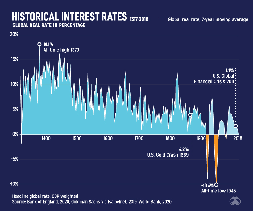
Some of the first data points in this series represent well-documented municipal debt issued in early Italian banking centers like Genoa, Florence, or Venice, during the beginning stages of the Italian Renaissance.
The early data sets of loans to noblemen, merchants, and kingdoms eventually merge with more contemporary data from central banks, and over the centuries it’s clear that falling interest rates are not a new phenomenon. In fact, on average, real rates have decreased by 1.6 basis points (0.016%) per year since the 14th century.
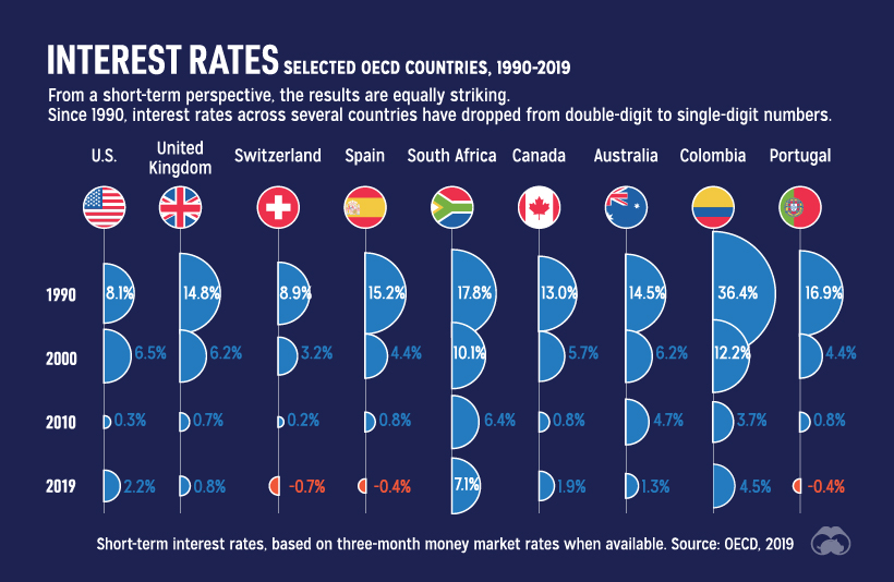
This same spectacle can also be seen in more modern time stretches:
And as the world reels from the COVID-19 crisis, governments are taking advantage of record-low rates to issue more debt and stimulate the economy.
This brings us to our next signal.
#2: Global Debt: To $258 Trillion and Beyond
The ongoing pandemic certainly made analysis trickier for some signals, but easier for others.
The accumulation of global debt falls into the latter category: as of Q1 2020, global debt sits at a record $258 trillion or 331% of world GDP, and it’s projected to rise sharply as a result of fiscal stimulus, falling tax revenues, and increasing budget deficits.
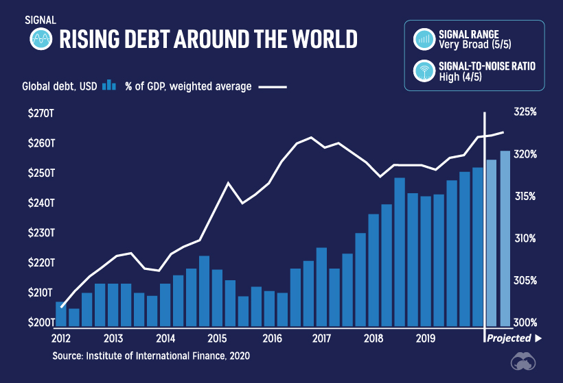
The above chart takes into consideration consumer, corporate, and government debt—but let’s just zoom in on government debt for a moment.
The below data, which is from early 2020, shows government debt ballooning between 2007 and early 2020 as a percentage of GDP.
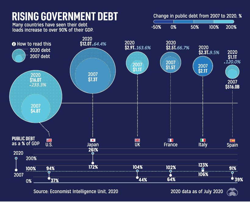
This chart does not include intragovernmental debt or new debt taken on after the start of the pandemic. Despite this, the percentage increase in debt held by some of these governments is in the triple digits over a period of only 13 years, including the 233% increase in the United States.
But it’s not just governments going on a borrowing spree. The following chart shows consumer debt over a recent four-year span, sorted by generation:
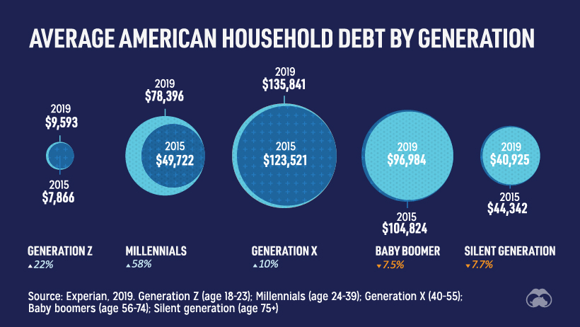
While Baby Boomers and the Silent Generation are successfully winding down some of their debt, younger generations are just getting aboard the debt train.
Between 2015-2019, Millennials added 58% to household debt, while Gen Xers find themselves (in the middle of their mortgage-paying years) as the most indebted generation with $135,841 of debt per household.
#3: Blue Chips and the Circle of Life
There was a time when it seemed absolutely unfathomable that large, entrenched companies could see their corporate advantages slide away.
But as the recent collapses of Blockbuster, Lehman Brothers, Kodak, or various retailers have taught us, there are no longer any guarantees around corporate longevity.
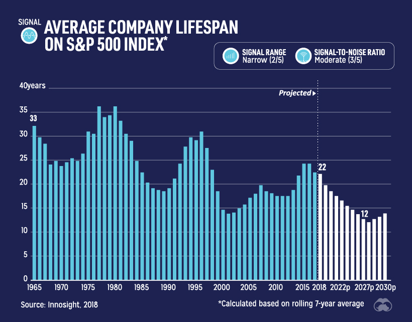
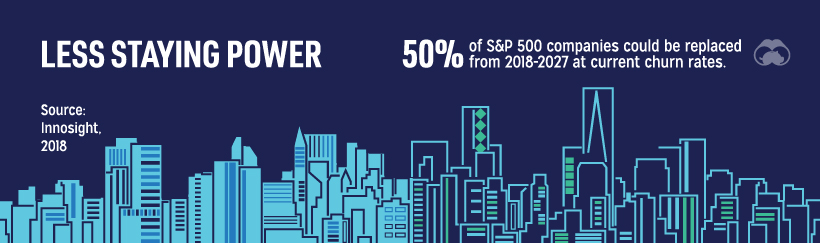
In 1964, the average tenure of a company on the S&P 500 was 33 years, but this is projected to fall to an average of just 12 years by the year 2027 according to consulting firm Innosight.
At this churn rate, it’s expected that 50% of the S&P 500 could turnover between 2018-2027.
For established companies, this is a sign of the times. Between the rapid acceleration in the speed of innovation and continuously falling barriers to market entry, the traditional corporate world finds itself playing defense.
For investors and startups, this is an interesting prospect to consider, as disruption now appears to be the status quo. Could the next big company to dominate global markets be found in someone’s garage in India today?
If you like this post, find hundreds of charts
like this in our new book “Signals”:

#4: ESG is the New Status Quo
The investment universe has reached an interesting tipping point.
Historically, performance was all the mattered to most investors—but going forward, considering ESG criteria (environment, social, and governance) is expected to become a default component of investment strategy as well.
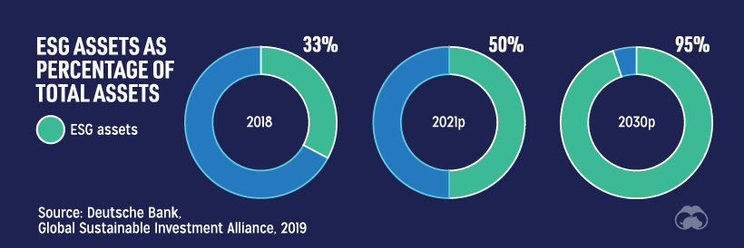
By the year 2030, it’s expected that a whopping 95% of all assets will incorporate ESG factors.
While this still seems far away, it’s clear that change is already happening in the investment sphere. As you can see in the following graphic, the percentage of ESG assets has already been rising by trillions of dollars per year globally:
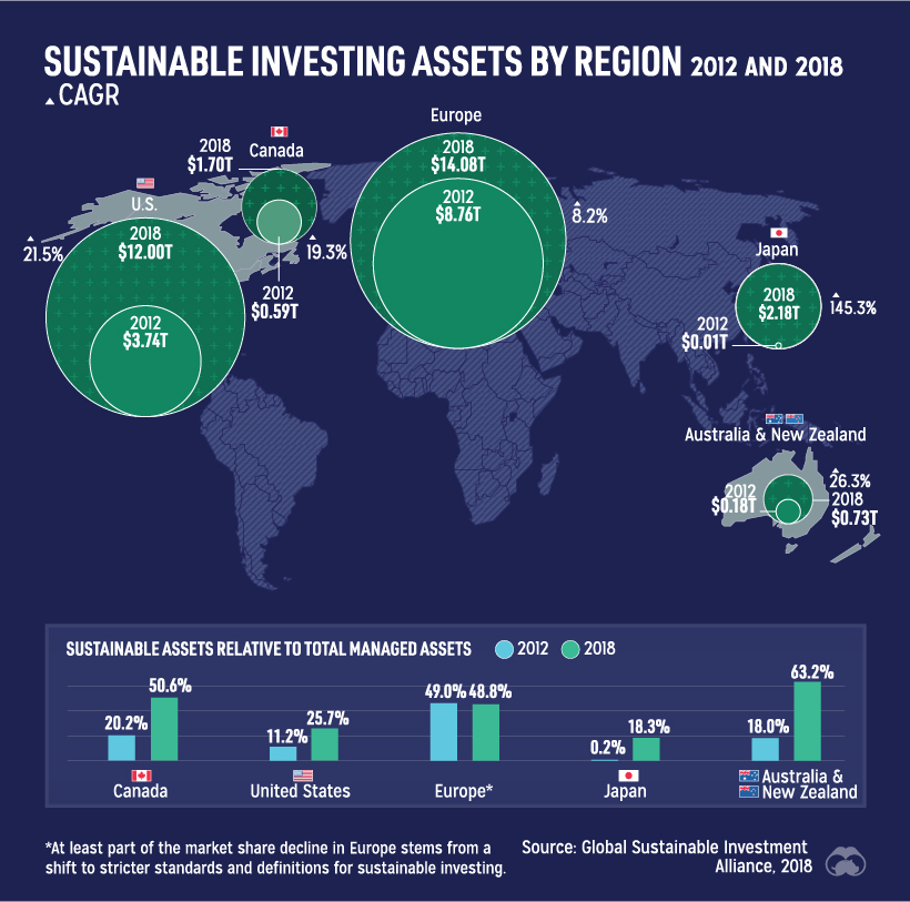
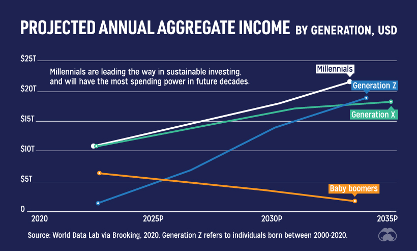
If you think this is a powerful trend now, wait until Millennials and Gen Z investors sink in their teeth. Both generations show a higher interest in sustainable investing, and both are already more likely to incorporate ESG factors into existing portfolios.
Companies are getting in front of the ESG investing trend, as well.
In 2011, just 20% of companies on the S&P 500 provided sustainability reports to investors. In 2019, that percentage rose to 90%—and with the world’s biggest asset managers already on board with ESG, there’s pressure for that to hit 100% in the coming years.
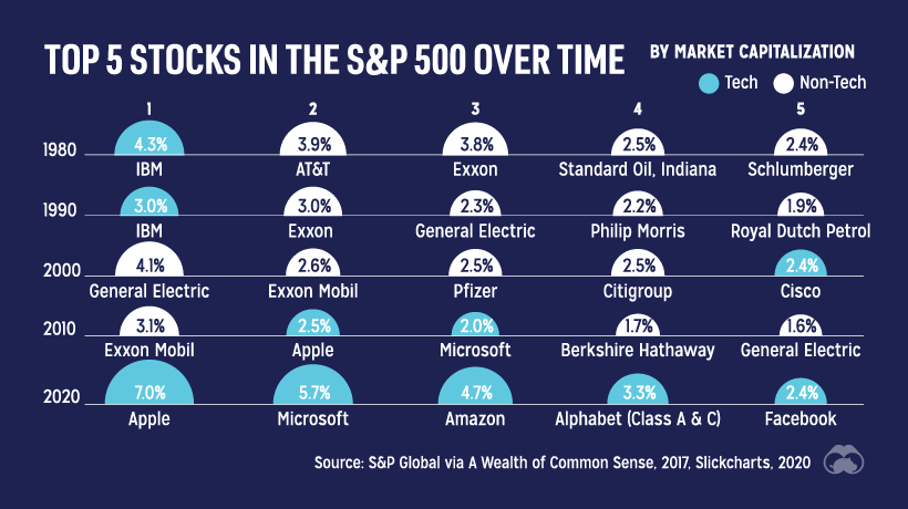
#5: Stock Market Concentration
In the last 40 years, the U.S. market has never been so concentrated as it is now.
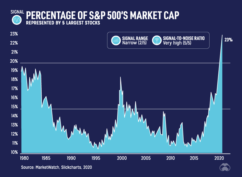
The top five stocks in the S&P 500 have historically made up less than 15% of the market capitalization of the index, but this year the percentage has skyrocketed to 23%.
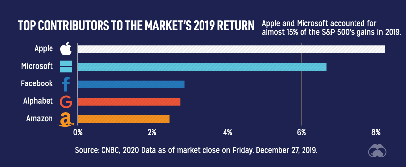
Not surprisingly, it’s the same companies—led by Apple and Microsoft—that propelled market performance the previous year.
Looking back at the top five companies in the S&P 500 over time helps reveal an important component of this signal, which is that it’s only a recent phenomenon for tech stocks to dominate the market so heavily.
#6: Central Banks: Between a Rock and a Hard Place
Since the financial crisis, central banks have found themselves to be in a tricky situation.
As interest rates close in on the zero bound, their usual toolkit of conventional policy options has dried up. Traditionally, lowering rates has encouraged borrowing and spending to prop up the economy, but once rates get ultra-low this effect disappears or even reverses.
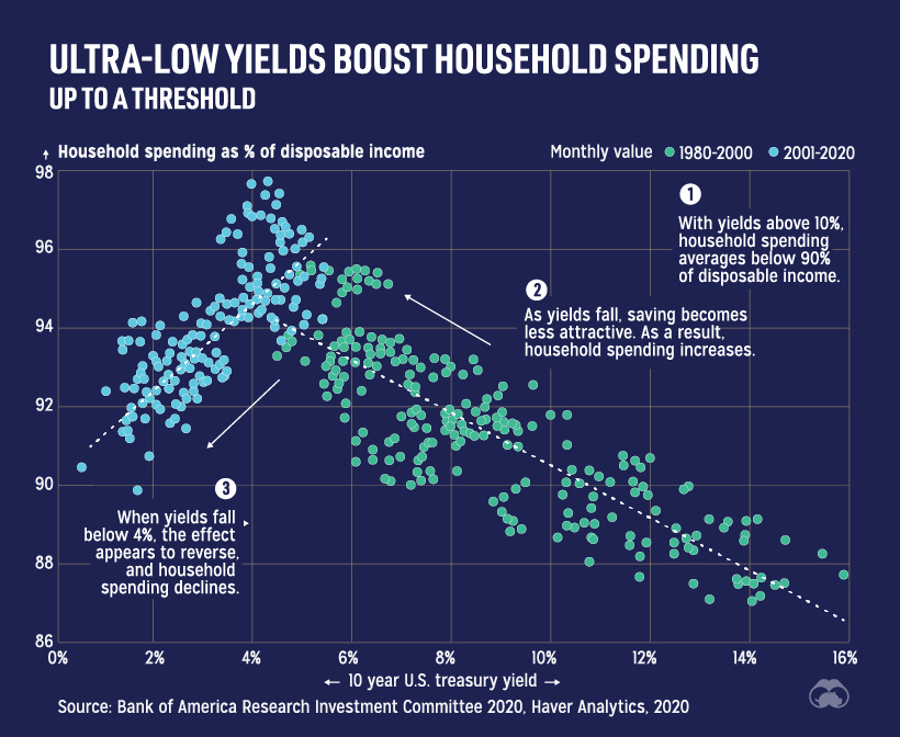
The pandemic has forced the hand of central banks to act in less conventional ways.
Quantitative easing (QE)—first used extensively by the Federal Reserve and European Central Bank after the financial crisis—has now become the go-to tool for central banks. By buying long-term securities on the open market, the goal is to increase money supply and encourage lending and investment.
In Japan, where QE has been a mainstay since the late-1990s, the Bank of Japan now owns 80% of ETF assets and roughly 8% of the domestic equity market.
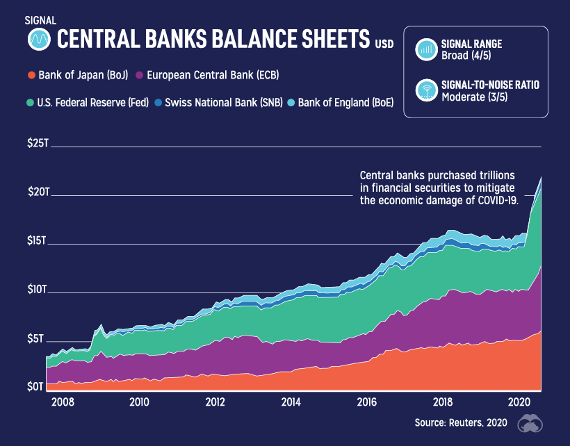
As banks “print money” to buy more assets, their balance sheets rise concurrently. This year, the Fed has already added over $3.5 trillion to the U.S. money supply (M2) as a result of the COVID-19 crisis, and there’s still likely much more to be done.
Regardless of how the monetary policy experiment turns out, it’s clear that this and many of the other aforementioned signals will be key drivers for the future of markets and investing.
If you like this post, find hundreds of charts
like this in our new book “Signals”:


Markets
Ranked: The Largest U.S. Corporations by Number of Employees
We visualized the top U.S. companies by employees, revealing the massive scale of retailers like Walmart, Target, and Home Depot.
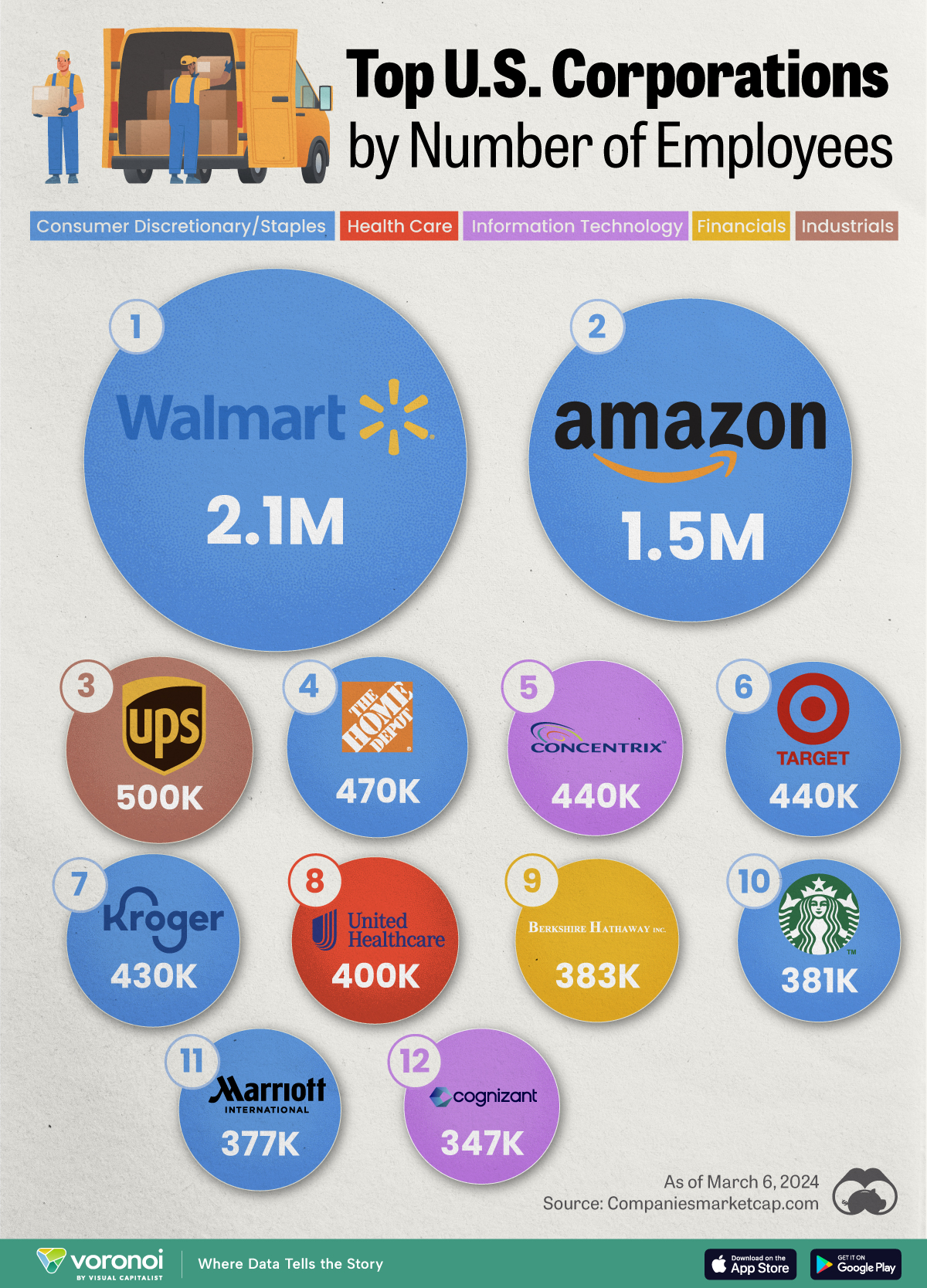
The Largest U.S. Corporations by Number of Employees
This was originally posted on our Voronoi app. Download the app for free on Apple or Android and discover incredible data-driven charts from a variety of trusted sources.
Revenue and profit are common measures for measuring the size of a business, but what about employee headcount?
To see how big companies have become from a human perspective, we’ve visualized the top U.S. companies by employees. These figures come from companiesmarketcap.com, and were accessed in March 2024. Note that this ranking includes publicly-traded companies only.
Data and Highlights
The data we used to create this list of largest U.S. corporations by number of employees can be found in the table below.
| Company | Sector | Number of Employees |
|---|---|---|
| Walmart | Consumer Staples | 2,100,000 |
| Amazon | Consumer Discretionary | 1,500,000 |
| UPS | Industrials | 500,000 |
| Home Depot | Consumer Discretionary | 470,000 |
| Concentrix | Information Technology | 440,000 |
| Target | Consumer Staples | 440,000 |
| Kroger | Consumer Staples | 430,000 |
| UnitedHealth | Health Care | 400,000 |
| Berkshire Hathaway | Financials | 383,000 |
| Starbucks | Consumer Discretionary | 381,000 |
| Marriott International | Consumer Discretionary | 377,000 |
| Cognizant | Information Technology | 346,600 |
Retail and Logistics Top the List
Companies like Walmart, Target, and Kroger have a massive headcount due to having many locations spread across the country, which require everything from cashiers to IT professionals.
Moving goods around the world is also highly labor intensive, explaining why UPS has half a million employees globally.
Below the Radar?
Two companies that rank among the largest U.S. corporations by employees which may be less familiar to the public include Concentrix and Cognizant. Both of these companies are B2B brands, meaning they primarily work with other companies rather than consumers. This contrasts with brands like Amazon or Home Depot, which are much more visible among average consumers.
A Note on Berkshire Hathaway
Warren Buffett’s company doesn’t directly employ 383,000 people. This headcount actually includes the employees of the firm’s many subsidiaries, such as GEICO (insurance), Dairy Queen (retail), and Duracell (batteries).
If you’re curious to see how Buffett’s empire has grown over the years, check out this animated graphic that visualizes the growth of Berkshire Hathaway’s portfolio from 1994 to 2022.

-
 Business2 weeks ago
America’s Top Companies by Revenue (1994 vs. 2023)
-

 Environment1 week ago
Ranked: Top Countries by Total Forest Loss Since 2001
-

 Markets2 weeks ago
Visualizing America’s Shortage of Affordable Homes
-

 Maps2 weeks ago
Mapped: Average Wages Across Europe
-

 Mining2 weeks ago
Charted: The Value Gap Between the Gold Price and Gold Miners
-

 Demographics2 weeks ago
Visualizing the Size of the Global Senior Population
-

 Misc2 weeks ago
Tesla Is Once Again the World’s Best-Selling EV Company
-

 Technology2 weeks ago
Ranked: The Most Popular Smartphone Brands in the U.S.