Demographics
A 3D Look at Shifting Urban Populations
Cities are constantly evolving, and urban populations respond to a number of push–pull factors, including economic opportunity, lifestyle trends, land values, and natural disasters.
Beyond the headlines and raw census numbers, it can be difficult to take population patterns into perspective. The talented team over at The Pudding has created an amazing, granular map that shows these patterns as 3D stacks.
Our focus today will be on growth between 1990 and 2015, as urban settlement patterns across Canada and the U.S. shifted dramatically over this relatively short timeframe. Let’s take a look.
Growing Cities
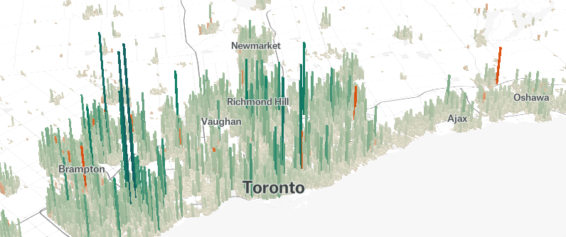
One of the most dramatic examples of robust growth is Toronto.
Canada’s largest city nearly doubled its population since 1990, and growth was distributed throughout the region. This city is a rare example of both extra-urban and downtown residential growth.
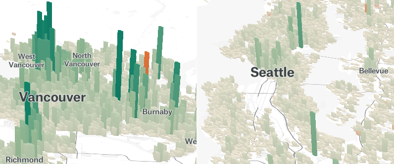
Vancouver is another Canadian city with a swelling urban population base. The city’s recent population growth has been heavily concentrated along transit lines and the downtown core, resulting in a “spiky” visualization which resembles the condo towers now dotting the city’s skyline.
Nearby, Seattle has added over a million people to its population since 1990. With one of the strongest economies in the country, it’s unlikely that momentum will slow any time soon.
Growing Suburbs
Only recently have some cities begun to see urban residential construction. For much of the ’90s and ’00s, America’s growth was in peripheral suburbs, where land was plentiful and cheap.
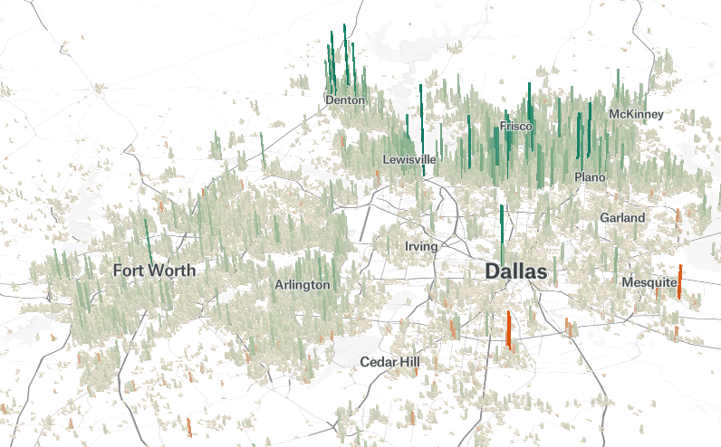
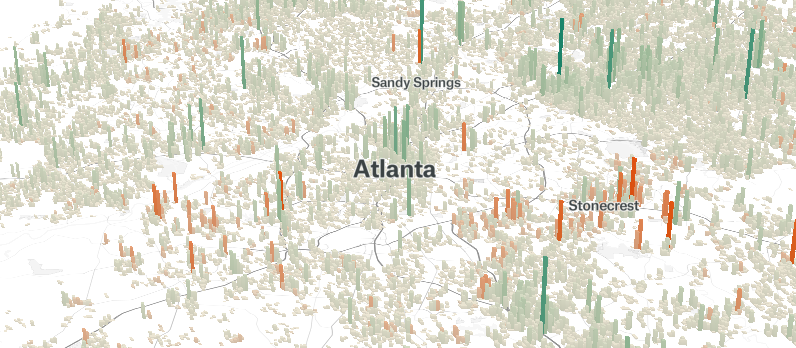
This sprawl effect is particularly easy to spot in the Texas Triangle – which encompasses the cities of San Antonio, Austin, Dallas–Fort Worth, and Houston – and Atlanta.
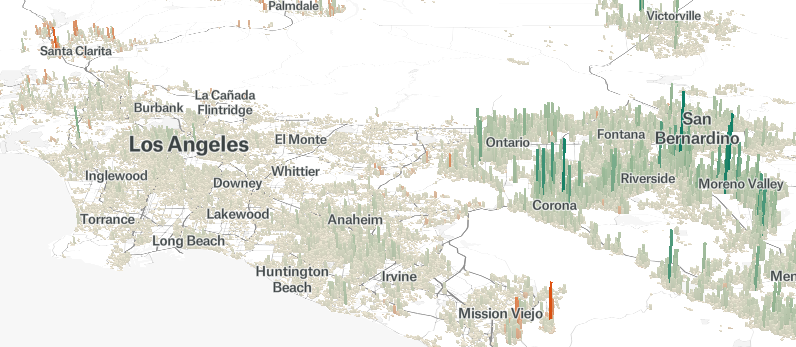
While Los Angeles did see a modest amount of growth over the past 25 years, it was the Inland Empire – anchored by San Bernardino and Riverside – that saw the most dramatic population growth in the region. The construction boom is only intensifying. The region added 50,000 new residents between 2016 and 2017.
Boomtowns
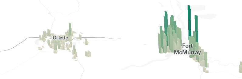
In general, smaller towns either lost population or remained relatively static. The exception is in places where resource extraction caused a growth spurt. Two prime examples are in Gillette, Wyoming, and Fort McMurray, Alberta. In the latter town, oil sands extraction added tens of thousands of new residents in a short amount of time.
Mixed growth and Static Cities
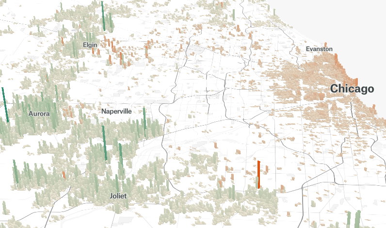
Chicago experienced one of the most striking growth patterns over the past 25 years. The contrast between urban decline and growth in the exurbs is clearly revealed in this visualization.
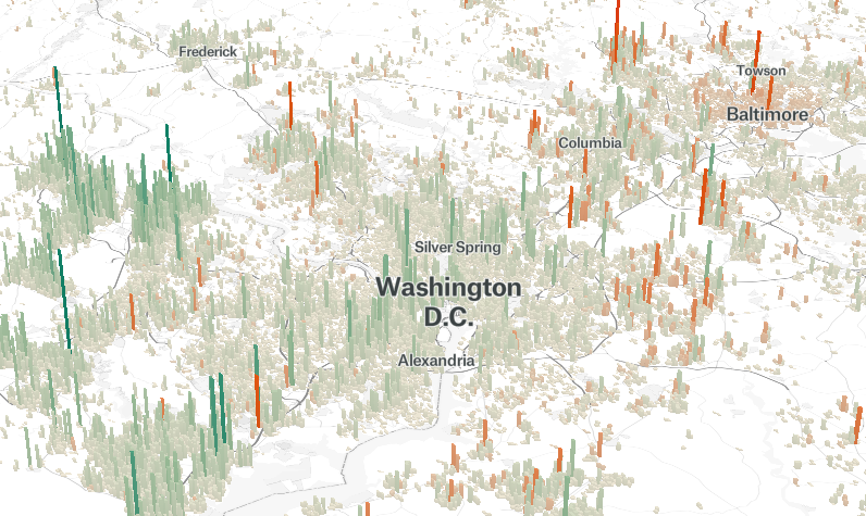
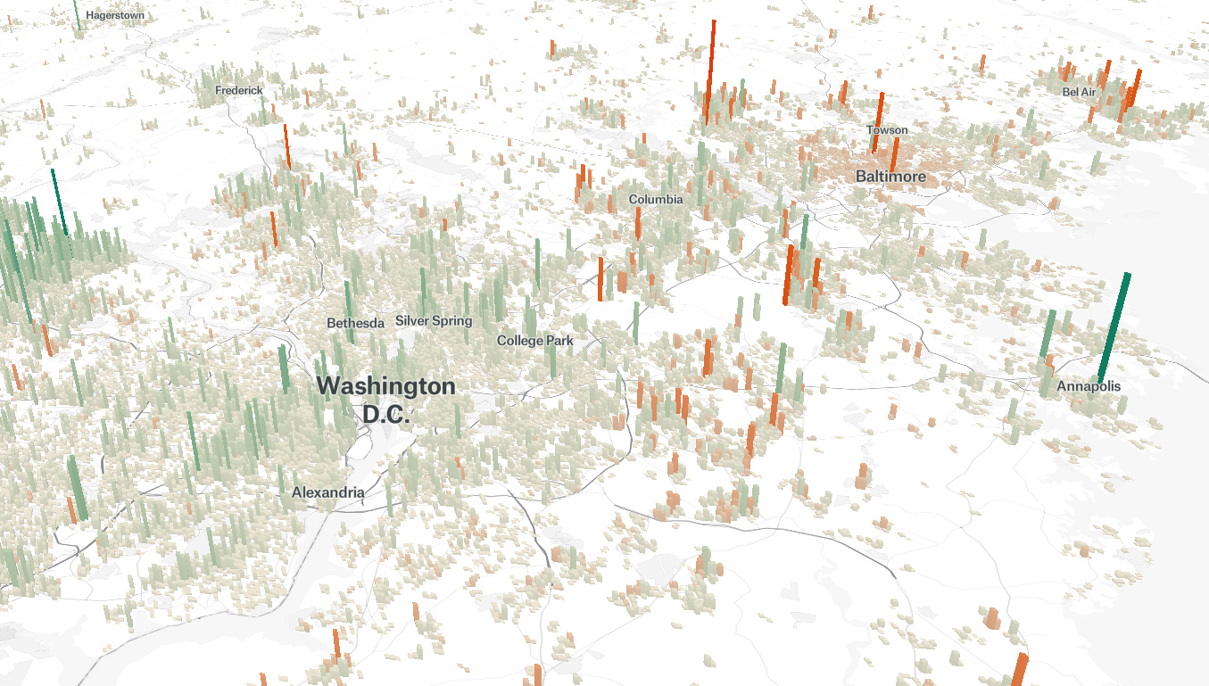
Contrast is also clear when looking at divergent patterns of Washington D.C. and Baltimore. The nation’s capital and surrounding areas have been growing steadily in recent years, whereas the neighboring city’s population is declining towards a 100-year low.
Static Cities
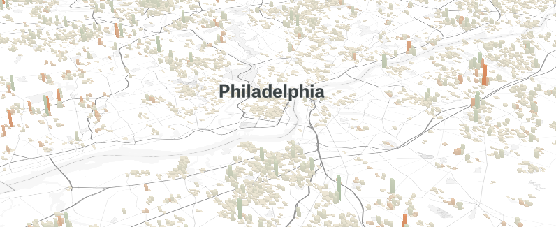
While a number of urban areas experienced dramatic shifts in the last couple of decades, some cities sidestepped wild population swings. For example, much of Philadelphia’s population pattern remains similar to what it was in 1990.
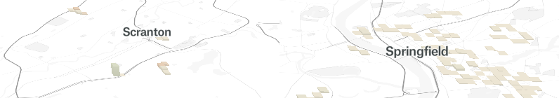
Scranton, Pennsylvania, and Springfield, Massachusetts, are examples of smaller cities that remained in stasis.
Decline and Disaster
A number of cities in America’s “Rust Belt” experienced declining populations. The visualizations of cities like Cleveland and Detroit show just how pronounced the exodus was.
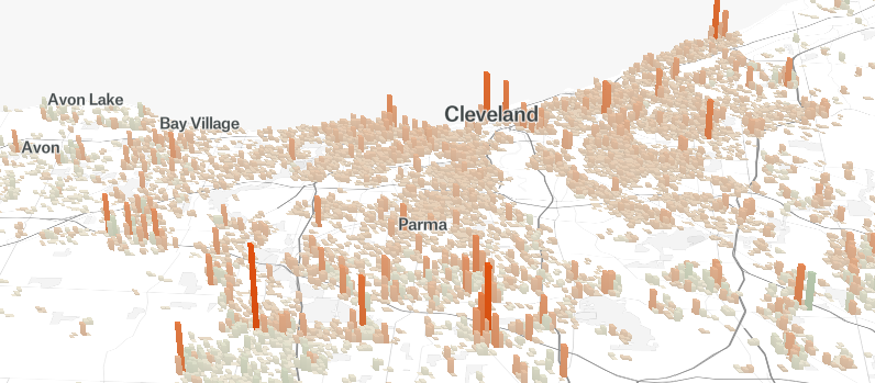
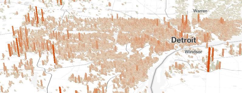
The shrinking tax base and glut of vacant homes is causing a number of problems in the two cities, and with mixed economic prospects, it’s unclear what the next 25 years will bring in terms of population changes.
Often, population declines are the result of economic reasons such as a decline in manufacturing or general stagnation. On occasion though, the raw power of nature changes the course of a city’s history. This is the case in New Orleans, were Hurricane Katrina’s legacy is clearly seen in this visualization.
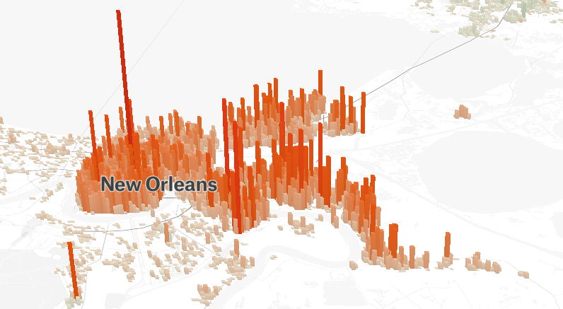
New Orleans did recover in the years after the hurricane. However, as of 2015, the city was still far below its pre-Katrina population. Resettlement has been patchy as well, which is reflected in the towering red peaks of the population map.
To explore your city or other parts of the world, visit The Pudding’s interactive map.


Demographics
The Smallest Gender Wage Gaps in OECD Countries
Which OECD countries have the smallest gender wage gaps? We look at the 10 countries with gaps lower than the average.

The Smallest Gender Pay Gaps in OECD Countries
This was originally posted on our Voronoi app. Download the app for free on iOS or Android and discover incredible data-driven charts from a variety of trusted sources.
Among the 38 member countries in the Organization for Economic Cooperation and Development (OECD), several have made significant strides in addressing income inequality between men and women.
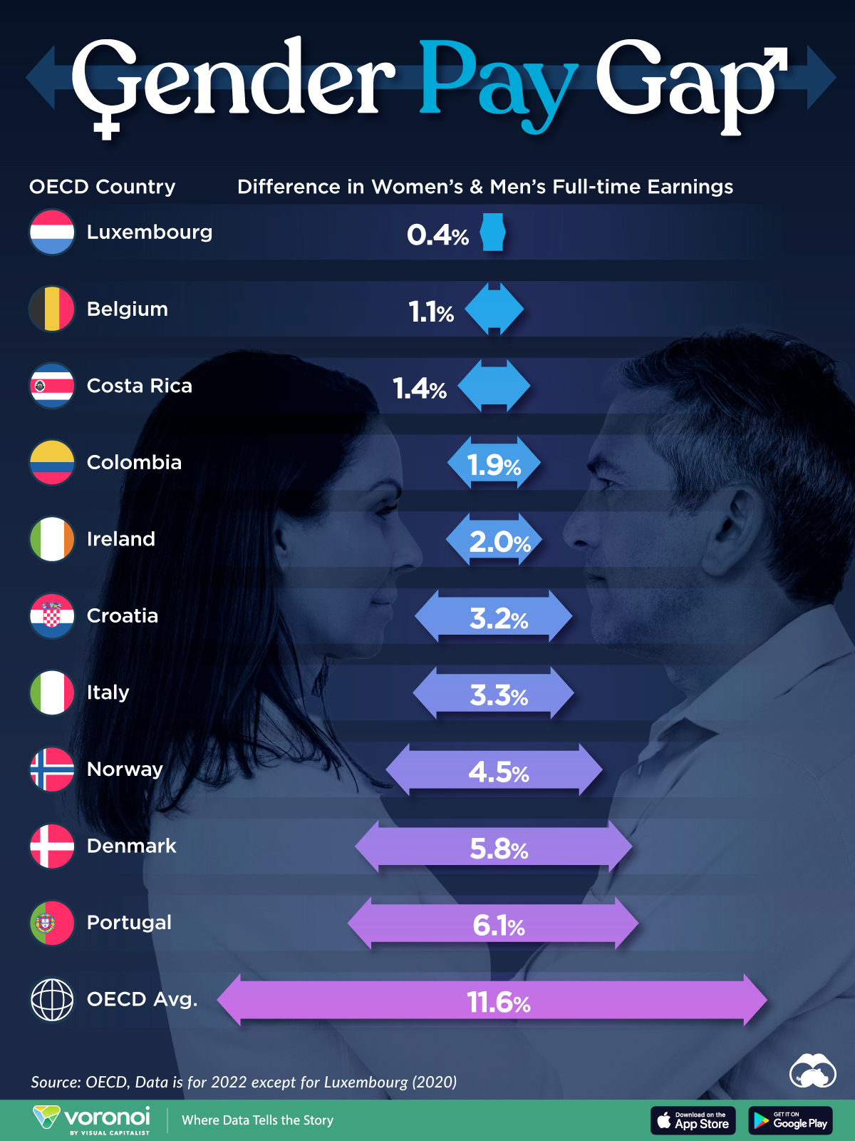
In this graphic we’ve ranked the OECD countries with the 10 smallest gender pay gaps, using the latest data from the OECD for 2022.
The gender pay gap is calculated as the difference between median full-time earnings for men and women divided by the median full-time earnings of men.
Which Countries Have the Smallest Gender Pay Gaps?
Luxembourg’s gender pay gap is the lowest among OECD members at only 0.4%—well below the OECD average of 11.6%.
| Rank | Country | Percentage Difference in Men's & Women's Full-time Earnings |
|---|---|---|
| 1 | 🇱🇺 Luxembourg | 0.4% |
| 2 | 🇧🇪 Belgium | 1.1% |
| 3 | 🇨🇷 Costa Rica | 1.4% |
| 4 | 🇨🇴 Colombia | 1.9% |
| 5 | 🇮🇪 Ireland | 2.0% |
| 6 | 🇭🇷 Croatia | 3.2% |
| 7 | 🇮🇹 Italy | 3.3% |
| 8 | 🇳🇴 Norway | 4.5% |
| 9 | 🇩🇰 Denmark | 5.8% |
| 10 | 🇵🇹 Portugal | 6.1% |
| OECD Average | 11.6% |
Notably, eight of the top 10 countries with the smallest gender pay gaps are located in Europe, as labor equality laws designed to target gender differences have begun to pay off.
The two other countries that made the list were Costa Rica (1.4%) and Colombia (1.9%), which came in third and fourth place, respectively.
How Did Luxembourg (Nearly) Eliminate its Gender Wage Gap?
Luxembourg’s virtually-non-existent gender wage gap in 2020 can be traced back to its diligent efforts to prioritize equal pay. Since 2016, firms that have not complied with the Labor Code’s equal pay laws have been subjected to penalizing fines ranging from €251 to €25,000.
Higher female education rates also contribute to the diminishing pay gap, with Luxembourg tied for first in the educational attainment rankings of the World Economic Forum’s Global Gender Gap Index Report for 2023.
See More Graphics about Demographics and Money
While these 10 countries are well below the OECD’s average gender pay gap of 11.6%, many OECD member countries including the U.S. are significantly above the average. To see the full list of the top 10 OECD countries with the largest gender pay gaps, check out this visualization.

-

 Green2 weeks ago
Ranked: Top Countries by Total Forest Loss Since 2001
-

 Travel1 week ago
Ranked: The World’s Top Flight Routes, by Revenue
-

 Technology2 weeks ago
Ranked: Semiconductor Companies by Industry Revenue Share
-

 Money2 weeks ago
Which States Have the Highest Minimum Wage in America?
-

 Real Estate2 weeks ago
Ranked: The Most Valuable Housing Markets in America
-

 Markets2 weeks ago
Charted: Big Four Market Share by S&P 500 Audits
-

 AI2 weeks ago
The Stock Performance of U.S. Chipmakers So Far in 2024
-

 Automotive2 weeks ago
Almost Every EV Stock is Down After Q1 2024