Markets
Mapped: The Salary Needed to Buy a Home in 50 U.S. Metro Areas
Check out the latest 2023 update of the salary needed to buy a home in the U.S.
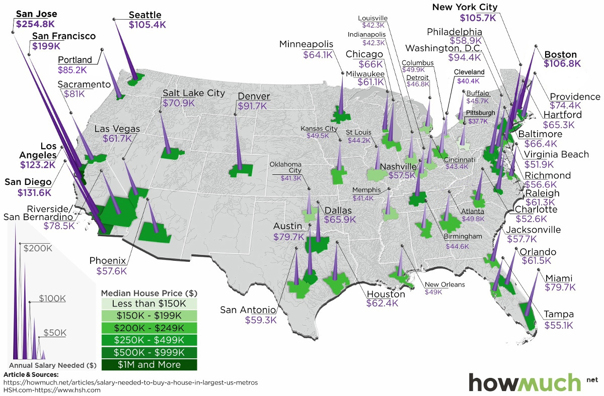
The Salary Needed to Buy a Home in 50 U.S. Metro Areas
Check out the latest 2023 update of the salary needed to buy a home in the U.S.
Over the last year, home prices have risen in 49 of the biggest 50 metro areas in the United States.
At the same time, mortgage rates have hit seven-year highs, making things more expensive for any prospective home buyer.
With this context in mind, today’s map comes from HowMuch.net, and it shows the salary needed to buy a home in the 50 largest U.S. metro areas.
The Least and Most Expensive Metro Areas
As a reference point, the median home in the United States costs about $257,600, according to the National Association of Realtors.
| Median Home Price | Montly Payment (PITI) | Salary Needed | |
|---|---|---|---|
| National | $257,600 | $1,433.91 | $61,453.51 |
With a 20% down payment and a 4.90% mortgage rate, and taking into account what’s needed to pay principal, interest, taxes, and insurance (PITI) on the home, it would mean a prospective buyer would need to have $61,453.51 in salary to afford such a purchase.
However, based on your frame of reference, this national estimate may seem extremely low or quite high. That’s because the salary required to buy in different major cities in the U.S. can fall anywhere between $37,659 to $254,835.
The 10 Cheapest Metro Areas
Here are the cheapest metro areas in the U.S., based on data and calculations from HSH.com:
| Rank | Metro Area | Median Home Price | Monthly Payment (PITI) | Salary Needed |
|---|---|---|---|---|
| #1 | Pittsburgh | $141,625 | $878.73 | $37,659.86 |
| #2 | Cleveland | $150,100 | $943.55 | $40,437.72 |
| #3 | Oklahoma City | $161,000 | $964.49 | $41,335.41 |
| #4 | Memphis | $174,000 | $966.02 | $41,400.93 |
| #5 | Indianapolis | $185,200 | $986.74 | $42,288.92 |
| #6 | Louisville | $180,100 | $987.54 | $42,323.15 |
| #7 | Cincinnati | $169,400 | $1,013.37 | $43,429.97 |
| #8 | St. Louis | $174,100 | $1,031.70 | $44,215.56 |
| #9 | Birmingham | $202,300 | $1,040.51 | $44,593.35 |
| #10 | Buffalo | $154,200 | $1,066.29 | $45,698.05 |
After the dust settles, Pittsburgh ranks as the cheapest metro area in the U.S. to buy a home. According to these calculations, buying a median home in Pittsburgh – which includes the surrounding metro area – requires an annual income of less than $40,000 to buy.
Just missing the list was Detroit, where a salary of $48,002.89 is needed.
The 10 Most Expensive Metro Areas
Now, here are the priciest markets in the country, also based on data from HSH.com:
| Rank | Metro Area | Median Home Price | Monthly Payment (PITI) | Salary Needed |
|---|---|---|---|---|
| #1 | San Jose | $1,250,000 | $5,946.17 | $254,835.73 |
| #2 | San Francisco | $952,200 | $4,642.82 | $198,978.01 |
| #3 | San Diego | $626,000 | $3,071.62 | $131,640.79 |
| #4 | Los Angeles | $576,100 | $2,873.64 | $123,156.01 |
| #5 | Boston | $460,300 | $2,491.76 | $106,789.93 |
| #6 | New York City | $403,900 | $2,465.97 | $105,684.33 |
| #7 | Seattle | $489,600 | $2,458.58 | $105,367.89 |
| #8 | Washington, D.C. | $417,400 | $2,202.87 | $94,408.70 |
| #9 | Denver | $438,300 | $2,139.02 | $91,672.45 |
| #10 | Portland | $389,000 | $1,987.37 | $85,173.08 |
Topping the list of the most expensive metro areas are San Jose and San Francisco, which are both cities fueled by the economic boom in Silicon Valley. Meanwhile, two other major metro areas in California, Los Angeles and San Diego, are not far behind.
New York City only ranks in sixth here, though it is worth noting that the NYC metro area extends well beyond the five boroughs. It includes Newark, Jersey City, and many nearby counties as well.
As a final point, it’s worth mentioning that all cities here (with the exception of Denver) are in coastal states.
Notes on Calculations
Data on median home prices comes from the National Association of Realtors and is based on 2018 Q4 information, while national mortgage rate data is derived from weekly surveys by Freddie Mac and the Mortgage Bankers Association of America for 30-year fixed rate mortgages.
Calculations include tax and homeowners insurance costs to determine the annual salary it takes to afford the base cost of owning a home (principal, interest, property tax and homeowner’s insurance, or PITI) in the nation’s 50 largest metropolitan areas.
Standard 28% “front-end” debt ratios and a 20% down payments subtracted from the median-home-price data are used to arrive at these figures.


Markets
U.S. Debt Interest Payments Reach $1 Trillion
U.S. debt interest payments have surged past the $1 trillion dollar mark, amid high interest rates and an ever-expanding debt burden.


U.S. Debt Interest Payments Reach $1 Trillion
This was originally posted on our Voronoi app. Download the app for free on iOS or Android and discover incredible data-driven charts from a variety of trusted sources.
The cost of paying for America’s national debt crossed the $1 trillion dollar mark in 2023, driven by high interest rates and a record $34 trillion mountain of debt.
Over the last decade, U.S. debt interest payments have more than doubled amid vast government spending during the pandemic crisis. As debt payments continue to soar, the Congressional Budget Office (CBO) reported that debt servicing costs surpassed defense spending for the first time ever this year.
This graphic shows the sharp rise in U.S. debt payments, based on data from the Federal Reserve.
A $1 Trillion Interest Bill, and Growing
Below, we show how U.S. debt interest payments have risen at a faster pace than at another time in modern history:
| Date | Interest Payments | U.S. National Debt |
|---|---|---|
| 2023 | $1.0T | $34.0T |
| 2022 | $830B | $31.4T |
| 2021 | $612B | $29.6T |
| 2020 | $518B | $27.7T |
| 2019 | $564B | $23.2T |
| 2018 | $571B | $22.0T |
| 2017 | $493B | $20.5T |
| 2016 | $460B | $20.0T |
| 2015 | $435B | $18.9T |
| 2014 | $442B | $18.1T |
| 2013 | $425B | $17.2T |
| 2012 | $417B | $16.4T |
| 2011 | $433B | $15.2T |
| 2010 | $400B | $14.0T |
| 2009 | $354B | $12.3T |
| 2008 | $380B | $10.7T |
| 2007 | $414B | $9.2T |
| 2006 | $387B | $8.7T |
| 2005 | $355B | $8.2T |
| 2004 | $318B | $7.6T |
| 2003 | $294B | $7.0T |
| 2002 | $298B | $6.4T |
| 2001 | $318B | $5.9T |
| 2000 | $353B | $5.7T |
| 1999 | $353B | $5.8T |
| 1998 | $360B | $5.6T |
| 1997 | $368B | $5.5T |
| 1996 | $362B | $5.3T |
| 1995 | $357B | $5.0T |
| 1994 | $334B | $4.8T |
| 1993 | $311B | $4.5T |
| 1992 | $306B | $4.2T |
| 1991 | $308B | $3.8T |
| 1990 | $298B | $3.4T |
| 1989 | $275B | $3.0T |
| 1988 | $254B | $2.7T |
| 1987 | $240B | $2.4T |
| 1986 | $225B | $2.2T |
| 1985 | $219B | $1.9T |
| 1984 | $205B | $1.7T |
| 1983 | $176B | $1.4T |
| 1982 | $157B | $1.2T |
| 1981 | $142B | $1.0T |
| 1980 | $113B | $930.2B |
| 1979 | $96B | $845.1B |
| 1978 | $84B | $789.2B |
| 1977 | $69B | $718.9B |
| 1976 | $61B | $653.5B |
| 1975 | $55B | $576.6B |
| 1974 | $50B | $492.7B |
| 1973 | $45B | $469.1B |
| 1972 | $39B | $448.5B |
| 1971 | $36B | $424.1B |
| 1970 | $35B | $389.2B |
| 1969 | $30B | $368.2B |
| 1968 | $25B | $358.0B |
| 1967 | $23B | $344.7B |
| 1966 | $21B | $329.3B |
Interest payments represent seasonally adjusted annual rate at the end of Q4.
At current rates, the U.S. national debt is growing by a remarkable $1 trillion about every 100 days, equal to roughly $3.6 trillion per year.
As the national debt has ballooned, debt payments even exceeded Medicaid outlays in 2023—one of the government’s largest expenditures. On average, the U.S. spent more than $2 billion per day on interest costs last year. Going further, the U.S. government is projected to spend a historic $12.4 trillion on interest payments over the next decade, averaging about $37,100 per American.
Exacerbating matters is that the U.S. is running a steep deficit, which stood at $1.1 trillion for the first six months of fiscal 2024. This has accelerated due to the 43% increase in debt servicing costs along with a $31 billion dollar increase in defense spending from a year earlier. Additionally, a $30 billion increase in funding for the Federal Deposit Insurance Corporation in light of the regional banking crisis last year was a major contributor to the deficit increase.
Overall, the CBO forecasts that roughly 75% of the federal deficit’s increase will be due to interest costs by 2034.

-

 Real Estate2 weeks ago
Visualizing America’s Shortage of Affordable Homes
-

 Technology1 week ago
Ranked: Semiconductor Companies by Industry Revenue Share
-

 Money2 weeks ago
Which States Have the Highest Minimum Wage in America?
-

 Real Estate2 weeks ago
Ranked: The Most Valuable Housing Markets in America
-

 Markets2 weeks ago
Charted: Big Four Market Share by S&P 500 Audits
-

 AI2 weeks ago
The Stock Performance of U.S. Chipmakers So Far in 2024
-

 Automotive2 weeks ago
Almost Every EV Stock is Down After Q1 2024
-

 Money2 weeks ago
Where Does One U.S. Tax Dollar Go?