Markets
30 Years of Gun Manufacturing in America


30 Years of Gun Manufacturing in America
While gun sales have been brisk in recent years, the uncertainty surrounding COVID-19 was a boon for the gun industry.
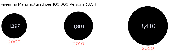
From 2010-2019, an average of 13 million guns were sold legally in the U.S. each year. In 2020 and 2021, annual gun sales sharply increased to 20 million.
While the U.S. does import millions of weapons each year, a large amount of firearms sold in the country were produced domestically. Let’s dig into the data behind the multi-billion dollar gun manufacturing industry in America.
Gun Manufacturing in the United States
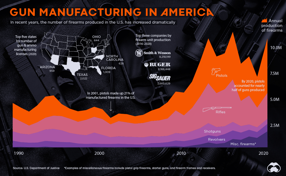
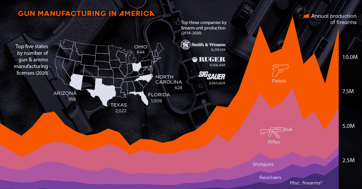
According to a recent report from the Bureau of Alcohol, Tobacco, Firearms and Explosives (ATF), the U.S. has produced nearly 170 million firearms over the past three decades, with production increasing sharply in recent years.
America’s gunmakers produce a wide variety of firearms, but they’re generally grouped into five categories; pistols, rifles, shotguns, revolvers, and everything else.
Below is a breakdown of firearms manufactured in the country over the past 30 years, by type:
| Year | Pistols | Rifles | Revolvers | Shotguns | Misc. Firearms | Total Firearms |
|---|---|---|---|---|---|---|
| 1989 | 1,404,753 | 1,407,400 | 628,573 | 935,541 | 42,126 | 4,418,393 |
| 1990 | 1,371,427 | 1,211,664 | 470,495 | 848,948 | 57,434 | 3,959,968 |
| 1991 | 1,378,252 | 883,482 | 456,966 | 828,426 | 15,980 | 3,563,106 |
| 1992 | 1,669,537 | 1,001,833 | 469,413 | 1,018,204 | 16,849 | 4,175,836 |
| 1993 | 2,093,362 | 1,173,694 | 562,292 | 1,144,940 | 81,349 | 5,055,637 |
| 1994 | 2,004,298 | 1,316,607 | 586,450 | 1,254,926 | 10,936 | 5,173,217 |
| 1995 | 1,195,284 | 1,411,120 | 527,664 | 1,173,645 | 8,629 | 4,316,342 |
| 1996 | 987,528 | 1,424,315 | 498,944 | 925,732 | 17,920 | 3,854,439 |
| 1997 | 1,036,077 | 1,251,341 | 370,428 | 915,978 | 19,680 | 3,593,504 |
| 1998 | 960,365 | 1,535,690 | 324,390 | 868,639 | 24,506 | 3,713,590 |
| 1999 | 995,446 | 1,569,685 | 335,784 | 1,106,995 | 39,837 | 4,047,747 |
| 2000 | 962,901 | 1,583,042 | 318,960 | 898,442 | 30,196 | 3,793,541 |
| 2001 | 626,836 | 1,284,554 | 320,143 | 679,813 | 21,309 | 2,932,655 |
| 2002 | 741,514 | 1,515,286 | 347,070 | 741,325 | 21,700 | 3,366,895 |
| 2003 | 811,660 | 1,430,324 | 309,364 | 726,078 | 30,978 | 3,308,404 |
| 2004 | 728,511 | 1,325,138 | 294,099 | 731,769 | 19,508 | 3,099,025 |
| 2005 | 803,425 | 1,431,372 | 274,205 | 709,313 | 23,179 | 3,241,494 |
| 2006 | 1,021,260 | 1,496,505 | 385,069 | 714,618 | 35,872 | 3,653,324 |
| 2007 | 1,219,664 | 1,610,923 | 391,334 | 645,231 | 55,461 | 3,922,613 |
| 2008 | 1,609,381 | 1,734,536 | 431,753 | 630,710 | 92,564 | 4,498,944 |
| 2009 | 1,868,258 | 2,248,851 | 547,195 | 752,699 | 138,815 | 5,555,818 |
| 2010 | 2,258,450 | 1,830,556 | 558,927 | 743,378 | 67,929 | 5,459,240 |
| 2011 | 2,598,133 | 2,318,088 | 572,857 | 862,401 | 190,407 | 6,541,886 |
| 2012 | 3,487,883 | 3,168,206 | 667,357 | 949,010 | 306,154 | 8,578,610 |
| 2013 | 4,441,726 | 3,979,570 | 725,282 | 1,203,072 | 495,142 | 10,844,792 |
| 2014 | 3,633,454 | 3,379,549 | 744,047 | 935,411 | 358,165 | 9,050,626 |
| 2015 | 3,557,199 | 3,691,799 | 885,259 | 777,273 | 447,131 | 9,358,661 |
| 2016 | 4,720,075 | 4,239,335 | 856,291 | 848,617 | 833,123 | 11,497,441 |
| 2017 | 3,691,010 | 2,504,092 | 720,917 | 653,139 | 758,634 | 8,327,792 |
| 2018 | 3,881,158 | 2,880,536 | 664,835 | 536,126 | 1,089,973 | 9,052,628 |
| 2019 | 3,046,013 | 1,957,667 | 580,601 | 480,735 | 946,929 | 7,011,945 |
| Total | 60,804,840 | 59,796,760 | 15,826,964 | 26,241,134 | 6,298,415 | 168,968,113 |
Pistols (36%) and rifles (35%) are the dominant categories, and over time, the former has become the most commonly produced firearm type.
In 2001, pistols accounted for 21% of firearms produced. Today, nearly half of all firearms produced are pistols.
Who is Producing America’s Firearms?
There are a wide variety of firearm manufacturing companies in the U.S., but production is dominated by a few key players.
Here are the top 10 gunmakers in America, which collectively make up 70% of production:
| Rank | Firearm Manufacturer | Guns Produced (2016-2020) | Share of total |
|---|---|---|---|
| 1 | Smith & Wesson Corp | 8,218,199 | 17.2% |
| 2 | Sturm, Ruger & Company, Inc | 8,166,448 | 17.1% |
| 3 | Sig Sauer Inc | 3,660,629 | 7.7% |
| 4 | Freedom Group | 3,045,427 | 6.4% |
| 5 | 0 F Mossberg & Sons Inc | 2,223,241 | 4.7% |
| 6 | Taurus International Manufacturing | 1,996,121 | 4.2% |
| 7 | WM C Anderson Inc | 1,816,625 | 3.8% |
| 8 | Glock Inc | 1,510,437 | 3.2% |
| 9 | Henry RAC Holding Corp | 1,378,544 | 2.9% |
| 10 | JIE Capital Holdings / Enterprises | 1,258,969 | 2.6% |
| Total | 33,274,640 | 69.7% |
One-third of production comes from two publicly-traded parent companies: Smith & Wesson (NASDAQ: SWBI), and Sturm, Ruger & Co. (NYSE: RGR)
Some of these players are especially dominant within certain types of firearms. For example:
- 58% of pistols were made by Smith & Wesson, Ruger, and SIG SAUER (2008–2018)
- 45% of rifles were made by Remington*, Ruger, and Smith & Wesson (2008–2018)
*In 2020, Remington filed for Chapter 11 bankruptcy protection, and its assets were divided and sold to various buyers. The Remington brand name is now owned by Vista Outdoor (NYSE: VSTO)
The Geography of Gun Manufacturing
Companies that manufacture guns hold a Type 07 license from the ATF. As of 2020, there are more than 16,000 Type 07 licensees across the United States.
Below is a state-level look at where the country’s licensees are located:
| State | Licenses (2000) | Licenses (2020) | Population | Licenses per 100,000 pop. (2020) |
|---|---|---|---|---|
| Alaska | 8 | 117 | 733,391 | 16.0 |
| Alabama | 40 | 276 | 5,039,877 | 5.5 |
| Arkansas | 28 | 302 | 3,011,524 | 10.0 |
| Arizona | 100 | 959 | 7,276,316 | 13.2 |
| California | 159 | 620 | 39,237,836 | 1.6 |
| Colorado | 27 | 481 | 5,812,069 | 8.3 |
| Connecticut | 71 | 194 | 3,605,944 | 5.4 |
| Delaware | 0 | 10 | 989,948 | 1.0 |
| Florida | 131 | 1,009 | 21,781,128 | 4.6 |
| Georgia | 52 | 510 | 10,799,566 | 4.7 |
| Hawaii | 0 | 11 | 1,455,271 | 0.8 |
| Iowa | 11 | 187 | 3,190,369 | 5.9 |
| Idaho | 38 | 358 | 1,839,106 | 19.5 |
| Illinois | 40 | 263 | 12,671,469 | 2.1 |
| Indiana | 39 | 280 | 6,805,985 | 4.1 |
| Kansas | 17 | 229 | 2,937,880 | 7.8 |
| Kentucky | 22 | 211 | 4,505,836 | 4.7 |
| Louisiana | 20 | 258 | 4,657,757 | 5.5 |
| Massachusetts | 67 | 263 | 6,984,723 | 3.8 |
| Maryland | 36 | 146 | 6,165,129 | 2.4 |
| Maine | 13 | 107 | 1,362,359 | 7.9 |
| Michigan | 43 | 386 | 10,050,811 | 3.8 |
| Minnesota | 63 | 254 | 5,707,390 | 4.5 |
| Missouri | 62 | 401 | 6,168,187 | 6.5 |
| Mississippi | 12 | 190 | 2,961,279 | 6.4 |
| Montana | 24 | 240 | 1,084,225 | 22.1 |
| North Carolina | 52 | 628 | 10,551,162 | 6.0 |
| North Dakota | 3 | 46 | 779,094 | 5.9 |
| Nebraska | 15 | 91 | 1,961,504 | 4.6 |
| New Hampshire | 25 | 188 | 1,377,529 | 13.6 |
| New Jersey | 10 | 26 | 9,267,130 | 0.3 |
| New Mexico | 18 | 179 | 2,117,522 | 8.5 |
| Nevada | 45 | 276 | 3,104,614 | 8.9 |
| New York | 35 | 299 | 19,835,913 | 1.5 |
| Ohio | 80 | 644 | 11,780,017 | 5.5 |
| Oklahoma | 37 | 423 | 3,959,353 | 10.7 |
| Oregon | 55 | 226 | 4,237,256 | 5.3 |
| Pennsylvania | 87 | 519 | 12,964,056 | 4.0 |
| Rhode Island | 1 | 20 | 1,097,379 | 1.8 |
| South Carolina | 25 | 284 | 5,190,705 | 5.5 |
| South Dakota | 14 | 79 | 886,667 | 8.9 |
| Tennessee | 76 | 352 | 6,975,218 | 5.0 |
| Texas | 150 | 2,022 | 29,527,941 | 6.8 |
| Utah | 33 | 478 | 3,271,616 | 14.6 |
| Virginia | 48 | 412 | 8,642,274 | 4.8 |
| Vermont | 15 | 85 | 643,077 | 13.2 |
| Washington | 49 | 351 | 7,738,692 | 4.5 |
| Wisconsin | 38 | 306 | 5,895,908 | 5.2 |
| West Virginia | 20 | 115 | 1,793,716 | 6.4 |
| Wyoming | 20 | 147 | 576,851 | 25.5 |
These manufacturers are located all around the country, so these numbers are somewhat reflective of population. Unsurprisingly, large states like Texas and Florida have the most licensees.
Sorting by the number of licensees per 100,000 people offers a different point of view. By this measure, Wyoming, Montana, and Idaho come out on top.
If recent sales and production trends are any indication, these numbers may only continue to grow.


Markets
U.S. Debt Interest Payments Reach $1 Trillion
U.S. debt interest payments have surged past the $1 trillion dollar mark, amid high interest rates and an ever-expanding debt burden.


U.S. Debt Interest Payments Reach $1 Trillion
This was originally posted on our Voronoi app. Download the app for free on iOS or Android and discover incredible data-driven charts from a variety of trusted sources.
The cost of paying for America’s national debt crossed the $1 trillion dollar mark in 2023, driven by high interest rates and a record $34 trillion mountain of debt.
Over the last decade, U.S. debt interest payments have more than doubled amid vast government spending during the pandemic crisis. As debt payments continue to soar, the Congressional Budget Office (CBO) reported that debt servicing costs surpassed defense spending for the first time ever this year.
This graphic shows the sharp rise in U.S. debt payments, based on data from the Federal Reserve.
A $1 Trillion Interest Bill, and Growing
Below, we show how U.S. debt interest payments have risen at a faster pace than at another time in modern history:
| Date | Interest Payments | U.S. National Debt |
|---|---|---|
| 2023 | $1.0T | $34.0T |
| 2022 | $830B | $31.4T |
| 2021 | $612B | $29.6T |
| 2020 | $518B | $27.7T |
| 2019 | $564B | $23.2T |
| 2018 | $571B | $22.0T |
| 2017 | $493B | $20.5T |
| 2016 | $460B | $20.0T |
| 2015 | $435B | $18.9T |
| 2014 | $442B | $18.1T |
| 2013 | $425B | $17.2T |
| 2012 | $417B | $16.4T |
| 2011 | $433B | $15.2T |
| 2010 | $400B | $14.0T |
| 2009 | $354B | $12.3T |
| 2008 | $380B | $10.7T |
| 2007 | $414B | $9.2T |
| 2006 | $387B | $8.7T |
| 2005 | $355B | $8.2T |
| 2004 | $318B | $7.6T |
| 2003 | $294B | $7.0T |
| 2002 | $298B | $6.4T |
| 2001 | $318B | $5.9T |
| 2000 | $353B | $5.7T |
| 1999 | $353B | $5.8T |
| 1998 | $360B | $5.6T |
| 1997 | $368B | $5.5T |
| 1996 | $362B | $5.3T |
| 1995 | $357B | $5.0T |
| 1994 | $334B | $4.8T |
| 1993 | $311B | $4.5T |
| 1992 | $306B | $4.2T |
| 1991 | $308B | $3.8T |
| 1990 | $298B | $3.4T |
| 1989 | $275B | $3.0T |
| 1988 | $254B | $2.7T |
| 1987 | $240B | $2.4T |
| 1986 | $225B | $2.2T |
| 1985 | $219B | $1.9T |
| 1984 | $205B | $1.7T |
| 1983 | $176B | $1.4T |
| 1982 | $157B | $1.2T |
| 1981 | $142B | $1.0T |
| 1980 | $113B | $930.2B |
| 1979 | $96B | $845.1B |
| 1978 | $84B | $789.2B |
| 1977 | $69B | $718.9B |
| 1976 | $61B | $653.5B |
| 1975 | $55B | $576.6B |
| 1974 | $50B | $492.7B |
| 1973 | $45B | $469.1B |
| 1972 | $39B | $448.5B |
| 1971 | $36B | $424.1B |
| 1970 | $35B | $389.2B |
| 1969 | $30B | $368.2B |
| 1968 | $25B | $358.0B |
| 1967 | $23B | $344.7B |
| 1966 | $21B | $329.3B |
Interest payments represent seasonally adjusted annual rate at the end of Q4.
At current rates, the U.S. national debt is growing by a remarkable $1 trillion about every 100 days, equal to roughly $3.6 trillion per year.
As the national debt has ballooned, debt payments even exceeded Medicaid outlays in 2023—one of the government’s largest expenditures. On average, the U.S. spent more than $2 billion per day on interest costs last year. Going further, the U.S. government is projected to spend a historic $12.4 trillion on interest payments over the next decade, averaging about $37,100 per American.
Exacerbating matters is that the U.S. is running a steep deficit, which stood at $1.1 trillion for the first six months of fiscal 2024. This has accelerated due to the 43% increase in debt servicing costs along with a $31 billion dollar increase in defense spending from a year earlier. Additionally, a $30 billion increase in funding for the Federal Deposit Insurance Corporation in light of the regional banking crisis last year was a major contributor to the deficit increase.
Overall, the CBO forecasts that roughly 75% of the federal deficit’s increase will be due to interest costs by 2034.

-

 Real Estate2 weeks ago
Visualizing America’s Shortage of Affordable Homes
-

 Technology1 week ago
Ranked: Semiconductor Companies by Industry Revenue Share
-

 Money1 week ago
Which States Have the Highest Minimum Wage in America?
-

 Real Estate1 week ago
Ranked: The Most Valuable Housing Markets in America
-

 Business2 weeks ago
Charted: Big Four Market Share by S&P 500 Audits
-

 AI2 weeks ago
The Stock Performance of U.S. Chipmakers So Far in 2024
-

 Misc2 weeks ago
Almost Every EV Stock is Down After Q1 2024
-

 Money2 weeks ago
Where Does One U.S. Tax Dollar Go?