Markets
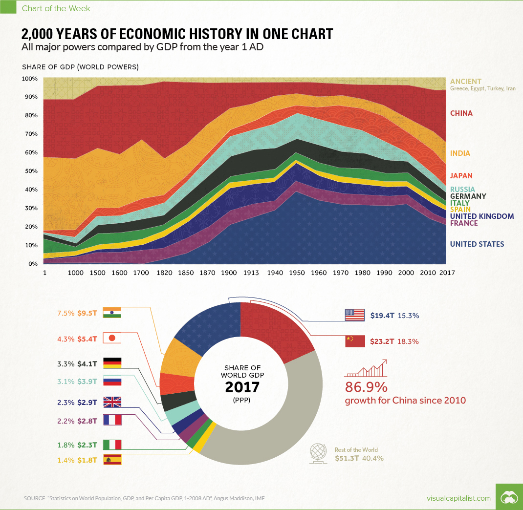
2,000 Years of Economic History in One Chart
Over 2,000 Years of Economic History in One Chart
All major powers compared by GDP from the year 1 AD
The Chart of the Week is a weekly Visual Capitalist feature on Fridays.
Long before the invention of modern day maps or gunpowder, the planet’s major powers were already duking it out for economic and geopolitical supremacy.
Today’s chart tells that story in the simplest terms possible. By showing the changing share of the global economy for each country from 1 AD until now, it compares economic productivity over a mind-boggling time period.
Originally published in a research letter by Michael Cembalest of JP Morgan, we’ve updated it based on the most recent data and projections from the IMF. If you like, you can still find the original chart (which goes to 2008) at The Atlantic. It’s also worth noting that the original source for all the data up until 2008 is from the late Angus Maddison, a famous economic historian that published estimates on population, GDP, and other figures going back to Roman times.
A Major Caveat
If you looked at the chart in any depth, you probably noticed a big problem with it. The time periods between data points aren’t equal – in fact, they are not close at all.
The first gap on the x-axis is 1,000 years and the second is 500 years. Then, as we get closer to modernity, the chart uses mostly 10 year intervals. Changing the scale like this is a big data visualization “no no”, as rightly pointed out in a blog post by The Economist.
While we completely agree, we have a made an exception in this case. Why? Because getting good economic data from the early 20th century is already difficult enough – and so trying to find data in regular intervals before then seems like a fool’s errand. Likewise, a stacked bar chart with different years also doesn’t really do this story justice.
We encountered similar historical data issues in our Richest People of Human History graphic, and at the end of the day decided it was primarily for fun. Like today’s chart, it has its share of imperfections – but ultimately, it provides a great amount of context and serves as a conversation starter.
Our Interpretation
Caveats aside, there are many stories that materialize from this simple chart. They include the colossal impact of the Industrial Revolution on the West, as well as the momentum behind the re-emergence of Asia.
But there’s one other story that ties it all together: the exponential rate of human economic growth that occurred over the last century.
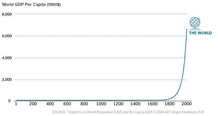
For thousands of years, economic progress was largely linear and linked to population growth. Without machines or technological innovations, one person could only produce so much with their time and resources.
More recently, innovations in technology and energy allowed the “hockey stick” effect to come into play.
It happened in Western Europe and North America first, and now it’s happening in other parts of the world. As this technological playing field evens, economies like China and India – traditionally some of the largest economies throughout history – are now making their big comeback.
Editor’s note: We have adjusted the main graphic as of Sep 10, 2017 to change the description of the chart. It now says “Share of GDP (World Powers)” instead of the previous “Share of world GDP”, which was technically an inaccurate description.


Markets
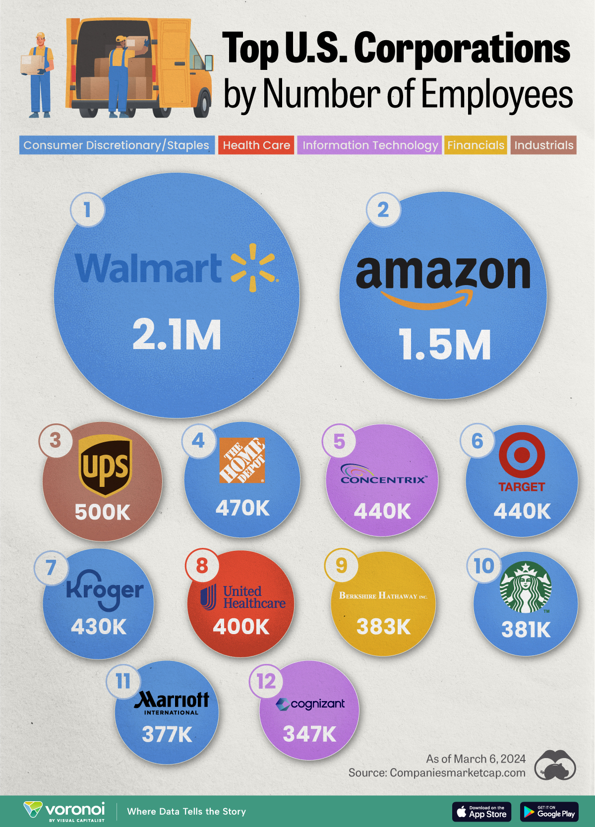
Ranked: The Largest U.S. Corporations by Number of Employees
We visualized the top U.S. companies by employees, revealing the massive scale of retailers like Walmart, Target, and Home Depot.
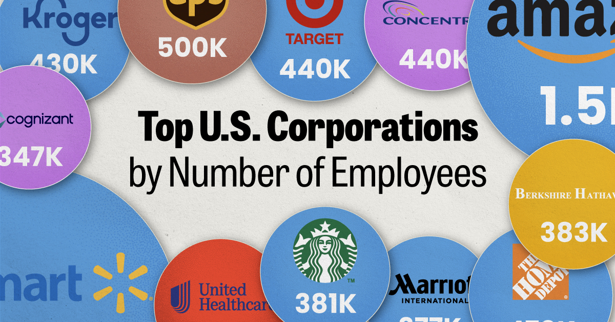
The Largest U.S. Corporations by Number of Employees
This was originally posted on our Voronoi app. Download the app for free on Apple or Android and discover incredible data-driven charts from a variety of trusted sources.
Revenue and profit are common measures for measuring the size of a business, but what about employee headcount?
To see how big companies have become from a human perspective, we’ve visualized the top U.S. companies by employees. These figures come from companiesmarketcap.com, and were accessed in March 2024. Note that this ranking includes publicly-traded companies only.
Data and Highlights
The data we used to create this list of largest U.S. corporations by number of employees can be found in the table below.
| Company | Sector | Number of Employees |
|---|---|---|
| Walmart | Consumer Staples | 2,100,000 |
| Amazon | Consumer Discretionary | 1,500,000 |
| UPS | Industrials | 500,000 |
| Home Depot | Consumer Discretionary | 470,000 |
| Concentrix | Information Technology | 440,000 |
| Target | Consumer Staples | 440,000 |
| Kroger | Consumer Staples | 430,000 |
| UnitedHealth | Health Care | 400,000 |
| Berkshire Hathaway | Financials | 383,000 |
| Starbucks | Consumer Discretionary | 381,000 |
| Marriott International | Consumer Discretionary | 377,000 |
| Cognizant | Information Technology | 346,600 |
Retail and Logistics Top the List
Companies like Walmart, Target, and Kroger have a massive headcount due to having many locations spread across the country, which require everything from cashiers to IT professionals.
Moving goods around the world is also highly labor intensive, explaining why UPS has half a million employees globally.
Below the Radar?
Two companies that rank among the largest U.S. corporations by employees which may be less familiar to the public include Concentrix and Cognizant. Both of these companies are B2B brands, meaning they primarily work with other companies rather than consumers. This contrasts with brands like Amazon or Home Depot, which are much more visible among average consumers.
A Note on Berkshire Hathaway
Warren Buffett’s company doesn’t directly employ 383,000 people. This headcount actually includes the employees of the firm’s many subsidiaries, such as GEICO (insurance), Dairy Queen (retail), and Duracell (batteries).
If you’re curious to see how Buffett’s empire has grown over the years, check out this animated graphic that visualizes the growth of Berkshire Hathaway’s portfolio from 1994 to 2022.

-
 Business2 weeks ago
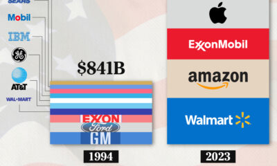
America’s Top Companies by Revenue (1994 vs. 2023)
-

 Environment1 week ago
Ranked: Top Countries by Total Forest Loss Since 2001
-

 Real Estate1 week ago
Visualizing America’s Shortage of Affordable Homes
-

 Maps2 weeks ago
Mapped: Average Wages Across Europe
-

 Mining2 weeks ago
Charted: The Value Gap Between the Gold Price and Gold Miners
-

 Demographics2 weeks ago
Visualizing the Size of the Global Senior Population
-

 Misc2 weeks ago
Tesla Is Once Again the World’s Best-Selling EV Company
-

 Technology2 weeks ago
Ranked: The Most Popular Smartphone Brands in the U.S.