Money
Chart: 14% of Americans Have Negative Wealth
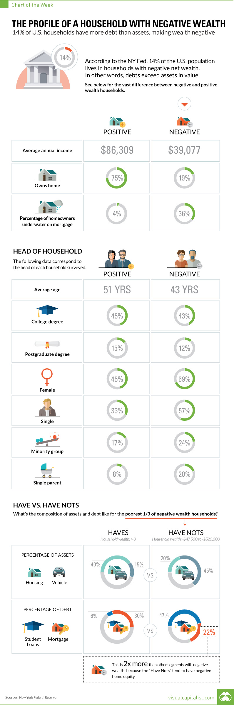
Chart: The Profile of a House With Negative Wealth
14% of all U.S. Households Have More Debts Than Assets
The Chart of the Week is a weekly Visual Capitalist feature on Fridays.
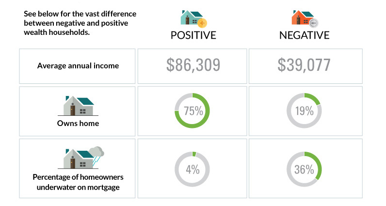
According to the New York Federal Reserve, 14% of the U.S. population lives in households that have “negative” wealth. In other words, these are households that have more debts piled up than assets, which puts their net worth in minus territory.
But what does a negative wealth household look like?
In today’s chart, we compare the data on negative wealth households with the data on their positive counterparts. There are some obvious and stark contrasts.
Positive vs. Negative Households
At the household level, the differences are probably what you would expect.
Negative wealth households bring in $39,077 in annual income, and only 19% of these families own their home. More than one-third (36%) of these mortgages are underwater.
Meanwhile, positive wealth households bring in $86,309 in annual income, and 75% of the families own their home. Only 4% of the mortgages are underwater.
The Head of the Household
For each of these households, we have data on the person that is the head of the household, or the breadwinner for each family.
In terms of education, there isn’t a big difference between the heads of negative and positive wealth households. Both seem to be similarly accomplished in terms of achieving college degrees (43% vs. 45%) and postgraduate degrees (12% vs. 15%).
However, there are greater differences when it comes to demographic profiles.
Negative wealth households have heads that are younger (43 vs. 51 years old), female (69% vs. 45%), and single (57% vs. 33%). There is also a higher proportion of minorities (24% vs. 17%) and single parents (20% vs. 7%) living in negative wealth households.
The Have and Have Nots
We also wanted to see the difference in composition of both assets and debts.
In this case, we are comparing the poorest third of those with negative wealth (-$47,500 to -$520,000) to those with positive wealth.
Households that are deep in the red have the majority of their wealth in the family car – automobiles make up 45% of the value of their total assets. Housing makes up 20% of their assets by value. For positive wealth households, it is the reverse: 40% of wealth is in the home, and 15% in vehicles.
The composition of debt is also very telling. Negative wealth households have a whopping 47% of debt in student loans, while positive houses have just 6%.


Money
How Debt-to-GDP Ratios Have Changed Since 2000
See how much the debt-to-GDP ratios of advanced economies have grown (or shrank) since the year 2000.


How Debt-to-GDP Ratios Have Changed Since 2000
This was originally posted on our Voronoi app. Download the app for free on Apple or Android and discover incredible data-driven charts from a variety of trusted sources.
Government debt levels have grown in most parts of the world since the 2008 financial crisis, and even more so after the COVID-19 pandemic.
To gain perspective on this long-term trend, we’ve visualized the debt-to-GDP ratios of advanced economies, as of 2000 and 2024 (estimated). All figures were sourced from the IMF’s World Economic Outlook.
Data and Highlights
The data we used to create this graphic is listed in the table below. “Government gross debt” consists of all liabilities that require payment(s) of interest and/or principal in the future.
| Country | 2000 (%) | 2024 (%) | Change (pp) |
|---|---|---|---|
| 🇯🇵 Japan | 135.6 | 251.9 | +116.3 |
| 🇸🇬 Singapore | 82.3 | 168.3 | +86.0 |
| 🇺🇸 United States | 55.6 | 126.9 | +71.3 |
| 🇬🇧 United Kingdom | 36.6 | 105.9 | +69.3 |
| 🇬🇷 Greece | 104.9 | 160.2 | +55.3 |
| 🇫🇷 France | 58.9 | 110.5 | +51.6 |
| 🇵🇹 Portugal | 54.2 | 104.0 | +49.8 |
| 🇪🇸 Spain | 57.8 | 104.7 | +46.9 |
| 🇸🇮 Slovenia | 25.9 | 66.5 | +40.6 |
| 🇫🇮 Finland | 42.4 | 76.5 | +34.1 |
| 🇭🇷 Croatia | 35.4 | 61.8 | +26.4 |
| 🇨🇦 Canada | 80.4 | 103.3 | +22.9 |
| 🇨🇾 Cyprus | 56.0 | 70.9 | +14.9 |
| 🇦🇹 Austria | 65.7 | 74.0 | +8.3 |
| 🇸🇰 Slovak Republic | 50.5 | 56.5 | +6.0 |
| 🇩🇪 Germany | 59.3 | 64.0 | +4.7 |
| 🇧🇪 Belgium | 109.6 | 106.8 | -2.8 |
| 🇮🇱 Israel | 77.4 | 56.8 | -20.6 |
| 🇮🇸 Iceland | 75.8 | 54.6 | -21.2 |
The debt-to-GDP ratio indicates how much a country owes compared to the size of its economy, reflecting its ability to manage and repay debts. Percentage point (pp) changes shown above indicate the increase or decrease of these ratios.
Countries with the Biggest Increases
Japan (+116 pp), Singapore (+86 pp), and the U.S. (+71 pp) have grown their debt as a percentage of GDP the most since the year 2000.
All three of these countries have stable, well-developed economies, so it’s unlikely that any of them will default on their growing debts. With that said, higher government debt leads to increased interest payments, which in turn can diminish available funds for future government budgets.
This is a rising issue in the U.S., where annual interest payments on the national debt have surpassed $1 trillion for the first time ever.
Only 3 Countries Saw Declines
Among this list of advanced economies, Belgium (-2.8 pp), Iceland (-21.2 pp), and Israel (-20.6 pp) were the only countries that decreased their debt-to-GDP ratio since the year 2000.
According to Fitch Ratings, Iceland’s debt ratio has decreased due to strong GDP growth and the use of its cash deposits to pay down upcoming maturities.
See More Debt Graphics from Visual Capitalist
Curious to see which countries have the most government debt in dollars? Check out this graphic that breaks down $97 trillion in debt as of 2023.

-

 Real Estate2 weeks ago
Visualizing America’s Shortage of Affordable Homes
-

 Technology1 week ago
Ranked: Semiconductor Companies by Industry Revenue Share
-

 Money1 week ago
Which States Have the Highest Minimum Wage in America?
-

 Real Estate1 week ago
Ranked: The Most Valuable Housing Markets in America
-

 Business2 weeks ago
Charted: Big Four Market Share by S&P 500 Audits
-

 AI2 weeks ago
The Stock Performance of U.S. Chipmakers So Far in 2024
-

 Misc2 weeks ago
Almost Every EV Stock is Down After Q1 2024
-

 Money2 weeks ago
Where Does One U.S. Tax Dollar Go?