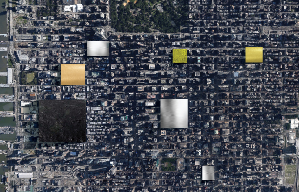
Silver
A Year’s Extraction of Metal Shown Next to Landmarks and Cities
https://beta.quiet.ly/list/share/db1ed-a-year-s-extraction-of-metal-shown-next-to-cities?width=1070&height=800&showGradient=false&showMapView=false&showAuthor=true&showLogo=true&showListTitle=true&showListDescription=true&showTitles=true&showDescriptions=true&showWeblinks=false&makeClickable=false&sharePage=true&showIcons=true&embedTheme=dark&titleSize=18&titleType=quietly&descriptionSize=14&descriptionType=quietly&useOriginalImages=true&lastSlide=default&lastSlideMsg=&lastSlideUrl=http%3A%2F%2Fwww.facebook.com%2Fvisualcapitalist
A Year’s Extraction of Metal Shown Next to Landmarks and Cities
“One death is a tragedy. One million is a statistic.” – Joseph Stalin
For thousands of years of development as a species, humans never really needed to understand the real meaning behind big, unreachable numbers such as billions or trillions. As a result, even today we have difficulty imaging what these seemingly abstract numbers represent.
This is why visualization can be such a powerful tool. Instead of dealing with zeroes, we get to actually see these large numbers applied in a way that we can relate to.
In the above slideshow visualization, we have taken the annual production of eight major commodities (platinum, gold, silver, uranium, nickel, copper, iron, and oil) and imagined that we could lump them together into a large 3d cube. Then, we put the cube within context of a visual scene that we can contrast them with. In this case, famous landmarks and cities.
Some cubes, such as platinum’s, are only the size of a Volkswagen. Others, such as oil, are kilometres on each side and span blocks of major cities.
We also calculated the value of each cube. Amazingly, all precious metals (gold, silver, platinum, palladium, etc.) do not even come close to comparing to the value of iron or oil. It goes to show how rare they are, but also that the size of their markets are sometimes not as massive as we think within the context of the bigger picture.

In this 90 page report, Tickerscores covers in-depth the 10 resource companies worth buying this fall. Click here to learn more.


Energy
Mapped: Solar Power by Country in 2021
In 2020, solar power saw its largest-ever annual capacity expansion at 127 gigawatts. Here’s a snapshot of solar power capacity by country.
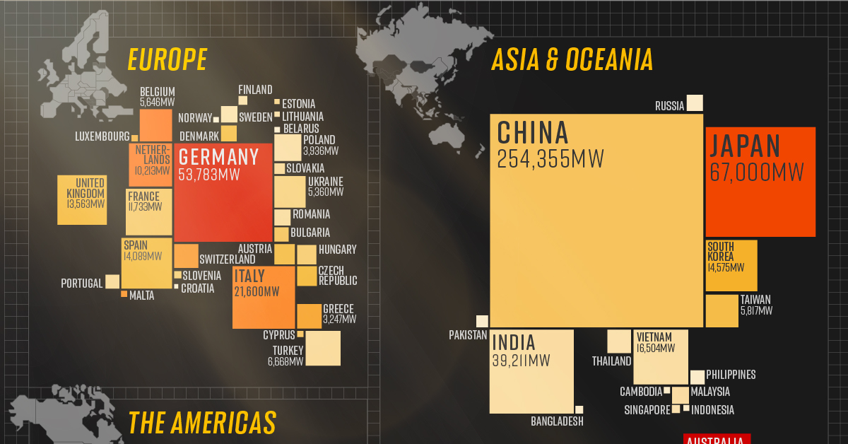
Mapped: Solar Power by Country in 2021
This was originally posted on Elements. Sign up to the free mailing list to get beautiful visualizations on natural resource megatrends in your email every week.
The world is adopting renewable energy at an unprecedented pace, and solar power is the energy source leading the way.
Despite a 4.5% fall in global energy demand in 2020, renewable energy technologies showed promising progress. While the growth in renewables was strong across the board, solar power led from the front with 127 gigawatts installed in 2020, its largest-ever annual capacity expansion.
The above infographic uses data from the International Renewable Energy Agency (IRENA) to map solar power capacity by country in 2021. This includes both solar photovoltaic (PV) and concentrated solar power capacity.
The Solar Power Leaderboard
From the Americas to Oceania, countries in virtually every continent (except Antarctica) added more solar to their mix last year. Here’s a snapshot of solar power capacity by country at the beginning of 2021:
| Country | Installed capacity, megawatts | Watts* per capita | % of world total |
|---|---|---|---|
| China 🇨🇳 | 254,355 | 147 | 35.6% |
| U.S. 🇺🇸 | 75,572 | 231 | 10.6% |
| Japan 🇯🇵 | 67,000 | 498 | 9.4% |
| Germany 🇩🇪 | 53,783 | 593 | 7.5% |
| India 🇮🇳 | 39,211 | 32 | 5.5% |
| Italy 🇮🇹 | 21,600 | 345 | 3.0% |
| Australia 🇦🇺 | 17,627 | 637 | 2.5% |
| Vietnam 🇻🇳 | 16,504 | 60 | 2.3% |
| South Korea 🇰🇷 | 14,575 | 217 | 2.0% |
| Spain 🇪🇸 | 14,089 | 186 | 2.0% |
| United Kingdom 🇬🇧 | 13,563 | 200 | 1.9% |
| France 🇫🇷 | 11,733 | 148 | 1.6% |
| Netherlands 🇳🇱 | 10,213 | 396 | 1.4% |
| Brazil 🇧🇷 | 7,881 | 22 | 1.1% |
| Turkey 🇹🇷 | 6,668 | 73 | 0.9% |
| South Africa 🇿🇦 | 5,990 | 44 | 0.8% |
| Taiwan 🇹🇼 | 5,817 | 172 | 0.8% |
| Belgium 🇧🇪 | 5,646 | 394 | 0.8% |
| Mexico 🇲🇽 | 5,644 | 35 | 0.8% |
| Ukraine 🇺🇦 | 5,360 | 114 | 0.8% |
| Poland 🇵🇱 | 3,936 | 34 | 0.6% |
| Canada 🇨🇦 | 3,325 | 88 | 0.5% |
| Greece 🇬🇷 | 3,247 | 258 | 0.5% |
| Chile 🇨🇱 | 3,205 | 142 | 0.4% |
| Switzerland 🇨🇭 | 3,118 | 295 | 0.4% |
| Thailand 🇹🇭 | 2,988 | 43 | 0.4% |
| United Arab Emirates 🇦🇪 | 2,539 | 185 | 0.4% |
| Austria 🇦🇹 | 2,220 | 178 | 0.3% |
| Czech Republic 🇨🇿 | 2,073 | 194 | 0.3% |
| Hungary 🇭🇺 | 1,953 | 131 | 0.3% |
| Egypt 🇪🇬 | 1,694 | 17 | 0.2% |
| Malaysia 🇲🇾 | 1,493 | 28 | 0.2% |
| Israel 🇮🇱 | 1,439 | 134 | 0.2% |
| Russia 🇷🇺 | 1,428 | 7 | 0.2% |
| Sweden 🇸🇪 | 1,417 | 63 | 0.2% |
| Romania 🇷🇴 | 1,387 | 71 | 0.2% |
| Jordan 🇯🇴 | 1,359 | 100 | 0.2% |
| Denmark 🇩🇰 | 1,300 | 186 | 0.2% |
| Bulgaria 🇧🇬 | 1,073 | 152 | 0.2% |
| Philippines 🇵🇭 | 1,048 | 9 | 0.1% |
| Portugal 🇵🇹 | 1,025 | 81 | 0.1% |
| Argentina 🇦🇷 | 764 | 17 | 0.1% |
| Pakistan 🇵🇰 | 737 | 6 | 0.1% |
| Morocco 🇲🇦 | 734 | 6 | 0.1% |
| Slovakia 🇸🇰 | 593 | 87 | 0.1% |
| Honduras 🇭🇳 | 514 | 53 | 0.1% |
| Algeria 🇩🇿 | 448 | 10 | 0.1% |
| El Salvador 🇸🇻 | 429 | 66 | 0.1% |
| Iran 🇮🇷 | 414 | 5 | 0.1% |
| Saudi Arabia 🇸🇦 | 409 | 12 | 0.1% |
| Finland 🇫🇮 | 391 | 39 | 0.1% |
| Dominican Republic 🇩🇴 | 370 | 34 | 0.1% |
| Peru 🇵🇪 | 331 | 10 | 0.05% |
| Singapore 🇸🇬 | 329 | 45 | 0.05% |
| Bangladesh 🇧🇩 | 301 | 2 | 0.04% |
| Slovenia 🇸🇮 | 267 | 128 | 0.04% |
| Uruguay 🇺🇾 | 256 | 74 | 0.04% |
| Yemen 🇾🇪 | 253 | 8 | 0.04% |
| Iraq 🇮🇶 | 216 | 5 | 0.03% |
| Cambodia 🇰🇭 | 208 | 12 | 0.03% |
| Cyprus 🇨🇾 | 200 | 147 | 0.03% |
| Panama 🇵🇦 | 198 | 46 | 0.03% |
| Luxembourg 🇱🇺 | 195 | 244 | 0.03% |
| Malta 🇲🇹 | 184 | 312 | 0.03% |
| Indonesia 🇮🇩 | 172 | 1 | 0.02% |
| Cuba 🇨🇺 | 163 | 14 | 0.02% |
| Belarus 🇧🇾 | 159 | 17 | 0.02% |
| Senegal 🇸🇳 | 155 | 8 | 0.02% |
| Norway 🇳🇴 | 152 | 17 | 0.02% |
| Lithuania 🇱🇹 | 148 | 37 | 0.02% |
| Namibia 🇳🇦 | 145 | 55 | 0.02% |
| New Zealand 🇳🇿 | 142 | 29 | 0.02% |
| Estonia 🇪🇪 | 130 | 98 | 0.02% |
| Bolivia 🇧🇴 | 120 | 10 | 0.02% |
| Oman 🇴🇲 | 109 | 21 | 0.02% |
| Colombia 🇨🇴 | 107 | 2 | 0.01% |
| Kenya 🇰🇪 | 106 | 2 | 0.01% |
| Guatemala 🇬🇹 | 101 | 6 | 0.01% |
| Croatia 🇭🇷 | 85 | 17 | 0.01% |
| World total 🌎 | 713,970 | 83 | 100.0% |
*1 megawatt = 1,000,000 watts.
China is the undisputed leader in solar installations, with over 35% of global capacity. What’s more, the country is showing no signs of slowing down. It has the world’s largest wind and solar project in the pipeline, which could add another 400,000MW to its clean energy capacity.
Following China from afar is the U.S., which recently surpassed 100,000MW of solar power capacity after installing another 50,000MW in the first three months of 2021. Annual solar growth in the U.S. has averaged an impressive 42% over the last decade. Policies like the solar investment tax credit, which offers a 26% tax credit on residential and commercial solar systems, have helped propel the industry forward.
Although Australia hosts a fraction of China’s solar capacity, it tops the per capita rankings due to its relatively low population of 26 million people. The Australian continent receives the highest amount of solar radiation of any continent, and over 30% of Australian households now have rooftop solar PV systems.
China: The Solar Champion
In 2020, President Xi Jinping stated that China aims to be carbon neutral by 2060, and the country is taking steps to get there.
China is a leader in the solar industry, and it seems to have cracked the code for the entire solar supply chain. In 2019, Chinese firms produced 66% of the world’s polysilicon, the initial building block of silicon-based photovoltaic (PV) panels. Furthermore, more than three-quarters of solar cells came from China, along with 72% of the world’s PV panels.
With that said, it’s no surprise that 5 of the world’s 10 largest solar parks are in China, and it will likely continue to build more as it transitions to carbon neutrality.
What’s Driving the Rush for Solar Power?
The energy transition is a major factor in the rise of renewables, but solar’s growth is partly due to how cheap it has become over time. Solar energy costs have fallen exponentially over the last decade, and it’s now the cheapest source of new energy generation.
Since 2010, the cost of solar power has seen a 85% decrease, down from $0.28 to $0.04 per kWh. According to MIT researchers, economies of scale have been the single-largest factor in continuing the cost decline for the last decade. In other words, as the world installed and made more solar panels, production became cheaper and more efficient.
This year, solar costs are rising due to supply chain issues, but the rise is likely to be temporary as bottlenecks resolve.

-

 Technology2 weeks ago
Ranked: The Most Popular Smartphone Brands in the U.S.
-

 Automotive1 week ago
Almost Every EV Stock is Down After Q1 2024
-

 Money1 week ago
Where Does One U.S. Tax Dollar Go?
-

 Green2 weeks ago
Ranked: Top Countries by Total Forest Loss Since 2001
-

 Real Estate2 weeks ago
Visualizing America’s Shortage of Affordable Homes
-

 Maps2 weeks ago
Mapped: Average Wages Across Europe
-

 Mining2 weeks ago
Charted: The Value Gap Between the Gold Price and Gold Miners
-

 Demographics2 weeks ago
Visualizing the Size of the Global Senior Population