Demographics
Visualizing the U.S. Population by Race
How to Use: The below maps will animate automatically. To pause, move your cursor on the image. Arrows on left/right navigate.


Visualizing the U.S. Population by Race
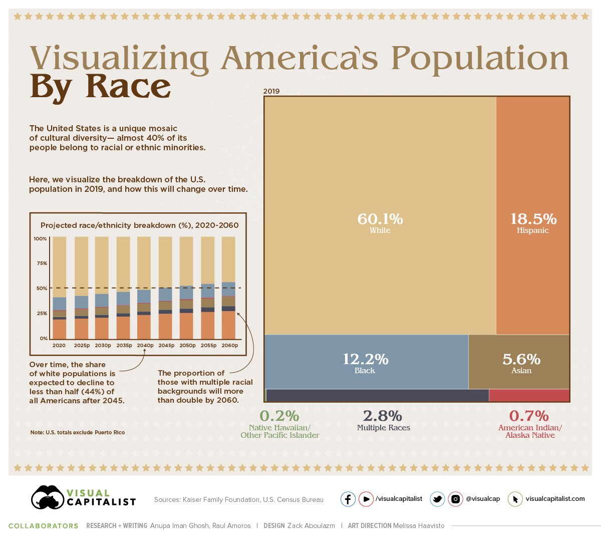
The American population is a unique mosaic of cultures—and almost 40% of people identify as racial or ethnic minorities today.
In this treemap, we use data for 2019 from the Kaiser Family Foundation, which bases its analysis on the latest American Community Survey (ACS) data from the U.S. Census Bureau. Then we break down the same data on a state-by-state basis.
Growing Diversity in America
As of 2019, here is the current distribution of the U.S. population by race and ethnicity:
- White: 60.1% (Non-Hispanic)
- Hispanic: 18.5%
- Black: 12.2%
- Asian: 5.6%
- Multiple Races: 2.8%
- American Indian/Alaska Native: 0.7%
- Native Hawaiian/Other Pacific Islander: 0.2%
Note that the U.S. totals do not include Puerto Rico.
However, these race and ethnicity projections are expected to change over the coming years. By the year 2060, it’s expected that the distribution of Non-Hispanic Whites as a percentage of total population will fall from 60.1% to 44.3% of Americans.
| Year | White* | Black | Hispanic | Asian | Multiple Races | Other** |
|---|---|---|---|---|---|---|
| 2020 | 59.7% | 12.5% | 18.7% | 5.8% | 2.3% | 0.9% |
| 2025 | 57.7% | 12.7% | 19.9% | 6.3% | 2.6% | 0.9% |
| 2030 | 55.8% | 12.8% | 21.1% | 6.7% | 2.8% | 0.9% |
| 2035 | 53.8% | 12.9% | 22.3% | 7.1% | 3.1% | 0.9% |
| 2040 | 51.7% | 13.0% | 23.5% | 7.5% | 3.4% | 0.9% |
| 2045 | 49.7% | 13.1% | 24.6% | 7.9% | 3.8% | 0.9% |
| 2050 | 47.8% | 13.3% | 25.7% | 8.2% | 4.1% | 0.9% |
| 2055 | 46.0% | 13.4% | 26.6% | 8.5% | 4.5% | 0.9% |
| 2060 | 44.3% | 13.6% | 27.5% | 8.9% | 4.9% | 0.9% |
Source: U.S. Census Bureau. *Excludes Hispanics **Other includes American Indian/Alaska Native (0.7%) and Native Hawaiian/Pacific Islander (0.2%). Both proportions remain unchanged in these projections.
Interestingly, the proportion of those from multiple racial and ethnic backgrounds will more than double, from 2.3% to 4.9% alongside rising patterns of interracial marriage.
Over time, the U.S. Census has been vastly expanded to reflect the true diversity that the country holds. In fact, it was only from 1960 onwards that people could select their own race—and only from 2020 can those who chose White or Black provide further information on their roots.
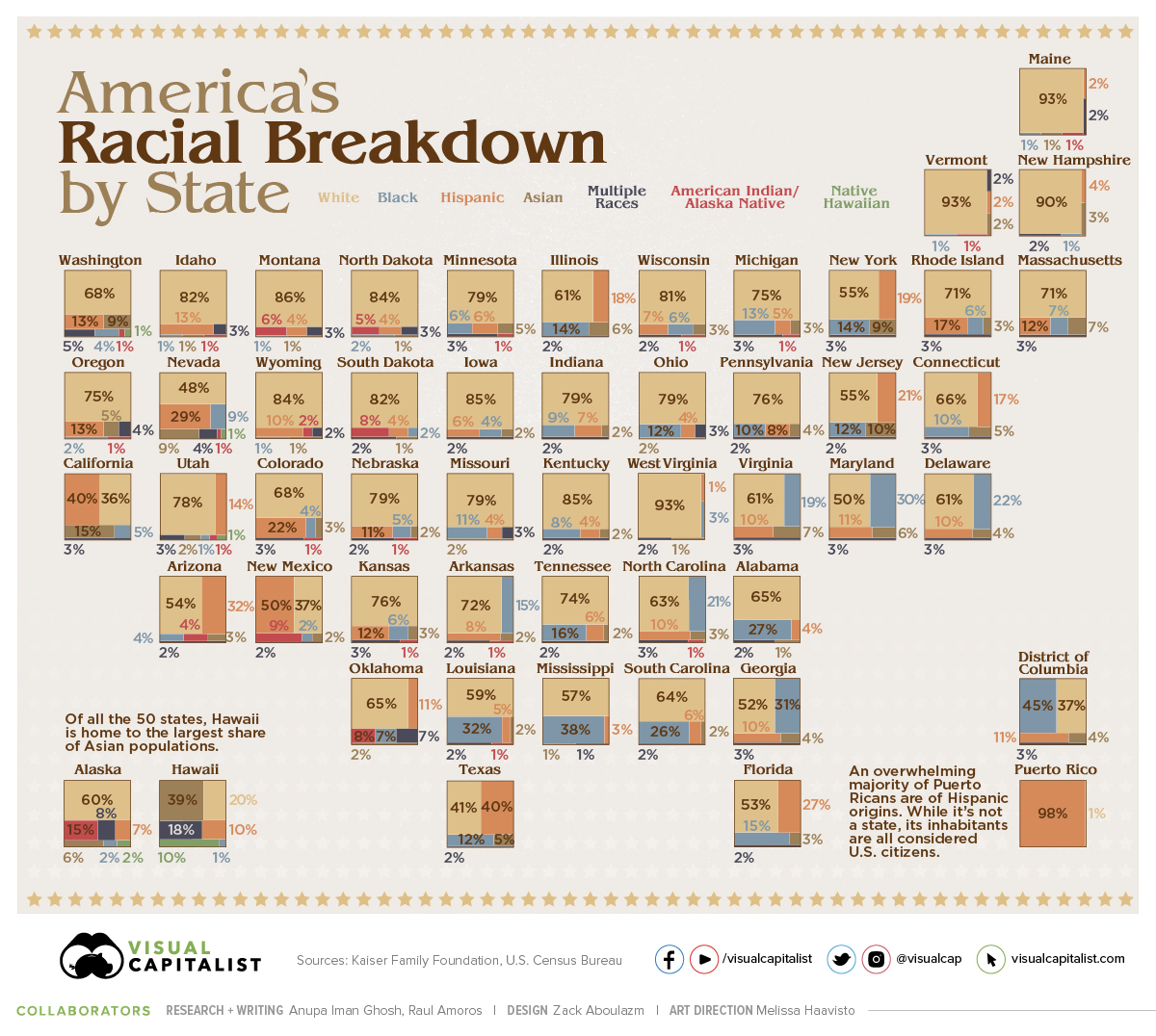
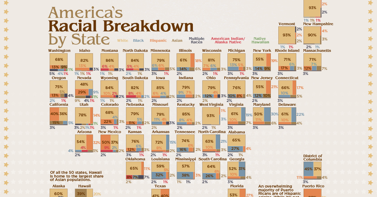
A State-by-State Breakdown
Of course, racial diversity in the United States differs widely from region to region.
In the Northeast—particularly the states Maine, Vermont, and New Hampshire—the Non-Hispanic White population accounts for 90% or more of the total. In contrast, Black populations are highest in the District of Columbia (45%) and several Southern states.
| Location | White | Black | Hispanic | Asian | Multiple Races | American Indian /Alaska Native | Native Hawaiian /Other Pacific Islander |
|---|---|---|---|---|---|---|---|
| Alabama | 65% | 27% | 4% | 1% | 2% | 0% | - |
| Alaska | 60% | 2% | 7% | 6% | 8% | 15% | 2% |
| Arizona | 54% | 4% | 32% | 3% | 2% | 4% | 0% |
| Arkansas | 72% | 15% | 8% | 2% | 2% | 1% | 0% |
| California | 36% | 5% | 40% | 15% | 3% | 0% | 0% |
| Colorado | 68% | 4% | 22% | 3% | 3% | 1% | 0% |
| Connecticut | 66% | 10% | 17% | 5% | 3% | 0% | - |
| Delaware | 61% | 22% | 10% | 4% | 3% | 0% | - |
| District of Columbia | 37% | 45% | 11% | 4% | 3% | 0% | - |
| Florida | 53% | 15% | 27% | 3% | 2% | 0% | 0% |
| Georgia | 52% | 31% | 10% | 4% | 3% | 0% | 0% |
| Hawaii | 20% | 1% | 10% | 39% | 18% | 0% | 10% |
| Idaho | 82% | 1% | 13% | 1% | 3% | 1% | - |
| Illinois | 61% | 14% | 18% | 6% | 2% | 0% | <.01 |
| Indiana | 79% | 9% | 7% | 2% | 2% | 0% | - |
| Iowa | 85% | 4% | 6% | 2% | 2% | 0% | <.01 |
| Kansas | 76% | 6% | 12% | 3% | 3% | 1% | - |
| Kentucky | 85% | 8% | 4% | 2% | 2% | 0% | - |
| Louisiana | 59% | 32% | 5% | 2% | 2% | 1% | - |
| Maine | 93% | 1% | 2% | 1% | 2% | 1% | - |
| Maryland | 50% | 30% | 11% | 6% | 3% | 0% | - |
| Massachusetts | 71% | 7% | 12% | 7% | 3% | 0% | <.01 |
| Michigan | 75% | 13% | 5% | 3% | 3% | 1% | - |
| Minnesota | 79% | 6% | 6% | 5% | 3% | 1% | - |
| Mississippi | 57% | 38% | 3% | 1% | 1% | 0% | - |
| Missouri | 79% | 11% | 4% | 2% | 3% | 0% | 0% |
| Montana | 86% | 1% | 4% | 1% | 3% | 6% | - |
| Nebraska | 79% | 5% | 11% | 2% | 2% | 1% | - |
| Nevada | 48% | 9% | 29% | 9% | 4% | 1% | 1% |
| New Hampshire | 90% | 1% | 4% | 3% | 2% | - | - |
| New Jersey | 55% | 12% | 21% | 10% | 2% | 0% | - |
| New Mexico | 37% | 2% | 50% | 2% | 2% | 9% | - |
| New York | 55% | 14% | 19% | 9% | 3% | 0% | - |
| North Carolina | 63% | 21% | 10% | 3% | 3% | 1% | <.01 |
| North Dakota | 84% | 2% | 4% | 1% | 3% | 5% | - |
| Ohio | 79% | 12% | 4% | 2% | 3% | 0% | - |
| Oklahoma | 65% | 7% | 11% | 2% | 7% | 8% | 0% |
| Oregon | 75% | 2% | 13% | 5% | 4% | 1% | 0% |
| Pennsylvania | 76% | 10% | 8% | 4% | 2% | 0% | <.01 |
| Puerto Rico | 1% | 0% | 98% | - | 0% | - | - |
| Rhode Island | 71% | 6% | 17% | 3% | 3% | 0% | - |
| South Carolina | 64% | 26% | 6% | 2% | 2% | 0% | - |
| South Dakota | 82% | 2% | 4% | 1% | 2% | 8% | - |
| Tennessee | 74% | 16% | 6% | 2% | 2% | 0% | - |
| Texas | 41% | 12% | 40% | 5% | 2% | 0% | 0% |
| Utah | 78% | 1% | 14% | 2% | 3% | 1% | 1% |
| Vermont | 93% | 1% | 2% | 2% | 2% | 1% | - |
| Virginia | 61% | 19% | 10% | 7% | 3% | 0% | <.01 |
| Washington | 68% | 4% | 13% | 9% | 5% | 1% | 1% |
| West Virginia | 93% | 3% | 1% | 1% | 2% | 0% | - |
| Wisconsin | 81% | 6% | 7% | 3% | 2% | 1% | - |
| Wyoming | 84% | 1% | 10% | 1% | 2% | 2% | - |
| U.S. | 60.1% | 12.2% | 18.5% | 5.6% | 2.8% | 0.7% | 0.2% |
Note: A dash (-) indicates estimates with relative standard errors greater than 30%, which were not included in the data
Of all the 50 states, Hawaii is home to the largest share of Asian populations at 39%. It also has one of the most diverse racial breakdowns in the nation overall, including the highest proportion of mixed race individuals.
Looking to another island, an overwhelming majority (98%) of Puerto Ricans are of Hispanic origins. While it’s not a state, its inhabitants are all considered U.S. citizens.
Charting the U.S. population by race is crucial for a number of reasons. This information can be used to better understand existing income and wealth gaps, track public health outcomes, and to aid in policy decision-making at higher levels.
We become not a melting pot but a beautiful mosaic. Different people, different beliefs, different yearnings, different hopes, different dreams.
—Jimmy Carter, 39th President of the U.S.
Editor’s note: This article has been updated to better reflect U.S. Census Bureau categories.


Demographics
The Countries That Have Become Sadder Since 2010
Tracking Gallup survey data for more than a decade reveals some countries are witnessing big happiness declines, reflecting their shifting socio-economic conditions.


The Countries That Have Become Sadder Since 2010
This was originally posted on our Voronoi app. Download the app for free on iOS or Android and discover incredible data-driven charts from a variety of trusted sources.
Can happiness be quantified?
Some approaches that try to answer this question make a distinction between two differing components of happiness: a daily experience part, and a more general life evaluation (which includes how people think about their life as a whole).
The World Happiness Report—first launched in 2012—has been making a serious go at quantifying happiness, by examining Gallup poll data that asks respondents in nearly every country to evaluate their life on a 0–10 scale. From this they extrapolate a single “happiness score” out of 10 to compare how happy (or unhappy) countries are.
More than a decade later, the 2024 World Happiness Report continues the mission. Its latest findings also include how some countries have become sadder in the intervening years.
Which Countries Have Become Unhappier Since 2010?
Afghanistan is the unhappiest country in the world right now, and is also 60% unhappier than over a decade ago, indicating how much life has worsened since 2010.
In 2021, the Taliban officially returned to power in Afghanistan, after nearly two decades of American occupation in the country. The Islamic fundamentalist group has made life harder, especially for women, who are restricted from pursuing higher education, travel, and work.
On a broader scale, the Afghan economy has suffered post-Taliban takeover, with various consequent effects: mass unemployment, a drop in income, malnutrition, and a crumbling healthcare system.
| Rank | Country | Happiness Score Loss (2010–24) | 2024 Happiness Score (out of 10) |
|---|---|---|---|
| 1 | 🇦🇫 Afghanistan | -2.6 | 1.7 |
| 2 | 🇱🇧 Lebanon | -2.3 | 2.7 |
| 3 | 🇯🇴 Jordan | -1.5 | 4.2 |
| 4 | 🇻🇪 Venezuela | -1.3 | 5.6 |
| 5 | 🇲🇼 Malawi | -1.2 | 3.4 |
| 6 | 🇿🇲 Zambia | -1.2 | 3.5 |
| 7 | 🇧🇼 Botswana | -1.2 | 3.4 |
| 8 | 🇾🇪 Yemen | -1.0 | 3.6 |
| 9 | 🇪🇬 Egypt | -1.0 | 4.0 |
| 10 | 🇮🇳 India | -0.9 | 4.1 |
| 11 | 🇧🇩 Bangladesh | -0.9 | 3.9 |
| 12 | 🇨🇩 DRC | -0.7 | 3.3 |
| 13 | 🇹🇳 Tunisia | -0.7 | 4.4 |
| 14 | 🇨🇦 Canada | -0.6 | 6.9 |
| 15 | 🇺🇸 U.S. | -0.6 | 6.7 |
| 16 | 🇨🇴 Colombia | -0.5 | 5.7 |
| 17 | 🇵🇦 Panama | -0.5 | 6.4 |
| 18 | 🇵🇰 Pakistan | -0.5 | 4.7 |
| 19 | 🇿🇼 Zimbabwe | -0.5 | 3.3 |
| 20 | 🇮🇪 Ireland | -0.5 | 6.8 |
| N/A | 🌍 World | +0.1 | 5.5 |
Nine countries in total saw their happiness score drop by a full point or more, on the 0–10 scale.
Noticeably, many of them have seen years of social and economic upheaval. Lebanon, for example, has been grappling with decades of corruption, and a severe liquidity crisis since 2019 that has resulted in a banking system collapse, sending poverty levels skyrocketing.
In Jordan, unprecedented population growth—from refugees leaving Iraq and Syria—has aggravated unemployment rates. A somewhat abrupt change in the line of succession has also raised concerns about political stability in the country.

-

 Markets1 week ago
U.S. Debt Interest Payments Reach $1 Trillion
-

 Business2 weeks ago
Charted: Big Four Market Share by S&P 500 Audits
-

 Markets2 weeks ago
Ranked: The Most Valuable Housing Markets in America
-

 Money2 weeks ago
Which States Have the Highest Minimum Wage in America?
-

 AI2 weeks ago
Ranked: Semiconductor Companies by Industry Revenue Share
-

 Markets2 weeks ago
Ranked: The World’s Top Flight Routes, by Revenue
-

 Demographics2 weeks ago
Population Projections: The World’s 6 Largest Countries in 2075
-

 Markets2 weeks ago
The Top 10 States by Real GDP Growth in 2023