Money
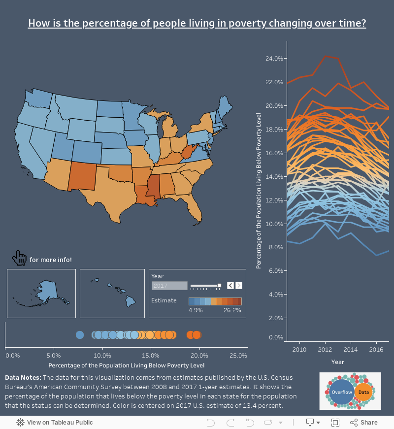
Visualizing the Poverty Rate of Each U.S. State
var divElement = document.getElementById(‘viz1543147079494’); var vizElement = divElement.getElementsByTagName(‘object’)[0]; if ( divElement.offsetWidth > 800 ) { vizElement.style.width=’1200px’;vizElement.style.height=’827px’;} else if ( divElement.offsetWidth > 500 ) { vizElement.style.width=’100%’;vizElement.style.height=’871px’;} else { vizElement.style.width=’100%’;vizElement.style.height=’1627px’;} var scriptElement = document.createElement(‘script’); scriptElement.src = ‘https://public.tableau.com/javascripts/api/viz_v1.js’; vizElement.parentNode.insertBefore(scriptElement, vizElement);
Visualizing the Poverty Rate of Each U.S. State
How many people live below the poverty line in states across the country?
Today’s interactive map comes to us from Overflow Solutions, and it visualizes the percentage of people living in poverty across the United States over the time period of 2008-2017.
U.S. Poverty Rates Today
To start, we’ll look at the situation using the most recent data, which was pulled from the American Community Survey (2017) done by the U.S. Census Bureau.
For additional context, it is worth noting that the national poverty level is estimated to sit at 13.4%.
Here are the five states with the highest levels of poverty today:
| Rank | State | Poverty Rate (2017) |
|---|---|---|
| #1 | Mississippi | 19.8% |
| #2 | Louisiana | 19.7% |
| #3 | New Mexico | 19.7% |
| #4 | West Virginia | 19.1% |
| #5 | Kentucky | 17.2% |
In three southern states, Mississippi, Louisiana, and New Mexico, nearly 20% of the population lives below the poverty line. Two Appalachian states round out the top five: West Virginia (19.1%) and Kentucky (17.2%).
On the flipside, here are the five states with the lowest levels of poverty:
| Rank | State | Poverty Rate (2017) |
|---|---|---|
| #47 | Connecticut | 9.6% |
| #48 (t) | Minnesota | 9.5% |
| #48 (t) | Hawaii | 9.5% |
| #50 | Maryland | 9.3% |
| #51 | New Hampshire | 7.7% |
New Hampshire (7.7%) has the lowest poverty rate by a long shot – about 1.6% lower than its closest competitor, which is the state of Maryland (9.3%).
Poverty Rates Over Time
While the data from 2017 provides an interesting snapshot, perhaps it is more insightful to look at the trend over time. In other words, are poverty rates increasing or decreasing?
Below is a comparison of state averages in 2008 (pre-crisis), 2012 (recent peak), and 2017:
| 2008 | 2012 | 2017 | |
|---|---|---|---|
| Avg. state poverty rate | 10.1% | 15.2% | 13.1% |
Since the recent peak in 2012, poverty has decreased by an average of 2.1% per state – in fact, over the 2012-2017 time period, there were only three states that did not see a reduction in poverty levels: Alaska, Delaware, and West Virginia.
Using the longer time window, however, you’ll see that poverty rates have actually risen by 3.0% on average since 2008. Today, not a single state has a lower poverty rate than it did in 2008.
State Poverty Rates (All)
Finally, here’s a full state table that is sortable and searchable, showing poverty levels in 2008, 2012, and 2017, for your convenience:
| 2008 | 2012 | 2017 | |
|---|---|---|---|
| Alabama | 13.1% | 19.0% | 16.9% |
| Alaska | 6.1% | 10.1% | 11.1% |
| Arizona | 12.6% | 18.7% | 14.9% |
| Arkansas | 14.6% | 19.8% | 16.4% |
| California | 11.2% | 17.0% | 13.3% |
| Colorado | 9.0% | 13.7% | 10.3% |
| Connecticut | 7.0% | 10.7% | 9.6% |
| Delaware | 7.6% | 12.0% | 13.6% |
| District of Columbia | 15.4% | 18.2% | 16.6% |
| Florida | 10.7% | 17.1% | 14.0% |
| Georgia | 12.4% | 19.2% | 14.9% |
| Hawaii | 5.8% | 11.6% | 9.5% |
| Idaho | 9.9% | 15.9% | 12.8% |
| Illinois | 10.0% | 14.7% | 12.6% |
| Indiana | 10.6% | 15.6% | 13.5% |
| Iowa | 7.9% | 12.7% | 10.7% |
| Kansas | 8.4% | 14.0% | 11.9% |
| Kentucky | 14.4% | 19.4% | 17.2% |
| Louisiana | 14.8% | 19.9% | 19.7% |
| Maine | 8.7% | 14.7% | 11.1% |
| Maryland | 5.7% | 10.3% | 9.3% |
| Massachusetts | 7.0% | 11.9% | 10.5% |
| Michigan | 11.5% | 17.4% | 14.2% |
| Minnesota | 6.5% | 11.4% | 9.5% |
| Mississippi | 19.0% | 24.2% | 19.8% |
| Missouri | 10.6% | 16.2% | 13.4% |
| Montana | 11.5% | 15.5% | 12.5% |
| Nebraska | 7.6% | 13.0% | 10.8% |
| Nevada | 9.0% | 16.4% | 13.0% |
| New Hampshire | 4.9% | 10.0% | 7.7% |
| New Jersey | 6.7% | 10.8% | 10.0% |
| New Mexico | 14.7% | 20.8% | 19.7% |
| New York | 11.1% | 15.9% | 14.1% |
| North Carolina | 12.0% | 18.0% | 14.7% |
| North Dakota | 8.6% | 11.2% | 10.3% |
| Ohio | 10.5% | 16.3% | 14.0% |
| Oklahoma | 13.2% | 17.2% | 15.8% |
| Oregon | 10.5% | 17.2% | 13.2% |
| Pennsylvania | 9.2% | 13.7% | 12.5% |
| Rhode Island | 8.3% | 13.7% | 11.6% |
| South Carolina | 13.0% | 18.3% | 15.4% |
| South Dakota | 9.7% | 13.4% | 13.0% |
| Tennessee | 12.9% | 17.9% | 15.0% |
| Texas | 14.1% | 17.9% | 14.7% |
| Utah | 6.9% | 12.8% | 9.7% |
| Vermont | 6.5% | 11.8% | 11.3% |
| Virginia | 7.9% | 11.7% | 10.6% |
| Washington | 8.4% | 13.5% | 11.0% |
| West Virginia | 13.1% | 17.8% | 19.1% |
| Wisconsin | 7.3% | 13.2% | 11.3% |
| Wyoming | 6.1% | 12.6% | 11.3% |


Money
How Debt-to-GDP Ratios Have Changed Since 2000
See how much the debt-to-GDP ratios of advanced economies have grown (or shrank) since the year 2000.


How Debt-to-GDP Ratios Have Changed Since 2000
This was originally posted on our Voronoi app. Download the app for free on Apple or Android and discover incredible data-driven charts from a variety of trusted sources.
Government debt levels have grown in most parts of the world since the 2008 financial crisis, and even more so after the COVID-19 pandemic.
To gain perspective on this long-term trend, we’ve visualized the debt-to-GDP ratios of advanced economies, as of 2000 and 2024 (estimated). All figures were sourced from the IMF’s World Economic Outlook.
Data and Highlights
The data we used to create this graphic is listed in the table below. “Government gross debt” consists of all liabilities that require payment(s) of interest and/or principal in the future.
| Country | 2000 (%) | 2024 (%) | Change (pp) |
|---|---|---|---|
| 🇯🇵 Japan | 135.6 | 251.9 | +116.3 |
| 🇸🇬 Singapore | 82.3 | 168.3 | +86.0 |
| 🇺🇸 United States | 55.6 | 126.9 | +71.3 |
| 🇬🇧 United Kingdom | 36.6 | 105.9 | +69.3 |
| 🇬🇷 Greece | 104.9 | 160.2 | +55.3 |
| 🇫🇷 France | 58.9 | 110.5 | +51.6 |
| 🇵🇹 Portugal | 54.2 | 104.0 | +49.8 |
| 🇪🇸 Spain | 57.8 | 104.7 | +46.9 |
| 🇸🇮 Slovenia | 25.9 | 66.5 | +40.6 |
| 🇫🇮 Finland | 42.4 | 76.5 | +34.1 |
| 🇭🇷 Croatia | 35.4 | 61.8 | +26.4 |
| 🇨🇦 Canada | 80.4 | 103.3 | +22.9 |
| 🇨🇾 Cyprus | 56.0 | 70.9 | +14.9 |
| 🇦🇹 Austria | 65.7 | 74.0 | +8.3 |
| 🇸🇰 Slovak Republic | 50.5 | 56.5 | +6.0 |
| 🇩🇪 Germany | 59.3 | 64.0 | +4.7 |
| 🇧🇪 Belgium | 109.6 | 106.8 | -2.8 |
| 🇮🇱 Israel | 77.4 | 56.8 | -20.6 |
| 🇮🇸 Iceland | 75.8 | 54.6 | -21.2 |
The debt-to-GDP ratio indicates how much a country owes compared to the size of its economy, reflecting its ability to manage and repay debts. Percentage point (pp) changes shown above indicate the increase or decrease of these ratios.
Countries with the Biggest Increases
Japan (+116 pp), Singapore (+86 pp), and the U.S. (+71 pp) have grown their debt as a percentage of GDP the most since the year 2000.
All three of these countries have stable, well-developed economies, so it’s unlikely that any of them will default on their growing debts. With that said, higher government debt leads to increased interest payments, which in turn can diminish available funds for future government budgets.
This is a rising issue in the U.S., where annual interest payments on the national debt have surpassed $1 trillion for the first time ever.
Only 3 Countries Saw Declines
Among this list of advanced economies, Belgium (-2.8 pp), Iceland (-21.2 pp), and Israel (-20.6 pp) were the only countries that decreased their debt-to-GDP ratio since the year 2000.
According to Fitch Ratings, Iceland’s debt ratio has decreased due to strong GDP growth and the use of its cash deposits to pay down upcoming maturities.
See More Debt Graphics from Visual Capitalist
Curious to see which countries have the most government debt in dollars? Check out this graphic that breaks down $97 trillion in debt as of 2023.

-

 Real Estate2 weeks ago
Visualizing America’s Shortage of Affordable Homes
-

 Technology1 week ago
Ranked: Semiconductor Companies by Industry Revenue Share
-

 Money1 week ago
Which States Have the Highest Minimum Wage in America?
-

 Real Estate1 week ago
Ranked: The Most Valuable Housing Markets in America
-

 Business2 weeks ago
Charted: Big Four Market Share by S&P 500 Audits
-

 AI2 weeks ago
The Stock Performance of U.S. Chipmakers So Far in 2024
-

 Misc2 weeks ago
Almost Every EV Stock is Down After Q1 2024
-

 Money2 weeks ago
Where Does One U.S. Tax Dollar Go?