Misc
Map: Visualizing Every Ship at Sea in Real-Time
The ocean is a big place, which makes it a pretty difficult thing to wrap our brains around.
It covers over 70% of the Earth’s surface, is home to millions of species of life, and it makes up 97% of all water on the planet. But, with this massive size and ubiquity also comes a significant challenge for humans interested in trade: it must be constantly traversed in order for us to move goods around.
As a result, millions of people hit the high seas each day to get cargo from one place to another. The vessels used range from tiny sailboats to massive oil tankers, some of which can get up to four football fields in length.
Every Ship at Sea
We previously posted an interactive map of shipping routes that used 250 million data points to show how boats moved across the ocean.
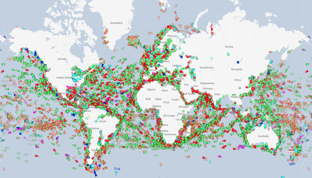
Today, in a similar vein, we highlight a website that tracks the world’s ships in real-time, providing a unique picture of what is happening at sea. Below is a screenshot from MarineTraffic and going there will allow you to see all major ships in real-time as they voyage around the Deep Blue Sea.
You may be wondering, does this really show every ship at sea?
Well, it might not catch your Uncle Steve’s sailboat off the coast of Florida, but this map will show all major commercial vessels. Any oil tanker, cargo vessel, cruise ship, or fishing boat can be spotted, and it makes for some interesting observations if you know where to look.
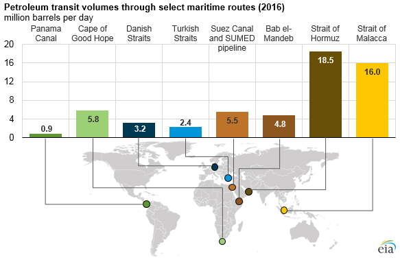
A Look at Oil Chokepoints
Upon loading the real-time map, the first thing we did was adjust the filters to only show oil tankers.
After all, we know that every day, about 18.5 million barrels transit through the Strait of Hormuz between Iran and Oman, and 16 million barrels go through the Strait of Malacca between Indonesia and Malaysia.
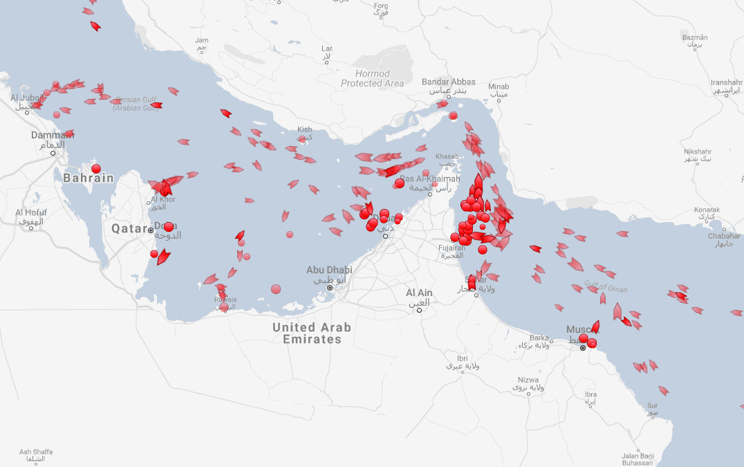
Here’s a screenshot of the Strait of Hormuz, showing only oil tankers. (Dots are tankers that are not moving, while arrows represent tankers that are currently on course.)
And here are the ships going through the Strait of Malacca, which at its narrowest point is only 1.7 miles (2.7 km) wide.
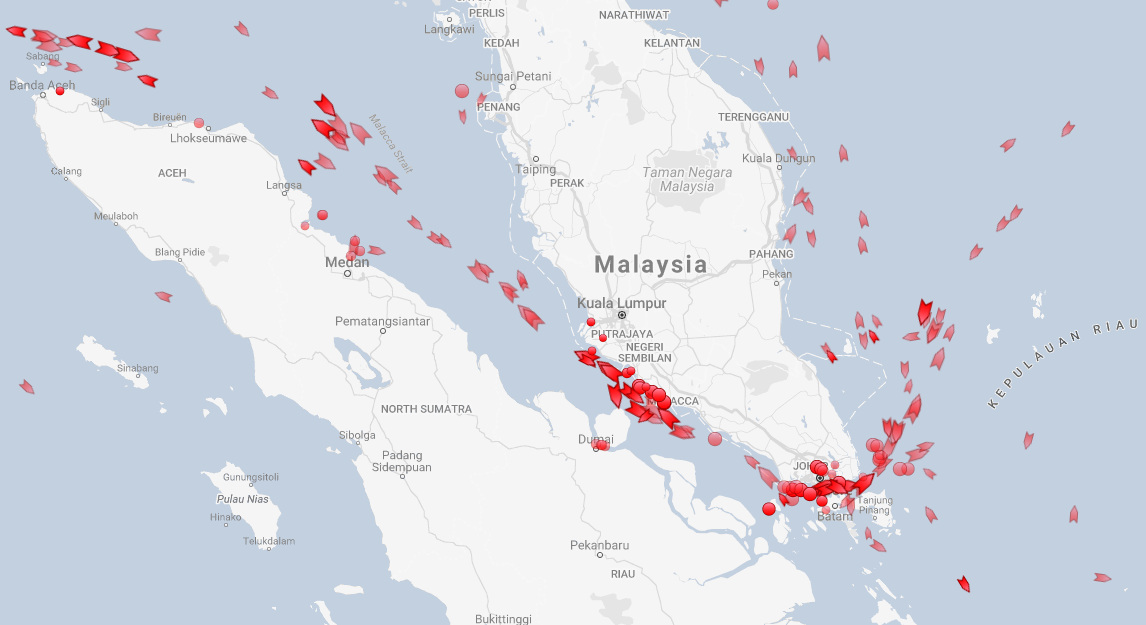
If you want to get oil from the Persian Gulf to the South China Sea, this strait is vital – otherwise a big ship must detour thousands of miles around the Indonesian islands of Sumatra and Java to find the next suitable waterway.
Coast of Somalia
Compare those above straits to the coast off of Somalia, where piracy and hydrocarbon theft are major concerns.
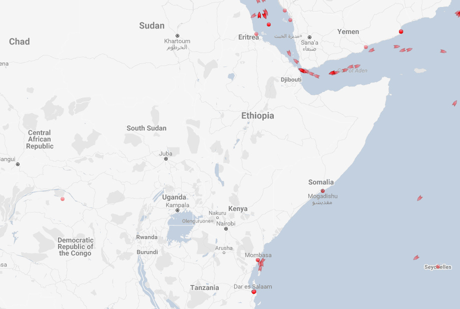
All is pretty quiet, aside from the one daring tanker that is about 500 miles (800 km) east of Mogadishu.
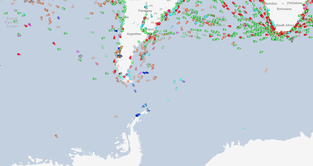
Antarctic Cruises
One other easy observation?
It’s the few passenger boats hanging around the Antarctic Peninsula – which is the part of the continent closest to Argentina and a destination for cruise ships.
If you have a chance, check out the live map for yourself and play around with the filters. It’s also interesting to see what’s happening in your local waters, as well.


Misc
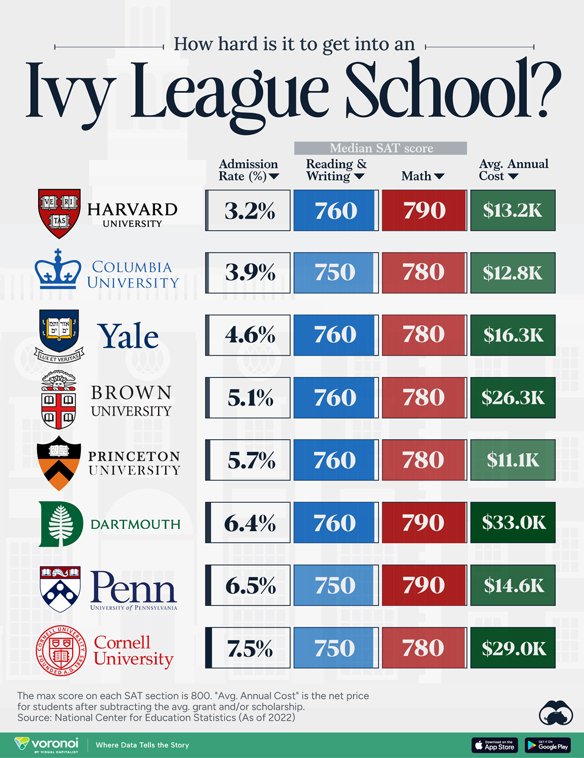
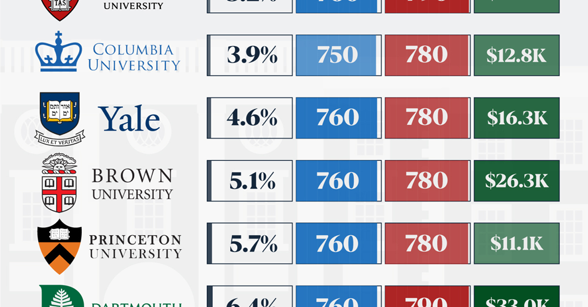
How Hard Is It to Get Into an Ivy League School?
We detail the admission rates and average annual cost for Ivy League schools, as well as the median SAT scores required to be accepted.
How Hard Is It to Get Into an Ivy League School?
This was originally posted on our Voronoi app. Download the app for free on iOS or Android and discover incredible data-driven charts from a variety of trusted sources.
Ivy League institutions are renowned worldwide for their academic excellence and long-standing traditions. But how hard is it to get into one of the top universities in the U.S.?
In this graphic, we detail the admission rates and average annual cost for Ivy League schools, as well as the median SAT scores required to be accepted. The data comes from the National Center for Education Statistics and was compiled by 24/7 Wall St.
Note that “average annual cost” represents the net price a student pays after subtracting the average value of grants and/or scholarships received.
Harvard is the Most Selective
The SAT is a standardized test commonly used for college admissions in the United States. It’s taken by high school juniors and seniors to assess their readiness for college-level academic work.
When comparing SAT scores, Harvard and Dartmouth are among the most challenging universities to gain admission to. The median SAT scores for their students are 760 for reading and writing and 790 for math. Still, Harvard has half the admission rate (3.2%) compared to Dartmouth (6.4%).
| School | Admission rate (%) | SAT Score: Reading & Writing | SAT Score: Math | Avg Annual Cost* |
|---|---|---|---|---|
| Harvard University | 3.2 | 760 | 790 | $13,259 |
| Columbia University | 3.9 | 750 | 780 | $12,836 |
| Yale University | 4.6 | 760 | 780 | $16,341 |
| Brown University | 5.1 | 760 | 780 | $26,308 |
| Princeton University | 5.7 | 760 | 780 | $11,080 |
| Dartmouth College | 6.4 | 760 | 790 | $33,023 |
| University of Pennsylvania | 6.5 | 750 | 790 | $14,851 |
| Cornell University | 7.5 | 750 | 780 | $29,011 |
*Costs after receiving federal financial aid.
Additionally, Dartmouth has the highest average annual cost at $33,000. Princeton has the lowest at $11,100.
While student debt has surged in the United States in recent years, hitting $1.73 trillion in 2023, the worth of obtaining a degree from any of the schools listed surpasses mere academics. This is evidenced by the substantial incomes earned by former students.
Harvard grads, for example, have the highest average starting salary in the country, at $91,700.

-

 Real Estate2 weeks ago
Visualizing America’s Shortage of Affordable Homes
-

 Technology1 week ago
Ranked: Semiconductor Companies by Industry Revenue Share
-

 Money1 week ago
Which States Have the Highest Minimum Wage in America?
-

 Real Estate1 week ago
Ranked: The Most Valuable Housing Markets in America
-

 Business2 weeks ago
Charted: Big Four Market Share by S&P 500 Audits
-

 AI2 weeks ago
The Stock Performance of U.S. Chipmakers So Far in 2024
-

 Misc2 weeks ago
Almost Every EV Stock is Down After Q1 2024
-

 Money2 weeks ago
Where Does One U.S. Tax Dollar Go?