Best of
Our Top Infographics of 2017
It’s that time of year again, and 2017 is almost in the rearview mirror.
With another year biting the dust, we are excited to present a curated list of our favorite infographics, charts, and data visualizations that we posted over the course of 2017.
If you’re new to Visual Capitalist, this annual countdown is one of the best ways to get acquainted with what we do. It tallies the year’s most powerful visuals that explain the world of business and investing. If you like what you see below, don’t forget to subscribe to our mailing list or connect via Facebook, Twitter, or LinkedIn to get our free content daily.
It’s also worth mentioning that many of these below graphics will be included in our upcoming book, which you can still pre-order today.
Important Notes:
Below are the top infographics of 2017. But first, a few quick notes:
- Images below are small preview images for each large infographic and article
- To view any post in full, click the image or link in the text. All links open in a new tab.
- At the end, we’ll link to some honorable mentions, as well as the year-end lists for 2014, 2015, and 2016.
Enjoy the countdown, and we wish you the best in the new year!
– The Visual Capitalist Team
17. The Future of Battery Technology
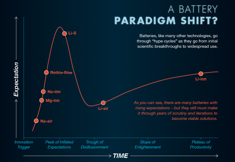
The final installment in our five-part Battery Series, this infographic covers what is coming down the battery technology pipeline in the future. It looks at the near-term advancements that will be made with lithium-ion batteries, as well as more unproven, distant technologies like Li-S, Li-air, and Na-ion batteries.
16. The 100 Websites That Rule the Internet
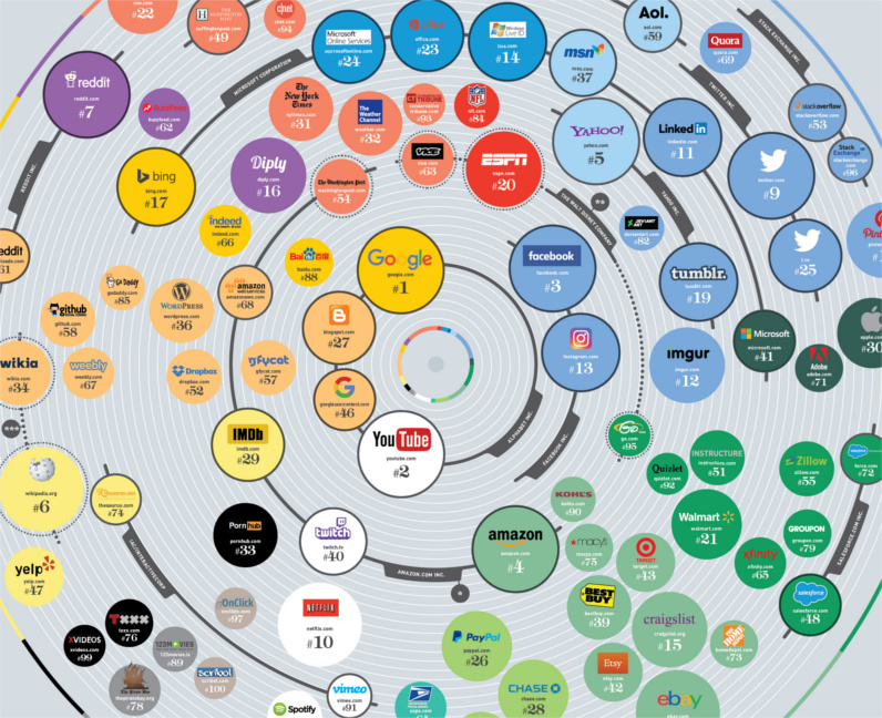
Ever wonder who owns the 100 most popular websites in the world? This massive infographic links it all together, and allows you to see the powerhouses that rule the internet.
15. The Richest People in History (Part 1)

This infographic shows the world’s richest people, with a focus on the pre-modern era that occurred before the Industrial Revolution. In it, you’ll find details on the fortunes of famous names like Augustus Caesar, Mansa Musa, King Solomon, Genghis Khan, and the Medici family.
14. How 5 Tech Giants Make Their Billions
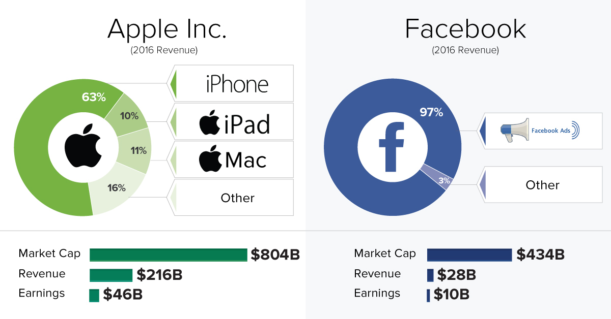
Do you know how tech giants like Facebook, Alphabet, Microsoft, Apple, and Amazon make their money? This chart breaks down the revenue streams for each company in an intuitive and simple manner.
13. These 35 Chinese Cities Have Economies as Big as Countries
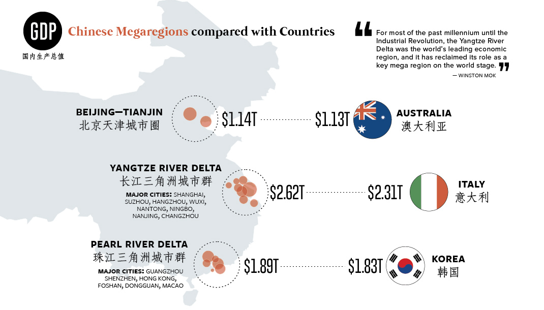
It’s often difficult to comprehend the size and scale of the economic boom in China.
That’s why it’s a topic we approach quite often with our visualizations – and we felt this one really hit the mark. Using a mind-boggling map, we compare each of China’s 35 biggest cities with the economies of entire countries. How many of these massive Chinese cities do you think you can name?
12. Bitcoin’s Journey to $10,000
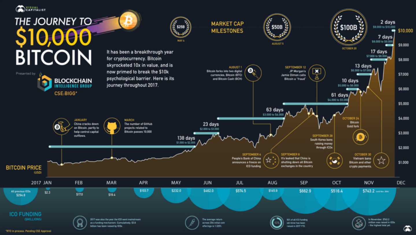
It was a landmark year for cryptocurrency, and Bitcoin’s ultra-quick journey from under $1,000 to $10,000 in just 11 months was the centerpiece of the excitement. This nifty infographic documents the ascent, as well as the major events that happened over the course of the year in the space.
11. Visualizing the Massive $15.7 Trillion Impact of AI
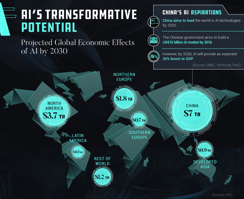
Artificial intelligence is going to impact every facet of our lives, and this infographic summarizes the impact and potential breadth of possibilities that AI will bring once it is ubiquitous.
10. Donald Trump’s $20 Trillion Problem
The year started with the controversial inauguration of Donald Trump – and this video, which was released around that time, sums up a major issue he faces during his presidency. How he approaches the country’s record-high $20 trillion national debt will be an important factor in whether he is able to make America “great again”.
9. Every Single Cognitive Bias in One Giant Infographic
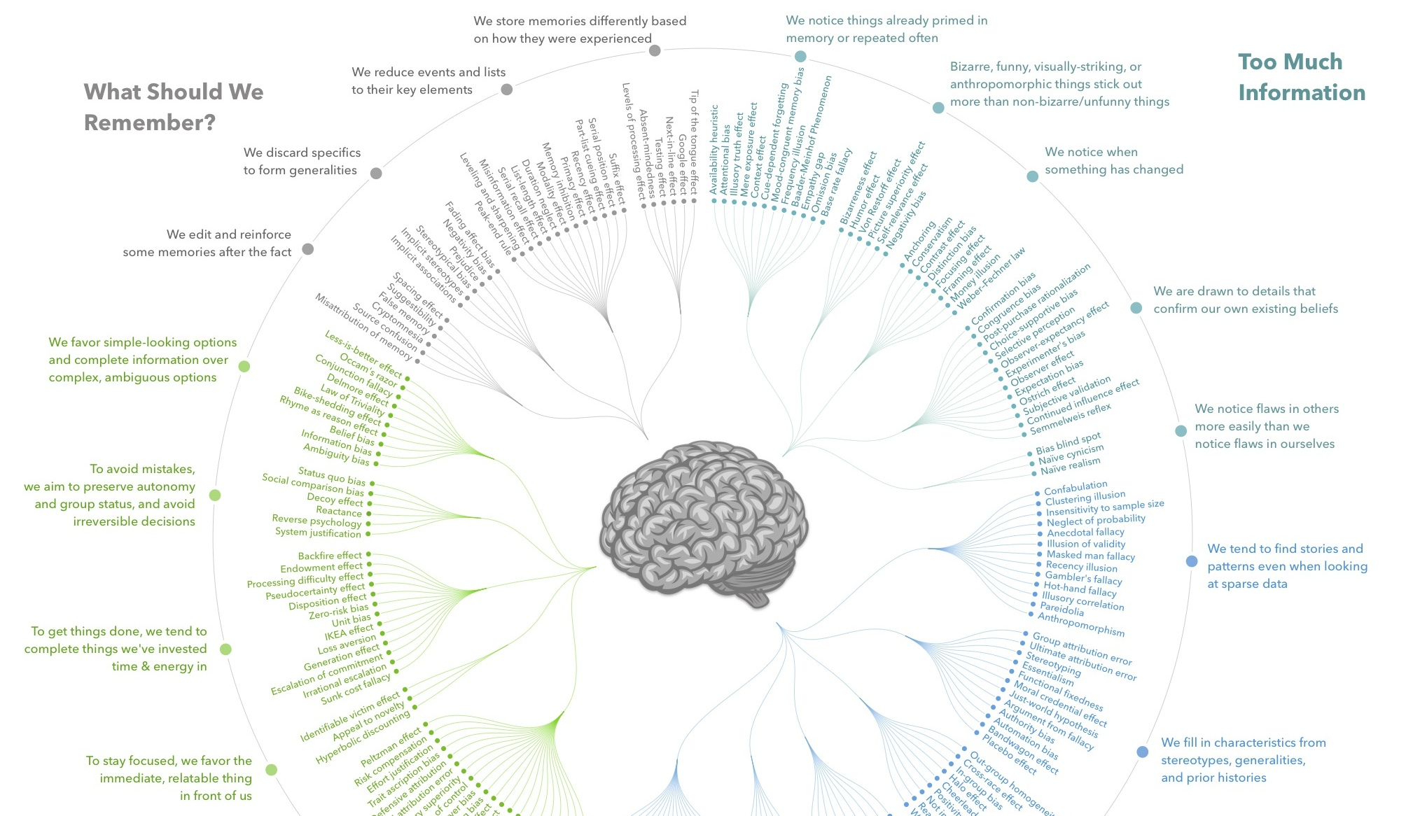
Has it been your lifelong dream to see every one of the existing 188 cognitive biases mapped out and organized in a useful codex? If so, then today is your lucky day.
8. Measuring Global Competitiveness
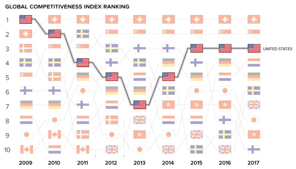
What makes an economy competitive at the global level, and why?
This useful animation shows how countries compare using the Global Competitiveness Index – and then later in the post, the factors influencing competitiveness are explained and compared.
7. The Crypto Universe
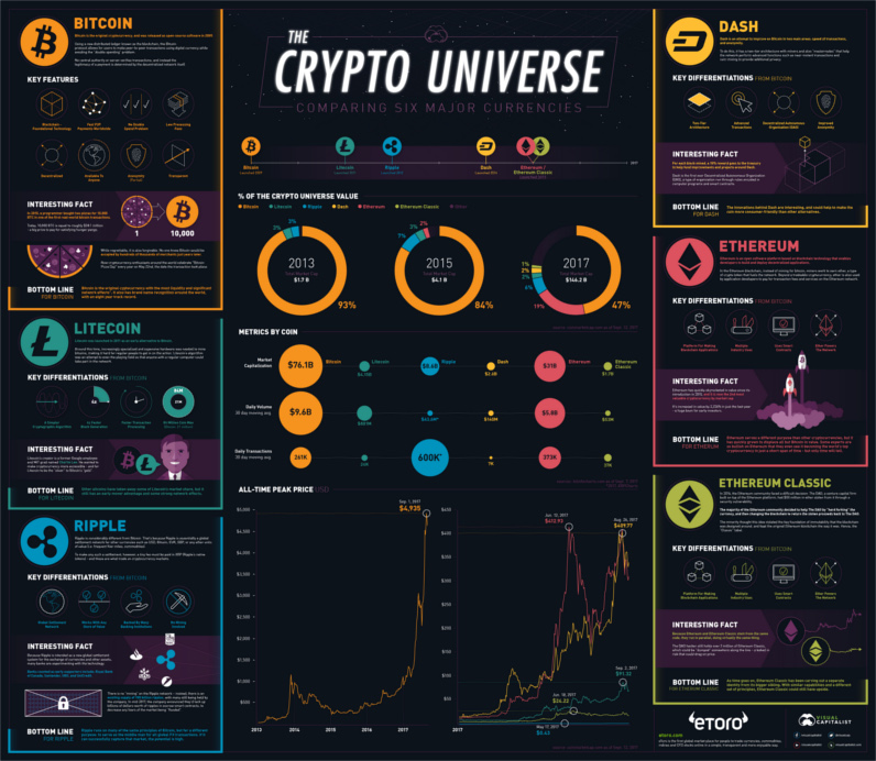
Back in September 2017, when a bitcoin was only worth $4,000, we made this chart to make sense of the cryptocurrency universe. It compares the differences between Bitcoin, Litecoin, Ethereum, Ripple, Dash, and Ethereum Classic – and it shows key metrics around volume, market capitalization, and transactions.
It’s all fairly out of date now, but that’s how the crypto space rolls.
6. $63 Trillion of World Debt
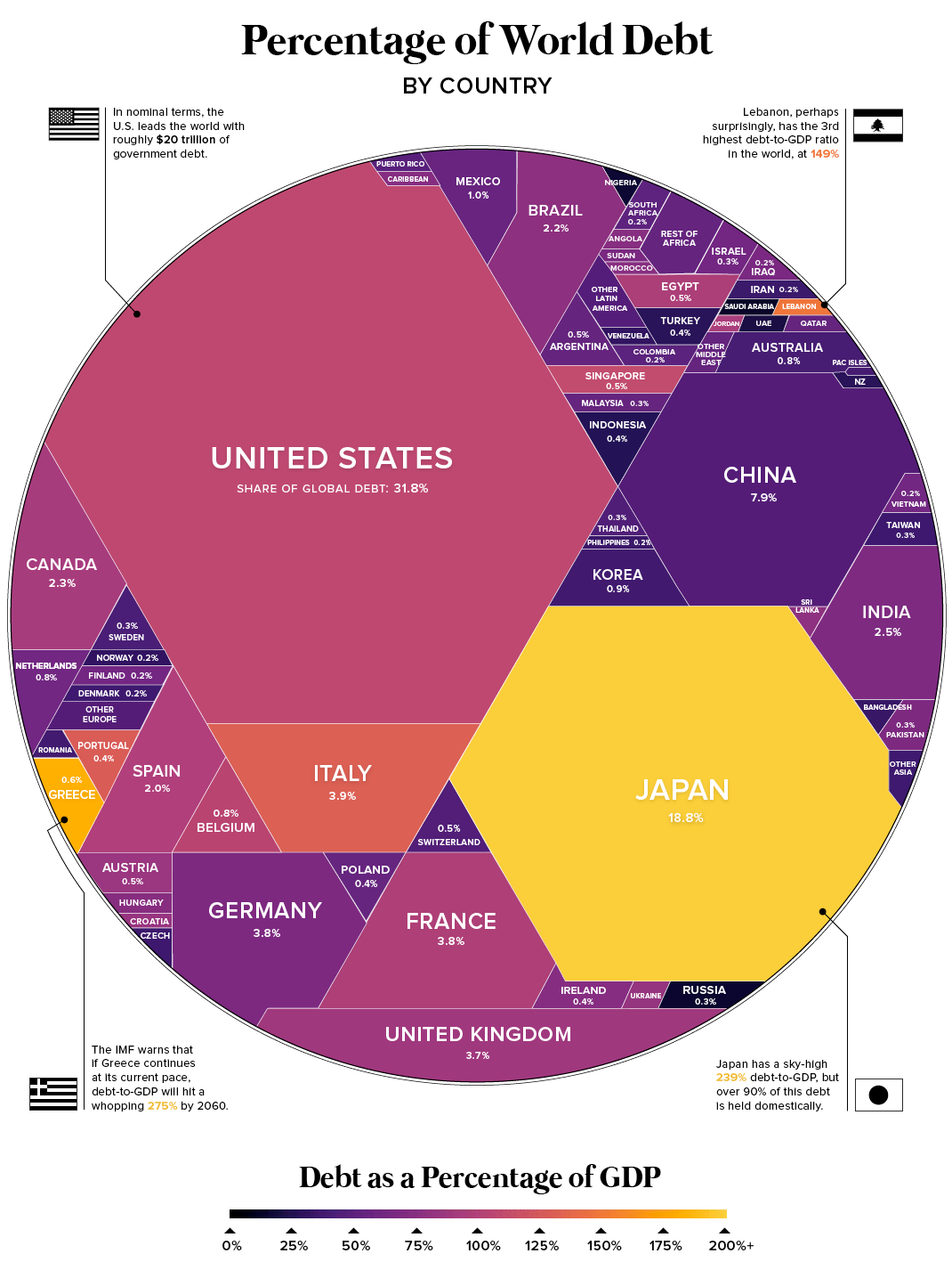
There is now a total of $63 trillion in global sovereign debt, and this colorful chart breaks it down by country and debt-to-GDP ratio. See the large version in all its glory here.
5. The Early Years of Warren Buffett
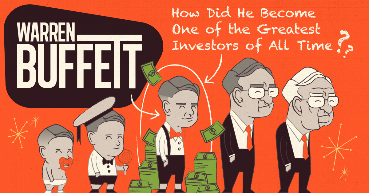
This marvelous infographic tells the story of Warren Buffet’s early years, including his various childhood business pursuits, his first stock purchase, and other events that have helped shape the Oracle of Omaha’s career. This is the start of our five-part Warren Buffett series, which will continue through 2018.
4. The World’s Top Brands
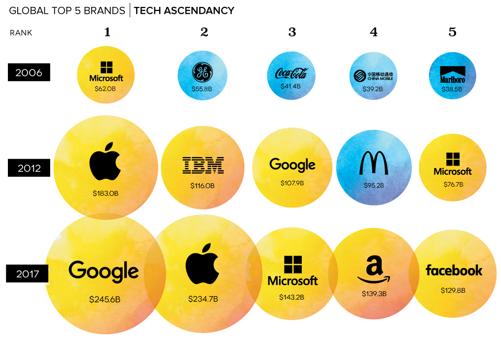
What are the world’s most valuable brands? This big chart counts down the companies with the most brand value in 2017, and also gives historical perspective (shown above) on the most valuable brands over time.
3. The Origin Story of Tesla

Today, we know Tesla as an important leader in the green revolution, developing everything from electric semi-trucks to Powerwalls. However, Tesla’s success wasn’t always a given – and this beautiful infographic tells the story of Tesla’s early vision, the company’s strategy to shed the stigma around EVs, the cost overruns in developing the Roadster, and the company’s narrow escape from the brink of bankruptcy.
It was the first piece of our three-part Rise of Tesla Series – the rest will be released in early 2018.
2. Walmart Nation
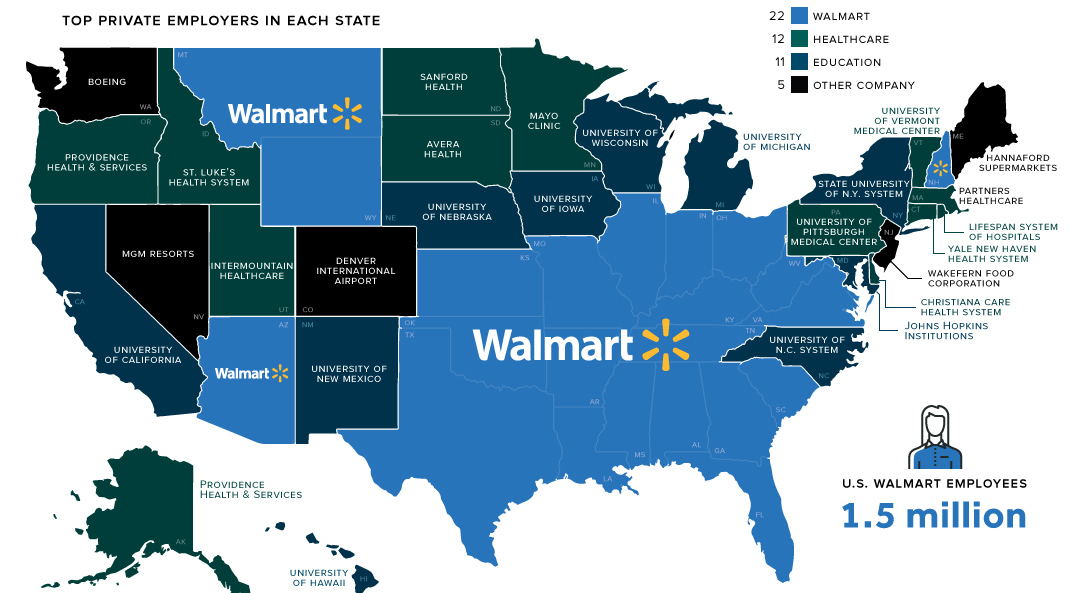
This memorable chart shows that Walmart has the most employees in a whopping 22 states. With nearly one million views and 75,000 social media shares, this was our most-shared post of the year.
1. All of the World’s Money and Markets
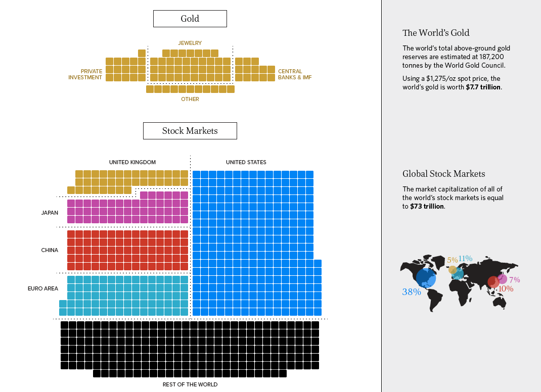
A remake of our 2015 graphic that “put us on the map”, this is the latest update to All of the World’s Money and Markets in One Visualization.
Including stats from both versions of the graphic, this visualization has now been seen by more than 1.5 million people on our site alone.
Honorable mentions:
The Jeff Bezos Empire in One Chart
Made after Amazon’s acquisition of Whole Foods, showing all the companies that Bezos has invested in or bought.
The Numbers Behind the World’s Closest Trade Relationship
Statistics behind USA-Canada trade
Histomap: Visualizing the 4,000 Year History of Global Power
This crazy chart made in 1931 isn’t ours, but it’s super interesting.
How Billionaire Investors Hedge Against Geopolitical Black Swans
Why geopolitical risk is higher, and what billionaires are doing to protect their wealth
The $74 Trillion Economy in One Chart
The global economy visualized
And lastly, don’t forget to check out our roundups from previous years!
The Top 16 Infographics of 2016
The Top 15 Infographics of 2015
The Top 14 Infographics of 2014
And if you haven’t subscribed to our free mailing list or social feeds, make sure you do so below.
Have a great 2018!


Best of
Best Visualizations of March on the Voronoi App
We round up the most popular, most discussed, and most liked visualizations of the month on Voronoi, our new data storytelling platform.
At the end of 2023, we publicly launched Voronoi, our free new data discovery app!
The initial response from both users and creators has been incredible. We now have millions of in-app views, and there are already more than 700 interesting visualizations to discover, many of which will never be published on Visual Capitalist.
For that reason, we’ve chosen to highlight some of the most popular visualizations and creators from March in this roundup. To see them and many others, make sure to download the app!
Let’s take a look at a popular creator worth highlighting, as well as the most viewed, most discussed, and most liked posts of the month.
POPULAR CREATOR
Ehsan Soltani
Visual Capitalist isn’t the only creator on the Voronoi app.
Instead, it features incredible data-driven charts and stories from many of the world’s best creators, like Ehsan Soltani.
Ehsan is an economist, and one of the most prolific creators on Voronoi so far. He’s published 41 visualizations on wide-ranging subjects such as:
- The world’s biggest “money printer” economies
- Global commodity returns
- Corruption by country
- Inflation rates in advanced economies
For those interested in what’s happening with the global economy, Ehsan Soltani is definitely worth a follow!
![]() View all of Ehsan’s visuals on Voronoi today.
View all of Ehsan’s visuals on Voronoi today.
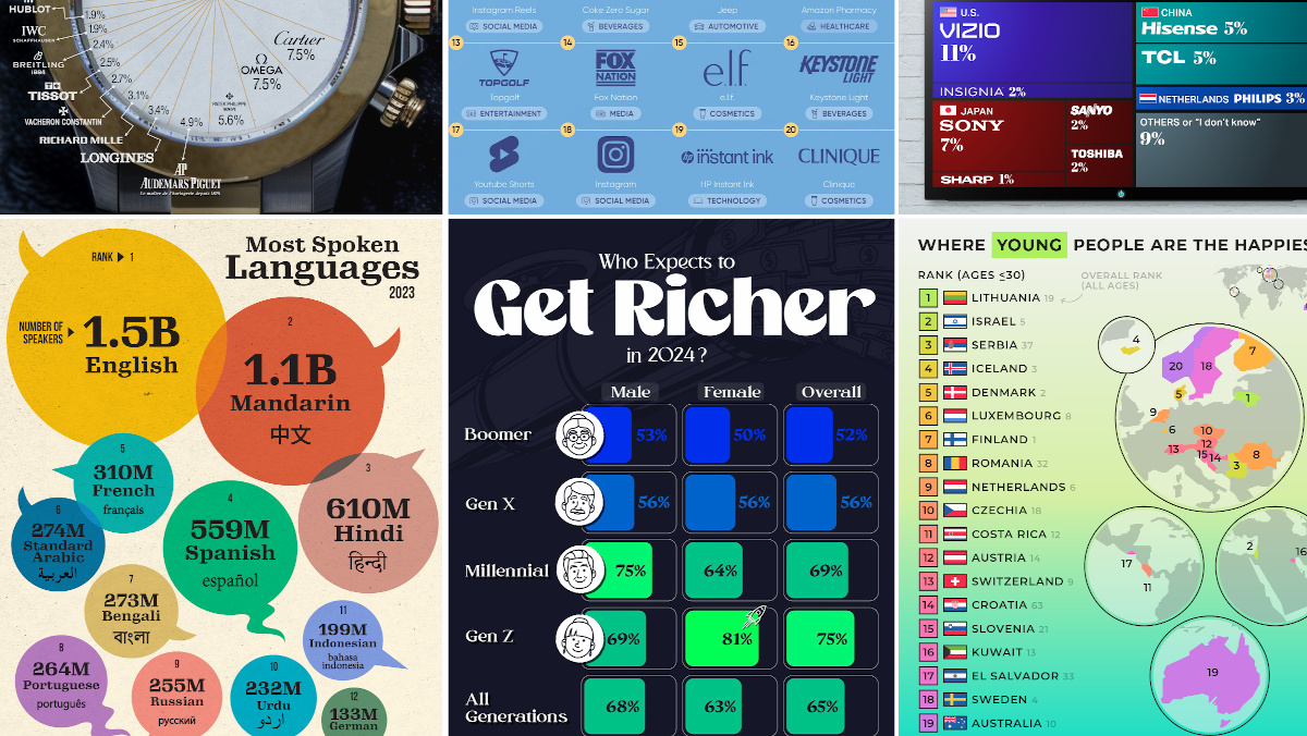
MOST VIEWED
The 12 Most Spoken Languages in 2023
Which languages are most commonly spoken around the world by native speakers?
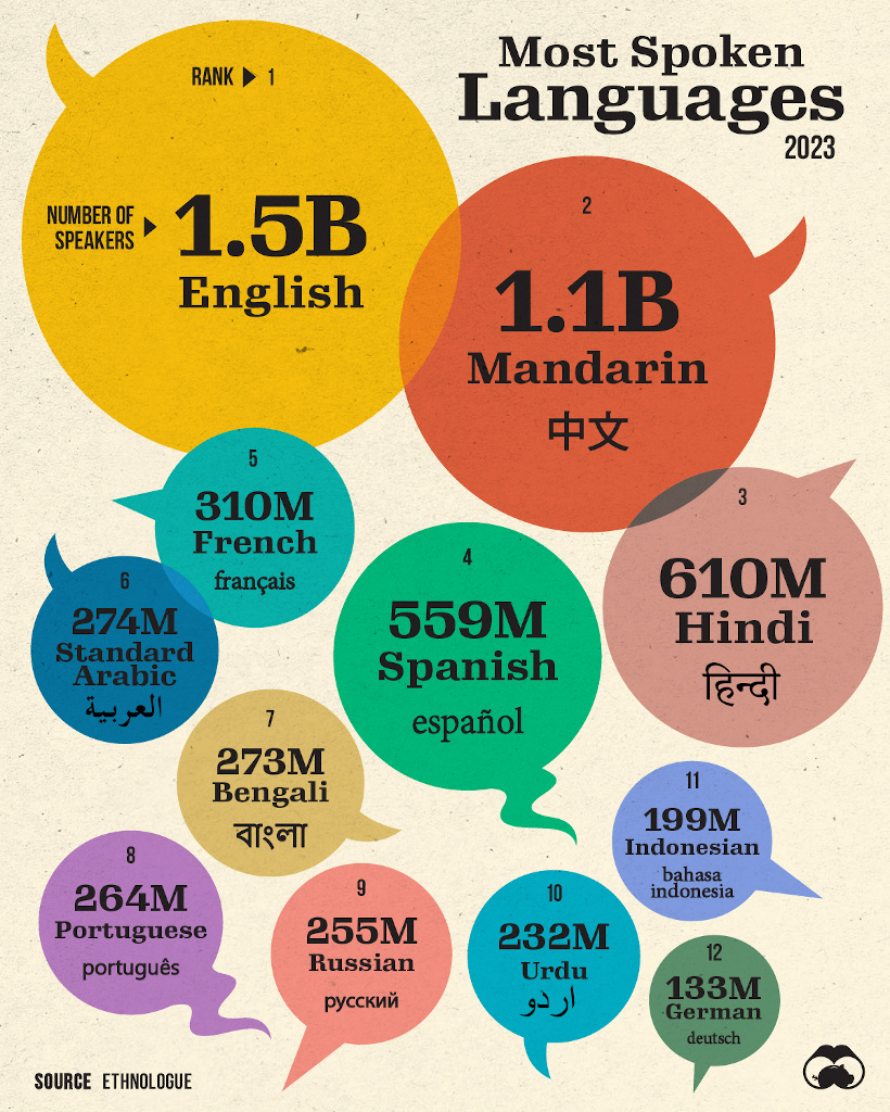
This visualization from Visual Capitalist was one of the most viewed by users, and it highlights the top languages spoken around the world.
Data here comes from the Ethnologue database, the most rigorous and comprehensive language database globally. It’s worth noting that it highlights languages spoken by native speakers only, so second languages are not counted here.
![]() Get the data behind this visual on Voronoi today.
Get the data behind this visual on Voronoi today.
MOST DISCUSSED
Where Young People are Happiest
The most commented on visualization from Visual Capitalist showed the countries with the happiest young people (under 30 years old).
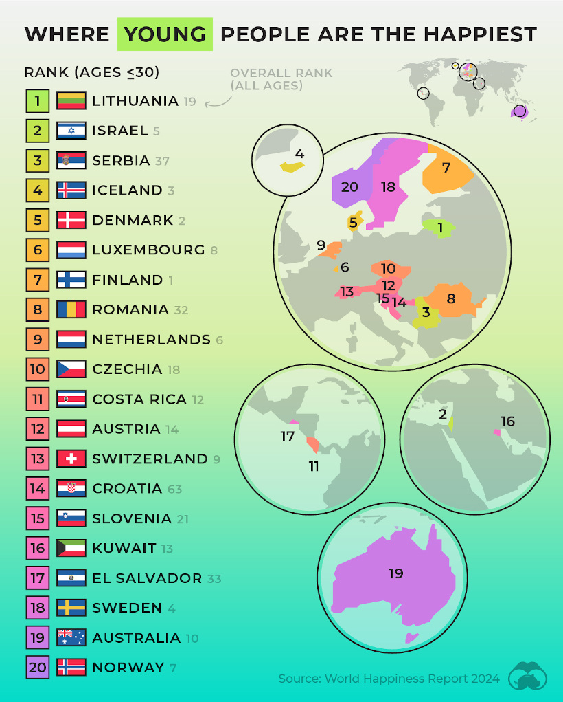
This comes from the World Happiness Report, which Visual Capitalist covers extensively every year.
In this year’s edition, one particularly interesting feature focused on happiness discrepancies between age groups. For example, in some countries, younger people were much happier than the average population—in others, older populations were far happier.
![]() To join the conversation, download Voronoi today.
To join the conversation, download Voronoi today.
MOST LIKED
The Fastest Growing Brands in the U.S.
The most liked visual on Voronoi in March came from Visual Capitalist, showing the brands that are growing the fastest in the United States.
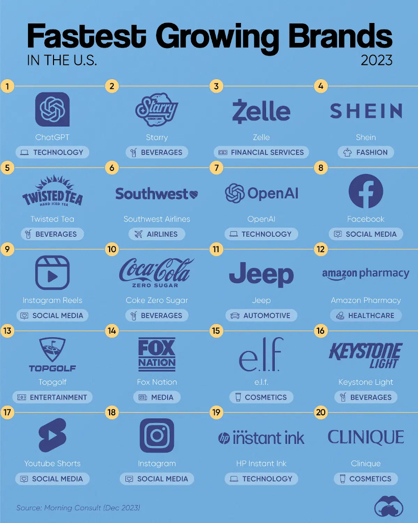
The data here comes from Morning Consult, and shows the share of customers that were considering purchasing a brand in October 1-24, 2023, and subtracted the share of those who said the same between Jan 1-31, 2023.
![]() Get the data behind this visual on Voronoi today.
Get the data behind this visual on Voronoi today.

-

 Maps2 weeks ago
Mapped: Average Wages Across Europe
-

 Money1 week ago
Which States Have the Highest Minimum Wage in America?
-

 Real Estate1 week ago
Ranked: The Most Valuable Housing Markets in America
-

 Markets1 week ago
Charted: Big Four Market Share by S&P 500 Audits
-

 AI1 week ago
The Stock Performance of U.S. Chipmakers So Far in 2024
-

 Automotive2 weeks ago
Almost Every EV Stock is Down After Q1 2024
-

 Money2 weeks ago
Where Does One U.S. Tax Dollar Go?
-

 Green2 weeks ago
Ranked: Top Countries by Total Forest Loss Since 2001