Markets
The U.S. States With the Most Million Dollar Homes
Whether it’s a mansion in the suburbs or a penthouse in the city center, the price tag of any prime piece of real estate is usually measured in the millions.
Where in the United States can the most multi-million dollar homes be found – and which specific cities have the highest growth rates for high-end property listings?
Million Dollar Homes
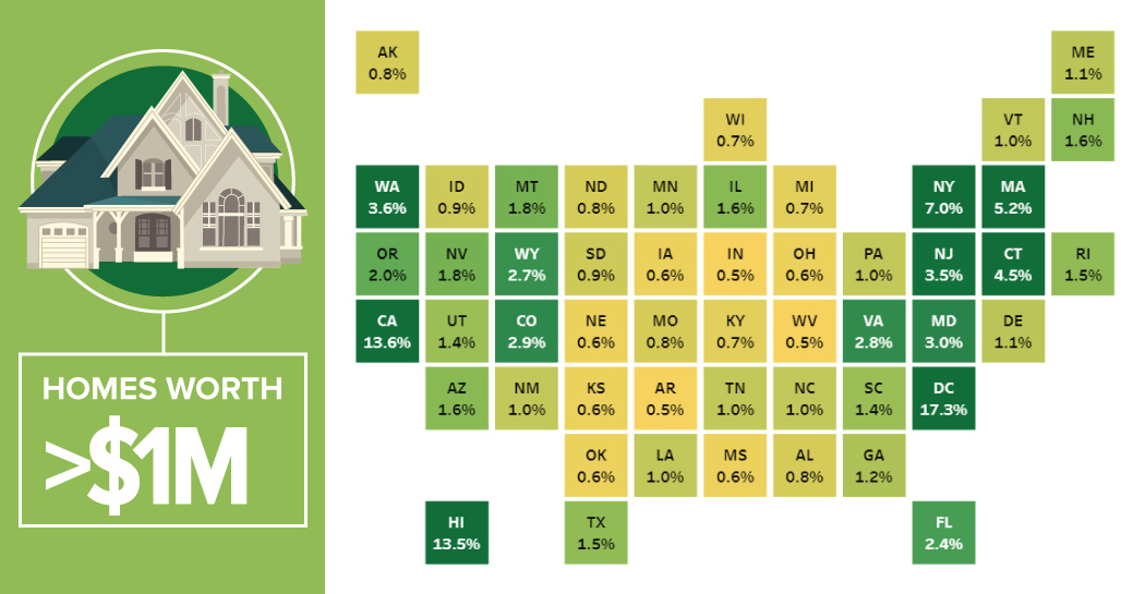
Today’s interactive visualization comes to us from Overflow Data, and it shows the percentage of homes worth greater than a million dollars in each state, as well as D.C.
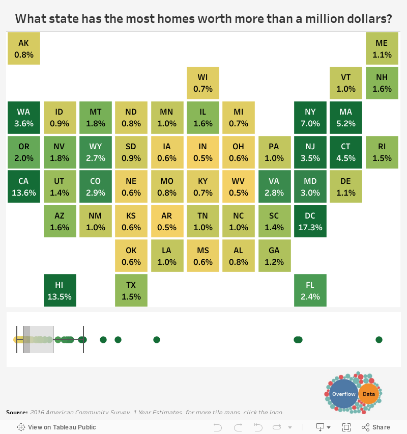
The first thing that stands out here is the skewed distribution.
The rate of million dollar homes per state ranges from 0.5% (Indiana) to 17.3% (D.C.), but the median is only 1.1%. That means that the vast amount of states are closer to the zero end of the spectrum.
In fact, only six jurisdictions exceed the 4% mark:
| Rank | Jurisdiction | % of million dollar homes |
|---|---|---|
| #1 | Washington, D.C. | 17.3% |
| #2 | California | 13.6% |
| #3 | Hawaii | 13.5% |
| #4 | New York | 7.0% |
| #5 | Massachusetts | 5.2% |
| #6 | Connecticut | 4.5% |
Leading the pack is Washington D.C. with 17.3% of all homes exceeding the $1 million benchmark. This puts the nation’s capital ahead of California (13.6%), Hawaii (13.5%), and New York (7.0%).
The high degree of expensive homes in D.C. is not surprising, since the district is a small, urban jurisdiction, with no real “countryside” where more affordable homes can usually be found.
Changing Cities
But what specific cities are trending upwards? Where are there increasing amounts of homes worth over a million bucks?
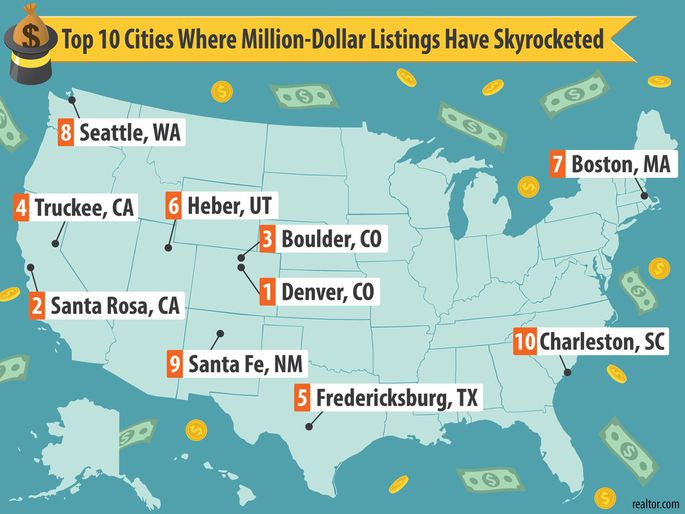
The above map from Realtor.com breaks down the cities that have the biggest increases in million dollar homes over the last three years.
Here’s a closer look:
| Rank | City | >$1mm homes (2017) | >$1 mm homes (2014) | Difference |
|---|---|---|---|---|
| #1 | Denver, CO | 9.4% | 3.3% | +6.1% |
| #2 | Santa Rosa, CA | 14.1% | 8.1% | +6.0% |
| #3 | Boulder, CO | 14.7% | 9.0% | +5.7% |
| #4 | Truckee, CA | 12.4% | 7.1% | +5.3% |
| #5 | Fredericksburg, TX | 13.6% | 9.8% | +3.8% |
| #6 | Heber, UT | 10.5% | 6.8% | +3.7% |
| #7 | Boston, MA | 9.9% | 6.8% | +3.1% |
| #8 | Seattle, WA | 7.7% | 5.3% | +2.4% |
| #9 | Santa Fe, NM | 11.7% | 9.4% | +2.3% |
| #10 | Charleston, SC | 7.0% | 4.9% | +2.1% |
The most impressive representation on the list comes from Colorado, where Denver and Boulder are #1 and #3 respectively.
That said, these cities are anomalies within Colorado as a whole, which has just 2.9% of all homes worth $1 million or more.


Markets
U.S. Debt Interest Payments Reach $1 Trillion
U.S. debt interest payments have surged past the $1 trillion dollar mark, amid high interest rates and an ever-expanding debt burden.


U.S. Debt Interest Payments Reach $1 Trillion
This was originally posted on our Voronoi app. Download the app for free on iOS or Android and discover incredible data-driven charts from a variety of trusted sources.
The cost of paying for America’s national debt crossed the $1 trillion dollar mark in 2023, driven by high interest rates and a record $34 trillion mountain of debt.
Over the last decade, U.S. debt interest payments have more than doubled amid vast government spending during the pandemic crisis. As debt payments continue to soar, the Congressional Budget Office (CBO) reported that debt servicing costs surpassed defense spending for the first time ever this year.
This graphic shows the sharp rise in U.S. debt payments, based on data from the Federal Reserve.
A $1 Trillion Interest Bill, and Growing
Below, we show how U.S. debt interest payments have risen at a faster pace than at another time in modern history:
| Date | Interest Payments | U.S. National Debt |
|---|---|---|
| 2023 | $1.0T | $34.0T |
| 2022 | $830B | $31.4T |
| 2021 | $612B | $29.6T |
| 2020 | $518B | $27.7T |
| 2019 | $564B | $23.2T |
| 2018 | $571B | $22.0T |
| 2017 | $493B | $20.5T |
| 2016 | $460B | $20.0T |
| 2015 | $435B | $18.9T |
| 2014 | $442B | $18.1T |
| 2013 | $425B | $17.2T |
| 2012 | $417B | $16.4T |
| 2011 | $433B | $15.2T |
| 2010 | $400B | $14.0T |
| 2009 | $354B | $12.3T |
| 2008 | $380B | $10.7T |
| 2007 | $414B | $9.2T |
| 2006 | $387B | $8.7T |
| 2005 | $355B | $8.2T |
| 2004 | $318B | $7.6T |
| 2003 | $294B | $7.0T |
| 2002 | $298B | $6.4T |
| 2001 | $318B | $5.9T |
| 2000 | $353B | $5.7T |
| 1999 | $353B | $5.8T |
| 1998 | $360B | $5.6T |
| 1997 | $368B | $5.5T |
| 1996 | $362B | $5.3T |
| 1995 | $357B | $5.0T |
| 1994 | $334B | $4.8T |
| 1993 | $311B | $4.5T |
| 1992 | $306B | $4.2T |
| 1991 | $308B | $3.8T |
| 1990 | $298B | $3.4T |
| 1989 | $275B | $3.0T |
| 1988 | $254B | $2.7T |
| 1987 | $240B | $2.4T |
| 1986 | $225B | $2.2T |
| 1985 | $219B | $1.9T |
| 1984 | $205B | $1.7T |
| 1983 | $176B | $1.4T |
| 1982 | $157B | $1.2T |
| 1981 | $142B | $1.0T |
| 1980 | $113B | $930.2B |
| 1979 | $96B | $845.1B |
| 1978 | $84B | $789.2B |
| 1977 | $69B | $718.9B |
| 1976 | $61B | $653.5B |
| 1975 | $55B | $576.6B |
| 1974 | $50B | $492.7B |
| 1973 | $45B | $469.1B |
| 1972 | $39B | $448.5B |
| 1971 | $36B | $424.1B |
| 1970 | $35B | $389.2B |
| 1969 | $30B | $368.2B |
| 1968 | $25B | $358.0B |
| 1967 | $23B | $344.7B |
| 1966 | $21B | $329.3B |
Interest payments represent seasonally adjusted annual rate at the end of Q4.
At current rates, the U.S. national debt is growing by a remarkable $1 trillion about every 100 days, equal to roughly $3.6 trillion per year.
As the national debt has ballooned, debt payments even exceeded Medicaid outlays in 2023—one of the government’s largest expenditures. On average, the U.S. spent more than $2 billion per day on interest costs last year. Going further, the U.S. government is projected to spend a historic $12.4 trillion on interest payments over the next decade, averaging about $37,100 per American.
Exacerbating matters is that the U.S. is running a steep deficit, which stood at $1.1 trillion for the first six months of fiscal 2024. This has accelerated due to the 43% increase in debt servicing costs along with a $31 billion dollar increase in defense spending from a year earlier. Additionally, a $30 billion increase in funding for the Federal Deposit Insurance Corporation in light of the regional banking crisis last year was a major contributor to the deficit increase.
Overall, the CBO forecasts that roughly 75% of the federal deficit’s increase will be due to interest costs by 2034.

-

 Green1 week ago
Ranked: The Countries With the Most Air Pollution in 2023
-

 Automotive2 weeks ago
Almost Every EV Stock is Down After Q1 2024
-

 AI2 weeks ago
The Stock Performance of U.S. Chipmakers So Far in 2024
-

 Markets2 weeks ago
Charted: Big Four Market Share by S&P 500 Audits
-

 Real Estate2 weeks ago
Ranked: The Most Valuable Housing Markets in America
-

 Money2 weeks ago
Which States Have the Highest Minimum Wage in America?
-

 AI2 weeks ago
Ranked: Semiconductor Companies by Industry Revenue Share
-

 Travel2 weeks ago
Ranked: The World’s Top Flight Routes, by Revenue