Money
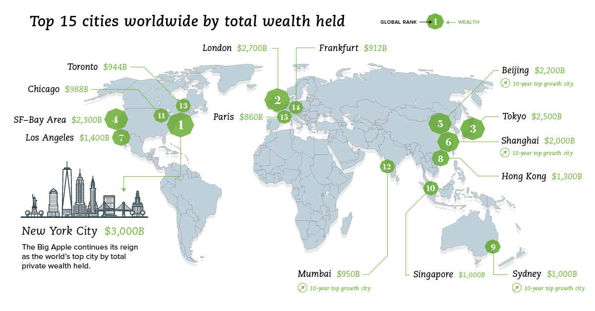
Mapping the World’s Wealthiest Cities
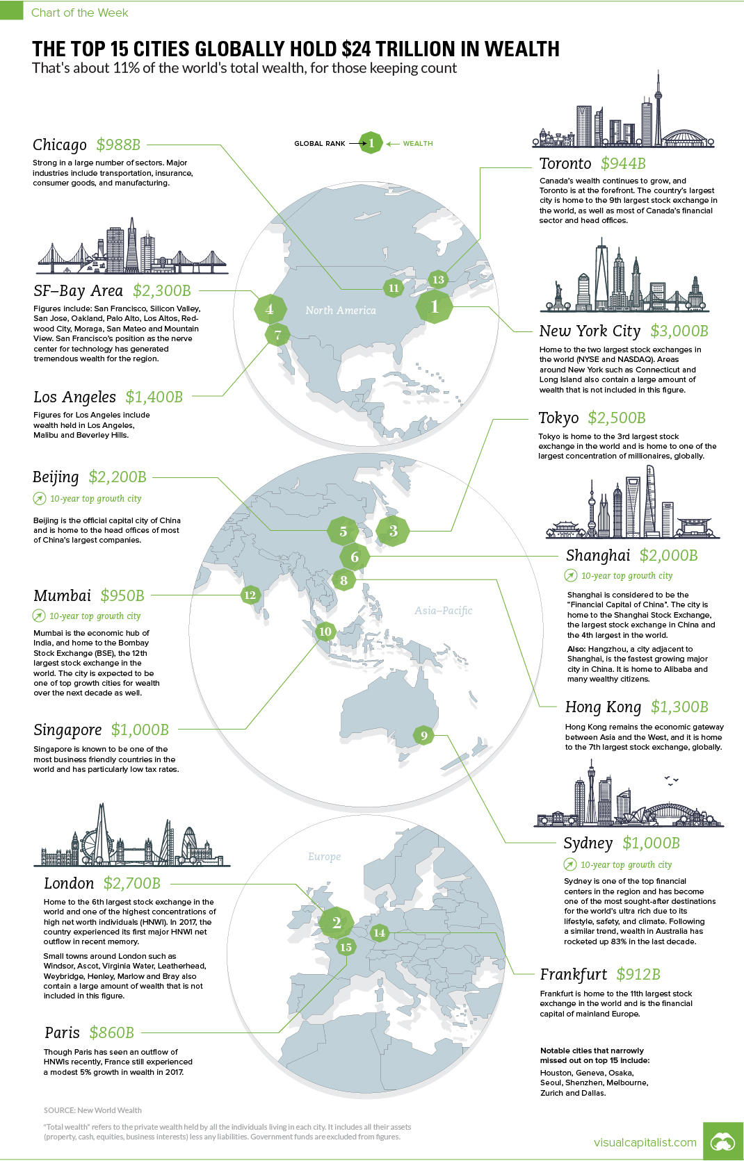
The Top 15 Cities Globally Hold $24 Trillion in Wealth
That’s about 11% of the world’s total private wealth
The Chart of the Week is a weekly Visual Capitalist feature on Fridays.
Which cities are the world’s economic powerhouses, and what portion of global wealth is located in these key urban centers?
Today’s chart pulls information from the latest report from market research firm New World Wealth, which we previously cited weeks ago when we visualized the shift in global wealth over the last decade.
The World’s Wealthiest Cities
The data shown in this chart represents the total amount of private wealth held by all the individuals living in each of these cities.
Figures here include all assets (property, cash, equities, business interests) less any liabilities. Meanwhile, government funds are excluded from these figures.
| Rank | City | Total Wealth |
|---|---|---|
| #1 | New York City | $3.0 trillion |
| #2 | London | $2.7 trillion |
| #3 | Tokyo | $2.5 trillion |
| #4 | San Francisco Bay Area | $2.3 trillion |
| #5 | Beijing | $2.2 trillion |
| #6 | Shanghai | $2.0 trillion |
| #7 | Los Angeles | $1.4 trillion |
| #8 | Hong Kong | $1.3 trillion |
| #9 | Sydney | $1.0 trillion |
| #10 | Singapore | $1.0 trillion |
| #11 | Chicago | $988 billion |
| #12 | Mumbai | $950 billion |
| #13 | Toronto | $944 billion |
| #14 | Frankfurt | $912 billion |
| #15 | Paris | $860 billion |
New World Wealth also mentions that there were eight cities that just missed out on the top 15: Houston, Geneva, Osaka, Seoul, Shenzhen, Melbourne, Zurich and Dallas.
It should also be made clear that wealth is a different measure than Gross Domestic Product (GDP), which is another common metric used to gauge economic power. That said, we do have a list of U.S. cities by GDP size if you’d like to explore the GDP measure on a city level, as well.
Wealth Past and Present
According to the same report, over last 10 years, the cities with the fastest growing rates of wealth were San Francisco, Beijing, Shanghai, Mumbai, and Sydney.
Meanwhile, Mumbai is expected to be the city that will see the highest rate of growth over the next decade.
Interestingly, the report also singles out two major Chinese cities as ones to watch:
Shenzhen: With $770 billion in wealth, this city just misses the Top 15 list. It’s considered the high tech capital of China and is home to the Shenzhen stock exchange (2nd largest in China, and 8th largest in the world). Major smartphone manufacturer Huawei is also based in the city.
Hangzhou: With $425 billion in wealth, this city doesn’t quite measure up to others on the list at first glance. However, it’s actually only a 45 minute train ride away from Shanghai ($2.0 trillion) – and people that work in Shanghai often have homes here as it is considered more scenic. Hangzhou is the fastest growing major city in China (in terms of wealth growth), and ecommerce giant Alibaba notably calls the city its home, as well.


Money
How Debt-to-GDP Ratios Have Changed Since 2000
See how much the debt-to-GDP ratios of advanced economies have grown (or shrank) since the year 2000.


How Debt-to-GDP Ratios Have Changed Since 2000
This was originally posted on our Voronoi app. Download the app for free on Apple or Android and discover incredible data-driven charts from a variety of trusted sources.
Government debt levels have grown in most parts of the world since the 2008 financial crisis, and even more so after the COVID-19 pandemic.
To gain perspective on this long-term trend, we’ve visualized the debt-to-GDP ratios of advanced economies, as of 2000 and 2024 (estimated). All figures were sourced from the IMF’s World Economic Outlook.
Data and Highlights
The data we used to create this graphic is listed in the table below. “Government gross debt” consists of all liabilities that require payment(s) of interest and/or principal in the future.
| Country | 2000 (%) | 2024 (%) | Change (pp) |
|---|---|---|---|
| 🇯🇵 Japan | 135.6 | 251.9 | +116.3 |
| 🇸🇬 Singapore | 82.3 | 168.3 | +86.0 |
| 🇺🇸 United States | 55.6 | 126.9 | +71.3 |
| 🇬🇧 United Kingdom | 36.6 | 105.9 | +69.3 |
| 🇬🇷 Greece | 104.9 | 160.2 | +55.3 |
| 🇫🇷 France | 58.9 | 110.5 | +51.6 |
| 🇵🇹 Portugal | 54.2 | 104.0 | +49.8 |
| 🇪🇸 Spain | 57.8 | 104.7 | +46.9 |
| 🇸🇮 Slovenia | 25.9 | 66.5 | +40.6 |
| 🇫🇮 Finland | 42.4 | 76.5 | +34.1 |
| 🇭🇷 Croatia | 35.4 | 61.8 | +26.4 |
| 🇨🇦 Canada | 80.4 | 103.3 | +22.9 |
| 🇨🇾 Cyprus | 56.0 | 70.9 | +14.9 |
| 🇦🇹 Austria | 65.7 | 74.0 | +8.3 |
| 🇸🇰 Slovak Republic | 50.5 | 56.5 | +6.0 |
| 🇩🇪 Germany | 59.3 | 64.0 | +4.7 |
| 🇧🇪 Belgium | 109.6 | 106.8 | -2.8 |
| 🇮🇱 Israel | 77.4 | 56.8 | -20.6 |
| 🇮🇸 Iceland | 75.8 | 54.6 | -21.2 |
The debt-to-GDP ratio indicates how much a country owes compared to the size of its economy, reflecting its ability to manage and repay debts. Percentage point (pp) changes shown above indicate the increase or decrease of these ratios.
Countries with the Biggest Increases
Japan (+116 pp), Singapore (+86 pp), and the U.S. (+71 pp) have grown their debt as a percentage of GDP the most since the year 2000.
All three of these countries have stable, well-developed economies, so it’s unlikely that any of them will default on their growing debts. With that said, higher government debt leads to increased interest payments, which in turn can diminish available funds for future government budgets.
This is a rising issue in the U.S., where annual interest payments on the national debt have surpassed $1 trillion for the first time ever.
Only 3 Countries Saw Declines
Among this list of advanced economies, Belgium (-2.8 pp), Iceland (-21.2 pp), and Israel (-20.6 pp) were the only countries that decreased their debt-to-GDP ratio since the year 2000.
According to Fitch Ratings, Iceland’s debt ratio has decreased due to strong GDP growth and the use of its cash deposits to pay down upcoming maturities.
See More Debt Graphics from Visual Capitalist
Curious to see which countries have the most government debt in dollars? Check out this graphic that breaks down $97 trillion in debt as of 2023.

-

 Maps2 weeks ago
Mapped: Average Wages Across Europe
-

 Money1 week ago
Which States Have the Highest Minimum Wage in America?
-

 Real Estate1 week ago
Ranked: The Most Valuable Housing Markets in America
-

 Markets1 week ago
Charted: Big Four Market Share by S&P 500 Audits
-

 AI1 week ago
The Stock Performance of U.S. Chipmakers So Far in 2024
-

 Automotive1 week ago
Almost Every EV Stock is Down After Q1 2024
-

 Money2 weeks ago
Where Does One U.S. Tax Dollar Go?
-

 Green2 weeks ago
Ranked: Top Countries by Total Forest Loss Since 2001