Technology
Tech Cold War: Facebook vs. Google
Tech Cold War: Facebook vs. Google
A war rages on as we speak, and it’s more intense than any war in Game of Thrones. The war I speak of is the battle between Facebook and Google for online supremacy.
Both companies have transcended their original purpose and mission, and a huge driving force of that change has been acquisitions. Google and Facebook are perennial newsmakers, due to their ever-expanding product and service offerings.
Last week at Google I/O, an annual software-developer conference, the tech giant announced that it is launching an initiative that will allow cell phone manufacturers the ability to produce low-cost, high performing cell phones that can use Google’s operating system. This program is aimed toward developing countries on the rise and the devices will be in the sub-$100 range. The program is set to launch in India, with three manufacturers participating in the pilot program.
Facebook, on the other hand, has been in the news recently for a much less PR-friendly reason. The social media giant is under heavy criticism for conducting a study on a small sub-section of users without their consent for a brief period in 2012. The study’s aim was to alter the emotional state of 700,000 users by manipulating the amount of positive and negative content in the users’ news feed. They were looking for something they called the “emotional contagion” effect – basically whether less positive stories would make users more negative and vice versa. The study has triggered an intense debate on the ethicality of the study and Facebook’s lack of respect for the users’ emotions and privacy.
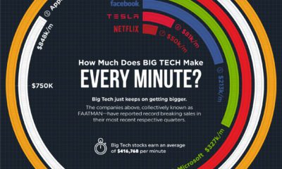
Original infographic from: WhoIsHostingThis.com


Brands
How Tech Logos Have Evolved Over Time
From complete overhauls to more subtle tweaks, these tech logos have had quite a journey. Featuring: Google, Apple, and more.


How Tech Logos Have Evolved Over Time
This was originally posted on our Voronoi app. Download the app for free on iOS or Android and discover incredible data-driven charts from a variety of trusted sources.
One would be hard-pressed to find a company that has never changed its logo. Granted, some brands—like Rolex, IBM, and Coca-Cola—tend to just have more minimalistic updates. But other companies undergo an entire identity change, thus necessitating a full overhaul.
In this graphic, we visualized the evolution of prominent tech companies’ logos over time. All of these brands ranked highly in a Q1 2024 YouGov study of America’s most famous tech brands. The logo changes are sourced from 1000logos.net.
How Many Times Has Google Changed Its Logo?
Google and Facebook share a 98% fame rating according to YouGov. But while Facebook’s rise was captured in The Social Network (2010), Google’s history tends to be a little less lionized in popular culture.
For example, Google was initially called “Backrub” because it analyzed “back links” to understand how important a website was. Since its founding, Google has undergone eight logo changes, finally settling on its current one in 2015.
| Company | Number of Logo Changes |
|---|---|
| 8 | |
| HP | 8 |
| Amazon | 6 |
| Microsoft | 6 |
| Samsung | 6 |
| Apple | 5* |
Note: *Includes color changes. Source: 1000Logos.net
Another fun origin story is Microsoft, which started off as Traf-O-Data, a traffic counter reading company that generated reports for traffic engineers. By 1975, the company was renamed. But it wasn’t until 2012 that Microsoft put the iconic Windows logo—still the most popular desktop operating system—alongside its name.
And then there’s Samsung, which started as a grocery trading store in 1938. Its pivot to electronics started in the 1970s with black and white television sets. For 55 years, the company kept some form of stars from its first logo, until 1993, when the iconic encircled blue Samsung logo debuted.
Finally, Apple’s first logo in 1976 featured Isaac Newton reading under a tree—moments before an apple fell on his head. Two years later, the iconic bitten apple logo would be designed at Steve Jobs’ behest, and it would take another two decades for it to go monochrome.

-

 Green1 week ago
Ranked: The Countries With the Most Air Pollution in 2023
-

 Automotive2 weeks ago
Almost Every EV Stock is Down After Q1 2024
-

 AI2 weeks ago
The Stock Performance of U.S. Chipmakers So Far in 2024
-

 Markets2 weeks ago
Charted: Big Four Market Share by S&P 500 Audits
-

 Real Estate2 weeks ago
Ranked: The Most Valuable Housing Markets in America
-

 Money2 weeks ago
Which States Have the Highest Minimum Wage in America?
-

 AI2 weeks ago
Ranked: Semiconductor Companies by Industry Revenue Share
-

 Travel2 weeks ago
Ranked: The World’s Top Flight Routes, by Revenue