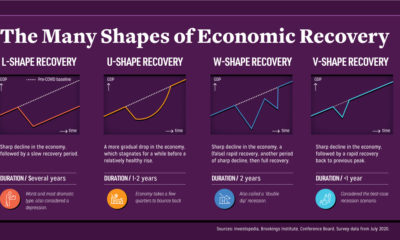

Economic recovery from COVID-19 could come in four shapes—L, U, W, and V. What do they mean, and what do global CEOs see as the most...
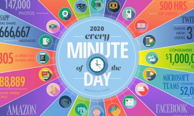

A lot can happen in an internet minute. This graphic looks at the enormous numbers behind the online services billions use every day.
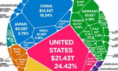

The world's total GDP crested $88 trillion in 2019—but how are the current COVID-19 economic contractions affecting its future outlook?
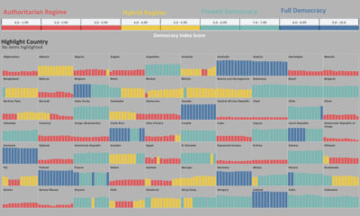

Has the world become more or less free? To find out, this graphic highlights the changing state of democracy in 167 countries since 2006.


This graphic charts the American dairy industry's shift in milk production from small commercial farms to fewer, larger farms.
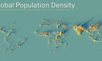

What does population density look like on a global scale? These detailed 3D renders illustrate our biggest urban areas and highlight population trends.
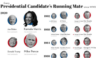

Picking the right VP makes all the difference to a President's success. We look at running mates of all Presidential hopefuls since 1940.
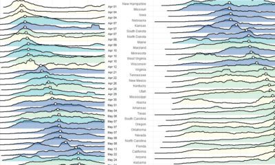

These charts and maps show the evolution of COVID-19's spread in the United States, by organizing data based on peak case and death dates.
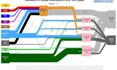

This incredible flow diagram shows how U.S. energy use broke down in 2019, including by source and end sector.
Which apps have been the winners and losers of the COVID-19 lockdown? See how consumer behavior and app popularity has shifted in recent months.


