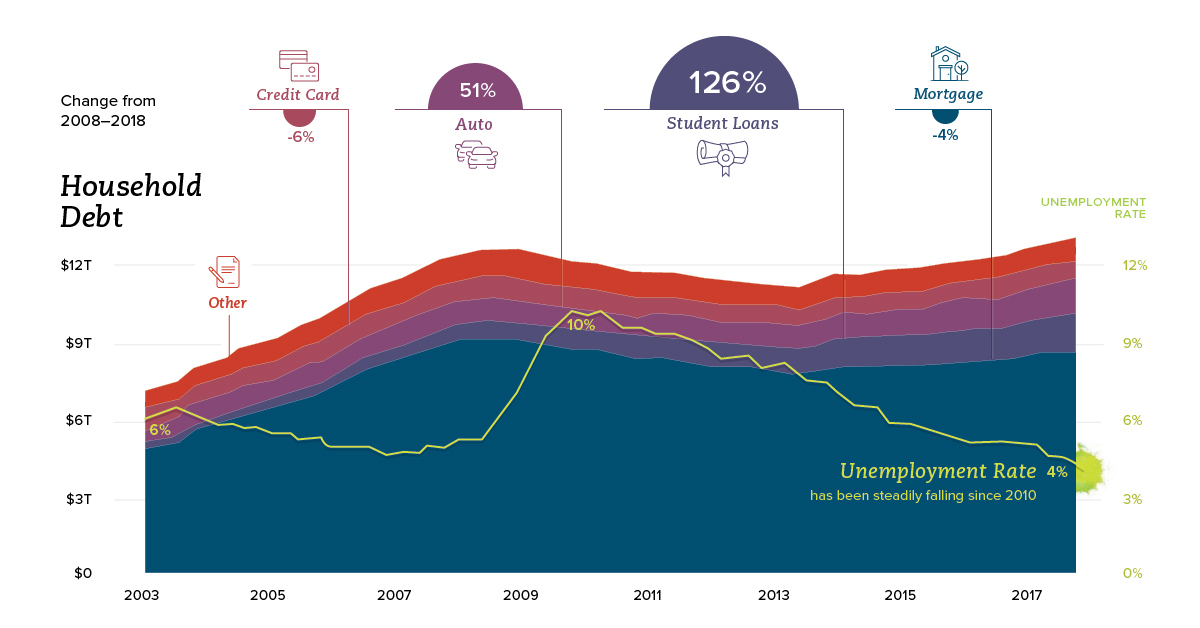
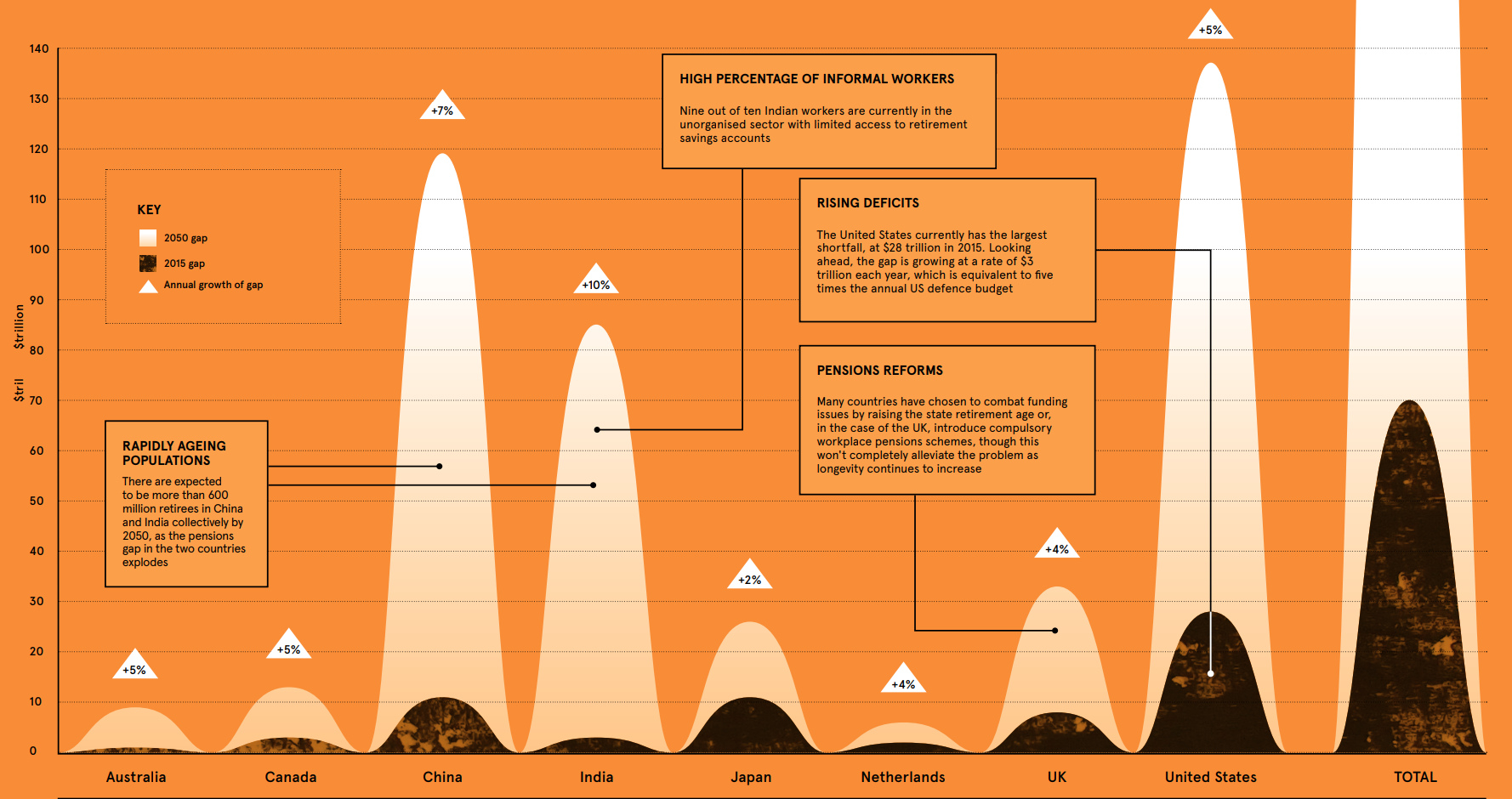
According to the WEF, the retirement savings gap is growing at $28 billion every 24 hours – and it could be the ‘financial equivalent of climate change’.
Tag Archives: saving
The difference between good and great is found in the details. As discussed in this infographic, a few little investing ideas can make a big difference.
Embed This Image On Your Site (copy code below):
Courtesy of: Visual Capitalist
- 2 Feb
- 0
Latest Posts
Most Popular

Ranked: The Best and Worst State Economies
1

The Relationship Between Money and Happiness
2

The Multi-Billion Dollar Industry That Makes Its Living From Your Data
3

This Chart Reveals Google's True Dominance Over the Web
4

Visualizing the Prolific Plastic Problem in Our Oceans
5

Ranked: The Best and Worst State Economies
1

The Pension Time Bomb: $400 Trillion by 2050
2

The Multi-Billion Dollar Industry That Makes Its Living From Your Data
3

The Relationship Between Money and Happiness
4

This Chart Reveals Google's True Dominance Over the Web
5
Tweets
- Infographic: Visualizing the Prolific Plastic Problem in Our Oceans (Full graphic here: https://t.co/52pYCA11YH) https://t.co/dGBWkikMPJ@Visualcap18 hours ago
- Got the munchies for a booming cannabis investment? Our #infographic shows you the 9 things you should know before… https://t.co/3X3HLiR1qh@Visualcap1 day ago
- Infographic: This Chart Reveals Google's True Dominance Over the Web https://t.co/KtVYwwDSaP https://t.co/2IJbEvtkpx@Visualcap1 day ago
- [Infographic] Ranked: The Best and Worst State Economies https://t.co/TeA6Y54Z4r https://t.co/Gl6V0FsCP3@Visualcap2 days ago
- Infographic: The Future of Crypto Payments in the Retail Market https://t.co/tKHuuBTrMU https://t.co/zw7gRsSKqo@Visualcap3 days ago