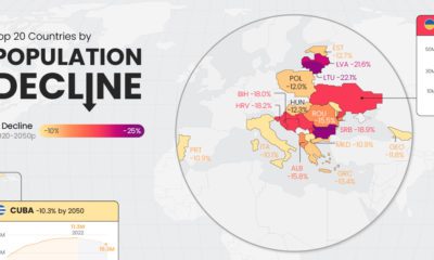

Population decline is a rising issue for many countries in Eastern Europe, as well as outliers like Japan and Cuba.
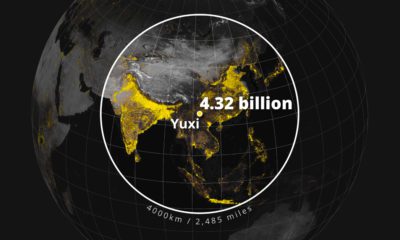

Population density varies across the globe. These maps use geographical circles to show the most densely populated areas on multiple continents.
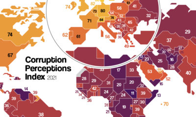

Which countries are the most (and least) corrupt? This map shows corruption around the world, and the movers and shakers over the last decade.
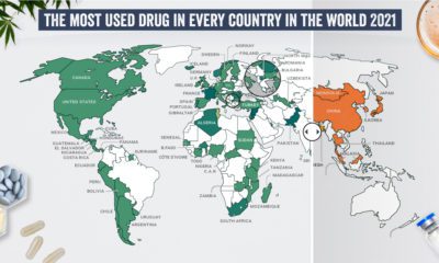

What are the most commonly used illicit drugs around the world?
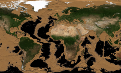

More than two-thirds of Earth’s surface is covered by water and hidden from sight. This animation drains the world’s oceans to reveal the ocean floor.
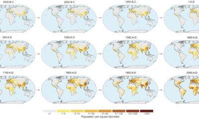

In the next year or so, humanity is expected to pass the 8 billion person milestone. These charts and maps put global population growth into context.
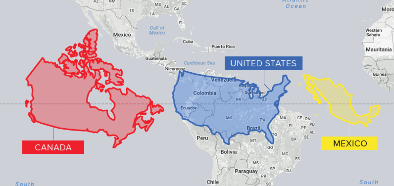
Conventional cartographic techniques have caused many to have a skewed perception of the true size of countries. Can an equal-area map provide clarity?
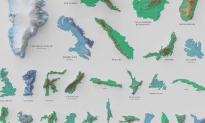

See the world's 100 biggest islands in a side-by-side comparison. Then, we look to see which islands have the highest population densities.

The world map you know is totally wrong. Check out this clever graphic, which helps put into perspective the true size of countries.
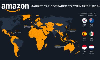

How do the big tech giants compare to entire countries? Here's how Apple, Microsoft, and Amazon's market caps stack up against national GDP.


 Creator Program