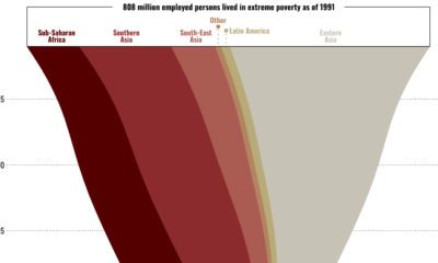

This graphic shows the regional breakdown of the world’s working poor, and how this demographic has changed since 1995.
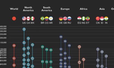

This graphic shows income distributions in 16 different countries around the world, using data from the World Inequality Database.
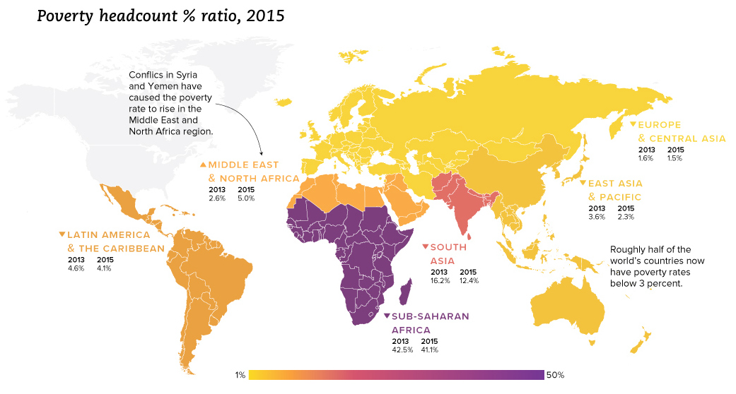
We look at the latest data from the World Bank, which reveals a drop in extreme poverty of 1 billion people globally since the year 1990.


 Creator Program