Money
Visualizing the Shifting Income Distribution of American Jobs
When we talk about the money that the “average” American worker makes, we are usually referencing a “median” or “mean” income statistic.
While this number can be useful in many different contexts, it can also be extremely limiting. The reality is that there’s a very wide range of incomes out there, even within a particular type of industry. Some people can barely make ends meet, and others make millions of dollars more.
To view income distribution through a wider lens, data visualization expert Nathan Yau has created an interactive chart that breaks down millions of data points into just 50 dots per industry. The dots are visualized on a scale from $0 to $200k+ and binned in $5,000 increments. Data is also adjusted for inflation.
Income Distribution by Industry in 1960
Here’s a snapshot showing what income distribution looked like 57 years ago for a variety of broad industries:
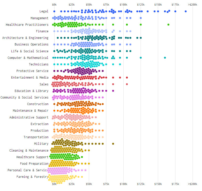
Generally speaking, many of the ranges are on the lower side of things and tend to have data points clustered around the “middle” of each distribution.
Income Distribution by Industry in 2014
Fast forward to 2014, and nearly every income bracket has expanded out.
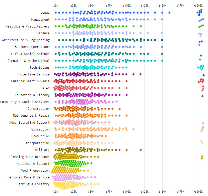
In many of these professions, workers are now making more money – this is good news for the economy.
The downside? There are two problems: (1) Higher inequality, and (2) Many of the new jobs created recently are on the lower end of the income spectrum.
As you can see, top earning lawyers, engineers, or managers are able to climb up towards the tops of their brackets. A lucky few are able to make $200k+, which is far more than the vast majority of the workforce.
However, workers in other industries like food preparation or healthcare support are not so lucky. Unfortunately, in these sectors, making a middle-class income is very difficult – and many people are bringing in less than $25k per year. Yet, it is in these types of sectors that we’ve seen the majority of “new jobs” appear over recent years.
It makes it difficult for society to solve the income inequality problem when this is the case.


Money
Charted: Who Has Savings in This Economy?
Older, better-educated adults are winning the savings game, reveals a January survey by the National Opinion Research Center at the University of Chicago.
Who Has Savings in This Economy?
This was originally posted on our Voronoi app. Download the app for free on iOS or Android and discover incredible data-driven charts from a variety of trusted sources.
Two full years of inflation have taken their toll on American households. In 2023, the country’s collective credit card debt crossed $1 trillion for the first time. So who is managing to save money in the current economic environment?
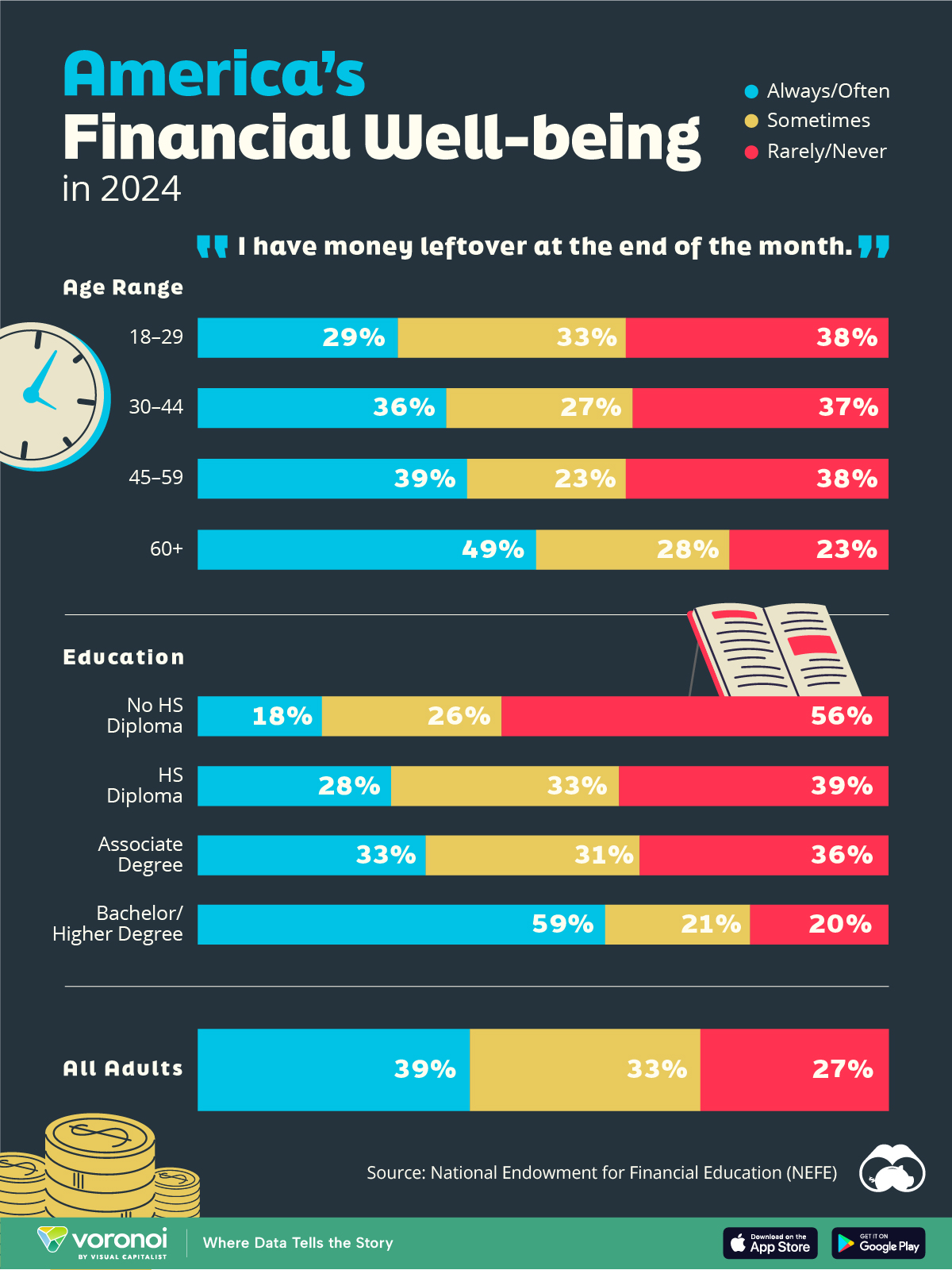
We visualize the percentage of respondents to the statement “I have money leftover at the end of the month” categorized by age and education qualifications. Data is sourced from a National Endowment for Financial Education (NEFE) report, published last month.
The survey for NEFE was conducted from January 12-14, 2024, by the National Opinion Research Center at the University of Chicago. It involved 1,222 adults aged 18+ and aimed to be representative of the U.S. population.
Older Americans Save More Than Their Younger Counterparts
General trends from this dataset indicate that as respondents get older, a higher percentage of them are able to save.
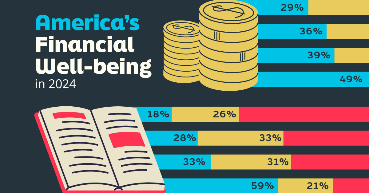
| Age | Always/Often | Sometimes | Rarely/Never |
|---|---|---|---|
| 18–29 | 29% | 33% | 38% |
| 30–44 | 36% | 27% | 37% |
| 45–59 | 39% | 23% | 38% |
| Above 60 | 49% | 28% | 23% |
| All Adults | 39% | 33% | 27% |
Note: Percentages are rounded and may not sum to 100.
Perhaps not surprisingly, those aged 60+ are the age group with the highest percentage saying they have leftover money at the end of the month. This age group spent the most time making peak earnings in their careers, are more likely to have investments, and are more likely to have paid off major expenses like a mortgage or raising a family.
The Impact of Higher Education on Earnings and Savings
Based on this survey, higher education dramatically improves one’s ability to save. Shown in the table below, those with a bachelor’s degree or higher are three times more likely to have leftover money than those without a high school diploma.
| Education | Always/Often | Sometimes | Rarely/Never |
|---|---|---|---|
| No HS Diploma | 18% | 26% | 56% |
| HS Diploma | 28% | 33% | 39% |
| Associate Degree | 33% | 31% | 36% |
| Bachelor/Higher Degree | 59% | 21% | 20% |
| All Adults | 39% | 33% | 27% |
Note: Percentages are rounded and may not sum to 100.
As the Bureau of Labor Statistics notes, earnings improve with every level of education completed.
For example, those with a high school diploma made 25% more than those without in 2022. And as the qualifications increase, the effects keep stacking.
Meanwhile, a Federal Reserve study also found that those with more education tended to make financial decisions that contributed to building wealth, of which the first step is to save.

-

 Markets1 week ago
U.S. Debt Interest Payments Reach $1 Trillion
-

 Business2 weeks ago
Charted: Big Four Market Share by S&P 500 Audits
-

 Markets2 weeks ago
Ranked: The Most Valuable Housing Markets in America
-

 Money2 weeks ago
Which States Have the Highest Minimum Wage in America?
-

 AI2 weeks ago
Ranked: Semiconductor Companies by Industry Revenue Share
-

 Markets2 weeks ago
Ranked: The World’s Top Flight Routes, by Revenue
-

 Demographics2 weeks ago
Population Projections: The World’s 6 Largest Countries in 2075
-

 Markets2 weeks ago
The Top 10 States by Real GDP Growth in 2023