Markets
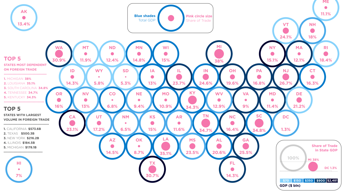
How Reliant Is Each U.S. State on Foreign Trade?
Foreign trade, as a % of GDP for each state:
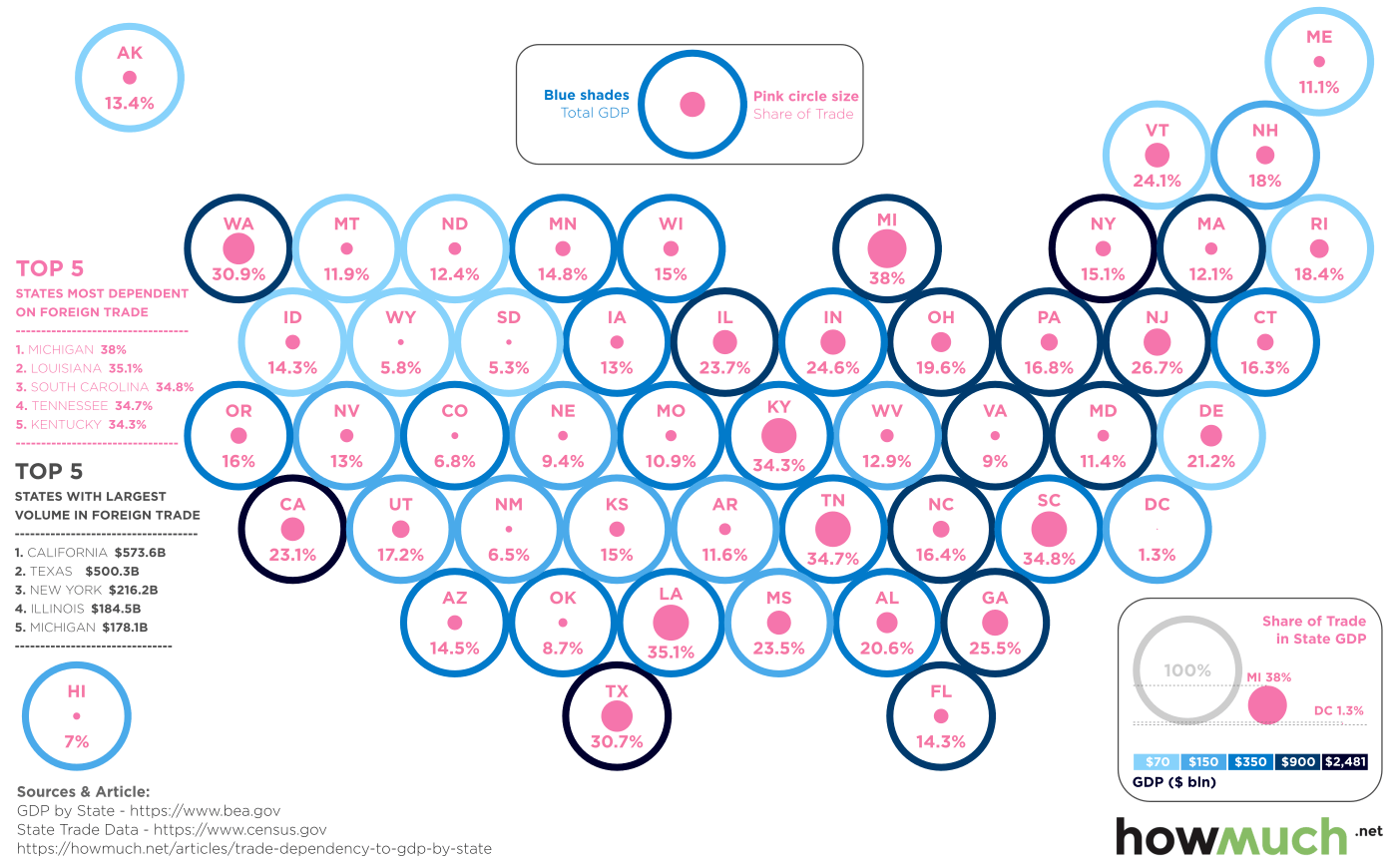
How Reliant Is Each U.S. State on Foreign Trade?
Whether it is lashing out on China for unfairly weakening its currency, or calling out “unfair” government subsidies on Canadian softwood lumber, it’s safe to say that re-opening discussions about foreign trade has become a key priority under President Trump.
Is this the right route to take, and does America really need to negotiate new trade deals?
There are arguments either way, but the the reality is that trade agreements like NAFTA are perceived to have a mixed track record of success. Under NAFTA, trade volume has exploded, prices have been lowered, and U.S. reliance on oil imported from the Middle East has decreased, but at the same time, it is clear that manufacturers, especially in the auto industry, have been setting up shop in Mexico. As a result, at least partially, manufacturing jobs hover near all-time lows.
Walking the Tightrope
The biggest challenge with acting on these re-negotiation ambitions is that it’s inherently risky, no matter how you slice it. Any big slip up or ill-advised trade war could have a drastic impact on the economy.
Today’s data visualization, which comes to us from HowMuch.net, highlights this risk in a relatable way by showing the reliance on foreign trade as a percentage of GDP for each state.
Here are the state economies most dependent on foreign trade:
| Rank | State | Foreign Trade | Trade as % of State GDP, 2015 |
|---|---|---|---|
| 1 | Michigan | $178 billion | 38.0% |
| 2 | Louisiana | $84 billion | 35.1% |
| 3 | South Carolina | $70 billion | 34.8% |
| 4 | Tennessee | $110 billion | 34.7% |
| 5 | Kentucky | $66 billion | 34.3% |
| 6 | Washington | $138 billion | 30.9% |
| 7 | Texas | $500 billion | 30.7% |
| 8 | New Jersey | $152 billion | 26.7% |
| 9 | Georgia | $127 billion | 25.5% |
| 10 | Indiana | $82.8 billion | 24.6% |
The state that stands out the most? It’s Michigan, the country’s auto manufacturing hub.
In 2015, a total of $171.8 billion (38.0%) of economic activity in the state was linked to foreign trade. Whether that’s buying aluminum from Canada to build a lighter chassis for Ford F-150s, or it’s one of the 2.6 million vehicles that the United States exports to 200 countries every year – that’s a large chunk of economic activity to muck around with.
Right now, the global economy is built around trade. And regardless of whether re-negotiating trade agreements is the right or wrong thing to do for Trump, the potential risks of any missteps ought to be respected.


Markets
U.S. Debt Interest Payments Reach $1 Trillion
U.S. debt interest payments have surged past the $1 trillion dollar mark, amid high interest rates and an ever-expanding debt burden.


U.S. Debt Interest Payments Reach $1 Trillion
This was originally posted on our Voronoi app. Download the app for free on iOS or Android and discover incredible data-driven charts from a variety of trusted sources.
The cost of paying for America’s national debt crossed the $1 trillion dollar mark in 2023, driven by high interest rates and a record $34 trillion mountain of debt.
Over the last decade, U.S. debt interest payments have more than doubled amid vast government spending during the pandemic crisis. As debt payments continue to soar, the Congressional Budget Office (CBO) reported that debt servicing costs surpassed defense spending for the first time ever this year.
This graphic shows the sharp rise in U.S. debt payments, based on data from the Federal Reserve.
A $1 Trillion Interest Bill, and Growing
Below, we show how U.S. debt interest payments have risen at a faster pace than at another time in modern history:
| Date | Interest Payments | U.S. National Debt |
|---|---|---|
| 2023 | $1.0T | $34.0T |
| 2022 | $830B | $31.4T |
| 2021 | $612B | $29.6T |
| 2020 | $518B | $27.7T |
| 2019 | $564B | $23.2T |
| 2018 | $571B | $22.0T |
| 2017 | $493B | $20.5T |
| 2016 | $460B | $20.0T |
| 2015 | $435B | $18.9T |
| 2014 | $442B | $18.1T |
| 2013 | $425B | $17.2T |
| 2012 | $417B | $16.4T |
| 2011 | $433B | $15.2T |
| 2010 | $400B | $14.0T |
| 2009 | $354B | $12.3T |
| 2008 | $380B | $10.7T |
| 2007 | $414B | $9.2T |
| 2006 | $387B | $8.7T |
| 2005 | $355B | $8.2T |
| 2004 | $318B | $7.6T |
| 2003 | $294B | $7.0T |
| 2002 | $298B | $6.4T |
| 2001 | $318B | $5.9T |
| 2000 | $353B | $5.7T |
| 1999 | $353B | $5.8T |
| 1998 | $360B | $5.6T |
| 1997 | $368B | $5.5T |
| 1996 | $362B | $5.3T |
| 1995 | $357B | $5.0T |
| 1994 | $334B | $4.8T |
| 1993 | $311B | $4.5T |
| 1992 | $306B | $4.2T |
| 1991 | $308B | $3.8T |
| 1990 | $298B | $3.4T |
| 1989 | $275B | $3.0T |
| 1988 | $254B | $2.7T |
| 1987 | $240B | $2.4T |
| 1986 | $225B | $2.2T |
| 1985 | $219B | $1.9T |
| 1984 | $205B | $1.7T |
| 1983 | $176B | $1.4T |
| 1982 | $157B | $1.2T |
| 1981 | $142B | $1.0T |
| 1980 | $113B | $930.2B |
| 1979 | $96B | $845.1B |
| 1978 | $84B | $789.2B |
| 1977 | $69B | $718.9B |
| 1976 | $61B | $653.5B |
| 1975 | $55B | $576.6B |
| 1974 | $50B | $492.7B |
| 1973 | $45B | $469.1B |
| 1972 | $39B | $448.5B |
| 1971 | $36B | $424.1B |
| 1970 | $35B | $389.2B |
| 1969 | $30B | $368.2B |
| 1968 | $25B | $358.0B |
| 1967 | $23B | $344.7B |
| 1966 | $21B | $329.3B |
Interest payments represent seasonally adjusted annual rate at the end of Q4.
At current rates, the U.S. national debt is growing by a remarkable $1 trillion about every 100 days, equal to roughly $3.6 trillion per year.
As the national debt has ballooned, debt payments even exceeded Medicaid outlays in 2023—one of the government’s largest expenditures. On average, the U.S. spent more than $2 billion per day on interest costs last year. Going further, the U.S. government is projected to spend a historic $12.4 trillion on interest payments over the next decade, averaging about $37,100 per American.
Exacerbating matters is that the U.S. is running a steep deficit, which stood at $1.1 trillion for the first six months of fiscal 2024. This has accelerated due to the 43% increase in debt servicing costs along with a $31 billion dollar increase in defense spending from a year earlier. Additionally, a $30 billion increase in funding for the Federal Deposit Insurance Corporation in light of the regional banking crisis last year was a major contributor to the deficit increase.
Overall, the CBO forecasts that roughly 75% of the federal deficit’s increase will be due to interest costs by 2034.

-

 Green1 week ago
Ranked: The Countries With the Most Air Pollution in 2023
-

 Automotive2 weeks ago
Almost Every EV Stock is Down After Q1 2024
-

 AI2 weeks ago
The Stock Performance of U.S. Chipmakers So Far in 2024
-

 Markets2 weeks ago
Charted: Big Four Market Share by S&P 500 Audits
-

 Real Estate2 weeks ago
Ranked: The Most Valuable Housing Markets in America
-

 Money2 weeks ago
Which States Have the Highest Minimum Wage in America?
-

 AI2 weeks ago
Ranked: Semiconductor Companies by Industry Revenue Share
-

 Travel2 weeks ago
Ranked: The World’s Top Flight Routes, by Revenue