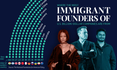
Technology
The Psychology of Color in Business
The Psychology of Color in Business
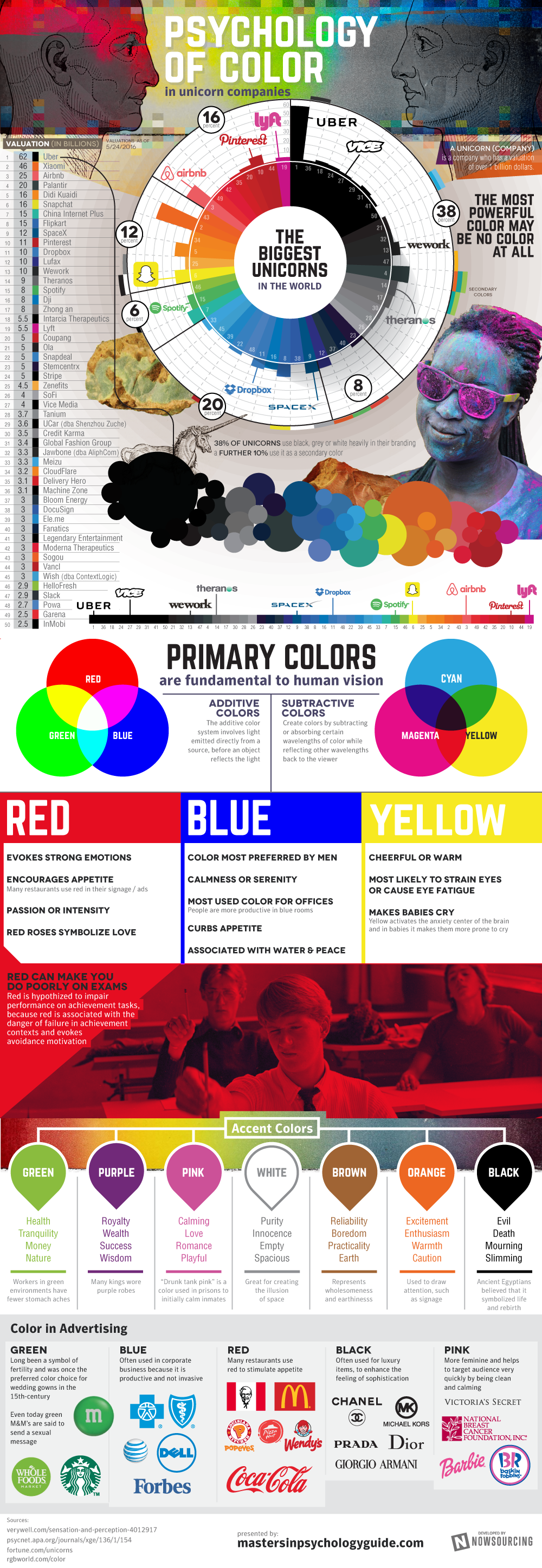
What do the colors in your company’s branding tell customers?
Today’s infographic, by the Masters in Psychology Guide, is on the psychology of color in business. It analyzes the colors used by major tech startups as well as by prominent consumer brands in their advertising.
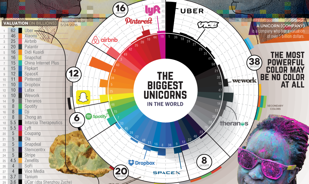
Unicorn Colors
Out of the largest 50 unicorns, tech startups that have achieved valuations of $1 billion or more, the most common primary branding color was black or grey. A total of 38% of companies, including stalwarts like Uber, Vice, and WeWork, rely on these hues for their outward appearance.
Blue is well-known as a strong business color, and it is no surprise that 20% of the top 50 unicorns focus on blue as their primary branding color. Dropbox and SpaceX are among the companies that are following in IBM’s “Big Blue” branding path here.
The red end of the spectrum makes up 16% of companies (including Pinterest and Airbnb), with yellow at 12% (including Snapchat), and green at just 6%. A green palette was least used for primary branding by unicorns, with Spotify being a rare exception.
The Psychology of Color in Branding and Ads
It’s not just tech startups that key in on color to help differentiate their brands. Companies, including some of the best-known consumer brands, have focused on color in their branding, advertisements, and communications for years.
Red is a color that allegedly stimulates appetite. That may explain why fast-food restaurants like McDonald’s, KFC, Pizza Hut, Wendy’s, and Popeye’s all heavily use red in their brands.
Black is all about the feeling of sophistication. Some of the largest luxury brands in the world use black as a primary branding color, including Chanel, Michael Kors, Prada, Dior, or Georgio Armani.
Blue is viewed as productive, but not invasive. It has been the color of choice for large corporate brands like IBM, AT&T, and Forbes.
Lastly, green is a symbol of fertility, and pink is chosen for a feminine feel.


Brands
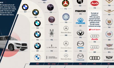
How Tech Logos Have Evolved Over Time
From complete overhauls to more subtle tweaks, these tech logos have had quite a journey. Featuring: Google, Apple, and more.


How Tech Logos Have Evolved Over Time
This was originally posted on our Voronoi app. Download the app for free on iOS or Android and discover incredible data-driven charts from a variety of trusted sources.
One would be hard-pressed to find a company that has never changed its logo. Granted, some brands—like Rolex, IBM, and Coca-Cola—tend to just have more minimalistic updates. But other companies undergo an entire identity change, thus necessitating a full overhaul.
In this graphic, we visualized the evolution of prominent tech companies’ logos over time. All of these brands ranked highly in a Q1 2024 YouGov study of America’s most famous tech brands. The logo changes are sourced from 1000logos.net.
How Many Times Has Google Changed Its Logo?
Google and Facebook share a 98% fame rating according to YouGov. But while Facebook’s rise was captured in The Social Network (2010), Google’s history tends to be a little less lionized in popular culture.
For example, Google was initially called “Backrub” because it analyzed “back links” to understand how important a website was. Since its founding, Google has undergone eight logo changes, finally settling on its current one in 2015.
| Company | Number of Logo Changes |
|---|---|
| 8 | |
| HP | 8 |
| Amazon | 6 |
| Microsoft | 6 |
| Samsung | 6 |
| Apple | 5* |
Note: *Includes color changes. Source: 1000Logos.net
Another fun origin story is Microsoft, which started off as Traf-O-Data, a traffic counter reading company that generated reports for traffic engineers. By 1975, the company was renamed. But it wasn’t until 2012 that Microsoft put the iconic Windows logo—still the most popular desktop operating system—alongside its name.
And then there’s Samsung, which started as a grocery trading store in 1938. Its pivot to electronics started in the 1970s with black and white television sets. For 55 years, the company kept some form of stars from its first logo, until 1993, when the iconic encircled blue Samsung logo debuted.
Finally, Apple’s first logo in 1976 featured Isaac Newton reading under a tree—moments before an apple fell on his head. Two years later, the iconic bitten apple logo would be designed at Steve Jobs’ behest, and it would take another two decades for it to go monochrome.

-

 Green1 week ago
Ranked: The Countries With the Most Air Pollution in 2023
-

 Automotive2 weeks ago
Almost Every EV Stock is Down After Q1 2024
-

 AI2 weeks ago
The Stock Performance of U.S. Chipmakers So Far in 2024
-

 Markets2 weeks ago
Charted: Big Four Market Share by S&P 500 Audits
-

 Real Estate2 weeks ago
Ranked: The Most Valuable Housing Markets in America
-

 Money2 weeks ago
Which States Have the Highest Minimum Wage in America?
-

 AI2 weeks ago
Ranked: Semiconductor Companies by Industry Revenue Share
-

 Travel2 weeks ago
Ranked: The World’s Top Flight Routes, by Revenue