Misc
Visualizing Data: How the Media Blows Things Out of Proportion
Visualizing Data: How the Media Blows Things Out of Proportion
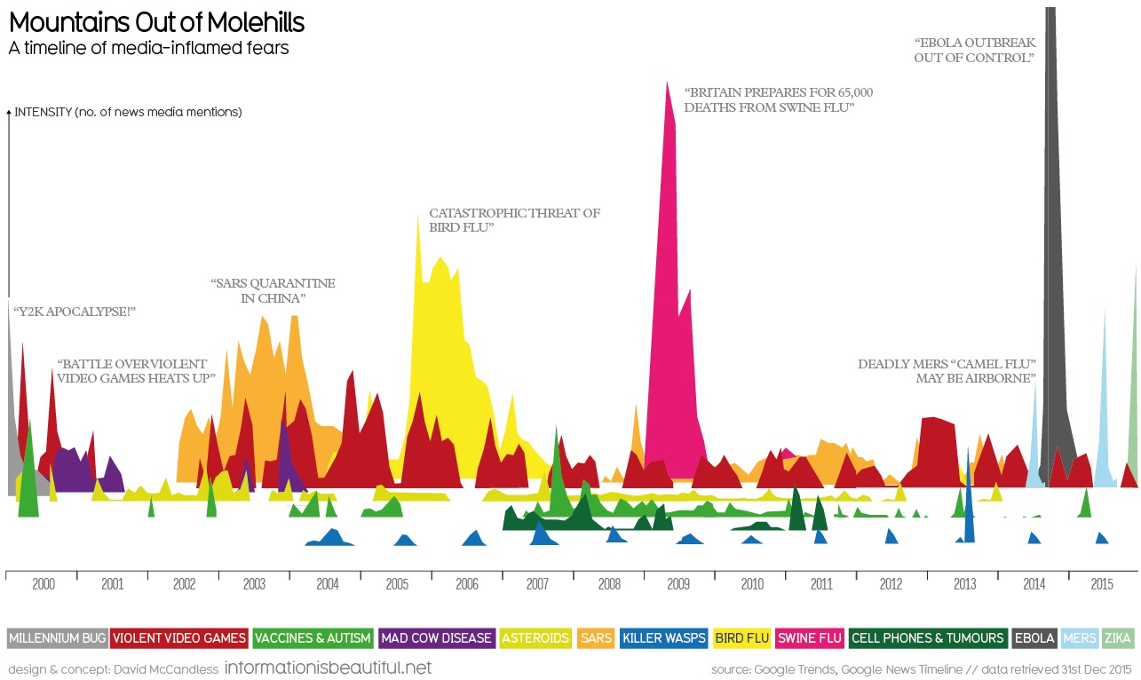
Every year, it seems that there is a new type of virus or an imminent technological disaster that will purportedly threaten the existence of humankind.
If it wasn’t the Y2K apocalypse that would bring society back to the Stone Age, it was going to be the bird flu or cellphone brain tumors that would kill us all.
However, as today’s data visualization from Information is Beautiful shows, these fears are mostly overblown. The media finds a way to tap into these hot-button issues and then people inevitably get worked into a frenzy.
“Swine flu”, which broke out in the U.S. in 2009, blew up into a full-on panic by media and authorities. While it did eventually kill about 12,000 people, that’s not very remarkable when it turns out that the common seasonal flu kills between 3,000 to 49,000 people each year, according to the Center for Disease Control.
The public consumed information on the swine flu like there was no tomorrow. Here’s Google searches for “swine flu” surpassing the amount of searches for the newly-elected “Barack Obama”:
But do you know what was even worse than swine flu? Ebola, of course.
In the very first chart on this post, the true length of the data for “ebola” is cut off because the series is literally off the chart. Here’s a revised version that puts all of the data in full perspective:
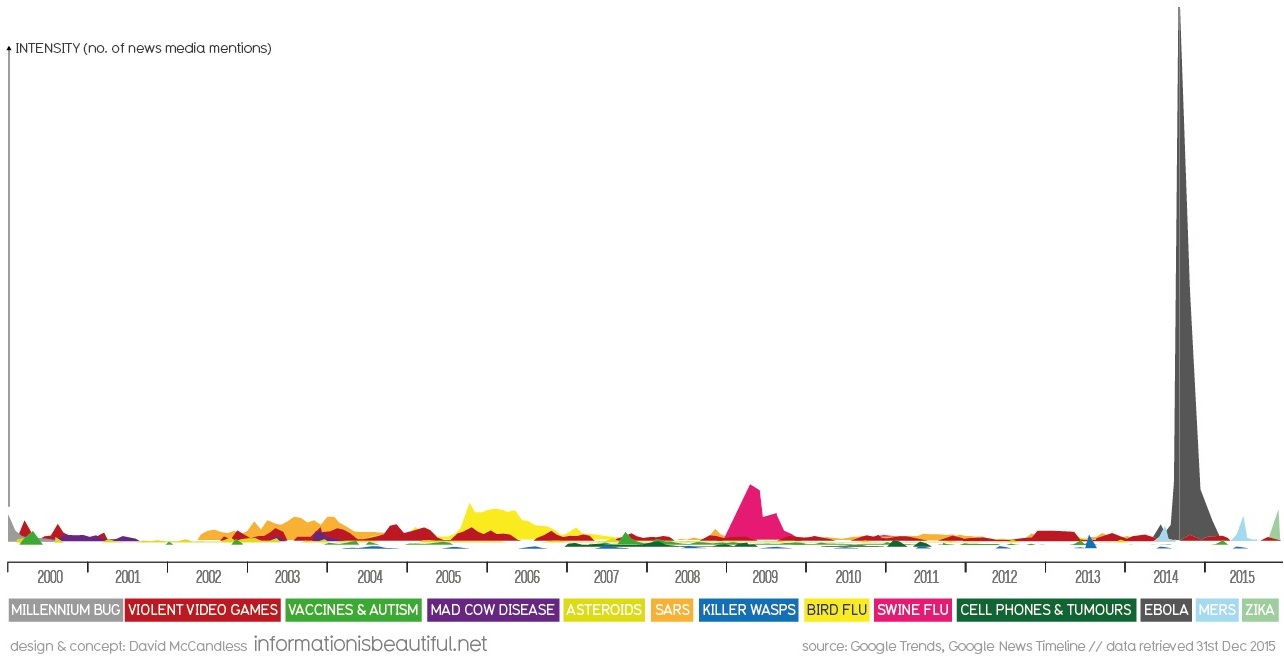
Based on this level of coverage and interest, the virus must have surely been on the level of the Black Plague, right?
According to The Economist, there were just 28,637 ebola cases and 11,315 deaths worldwide. The World Health Organization officially declared the outbreak to be over in January, and there hasn’t been a trace of the virus since.
Next time the talking heads on television are discussing the newest global distraction, take a deep breath. There’s no need to panic if mountains are being made out of molehills.


VC+
VC+: Get Our Key Takeaways From the IMF’s World Economic Outlook
A sneak preview of the exclusive VC+ Special Dispatch—your shortcut to understanding IMF’s World Economic Outlook report.

Have you read IMF’s latest World Economic Outlook yet? At a daunting 202 pages, we don’t blame you if it’s still on your to-do list.
But don’t worry, you don’t need to read the whole April release, because we’ve already done the hard work for you.
To save you time and effort, the Visual Capitalist team has compiled a visual analysis of everything you need to know from the report—and our upcoming VC+ Special Dispatch will be available exclusively to VC+ members on Thursday, April 25th.
If you’re not already subscribed to VC+, make sure you sign up now to receive the full analysis of the IMF report, and more (we release similar deep dives every week).
For now, here’s what VC+ members can expect to receive.
Your Shortcut to Understanding IMF’s World Economic Outlook
With long and short-term growth prospects declining for many countries around the world, this Special Dispatch offers a visual analysis of the key figures and takeaways from the IMF’s report including:
- The global decline in economic growth forecasts
- Real GDP growth and inflation forecasts for major nations in 2024
- When interest rate cuts will happen and interest rate forecasts
- How debt-to-GDP ratios have changed since 2000
- And much more!

Get the Full Breakdown in the Next VC+ Special Dispatch
VC+ members will receive the full Special Dispatch on Thursday, April 25th.
Make sure you join VC+ now to receive exclusive charts and the full analysis of key takeaways from IMF’s World Economic Outlook.
Don’t miss out. Become a VC+ member today.
What You Get When You Become a VC+ Member
VC+ is Visual Capitalist’s premium subscription. As a member, you’ll get the following:
- Special Dispatches: Deep dive visual briefings on crucial reports and global trends
- Markets This Month: A snappy summary of the state of the markets and what to look out for
- The Trendline: Weekly curation of the best visualizations from across the globe
- Global Forecast Series: Our flagship annual report that covers everything you need to know related to the economy, markets, geopolitics, and the latest tech trends
- VC+ Archive: Hundreds of previously released VC+ briefings and reports that you’ve been missing out on, all in one dedicated hub
You can get all of the above, and more, by joining VC+ today.

-

 Maps1 week ago
The Largest Earthquakes in the New York Area (1970-2024)
-

 Money2 weeks ago
Where Does One U.S. Tax Dollar Go?
-

 Automotive2 weeks ago
Almost Every EV Stock is Down After Q1 2024
-

 AI2 weeks ago
The Stock Performance of U.S. Chipmakers So Far in 2024
-

 Markets2 weeks ago
Charted: Big Four Market Share by S&P 500 Audits
-

 Real Estate2 weeks ago
Ranked: The Most Valuable Housing Markets in America
-

 Money2 weeks ago
Which States Have the Highest Minimum Wage in America?
-

 AI2 weeks ago
Ranked: Semiconductor Companies by Industry Revenue Share