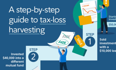
In Canada, tax-loss harvesting allows investors to turn losses into tax savings. This graphic breaks down how it works in...


click for more →


Scan with your phone's camera or QR code app to view
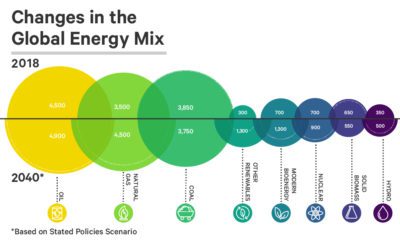

See how the world's future energy mix is expected to change by 2040, using projections based on two different policy scenarios.
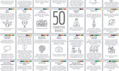

Our rapidly evolving world forces us to adopt distinct patterns of behavior, and in the process, paves the way for new cognitive biases to emerge.
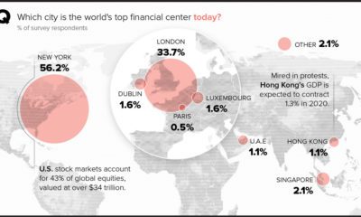

Perceptions of major financial centers are being reexamined amid shifts in the geopolitical landscape, including Brexit and unrest in Hong Kong.
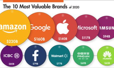

This infographic ranks some of the world’s biggest companies by brand value in 2020 and visualizes the movers and shakers over the past year.
A data-driven look at America's nuclear weapons arsenal – both location and deployment, and the costs associated with refurbishing an aging nuclear program.
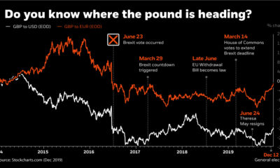

This infographic uses the recent Brexit-related volatility of the British pound to illustrate how currency risk can impact an investor's portfolio.
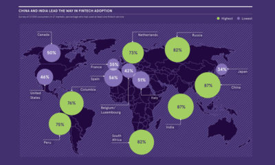

The fintech industry welcomed multi-billion dollar investments in 2019. Where is the most growth, and how are incumbents dealing with digital disruption?
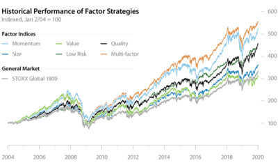

Factor investing has demonstrated its potential to outperform the general market for years. In this infographic, learn how to apply it in your portfolio.
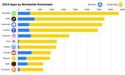

The app economy is expected to be over $6 trillion by 2021—see the world's most downloaded apps and how they're driving the future of this market.
Tesla is not only the top valued U.S. automaker, it's now worth more than Ford and GM combined. Will the rally continue, or will short sellers...
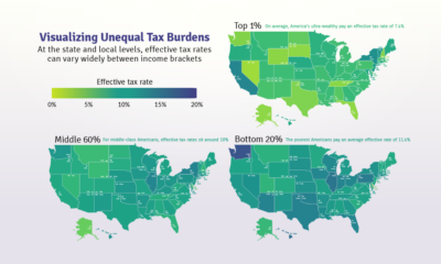

Poor families pay a higher share of their income towards state and local taxes than wealthy families. These maps show the inequitable tax burdens.
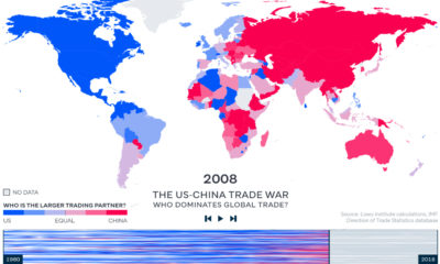

China has become the world's major trading partner – and now, 128 of 190 countries trade more with China than they do with the United States.
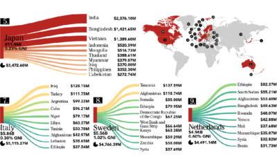

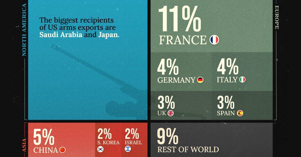
This infographic looks at who is giving – and who is receiving – the billions of dollars in foreign aid that flows between countries each year.
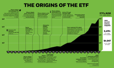

This graphic timeline highlights how the exchange-traded fund (ETF) came into existence, as well as the 26-year history of ETFs as an investment vehicle.
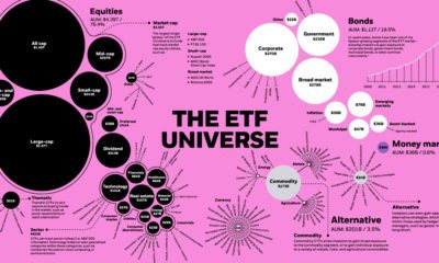

The global ETF universe has grown to be worth $5.75 trillion — here's how the assets break down by type, sector, and investment focus.
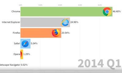

This animation provides a nostalgic look back at the market share of various web browsers, from Netscape Navigator to Google Chrome.
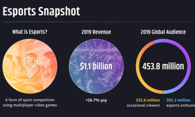

Telcos failed to capitalize on the 'Netflix' opportunity — however, the birth of a new multi-billion dollar industry (esports) could change the game.