Markets
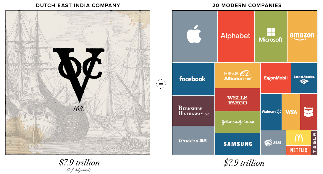
The Most Valuable Companies of All-Time
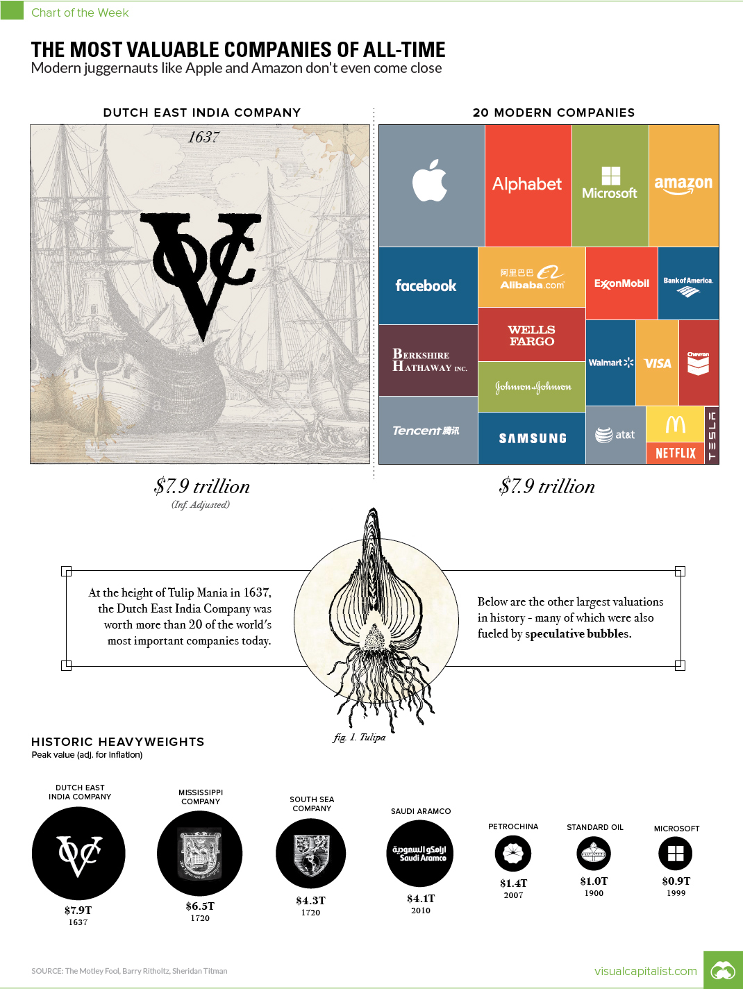
Chart: The Most Valuable Companies of All-Time
The Chart of the Week is a weekly Visual Capitalist feature on Fridays.
Before speculative bubbles could form around Dotcom companies (late-1990s) or housing prices (mid-2000s), some of the first financial bubbles formed from the prospect of trading with faraway lands.
Looking back, it’s pretty easy to see why.
Companies like the Dutch East India Company (known in Dutch as the VOC, or Verenigde Oost-Indische Compagnie) were granted monopolies on trade, and they engaged in daring voyages to mysterious and foreign places. They could acquire exotic goods, establish colonies, create military forces, and even initiate wars or conflicts around the world.
Of course, the very nature of these risky ventures made getting any accurate indication of intrinsic value nearly impossible, which meant there were no real benchmarks for what companies like this should be worth.
Speculative Peak
The Dutch East India Company was established as a charter company in 1602, when it was granted a 21-year monopoly by the Dutch government for the spice trade in Asia. The company would eventually send over one million voyagers to Asia, which is more than the rest of Europe combined.
However, despite its 200-year run as Europe’s foremost trading juggernaut – the speculative peak of the company’s prospects coincided with Tulip Mania in Holland in 1637.
Widely considered the world’s first financial bubble, the history of Tulip Mania is a fantastic story in itself. During this frothy time, the Dutch East India Company was worth 78 million Dutch guilders, which translates to a whopping $7.9 trillion in modern dollars.
This is according to sources such as Alex Planes from The Motley Fool, who has conducted extensive research on the history of very large companies in history.
Modern Comparisons
The peak value of the Dutch East India Company was so high, that it puts modern economies to shame.
In fact, at its height, the Dutch East India Company was worth roughly the same amount as the GDPs of modern-day Japan ($4.8T) and Germany ($3.4T) added together.
Even further, in today’s chart, we added the market caps of 20 of the world’s largest companies, such as Apple, Microsoft, Amazon, ExxonMobil, Berkshire Hathaway, Tencent, and Wells Fargo. All of them combined gets us to $7.9 trillion.
At the same time, the world’s most valuable company (Apple) only makes it to 11% of the peak value of the Dutch East India Company by itself.
Historic Heavyweights
Despite the speculation that fueled the run-up of Dutch East India Company shares, the company was still successful in real terms. At one point, it even had 70,000 employees – a massive accomplishment for a company born over 400 years ago.
The same thing can’t be said for the other two most valuable companies in history – both of which were the subject of simultaneous bubbles occurring in France and Britain that popped in 1720.
In France, the wealth of Louisiana was exaggerated in a marketing scheme for the newly formed Mississippi Company, and its value temporarily soared to the equivalent of $6.5 trillion today. Meanwhile, a joint-stock company in Britain, known as the South Sea Company, was granted a monopoly to trade with South America. It was eventually worth $4.3 trillion in modern currency.
Interestingly, both would barely engage in any actual trade with the Americas.
The other historic heavyweights included in our chart?
- Saudi Aramco, at $4.1 trillion, based on calculations by University of Texas finance professor Sheridan Titman in 2010, and adjusted for inflation.
- PetroChina surpassed $1 trillion in market cap in 2007. Adjusted for inflation that’s $1.4 trillion today.
- Standard Oil, before its famous breakup due to monopolistic reasons, was worth at least $1 trillion. Adjusted for inflation it would likely be more, but we kept this conservative.
- Microsoft reached its peak valuation in 1999, at the top of the Dotcom Bubble. Today, that would be equal to $912 billion.


Markets
U.S. Debt Interest Payments Reach $1 Trillion
U.S. debt interest payments have surged past the $1 trillion dollar mark, amid high interest rates and an ever-expanding debt burden.


U.S. Debt Interest Payments Reach $1 Trillion
This was originally posted on our Voronoi app. Download the app for free on iOS or Android and discover incredible data-driven charts from a variety of trusted sources.
The cost of paying for America’s national debt crossed the $1 trillion dollar mark in 2023, driven by high interest rates and a record $34 trillion mountain of debt.
Over the last decade, U.S. debt interest payments have more than doubled amid vast government spending during the pandemic crisis. As debt payments continue to soar, the Congressional Budget Office (CBO) reported that debt servicing costs surpassed defense spending for the first time ever this year.
This graphic shows the sharp rise in U.S. debt payments, based on data from the Federal Reserve.
A $1 Trillion Interest Bill, and Growing
Below, we show how U.S. debt interest payments have risen at a faster pace than at another time in modern history:
| Date | Interest Payments | U.S. National Debt |
|---|---|---|
| 2023 | $1.0T | $34.0T |
| 2022 | $830B | $31.4T |
| 2021 | $612B | $29.6T |
| 2020 | $518B | $27.7T |
| 2019 | $564B | $23.2T |
| 2018 | $571B | $22.0T |
| 2017 | $493B | $20.5T |
| 2016 | $460B | $20.0T |
| 2015 | $435B | $18.9T |
| 2014 | $442B | $18.1T |
| 2013 | $425B | $17.2T |
| 2012 | $417B | $16.4T |
| 2011 | $433B | $15.2T |
| 2010 | $400B | $14.0T |
| 2009 | $354B | $12.3T |
| 2008 | $380B | $10.7T |
| 2007 | $414B | $9.2T |
| 2006 | $387B | $8.7T |
| 2005 | $355B | $8.2T |
| 2004 | $318B | $7.6T |
| 2003 | $294B | $7.0T |
| 2002 | $298B | $6.4T |
| 2001 | $318B | $5.9T |
| 2000 | $353B | $5.7T |
| 1999 | $353B | $5.8T |
| 1998 | $360B | $5.6T |
| 1997 | $368B | $5.5T |
| 1996 | $362B | $5.3T |
| 1995 | $357B | $5.0T |
| 1994 | $334B | $4.8T |
| 1993 | $311B | $4.5T |
| 1992 | $306B | $4.2T |
| 1991 | $308B | $3.8T |
| 1990 | $298B | $3.4T |
| 1989 | $275B | $3.0T |
| 1988 | $254B | $2.7T |
| 1987 | $240B | $2.4T |
| 1986 | $225B | $2.2T |
| 1985 | $219B | $1.9T |
| 1984 | $205B | $1.7T |
| 1983 | $176B | $1.4T |
| 1982 | $157B | $1.2T |
| 1981 | $142B | $1.0T |
| 1980 | $113B | $930.2B |
| 1979 | $96B | $845.1B |
| 1978 | $84B | $789.2B |
| 1977 | $69B | $718.9B |
| 1976 | $61B | $653.5B |
| 1975 | $55B | $576.6B |
| 1974 | $50B | $492.7B |
| 1973 | $45B | $469.1B |
| 1972 | $39B | $448.5B |
| 1971 | $36B | $424.1B |
| 1970 | $35B | $389.2B |
| 1969 | $30B | $368.2B |
| 1968 | $25B | $358.0B |
| 1967 | $23B | $344.7B |
| 1966 | $21B | $329.3B |
Interest payments represent seasonally adjusted annual rate at the end of Q4.
At current rates, the U.S. national debt is growing by a remarkable $1 trillion about every 100 days, equal to roughly $3.6 trillion per year.
As the national debt has ballooned, debt payments even exceeded Medicaid outlays in 2023—one of the government’s largest expenditures. On average, the U.S. spent more than $2 billion per day on interest costs last year. Going further, the U.S. government is projected to spend a historic $12.4 trillion on interest payments over the next decade, averaging about $37,100 per American.
Exacerbating matters is that the U.S. is running a steep deficit, which stood at $1.1 trillion for the first six months of fiscal 2024. This has accelerated due to the 43% increase in debt servicing costs along with a $31 billion dollar increase in defense spending from a year earlier. Additionally, a $30 billion increase in funding for the Federal Deposit Insurance Corporation in light of the regional banking crisis last year was a major contributor to the deficit increase.
Overall, the CBO forecasts that roughly 75% of the federal deficit’s increase will be due to interest costs by 2034.

-

 Maps2 weeks ago
Mapped: Average Wages Across Europe
-

 Money1 week ago
Which States Have the Highest Minimum Wage in America?
-

 Real Estate1 week ago
Ranked: The Most Valuable Housing Markets in America
-

 Markets1 week ago
Charted: Big Four Market Share by S&P 500 Audits
-

 AI1 week ago
The Stock Performance of U.S. Chipmakers So Far in 2024
-

 Misc2 weeks ago
Almost Every EV Stock is Down After Q1 2024
-

 Money2 weeks ago
Where Does One U.S. Tax Dollar Go?
-

 Green2 weeks ago
Ranked: Top Countries by Total Forest Loss Since 2001