Misc
7 Striking Maps that Visualize the Human Footprint
View a high resolution version of this graphic
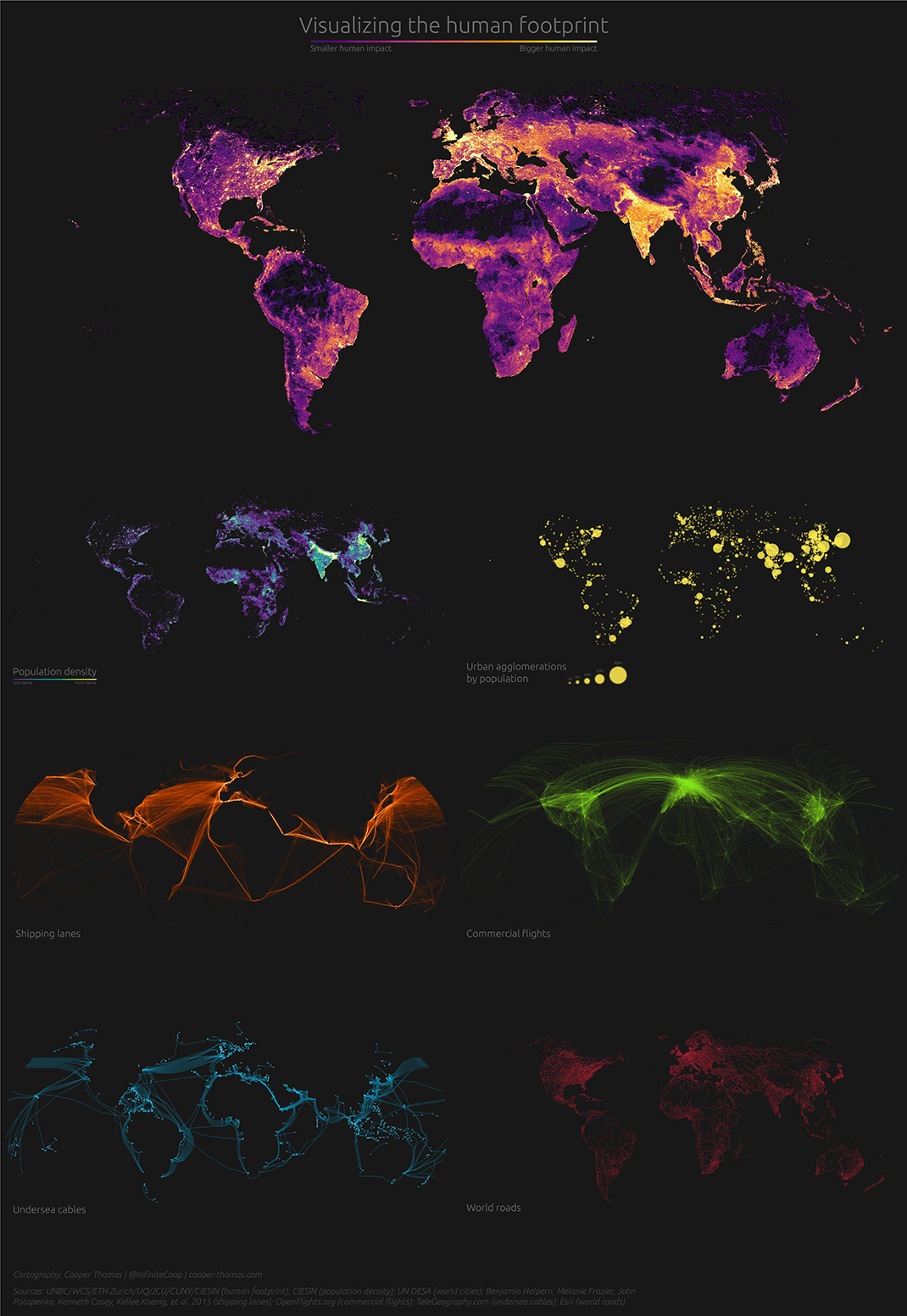
7 Striking Maps that Visualize the Human Footprint
View the high resolution version of today’s graphic by clicking here.
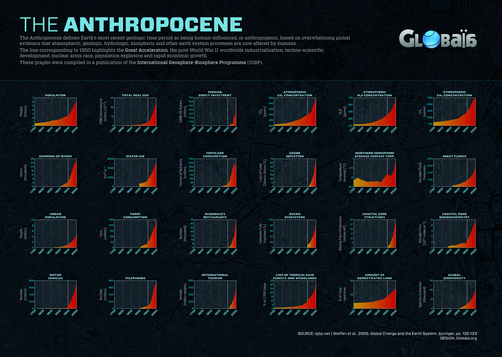
In a short amount of time, humans have changed the face of planet Earth.
Our impact has been so profound, in fact, that scientists have declared the dawn of the Anthropocene epoch, or the age of human influence.
Today’s ambitious graphic comes to us from Reldresal, and it looks at this human footprint from a number of different angles. Here are some of the ones we found most interesting.
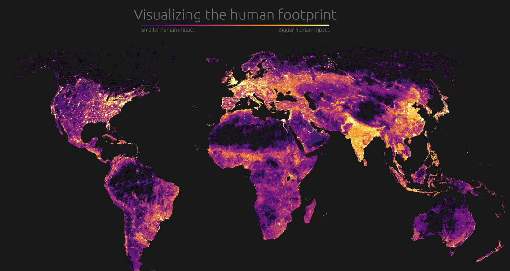
Population Density
While there are humans present in nearly every part of the world, the overall distribution of population is far from even. As the map above vividly demonstrates, humans cluster in specific places that have the right conditions to support a large population. Massive river deltas such as Ganges-Brahmaputra (Bangladesh) and the Nile (Egypt) are obvious bright spots on the map.
Not surprisingly, sparsely populated countries like Australia and Canada are nearly indistinguishable as most people cluster in more habitable places.
People and Products in Perpetual Motion
The band of industrialized countries running across the northern hemisphere is highlighted by a bright cluster of shipping and air traffic routes.
When visualized, it’s easy to see how the global flow of people and goods plugs into specific hubs. At the same time, other continents such as South America and Africa have very little connectivity in comparison.
Under the Sea
Since the first undersea cable dipped below the icy Atlantic waves in the mid-1800s, people have been instantaneously transmitting information across oceans. Fiber optic cables form the backbone of the internet, transmitting about 99% of all data.
Without the 400+ submarine cables in service today, our ability to transmit data would be severely restricted.
End of the Road
Paved roads have made some of the most remote swaths of land accessible by vehicle, but there are a few places on Earth that remain poorly connected due to difficult terrain.
The most dramatic example – one of the most obvious “holes” on the road network map – is the Sahara desert. The desert is so inhospitable that building a reliable, fully-paved highway has proved impossible up until this point. For this reason, economic data on Africa is often divided between North and Sub-Saharan.
There is a similar situation in the Amazon, where the Trans-Amazonian highway is the one lonely route connecting the interior of the rainforest. Brazil has rapidly expanded the footprint of their road network in recent years in an effort to open up economic opportunities in the interior of the continent.
For better or worse, this map could look a lot different in future years.


Misc
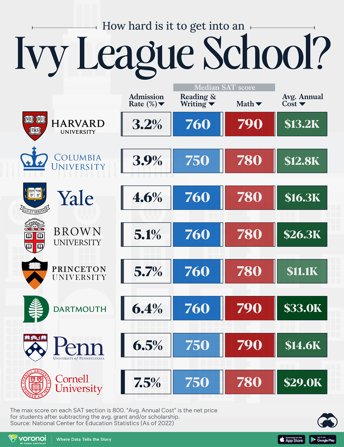
How Hard Is It to Get Into an Ivy League School?
We detail the admission rates and average annual cost for Ivy League schools, as well as the median SAT scores required to be accepted.
How Hard Is It to Get Into an Ivy League School?
This was originally posted on our Voronoi app. Download the app for free on iOS or Android and discover incredible data-driven charts from a variety of trusted sources.
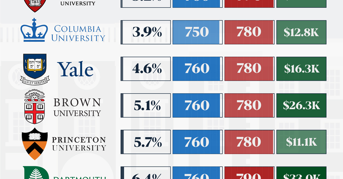
Ivy League institutions are renowned worldwide for their academic excellence and long-standing traditions. But how hard is it to get into one of the top universities in the U.S.?
In this graphic, we detail the admission rates and average annual cost for Ivy League schools, as well as the median SAT scores required to be accepted. The data comes from the National Center for Education Statistics and was compiled by 24/7 Wall St.
Note that “average annual cost” represents the net price a student pays after subtracting the average value of grants and/or scholarships received.
Harvard is the Most Selective
The SAT is a standardized test commonly used for college admissions in the United States. It’s taken by high school juniors and seniors to assess their readiness for college-level academic work.
When comparing SAT scores, Harvard and Dartmouth are among the most challenging universities to gain admission to. The median SAT scores for their students are 760 for reading and writing and 790 for math. Still, Harvard has half the admission rate (3.2%) compared to Dartmouth (6.4%).
| School | Admission rate (%) | SAT Score: Reading & Writing | SAT Score: Math | Avg Annual Cost* |
|---|---|---|---|---|
| Harvard University | 3.2 | 760 | 790 | $13,259 |
| Columbia University | 3.9 | 750 | 780 | $12,836 |
| Yale University | 4.6 | 760 | 780 | $16,341 |
| Brown University | 5.1 | 760 | 780 | $26,308 |
| Princeton University | 5.7 | 760 | 780 | $11,080 |
| Dartmouth College | 6.4 | 760 | 790 | $33,023 |
| University of Pennsylvania | 6.5 | 750 | 790 | $14,851 |
| Cornell University | 7.5 | 750 | 780 | $29,011 |
*Costs after receiving federal financial aid.
Additionally, Dartmouth has the highest average annual cost at $33,000. Princeton has the lowest at $11,100.
While student debt has surged in the United States in recent years, hitting $1.73 trillion in 2023, the worth of obtaining a degree from any of the schools listed surpasses mere academics. This is evidenced by the substantial incomes earned by former students.
Harvard grads, for example, have the highest average starting salary in the country, at $91,700.

-

 Real Estate2 weeks ago
Visualizing America’s Shortage of Affordable Homes
-

 Technology1 week ago
Ranked: Semiconductor Companies by Industry Revenue Share
-

 Money1 week ago
Which States Have the Highest Minimum Wage in America?
-

 Real Estate1 week ago
Ranked: The Most Valuable Housing Markets in America
-

 Business2 weeks ago
Charted: Big Four Market Share by S&P 500 Audits
-

 AI2 weeks ago
The Stock Performance of U.S. Chipmakers So Far in 2024
-

 Misc2 weeks ago
Almost Every EV Stock is Down After Q1 2024
-

 Money2 weeks ago
Where Does One U.S. Tax Dollar Go?