Demographics
These 5 Maps Visualize Population Distribution in a Unique Way
Every once in a while, a data visualization trend organically sweeps through Reddit, the popular social news aggregation site, leading to some eye-catching and interesting user-generated results.
We’ve seen users visualize how they spend their disposable income, how they spend their time, and even details of their relationships. Sometimes these charts are fairly personal and uninteresting to the outside world – but other times, they can be quite compelling to a wider audience.
Population in Fourths
Most recently, in the Data is Beautiful subreddit, the trend has been to use data visualization techniques to split up the maps of countries into four evenly populated areas.
There are hundreds of maps to be found using this technique, but here are just five examples that we thought were particularly interesting. Each one reveals certain things about the population distribution, geography, and urban/rural split in their respective jurisdictions.
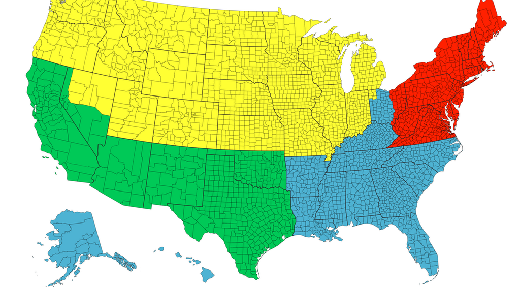
The United States
The first map is the least striking, but it creates an interesting baseline – it shows the U.S. divided into four equal sections of population, with no single area standing out as being incredibly dense or sparse:
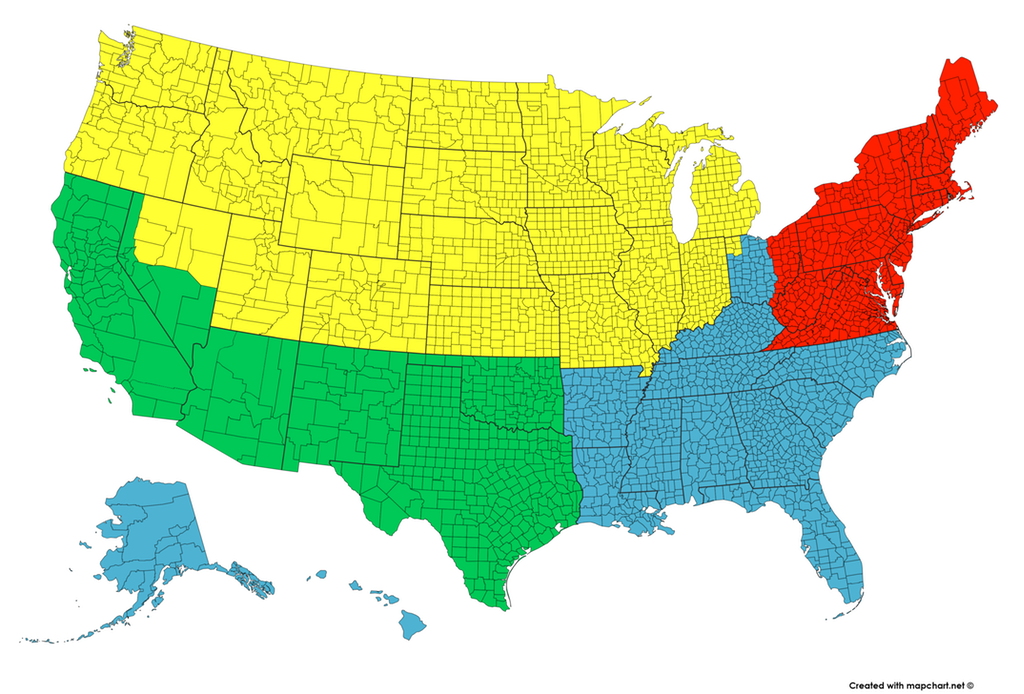
With over 300 million people spread throughout the country and big population centers in each region, it’s no surprise that this split into fourths is quite even.
However, that will not be the case for the remaining maps.
California
For example, when we go to the state level the distributions can be more easily impacted by big cities:
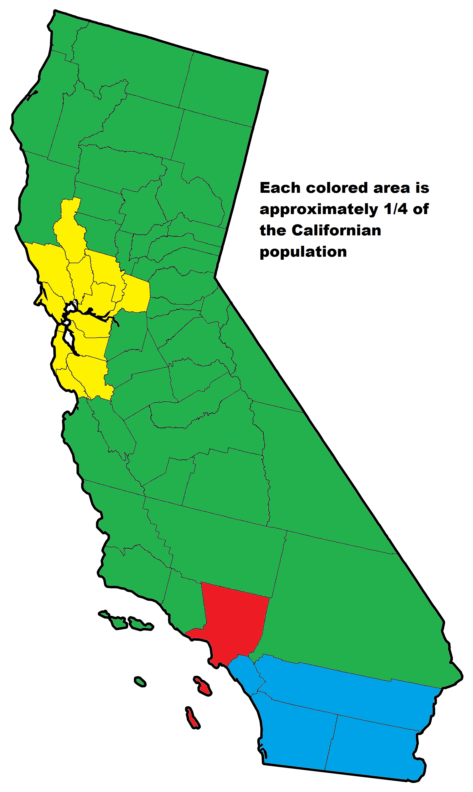
This map of California by old_gold_mountain is a great example of this – with three major urban areas (Los Angeles, Bay Area, and San Diego) all holding large amounts of the state’s population, the composition looks quite uneven when it gets divvied up in this way.
Canada
But Canada’s sparseness in the north goes to an even greater extreme:
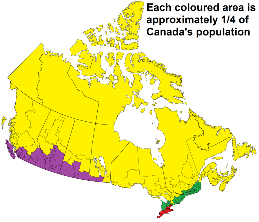
It’s said that 90% of the Canadian population lives within 100km of the U.S. border – and this map by repliers_beware makes it clear that any further north can get pretty remote.
Australia
Australia is another country with geographical diversity. Some regions are conducive to civilization and growing great wine, but few species (including humans) find the Outback very hospitable.
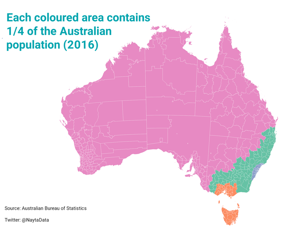
In this case, user NaytaData lumps in the Outback with cities like Adelaide and Perth to get this colored area up to the required 25% population mark.
Chile
For a very long and narrow finale, here is the country of Chile.
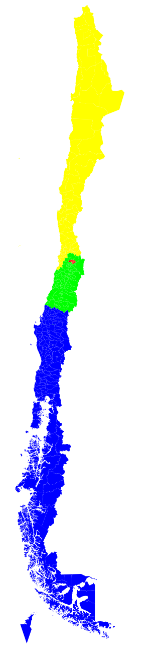
This map by QuietlyEcstatic shows that the capital Santiago and its surrounding area is roughly equal to three other very large sections of the country – including the sparse but beautiful Chilean piece of Patagonia.


Demographics
The Smallest Gender Wage Gaps in OECD Countries
Which OECD countries have the smallest gender wage gaps? We look at the 10 countries with gaps lower than the average.
The Smallest Gender Pay Gaps in OECD Countries
This was originally posted on our Voronoi app. Download the app for free on iOS or Android and discover incredible data-driven charts from a variety of trusted sources.
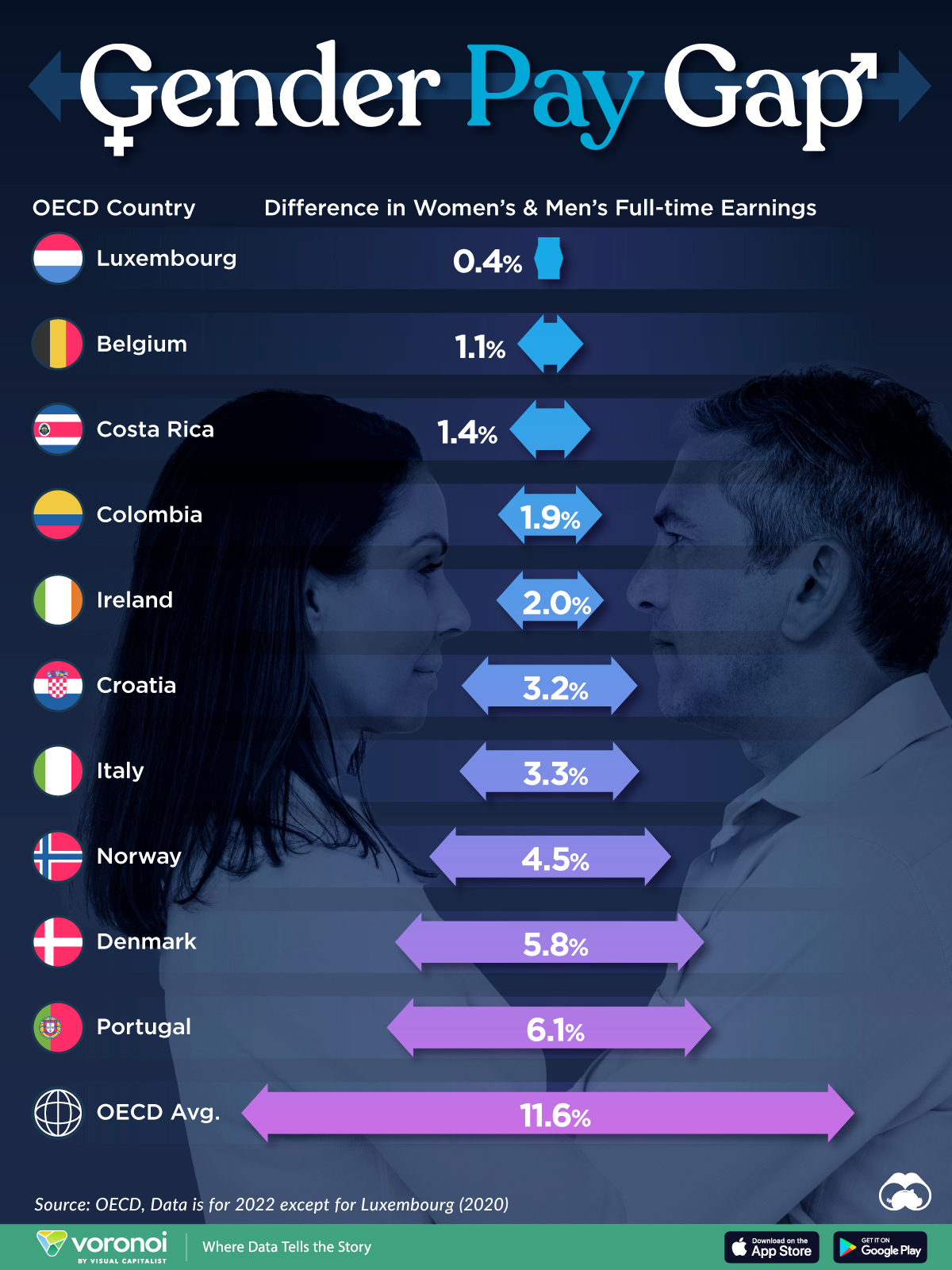
Among the 38 member countries in the Organization for Economic Cooperation and Development (OECD), several have made significant strides in addressing income inequality between men and women.
In this graphic we’ve ranked the OECD countries with the 10 smallest gender pay gaps, using the latest data from the OECD for 2022.
The gender pay gap is calculated as the difference between median full-time earnings for men and women divided by the median full-time earnings of men.
Which Countries Have the Smallest Gender Pay Gaps?
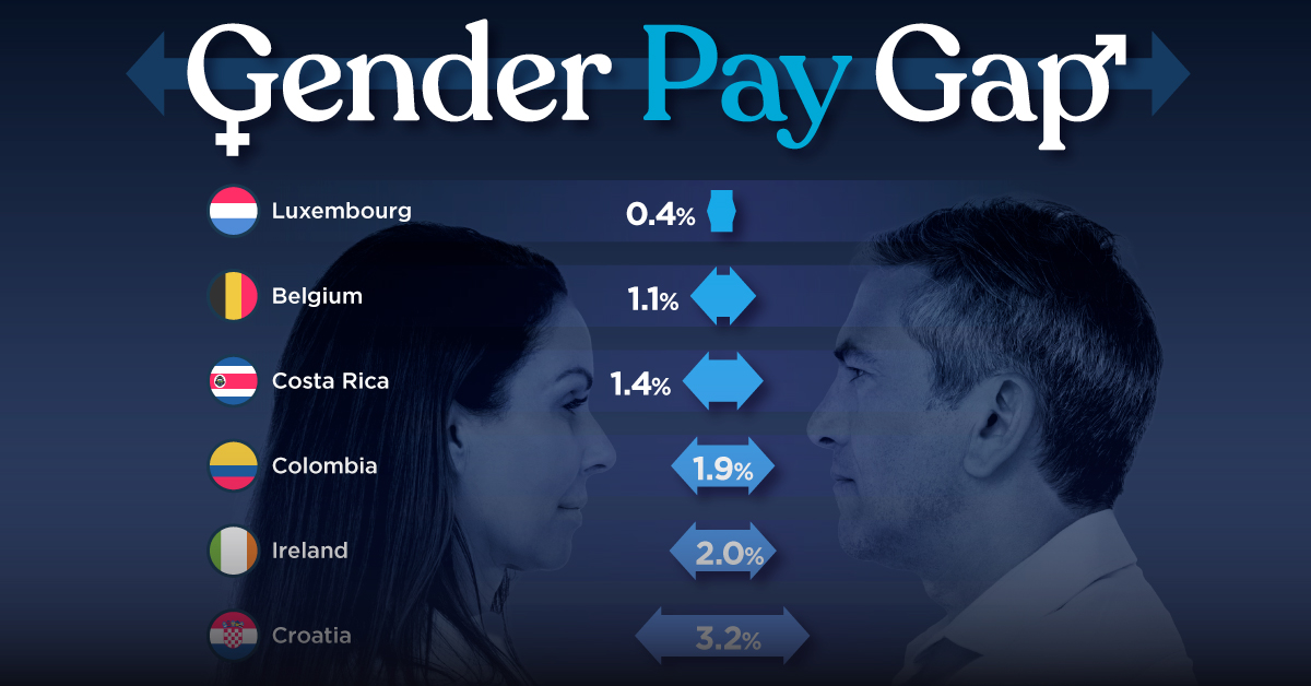
Luxembourg’s gender pay gap is the lowest among OECD members at only 0.4%—well below the OECD average of 11.6%.
| Rank | Country | Percentage Difference in Men's & Women's Full-time Earnings |
|---|---|---|
| 1 | 🇱🇺 Luxembourg | 0.4% |
| 2 | 🇧🇪 Belgium | 1.1% |
| 3 | 🇨🇷 Costa Rica | 1.4% |
| 4 | 🇨🇴 Colombia | 1.9% |
| 5 | 🇮🇪 Ireland | 2.0% |
| 6 | 🇭🇷 Croatia | 3.2% |
| 7 | 🇮🇹 Italy | 3.3% |
| 8 | 🇳🇴 Norway | 4.5% |
| 9 | 🇩🇰 Denmark | 5.8% |
| 10 | 🇵🇹 Portugal | 6.1% |
| OECD Average | 11.6% |
Notably, eight of the top 10 countries with the smallest gender pay gaps are located in Europe, as labor equality laws designed to target gender differences have begun to pay off.
The two other countries that made the list were Costa Rica (1.4%) and Colombia (1.9%), which came in third and fourth place, respectively.
How Did Luxembourg (Nearly) Eliminate its Gender Wage Gap?
Luxembourg’s virtually-non-existent gender wage gap in 2020 can be traced back to its diligent efforts to prioritize equal pay. Since 2016, firms that have not complied with the Labor Code’s equal pay laws have been subjected to penalizing fines ranging from €251 to €25,000.
Higher female education rates also contribute to the diminishing pay gap, with Luxembourg tied for first in the educational attainment rankings of the World Economic Forum’s Global Gender Gap Index Report for 2023.
See More Graphics about Demographics and Money
While these 10 countries are well below the OECD’s average gender pay gap of 11.6%, many OECD member countries including the U.S. are significantly above the average. To see the full list of the top 10 OECD countries with the largest gender pay gaps, check out this visualization.

-

 Real Estate2 weeks ago
Visualizing America’s Shortage of Affordable Homes
-

 Technology1 week ago
Ranked: Semiconductor Companies by Industry Revenue Share
-

 Money1 week ago
Which States Have the Highest Minimum Wage in America?
-

 Real Estate1 week ago
Ranked: The Most Valuable Housing Markets in America
-

 Business2 weeks ago
Charted: Big Four Market Share by S&P 500 Audits
-

 AI2 weeks ago
The Stock Performance of U.S. Chipmakers So Far in 2024
-

 Misc2 weeks ago
Almost Every EV Stock is Down After Q1 2024
-

 Money2 weeks ago
Where Does One U.S. Tax Dollar Go?