Money
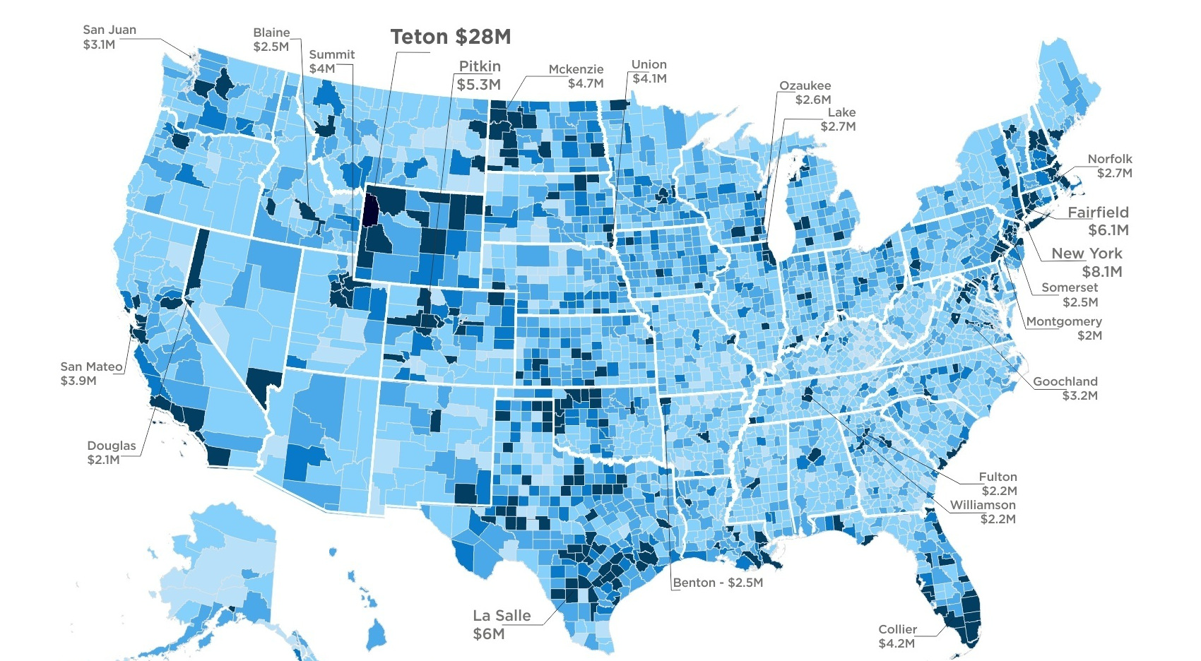
This Map Shows the Average Income of the Top 1% by Location
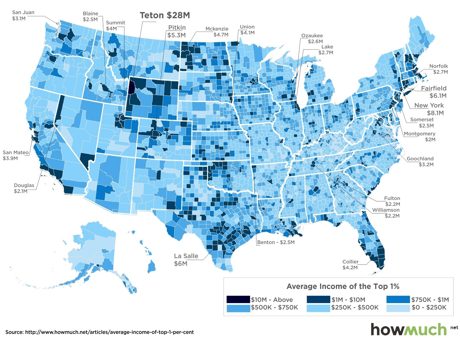
This Map Shows the Average Income of the Top 1% by Location
To be considered in a top 1% earner in the United States, the magic number that must be reached is $521,411 per household.
However, it turns out that on a county level, the income of the Top 1% varies wildly based on location. For example, if you want to be in the “1% Club” in New York City, you’re going to have work extremely hard, get very lucky, or preferably, manage some incredible combination of those two things.
Meanwhile, if you want to be in the crème de la crème of the social scene in Jackson, Kentucky or Chattahoochee, Georgia, things might seem a little more realistic. In fact, if you’re doing well for yourself, you may even be able to do it based on your income today.
The Top 1% by County
The above map by HowMuch.net, a cost information site, shows the average income of the top 1% by county.
Here’s the breakdown by county:
Richest Counties by Average Income of Top 1%
- Teton, Wyoming – Average Income: $28,163,786
- New York, New York – Average Income: $8,143,415
- Fairfield, Connecticut – Average Income: $6,061,230
- La Salle, Texas – Average Income: $6,021,357
- Pitkin, Colorado – Average Income: $5,289,153
- McKenzie, North Dakota – Average Income: $4,709,883
- Shackelford, Texas – Average Income: $4,585,725
- Westchester, New York – Average Income: $4,326,049
- Collier, Florida – Average Income: $4,191,055
- Union, South Dakota – Average Income: $4,106,670
Poorest Counties by Average Income of Top 1%
- Quitman, Georgia – Average Income: $127,425
- Taliaferro, Georgia – Average Income: $139,439
- Wade Hampton, Alaska – Average Income: $149,639
- Robertson, Kentucky – Average Income: $152,637
- Chattahoochee, Georgia – Average Income: $158,749
- Glascock, Georgia – Average Income: $169,027
- Shannon, South Dakota – Average Income: $174,433
- McCreary, Kentucky – Average Income: $177,132
- Menifee, Kentucky – Average Income: $177,192
- Jackson, Kentucky – Average Income: $178,917
Making the Top 1%
Taking the top spot by a long mile is Teton, Wyoming – the county home to the affluent Jackson Hole ski area, and 40.4% of the famous Yellowstone National Park. The Top 1% that live near Old Faithful are particularly well-off, making an average of $28.2 million each year!
New York City is another place that needs Gordon Gekko-like income to make it into the top ranks. An income of $8.1 million will put you on par with the average one percenter there.
Meanwhile, you don’t need a private jet to be one of the wealthiest people in counties in Georgia, Alaska, Kentucky, or South Dakota. If you make $180,000 per year, you are actually doing better than the average member of the Top 1% in many of those places.
The rural county of Quitman, Georgia, has the lowest average 1% income at $127,425 per year.


Money
How Debt-to-GDP Ratios Have Changed Since 2000
See how much the debt-to-GDP ratios of advanced economies have grown (or shrank) since the year 2000.


How Debt-to-GDP Ratios Have Changed Since 2000
This was originally posted on our Voronoi app. Download the app for free on Apple or Android and discover incredible data-driven charts from a variety of trusted sources.
Government debt levels have grown in most parts of the world since the 2008 financial crisis, and even more so after the COVID-19 pandemic.
To gain perspective on this long-term trend, we’ve visualized the debt-to-GDP ratios of advanced economies, as of 2000 and 2024 (estimated). All figures were sourced from the IMF’s World Economic Outlook.
Data and Highlights
The data we used to create this graphic is listed in the table below. “Government gross debt” consists of all liabilities that require payment(s) of interest and/or principal in the future.
| Country | 2000 (%) | 2024 (%) | Change (pp) |
|---|---|---|---|
| 🇯🇵 Japan | 135.6 | 251.9 | +116.3 |
| 🇸🇬 Singapore | 82.3 | 168.3 | +86.0 |
| 🇺🇸 United States | 55.6 | 126.9 | +71.3 |
| 🇬🇧 United Kingdom | 36.6 | 105.9 | +69.3 |
| 🇬🇷 Greece | 104.9 | 160.2 | +55.3 |
| 🇫🇷 France | 58.9 | 110.5 | +51.6 |
| 🇵🇹 Portugal | 54.2 | 104.0 | +49.8 |
| 🇪🇸 Spain | 57.8 | 104.7 | +46.9 |
| 🇸🇮 Slovenia | 25.9 | 66.5 | +40.6 |
| 🇫🇮 Finland | 42.4 | 76.5 | +34.1 |
| 🇭🇷 Croatia | 35.4 | 61.8 | +26.4 |
| 🇨🇦 Canada | 80.4 | 103.3 | +22.9 |
| 🇨🇾 Cyprus | 56.0 | 70.9 | +14.9 |
| 🇦🇹 Austria | 65.7 | 74.0 | +8.3 |
| 🇸🇰 Slovak Republic | 50.5 | 56.5 | +6.0 |
| 🇩🇪 Germany | 59.3 | 64.0 | +4.7 |
| 🇧🇪 Belgium | 109.6 | 106.8 | -2.8 |
| 🇮🇱 Israel | 77.4 | 56.8 | -20.6 |
| 🇮🇸 Iceland | 75.8 | 54.6 | -21.2 |
The debt-to-GDP ratio indicates how much a country owes compared to the size of its economy, reflecting its ability to manage and repay debts. Percentage point (pp) changes shown above indicate the increase or decrease of these ratios.
Countries with the Biggest Increases
Japan (+116 pp), Singapore (+86 pp), and the U.S. (+71 pp) have grown their debt as a percentage of GDP the most since the year 2000.
All three of these countries have stable, well-developed economies, so it’s unlikely that any of them will default on their growing debts. With that said, higher government debt leads to increased interest payments, which in turn can diminish available funds for future government budgets.
This is a rising issue in the U.S., where annual interest payments on the national debt have surpassed $1 trillion for the first time ever.
Only 3 Countries Saw Declines
Among this list of advanced economies, Belgium (-2.8 pp), Iceland (-21.2 pp), and Israel (-20.6 pp) were the only countries that decreased their debt-to-GDP ratio since the year 2000.
According to Fitch Ratings, Iceland’s debt ratio has decreased due to strong GDP growth and the use of its cash deposits to pay down upcoming maturities.
See More Debt Graphics from Visual Capitalist
Curious to see which countries have the most government debt in dollars? Check out this graphic that breaks down $97 trillion in debt as of 2023.

-

 Green2 weeks ago
Ranked: Top Countries by Total Forest Loss Since 2001
-

 Travel2 weeks ago
Ranked: The World’s Top Flight Routes, by Revenue
-

 Technology2 weeks ago
Ranked: Semiconductor Companies by Industry Revenue Share
-

 Money2 weeks ago
Which States Have the Highest Minimum Wage in America?
-

 Real Estate2 weeks ago
Ranked: The Most Valuable Housing Markets in America
-

 Markets2 weeks ago
Charted: Big Four Market Share by S&P 500 Audits
-

 AI2 weeks ago
The Stock Performance of U.S. Chipmakers So Far in 2024
-

 Automotive2 weeks ago
Almost Every EV Stock is Down After Q1 2024